

In the last article, we have explored “Data Wrangling and Visualization in R Programming Languages“. Here we will learn about Exploratory Data Analysis in R.
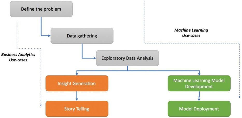
A typical data science use case usually takes a path of a core business-analytics problem or a machine-learning problem. Exploratory Data Analysis is considered as an inevitable approach. The figure below demonstrates the life cycle of a basic data science use case. It includes the initialization of a problem statement using one or more standard frameworks, and then it shifts to data gathering where it reaches the point of EDA. The majority of efforts and time in any project in this phase. Once the process of understanding the data is complete, a project may take a different path based on the requirements and the scope of use case.
The most important step is to assimilate all the observed patterns into meaningful insights. There are various scenarios where the objective is to develop a particular predictive model where the next step would be to create a machine learning model and then deploy it into a production system/product.
From a common man’s point of view, we can define EDA as the skill of understanding data from scratch. A more formal definition is nothing but the process of analyzing and exploring datasets to summarize its characteristics, properties, and latent relationships using statistical, visual, analytical, or a combination of techniques.

Breaking this further down, we can consider other dimensions to cater to is nothing but the types of features—numeric or categorical. In each of the type of analysis mentioned which is mentioned below:
- Univariate
- Bivariate
These types of EDA are based on the type of feature, where we can have a different visual technique to accomplish the study. So, for univariate analysis, we can consider a numeric variable, which creates a histogram or a boxplot, whereas we might use a frequency bar chart for a categorical variable. In this blog, we will focus on the steps which are needed for the implementation of exploratory data analysis using R.
Bank Dataset: We will focus on the attributes which are needed for understanding the bank dataset. This dataset is related to the direct marketing campaigns of a Portuguese banking institution. The marketing campaigns are completely based on phone calls. More than one contact will have to connect with the same client that was required in order to access if the product (bank term deposit) would be (‘yes’) or not (‘no’) subscribed.
Step 1: Let us understand the packages which are needed to install and create the required exploratory data analysis.
> install.packages("dplyr")
> install.packages("ggplot2")
> install.packages("repr")
> install.packages("cowplot")
Step 2: Include the libraries in the workspace to implement the model.
> library(dplyr)
> library(ggplot2)
> library(repr)
> library(cowplot)
> options(repr.plot.width=12, repr.plot.height=4)
Step 3: Convert the required dataset into a data frame to start with exploratory data analysis with R
> df <- read.csv("bank-additional-full.csv",sep=";")
> View(df)
> str(df)
'data.frame':	41188 obs. of  21 variables:
 $ age           : int  56 57 37 40 56 45 59 41 24 25 ...
 $ job           : Factor w/ 12 levels "admin.","blue-collar",..: 4 8 8 1 8 8 1 2 10 8 ...
 $ marital       : Factor w/ 4 levels "divorced","married",..: 2 2 2 2 2 2 2 2 3 3 ...
 $ education     : Factor w/ 8 levels "basic.4y","basic.6y",..: 1 4 4 2 4 3 6 8 6 4 ...
 $ default       : Factor w/ 3 levels "no","unknown",..: 1 2 1 1 1 2 1 2 1 1 ...
 $ housing       : Factor w/ 3 levels "no","unknown",..: 1 1 3 1 1 1 1 1 3 3 ...
 $ loan          : Factor w/ 3 levels "no","unknown",..: 1 1 1 1 3 1 1 1 1 1 ...
 $ contact       : Factor w/ 2 levels "cellular","telephone": 2 2 2 2 2 2 2 2 2 2 ...
 $ month         : Factor w/ 10 levels "apr","aug","dec",..: 7 7 7 7 7 7 7 7 7 7 ...
 $ day_of_week   : Factor w/ 5 levels "fri","mon","thu",..: 2 2 2 2 2 2 2 2 2 2 ...
 $ duration      : int  261 149 226 151 307 198 139 217 380 50 ...
 $ campaign      : int  1 1 1 1 1 1 1 1 1 1 ...
 $ pdays         : int  999 999 999 999 999 999 999 999 999 999 ...
 $ previous      : int  0 0 0 0 0 0 0 0 0 0 ...
 $ poutcome      : Factor w/ 3 levels "failure","nonexistent",..: 2 2 2 2 2 2 2 2 2 2 ...
 $ emp.var.rate  : num  1.1 1.1 1.1 1.1 1.1 1.1 1.1 1.1 1.1 1.1 ...
 $ cons.price.idx: num  94 94 94 94 94 ...
 $ cons.conf.idx : num  -36.4 -36.4 -36.4 -36.4 -36.4 -36.4 -36.4 -36.4 -36.4 -36.4 ...
 $ euribor3m     : num  4.86 4.86 4.86 4.86 4.86 ...
 $ nr.employed   : num  5191 5191 5191 5191 5191 ...
 $ y             : Factor w/ 2 levels "no","yes": 1 1 1 1 1 1 1 1 1 1 ...


>
As you can see from the dataset, we have 20 independent variables, such as age, job, and education, and one outcome/dependent variable—y. Here, the outcome variable defines whether the campaign call made to the client resulted in a successful deposit sign-up with yes or no. To understand the overall dataset, we now need to study each variable in the dataset. Let’s first hop on to univariate analysis.
Step 4: It is important to take into consideration of univariate analysis. Univariate analysis is the study of a single feature or rather a single variable through which we get the overall view of how the data is organized. For numeric features, such as columns called age, duration, nr.employed (numeric features in the dataset) and many others, we look at summary statistics such as min, max, mean, standard deviation, and percentile distribution.
> print(summary(df$age))
   Min. 1st Qu.  Median    Mean 3rd Qu.    Max.
  17.00   32.00   38.00   40.02   47.00   98.00
> print(paste("Std.Dev:",round(sd(df$age),2)))
[1] "Std.Dev: 10.42"
> ggplot(data=df,aes(y=age)) + geom_boxplot(outlier.colour="black")
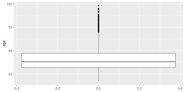
R includes an inbuilt function called a summary, which takes the print of summary statistics which is needed to draw min, median, max, 75th percentile, and 25th percentile values. After that, we implement the sd function to compute the standard deviation, and, lastly, we implement the ggplot library to plot the boxplot for the data. The boxplot helps in visualizing the information in a simple and lucid way. The boxplot splits the required data into three quartiles. The lower quartile is the section that is present below the line represents the min and the 25th percentile. The middle quartile represents the 25th to 50th to 75thpercentile. The upper quartile represents the 75th to the 100th percentile. The dots which are represented above the 100th percentile are outliers determined by the internal functions.
Step 5: The ggplot function defines the base layer for visualization, which is then followed by the geom_histogram function with parameters that define the histogram-related aspects such as the number of bins, color to fill, alpha (opacity), and many more.
> ggplot(data=df,aes(x=age)) +
+     geom_histogram(bins=10,fill="blue",color="black", alpha =0.5)  +
+     ggtitle("Histogram for Age") + theme_bw()
Step 6: Now we will focus on visualizing multiple variables using a histogram of our mentioned dataset. Multiple variables can be plotted together in one particular grid with the help of cowplot.
> library(cowplot)
> plot_grid_numeric <- function(df,list_of_variables,ncols=2){
+     plt_matrix<-list()
+     i<-1
+     for(column in list_of_variables){
+         plt_matrix[[i]]<-ggplot(data=df,aes_string(x=column)) +
+             geom_histogram(binwidth=2,fill="blue", color="black",
+                            alpha =0.5)  +
+             ggtitle(paste("Histogram for variable: ",column)) + theme_bw()
+             i<-i+1
+             }
+     plot_grid(plotlist=plt_matrix,ncol=2)
+ }
> summary(df[,c("campaign","pdays","previous","emp.var.rate")])
    campaign          pdays          previous      emp.var.rate
 Min.   : 1.000   Min.   :  0.0   Min.   :0.000   Min.   :-3.40000
 1st Qu.: 1.000   1st Qu.:999.0   1st Qu.:0.000   1st Qu.:-1.80000
 Median : 2.000   Median :999.0   Median :0.000   Median : 1.10000
 Mean   : 2.568   Mean   :962.5   Mean   :0.173   Mean   : 0.08189
 3rd Qu.: 3.000   3rd Qu.:999.0   3rd Qu.:0.000   3rd Qu.: 1.40000
 Max.   :56.000   Max.   :999.0   Max.   :7.000   Max.   : 1.40000
> plot_grid_numeric(df,c("campaign","pdays","previous","emp.var.rate"),2)
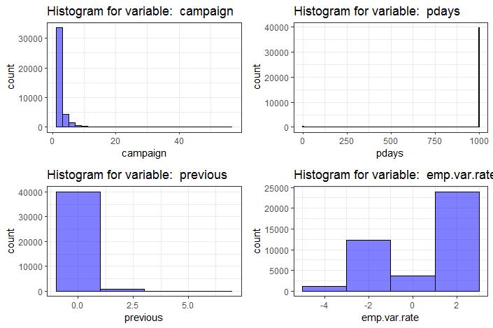
When we define the function plot_grid_numeric, which accepts the parameters dataset, we will consider the number of points to be plotted in the graph. The function provides the list of provided variables using for loop and collects the individual plots into a list called plt_matrix. With the help of cowplot library, we can arrange the plots into a grid with two columns.
Step 7: Now we will move to the concept of bivariate analysis. In bivariate analysis, we extend the analysis with respect to two variables. To understand it is important the relationship between two numeric variables so that we can leverage the required scatter plots. It is usually considered as a 2-dimensional visualization of the data, where each variable is plotted with respect to the axis of the required length.
ggplot(data=df,aes(x=emp.var.rate,y=nr.employed)) + geom_point(size=4) +
+ ggtitle("Scatterplot of Employment variation rate v/s Number of Employees")
With the help of the mentioned plot, we can see the increasing trend as the employment variance rate increases, the number of employees also increases. The fewer number of dots are due to repetitive records in the mentioned column nr.employed.
Conclusion
In this article, we explored the process of EDA with the help of practical use cases and traversed the business problem. We started by understanding the overall process of executing a data science problem which is a must for every data scientist to analyze (bank dataset as an example) and then defined our business problem using an industry-standard framework. We focussed on exploring the journey of EDA, with the help of univariate, bivariate, and multivariate analysis.
The next article will be the last article of this series on R programming language. in the last article, we will be going to cover “Clustering using FactoExtra Package“.
So, see you there!


