
The era of app wars has begun.
We are no longer living in a world of inconvenience. Everything we ever need is now at the tip of our fingers.
From banking, grocery shopping, movie streaming, reading, list-making, music, games, navigation even down to meditation and journaling… they have been done.
Apps have become the bread and butter of our social age.
So, it is not a surprise that the demand for icons has also increased.
The Transition From Bevel to Flat Icons
Remember those chunky app icons prior to the era of minimalist design? They used to be the epitome of icons.
Now they are replaced by flat design (minimalism) and they are now the preferred mode of representing an application.
What has caused this transition?
Apple did.
Apple And Its Pursuit Of Simplicity
The company responsible for the famous iPod, iPad and iPhone have been the trendsetter for the flat design movement.
When Apple released their iPod, other mp3 players were too complicated in their design and function.
After this, they launched iPhone 4 and iPhone 4s with an all-new iOS that featured flat icons for the apps.
Apple in its core believed that technology must be simple.
In turn, this was communicated to their user experience and user interface (UX/UI). The minimalist design allowed users to have more clarity on their daily gadget usage.
![]()
A more universal approach was considered: it included senile people and younger generations having the ability to use Apple products with ease and flexibility.
Because of this simplicity, Apple was able to deliver more with less. The company responsible for spearheading sleek hardware design also pioneered the biggest trend in the century.
For app designers and startup founders, having an effective app icon design will make or break your downloads. If few people have your apps, there’s fewer exposure to your brand. And few brand exposure means less customer awareness and lower sales.
So in line with this, we’re going to dish out the 5 ways a good icon design can get customers to download your app.
![]()
1. A Good App Icon Gives An Impact On Your Company’s Visual Identity
In 2014, Paypal has launched a new logo that hinted its more mobile future.
In an article cited by Wired.com, it was stated that:
“In 15 years PayPal has been handling our money, there’s been little change in how it presents itself to the world. The company’s technological advancements—things like Beacon and PayPal Here—have been downplayed by its visual steadfastness over the years.”
They mentioned that Paypal had a “perception” and as a result, this gave their customers various understanding of how they work.
A business that confuses or does not have an impact on its users generate fewer results such as sales or app downloads.
How To Fix It: Have a clear visual identity for your icon.
Here are some ways you could improve your app icon:
1. Use appropriate colors. For example, blue communicates trustworthiness and red commands attention and vigor.
2. Make sure there’s ample white space around your logo.
3. If you are using your icon as the full app icon, make sure it is clear and recognizable in a right away.
4. Do not use words unless necessary.
5. Don’t have too many items in the design. An effective app icon is direct with its message and is uncluttered.
2. A Good App Icon Makes You Want To Know More And Do More
Curiosity is the name of the game when it comes to app wars.
Do you remember when Instagram rebranded their logo?
In 2016, a lot of their users were shocked when they did. But if you were part of that crowd, you would know why. Read on.
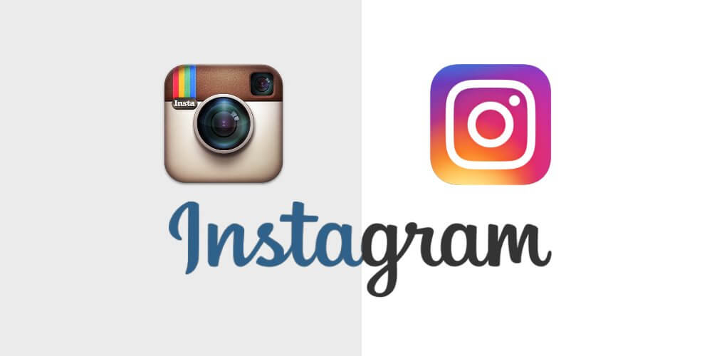
Instagram had their old logo from the beginning. And when Apple rolled out their new iOS featuring minimalist design and flat app icons, the whole interface changed.
Suddenly, Instagram couldn’t fit in with the rest anymore.
But why did they rebrand?
As Instagram puts it:
“We’ve made improvements to how the Instagram app looks on the inside as well. The simpler design puts more focus on your photos and videos without changing how you navigate the app.”
And doesn’t that inspire curiosity and action?
How To Improve Your App Icon Design: Make sure to stay fresh, relevant and mindful to your customers. Have these qualities reflect on your app design and icon.
3. A Good App Icon Stands Out From Its Competition
In Google Play alone, there are a million apps waiting to be downloaded.
![]()
One of those apps was Piano Master 2, which was an application rebranded by Roman Rudnik.
When you open Google Play or the App Store, you’ll be welcomed by a plethora of applications that have similar functions.
To stay outstanding in a sea of apps is quite a herculean task.
But, not if you have a strong app icon.
How To Improve Your App Icon Design: Create an enticing look that clearly communicates your app’s purpose. If it’s too cluttered or not well-designed, users may think your app is of low quality. If it’s too sophisticated, they may think it’s hard to use and a hefty paid subscription is needed. You have to find the sweet spot for the right message through your icon design.
4. A Good App Icon Uses The Right Look
If you have an e-commerce store for books, you will most likely use a book icon to denote your app’s representation.
Book icons will serve as visual shorthand, helping users quickly identify and associate your brand and app with the products you offer.
This is an example of how good apps get customers to download: if it sends the right message.We’ve tackled a bit of this from number 3, but in this section, we will place emphasis on “why”.
Why You Need The Right Look For Your App Icon Design:
1. Customers can tell it is actually you. Be consistent. If you have used your logo on social media, don’t have a different logo for your app icon.
2. It builds customer loyalty and pride. A user who has downloaded your app will be proud to have it inside his gadget if your icon is professional. Make it your mark.
3. It dispels competition. Aside from being outstanding, a good app icon can make or break the market. If your app icon is prominent enough that your customers cannot associate your industry without you, then you have successfully delivered.
![]()
5. A Good App Icon Sits Well With Other Icons
I don’t know if you have noticed, but there are many instances where the interface of the app say, whether it be a phone or a tablet, Facebook and Twitter apps are next to each other.
Check your phone if you don’t believe us.
More likely, similar apps are collected together in one screen or grouped in one category.
This is an essential part of your app’s impression.
If your app looks neat and smart together with other complementary apps on a user’s smartphone, they’ll most likely download it.
They may not be conscious about it but you can be the better person and start doing A/B or split tests.
To give you a comprehensive backup, here are 10 case studies that showed how an application’s new icon can increase downloads.
How did you find this article, helpful? Do you think your app icon needs a makeover? Share us your comments below.

