
Hello Friends,
In some previous chapters we had learned to create a static webpage.
Today we are going to create a webpage containing a form which can interact with the user. Obviously, interaction will be done using some other programming language and as usual, designing of the form will be done using HTML.
We had learned about the tags used to create a form and input elements in chapter “Basic HTML Forms and input” session already.
Now let’s use it practically.
We are going to create a form that takes the contact information of the members of the Blue Developer team as input.
The final form will look like this:
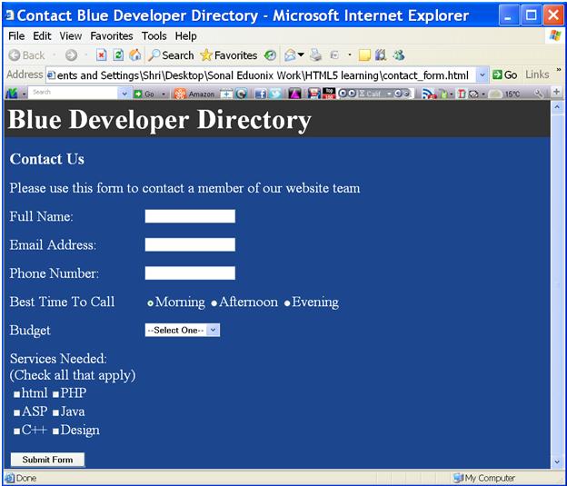
fig 1
Here is the outline of the webpage that tells us, what all we need to do in it.
<html>
	<head>
		<title>Contact Blue Developer Directory</title>
	</head>
	<body style="margin:0;background-color:#1c478e;color:#fff;">
		<h1 style="margin:0;padding:5px;background-color:#333;color:#fff;">Blue Developer Directory</h1>
		<div>  <!--main div start-->
			<h3>Contact Us</h3>
			<p>Please use this form to contact a member of our website team</p>
			<!--form here-->
		</div> <!--main div end-->
	</body>
</html>
- Open a notepad++ editor:
- Open a notepad++ editor and write the above given code (outline of the webpage) in it.
- Save the file with name “contact_form.html” as shown below.
- The code in notepad++ is shown below:
- Here we have to replace the comment
(<!—form here-->)
with the code for form creation.
- The output of the above code is shown below:
- Till now, we have used just heading tags and paragraph tag to display the heading and paragraph.
- Now, let’s start with form creation.
- For creating form, we use starting form tag and ending form tag.
- Its main attributes are “action” and “method”.
- To create the input elements such as textboxes, checkboxes, radio-buttons etc. on the form, input tag is used.
- input tag is a singleton/unpaired tag, having no ending tag.
- The form tag attributes are used as shown below:
- Here in above code, we can see, the action attribute having the value as “process.php”. What does it mean?
- We know that, HTML is used only for designing purpose; but as this is a form you need some processing for it.
- In this example whatever input we give to this form, will be transferred to the file “process.php” for its processing. Thus action attribute is used to specify the destination of our form input to be processed.
- “method” attribute is used to specify, the service, whether it’s a “get” or “post” service. It determines the security of the information. We had seen this in previous session.
- Here, we have used “post” value for “method” attribute.
- You can see in the final output, fig 1 above that “Full Name:”, Email Address:”, “Phone Number:” etc. are labels and they have their respective input fields in front of them in the form of textboxes, radio-buttons etc.
- Now let’s design input fields one by one.
- Creating input elements:
- Creating labels and textboxes:
- Let’s create first label “Full Name” and textbox in front of it.
- We will create each label and input element pair in paragraph tag.
- We have written the following code inside starting form tag and ending form tag block.
- Here in the above code, starting label tag and ending label tag are used to create a label.
- “for” is an attribute of label tag used to associate a label with an input element.
- To enter the full name, we need a textbox, so we use “type” attribute of input tag with value “text”. This will create a textbox.
- “name” attribute of input tag is used to give identification to the input element.
- Here, we have name=”name”, this means, “name” is the identification given to the textbox used to enter the full name.
- Note that: the value for the “for” attribute of the label and the “name” attribute of the associated input element should be same. It associates them with each other.
- Just see its output:
- Label is not a block element; it is an inline element; so whichever element we take after label will be placed right in front of the label.
- For instance, if we type some text after ending label tag, it will appear right next to label.
- It’s output is shown here:
- If label would have been block element, the “test” text would have been placed below “Full Name:” label.
- But since it is an inline element, any input element associated with that label will be placed in front of it in the same row.
- We will create the next label-textbox field pair in the same way.
- Code is as follows:
- The code in notepad++ is shown below:
- It’s output is shown below:
- Creating radio-buttons:
- To create radio-buttons input tag’s “type” attribute has value as “radio”.
- We have 3 radio-buttons in our webpage viz: Morning, Afternoon and Evening.
- The code for creating them is as follows:
- Here, “name” attribute of all the three radio-buttons have ”call” as its value, which is same as the value of “for” attribute of the label associated with it.
- Whatever we have inside the input tag is responsible to create only the radio-buttons and the text viz: “Morning”, “Afternoon” and “Evening” is the caption/text of the radio-button.
- If you remove the text, you will see only a small circle and nothing else.
- The output is shown below:
- In the output, you can see that the radio-buttons are unchecked by default. But in some websites, one radio-button is checked already when the page is loaded.
- We can achieve this, by just writing the text “checked” in the input tag as follows:
- Output is shown here:
- Creating a dropdown list:
- To create a dropdown list, starting select tags and ending select tags are used.
- To have options in the dropdown list starting option tags and ending option tags are used.
- Let’s see the code:
- Due to this above code, a dropdown list has been created.
- The option “Select One” makes it sure that no other option is pre-selected when the webpage is loaded.
- You are allowed to select any one option in this dropdown list.
- The webpage with the dropdown list is as shown below:
- Creating Checkboxes:
- To create checkbox, the value of “type” attribute of input tag is “checkbox”.
- Checkboxes are used for multiple selections.
- In fig 1, you might have seen the arrangement of the checkboxes. This systematic placement of checkboxes on the form is done using HTML table.
- Here is the code:
- Here in the above code, we have a table having three rows, each containing two checkboxes.
- Value for “name” attribute of input tag for all checkboxes is “services”, same as the value of “for” attribute of label.
- “value” is another attribute, having different values for each checkbox.
- The input tag with its attributes creates the checkbox and the text immediately written after the input tag forms the caption of the checkbox.
- The output is as shown below:
- Creating a button:
- Below the checkboxes we have a “Submit Form” button.
- To create a submit button, the value of “type” attribute of input tag is “submit”.
- The button is created in another paragraph tags block as follows:
- Here, the “value” attributes text, “Submit Form” will appear on the submit button.
- The output is shown below:
- Applying Styles:
- We have finished with our designing. The only thing remaining is to make the webpage look more aligned and better.
- For this we need to style the webpage.
- Let’s do it:
- Labels in fig 2.9 are at the extreme left, they must be shifted slightly at the right side, as in fig 1.
- We know that all the labels and input elements are in the div block. So, if this div block is shifted slightly, all the elements will automatically be shifted to right.
- The following code satisfies our requirement:
- Here, padding-left:10px; means leave 10 pixels of space at the left side of the div block.
- Output is as follows:
- Now, as shown in fig 1, there is a space between every label and input element.
- So to achieve it, instead of writing the code for every label, we will write the code once in style block in head section.
- The code is as follows:
- Here, we need to style all the labels in the form, so style block contains styling code for label.
- It has “display” selector with value ”inline-block”, which means that the display of labels be of “inline-block type”.
- width:250px; tells us that, the input elements are placed at a width of 250 pixels from the left margin, thus aligning all the form elements.
- We have used such kind of styling using style block in previous chapter also.
- Output after this styling is shown below, which is our final output.
- Thus we finished creating our contact form.
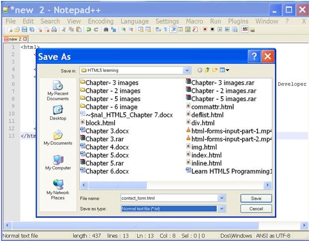
fig 1.1
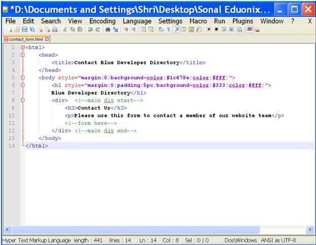
fig 1.2
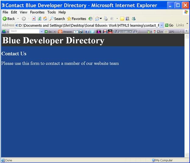
fig 1.3
<div>  <!--main div start-->
    <h3>Contact Us</h3>
    <p>Please use this form to contact a member of our website team</p>
    <form action="process.php" method="post"><!--form here-->
    </form>
</div> <!--main div end-->
<p>
	<label for="name">Full Name:</label>
	<input type="text" name="name">
</p>
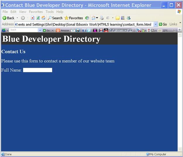
fig 2.1
<p>
    <label for="name">Full Name:</label>test
</p>
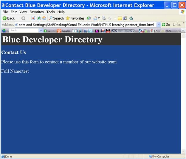
fig 2.2
<form action="process.php" method="post"><!--form here-->
      <p>
	     <label for="name">Full Name:</label>
	     <input type="text" name="name">
      </p>
      <p>
	     <label for="email">Email Address:</label>
	     <input type="text" name="email">
      </p>
      <p>
	     <label for="phone">Phone Number:</label>
	     <input type="text" name="phone">
      </p>
</form>
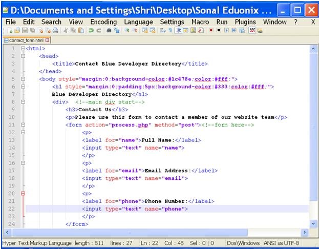
fig 2.3
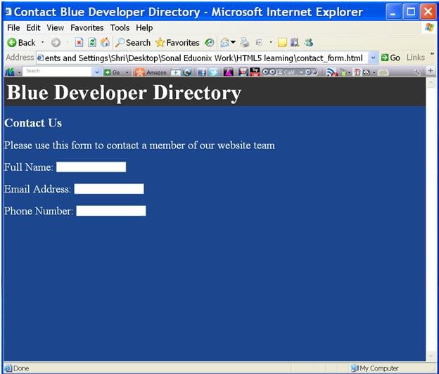
fig 2.4
<p>
  <label for="call">Best Time To Call</label>
  <input type="radio" name="call" value="morning">Morning
  <input type="radio" name="call" value="afternoon">Afternoon
  <input type="radio"name="call" value="evening">Evening
</p>

fig 2.5
<p>
 <label for="call">Best Time To Call</label>
 <input type="radio" name="call" value="morning" checked>Morning
 <input type="radio" name="call" value="afternoon">Afternoon
 <input type="radio" name="call" value="evening">Evening
</p>
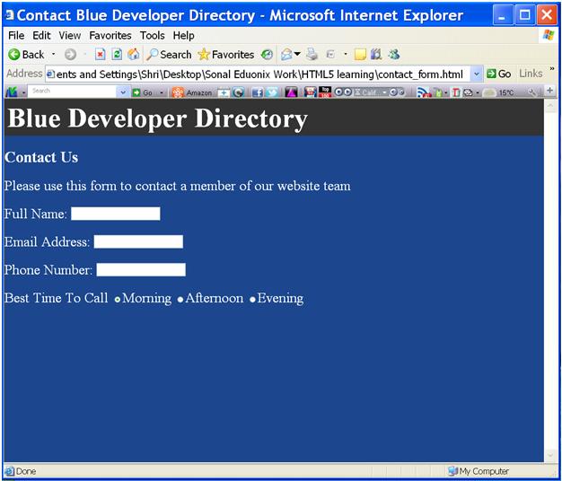
fig 2.6
In the above figure, “Morning” is pre-checked when the page is loaded.
<p>
    <label for="budget">Budget</label>
    <select type="list" name="budget">
    <option>--Select One--</option>
    <option value="100-500">$100-$500</option>
    <option value="500-1000">$500-$1000</option>
    <option value="1000-2000">$1000-$2000</option>
    <option value="2000+">$2000+</option>
    <option value="not sure">Not Sure</option>
    </select>
</p>
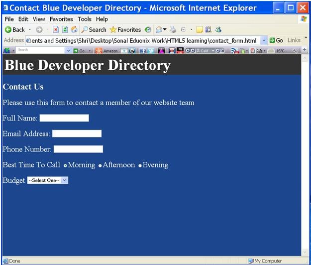
fig 2.7
<p>
 <label for="services">Services Needed: (Check all that apply) </label>
  <table>
   <tr>
   <td><input type="checkbox" name="services"  value="html">html</td>
   <td><input type="checkbox" name="services"  value="php">PHP</td>
   </tr>
   <tr>
   <td><input type="checkbox" name="services"  value="asp">ASP</td>
   <td><input type="checkbox" name="services" value="java">Java</td>
   </tr>
   <tr>
   <td><input type="checkbox" name="services"  value="c">C++</td>
   <td><input type="checkbox" name="services" value="design">Design</td>
   </tr>
  </table>
</p>
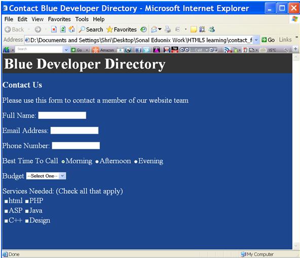
fig 2.8
<p>
<input type="submit" name="submit" value="Submit Form">
</p>
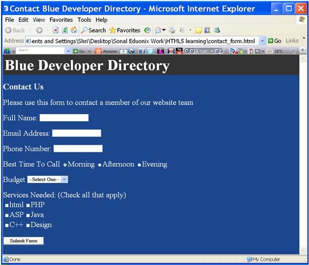
fig 2.9
<div style="padding-left:10px;">
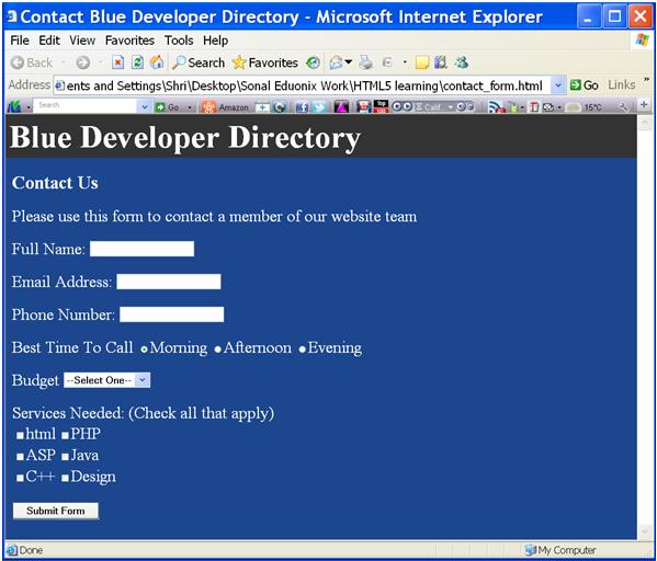
fig 3.1
<head>
		<title>Contact Blue Developer Directory</title>
		<style>
			label
			{
				display:inline-block;
				width:250px;
			}
		</style>
</head>

fig 3.2