

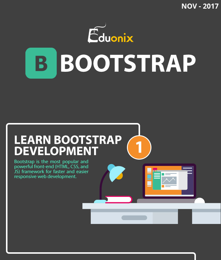
Bootstrap Development Infographic Introduction
Build responsive websites quickly with this amazing front-end toolkit. With Google giving preference to mobile websites over the traditional desktop ones, progressive websites are now no longer just a choice, but rather a need.
However, building responsive websites isn’t all that easy with JavaScript, HTML and CSS. The long scripts required are exhausting and buggy, which is why Bootstrap is a great way to put the responsive layout directly into your website and let it do all the hard work for you.

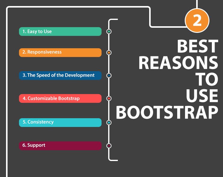
The best part is that Bootstrap works well for newbies and experienced developers. For newbies, you don’t have to mess around with a lot of codes and scripts and programming syntax, and for experienced developers, they can play around the Bootstrap script and actually modify it according to their own needs, resulting in a more unique Bootstrap experience.
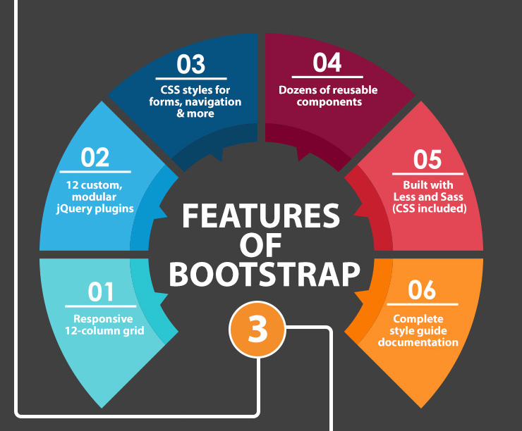
If you want a thorough discussion on Bootstrap, including benefits, features, pros and cons and other important information, you can find all of that down below in the infographic! Try Bootstrap and we can guarantee that it will not only blow your mind, but actually change your life!
