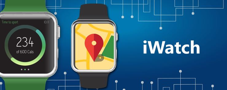
There’s so much you can do with an iWatch, it’s mind blowing. From tracking, to maps, to even telling time (it is a watch, after all), the iWatch is capable of literally hundreds of different functions. To help you keep things in perspective as a coder, here are the top ten interface elements for the Apple iWatch, and what makes them so incredible.
1) Menus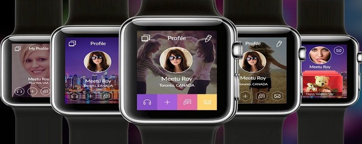
When you’re looking for some base commands in your app, you typically look for some form of menu. Menus are accessed with a firm press on the iWatch screen. Not all applications will have a menu, and if they don’t, then typically an animation will play. A menu is a way to have some limited interface with your iWatch. This interface is done via commands, and you can have up to four different commands in one Menu. This is also about as many as the screen can hold. See the 4 options in the menu above.
2) Images
The iWatch has a retina display, so your images should look outstanding. The iWatch will support nearly any image type you can think of, but the preferred format is png. When creating images for the iWatch, try to keep them between 38mm and 42mm, and when designing your graphics, feel free to create them at 2x size. Again, the retina display is pretty sharp, and you should have no problem in making your images and compressing them down.
3) Sliders
If you need to change something size-wise, you might want to consider adding a slider. On a phone, a slider would be you using two fingers to make something grow or shrink. On the iWatch, the slider function is done with a tap. In most apps that support sliders, the tap is designed to increase or decrease the size of font. It is not meant for numbers, and not often associated with graphics. It should be noted that all the different sizes available via a slider are predetermined.
4) Maps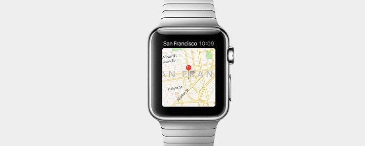
There’s already a maps app on your iWatch, but getting to it is usually done via maps. Maps are static graphics that you can tap to access the locations you need. Most are not dynamic, and are loaded as the apps are created. The content that appears on them is dynamic, and can be changed whenever the application is loaded.
5) Switches
Not all applications require a lot of choices. A switch is used when you only have two choices, yes or no. This is also known in coding as a Boolean, and is quite common in most apps. It is customary for the app to have a description next to the switch, so the user knows what their choice will do.
6) Buttons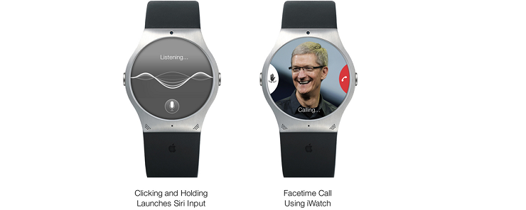
Any time you want to have a user interface, you can use a button. Buttons can come in all shapes and sizes, and some even take up the entire screen. When designing your buttons, keep the structure of the watch in mind. Pay attention to the corners, and if you want to have multiple buttons on the screen, try to make them match in formatting and size. Buttons are meant to be dynamic, and are app specific.
7) Tables
A table is a collection of data. In a larger interface, a table would have multiple rows and columns. Due to the size of the iWatch, tables here should typically only be one column, so as to avoid confusion. Also, to make sure your users don’t get lost, you should probably limit the number of rows in your table to about 20. This is a good number, and won’t overload an end-user.
Tables are great for breaking up large amounts of data, but try to keep them clean. Also, try not to display your tables in groups, if you can help it.
8) Groups
A group is a collection of objects on the screen. Think of it as a table, but for objects, text, and images. You can have multiple groups on your screen, however try not to overdo it. Also, keep in mind that there should be some method to your groups, and that grouped items are typically thought of as like items. In other words, don’t go pell-mell with your groupings. Also, how much space will your group take up? As a coder, don’t sacrifice readability and style for content.
9) Labels
Labels are exactly that; short lines of text that appear on your watch. They are not meant to be dynamic, and often times only give the reader a few lines of text. A label is good for providing an overview, but is not meant for a deep-dive or to be scrolled. If you have more information that can fit on one watch screen, then the label is not for you.
10) Date and Time Labels
Date and time values can be customized, and will run automatically. You can choose between seeing the date, the time, or both, and you can not only set the style of time (24 vs 12 hours), but you can also set your region to anywhere you want in the world. As far as a timer, the iWatch can do that as well. The timer replaces the time on the screen and woks much like a stop watch. In other words, on top of everything else the iWatch can do, the programmers remembered that first and foremost, it’s supposed to be a watch. When you’re working with your applications, keep this fact in mind as well.
There’s a ton you can do with the Apple iWatch. The ten items listed out in this article are some of the more common ones that you’ll run across, and you’ll probably notice them in numerous apps if you download them. As far as figuring out what works best for you, be brave and download a wide variety of applications before settling on the tools you want. See how other people have done it and see what works for you. In the end, there’s no one right item or command to include. It all boils down to what works for you, your app, and how you want it to work.
