
Introduction to Visualization and R plots
When working with statistics and models, plots and data visualization are the most used tools for technical, or non-technical representation of data, greatly beneficial for decision-making. The R language provides a wide range of inbuilt functions and libraries such as “ggplot” for visualization. In this tutorial, we will go through the built-in plotting methods in R and R plots.
Categories of Presentation of Plots
There are mainly four categories to separate plots of functions:
- Comparison: Plots that compare variables. Example- Line, column, and bar charts.
- Composition: Plots that show how some quantity is composed or built. Example- Stacked charts, pie charts.
- Distribution: Plots that consider the given data and show its distribution on some criteria such as classes. Example- Histogram, scatter-plot, and area plot.
- Relationship: Plots that show the relationship between variables. Examples- Scatter plots for 2 variables, bubble charts.
Types of Plots
Mentioned below are the most common types of R plots.
-
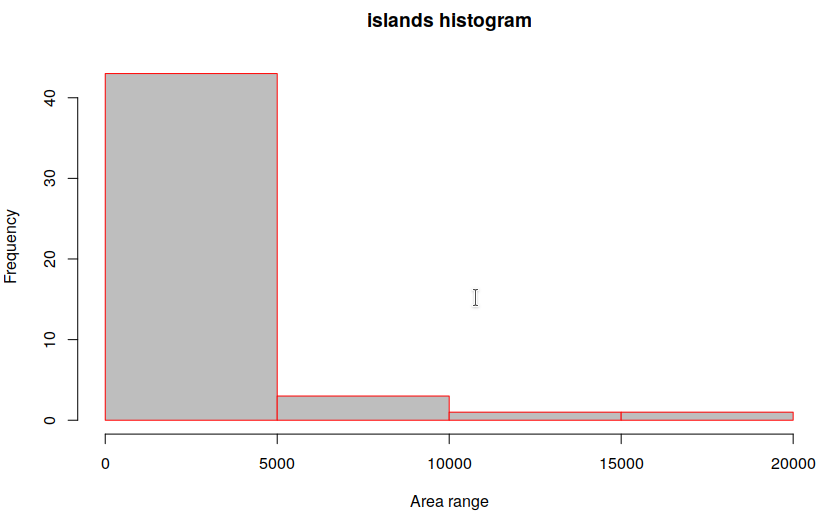
Histogram
Also called frequency plot, a histogram breaks down continuous data into classes or “bins”. In the chart, the X-axis represents bins and corresponding to any bin on the X-axis, the value on Y-axis indicates the “class frequency”. In R, the hist() function [Documentation] is used for plotting histograms, with two main arguments: Data, and Breaks (the number of bins you wish to create). An example for the in-built “islands” dataset:
hist(islands, breaks=5, main="islands histogram", xlab="Area range", border="red", col="grey")
-
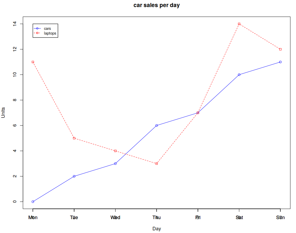
Bar/Line Chart
Line charts and bar charts are something most of us are familiar with, where a 2 or 3-dimensional graph uses a line to connect a series of data points. It is the most used plot in statistics and analysis, for example, to plot the accuracy of a neural network, or tracking the value of a stock in the stock market. Let’s plot some sales data as given:
cars <- c(0, 2, 3, 6, 7, 10, 11)
days <- c("Mon","Tue","Wed","Thu","Fri", "Sat","Sun")

## Adding some more data to plot
laptops <- c(11, 5, 4, 3, 7, 14, 12)

## Find the maximum range g_range, for setting axis limits
g_range <- range(0, cars, laptops)

## Create a plot, of “cars” - Set the ylim and disable axes
plot(cars, type="o", ylim=g_range, axes=TRUE, main="car sales per day", xlab="Day", ylab="Units", col="blue")

## Tell R language to create another plot in the same figure
lines(laptops, type="o", pch=22, lty=2, col="red")

## Fancy commands to improve presentation!
axis(1, at=1:7, lab=days);
legend(1, g_range[2], c("cars","laptops"), cex=0.8, col=c("blue","red"), pch=21:22, lty=1:2);
The resultant line chart:
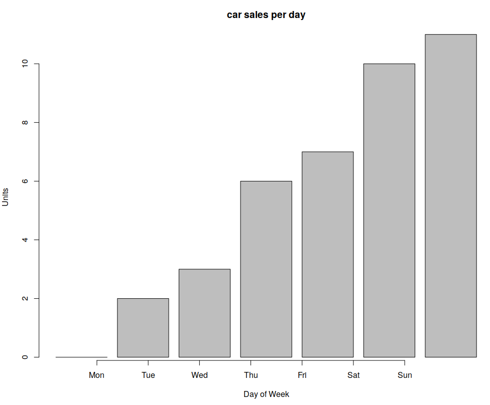
You can also use bar charts:
cars <- c(0, 2, 3, 6, 7, 10, 11)
days <- c("Mon","Tue","Wed","Thu","Fri", "Sat","Sun")
barplot(cars, main="car sales per day", xlab="Day of Week", ylab="Units")
axis(1, at=1:7, lab=days)
-
Box plot
A box plot displays five statistically significant numbers: Minimum, 25th percentile, median, 75th percentile, and maximum. It is useful to represent the spread or variance of data. For example, consider the IRIS dataset which has 4 features and targets for 150 training samples. The following creates box R plots for two variables in R [Documentation]:
boxplot(iris$Petal.Length ~ iris$Species, main="Box plot-IRIS", xlab="class", ylab="Petal length", col="grey")
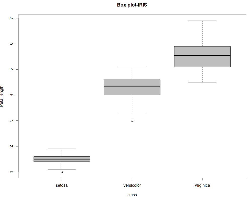
For presenting, I chose not to print any other text in the plot beside axis labels, for clarity. The top and bottom lines indicate the maximum and minimum values, the thick black line in the medium indicates the median and the borders of the shape surrounding the median are the 1st and 3rd quartiles.
-
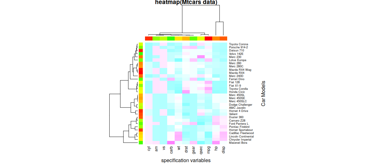
Heatmap
A heatmap is commonly used to look for hotspots in two dimensions. You can think of a heatmap as a replacement to histogram where colors are used instead of height or width, to present hotspots in the data and is also one of the many kinds of R plots. For instance, Heatmaps can be used to see what areas of webpages are most clicked or viewed. Pass a matrix to the heatmap() function in R and you can see the heatmap. An example is given below:
## Load the mtcars dataset
x <- as.matrix(mtcars);

## Colors for the heatmap
rc <- rainbow(nrow(x), start = 0, end = .3);
cc <- rainbow(ncol(x), start = 0, end = .3);

## Plot heatmap
hv <- heatmap(x, col = cm.colors(256), scale = "column", RowSideColors=rc, ColSideColors = cc, margins = c(5,10), xlab = "Specification variables", ylab = "Car Models", main = "heatmap(Mtcars data)");
The resultant heatmap:
-
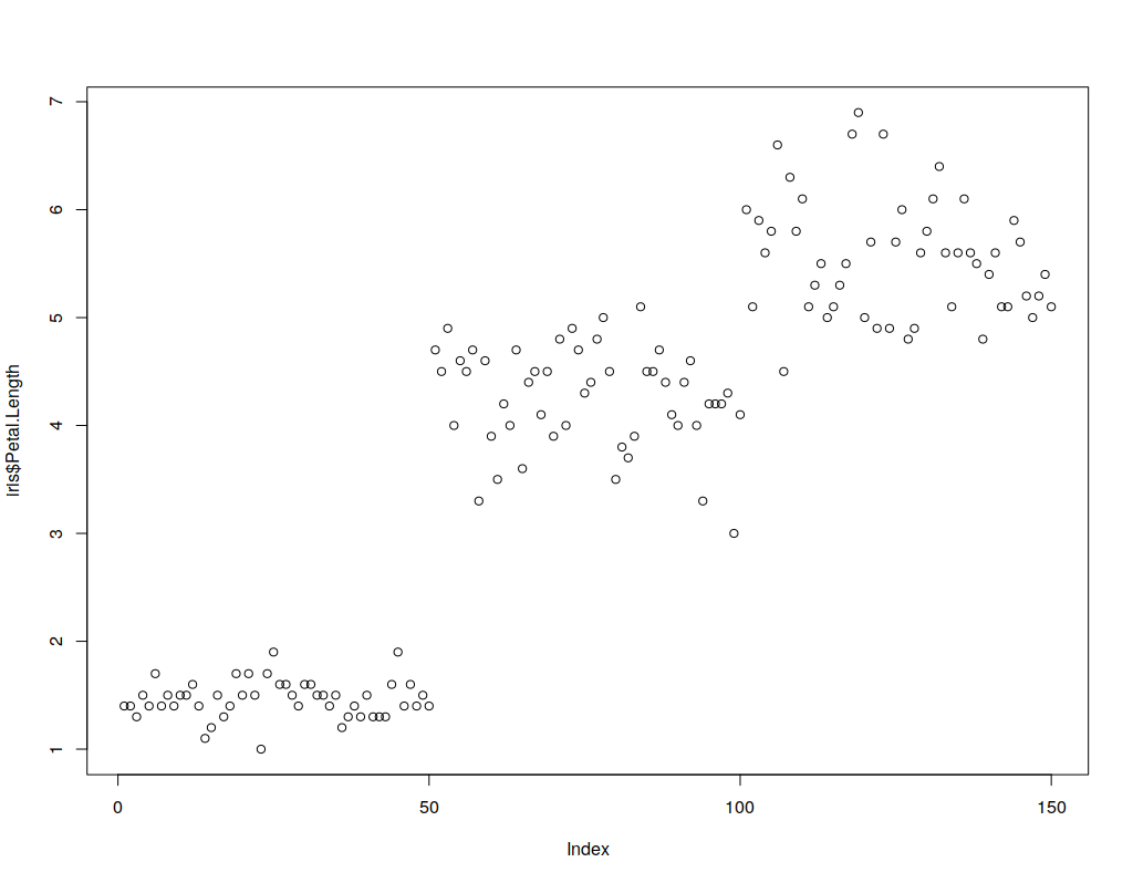
Scatterplot
Generally, in 2 or 3 dimensions, the points are of format (x1,x2,…xN) and are represented by shapes and/or colors in the vector space. Scatter plots are also used in representing neural network accuracy in prediction or classification. As an example, below is a simple 1-dimensional scatter plot of the IRIS data. The X axis is the index (0…149) of the sample and the Y-axis is the petal length of the sample.
plot(x=0:149,y=iris$Petal.Length) ## Simple Scatterplot for IRIS data
-
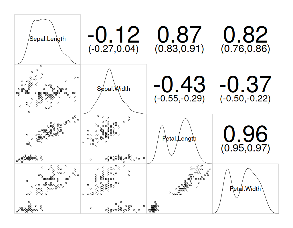
Correlogram
Correlograms help in the visualization of data in terms of correlation matrices. Since corrgram() is not an in-built, we need to install the corrgram package. The following commands will install and use corrgram on the IRIS dataset:
## Install corrgram packages
install.packages("corrgram")

## Enable corrgram
library(corrgram)

corrgram(iris, lower.panel=panel.pts, upper.panel=panel.conf, diag.panel=panel.density)
Neural Networks with R
I will assume you know enough about Neural Networks and the syntax of R language, to go ahead with this demonstration of creating, training, and visualizing a neural network with R.
The neuralnet library for R provides a framework to create NNs. The following code creates a neural network for IRIS dataset.
## download/install and load neuralnet library
install.packages("neuralnet")
library(neuralnet)
# Make training and validation data
set.seed(123)
train <- sample(nrow(iris), nrow(iris)*0.5)
iristrain <- iris[train,]
valid <- seq(nrow(iris))[-train]
irisvalid <- iris[valid,]
# Binarize the categorical output
iristrain <- cbind(iristrain, iristrain$Species == 'setosa')
iristrain <- cbind(iristrain, iristrain$Species == 'versicolor')
iristrain <- cbind(iristrain, iristrain$Species == 'virginica')
names(iristrain)[6:8] <- c('setosa', 'versicolor', 'virginica')
# Fit model
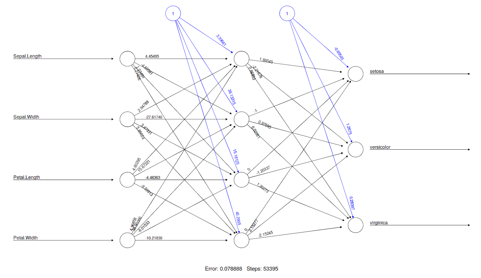
nn <- neuralnet(setosa+versicolor+virginica ~ Sepal.Length + Sepal.Width + Petal.Length + Petal.Width, data=iristrain, hidden=c(4))
plot(nn) # Visualization: plot() understands neuralnet objects
# Predict
comp <- compute(nn, irisvalid[-5])
pred.weights <- comp$net.result
idx <- apply(pred.weights, 1, which.max)
pred <- c('setosa', 'versicolor', 'virginica')[idx]
table(pred, irisvalid$Species)
To visualize this neural network, the plot() function understands that you pass an object from the neural net library so it displays the neural network connections, weights, and statistics.
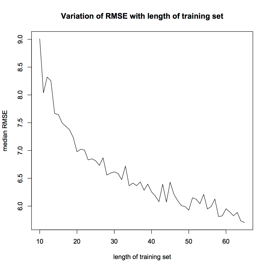
It is also possible to use plots and compare the accuracy of the NN for different sizes of training datasets. For instance, there will be a significant difference in the accuracy of a network with 50% training data and 50% testing data, compared to a network with 90% training data and 10% testing data. Thus, you can create a for the loop by varying the size of the training data and store the NN accuracy at every iteration, and use a plot to see what the suitable training set size is for you. An example of this is given below:
Conclusion
In this article, we looked at categories and types of plots, and the essence of data visualization in R. For an example we also look at the visualization of a neural network in R. So this was it, I will hope that now you have a basic idea of different types of R plots in R programming language. For more comprehensive understandings, you can go with Introduction To Data Science Using R Programming online tutorial. It consists of various sections which teach you various R tools, Data Visualization, Leaflet Maps, Statistics, Data Manipulation in detail and also make R plots with ease.

