

What is Footer?
Footer is the bottom section of the document. It is located under the main section or body. The <footer> tag defines a footer for a document or section. You can have many <footer> elements in a single document.
Importance of Footer:
Website footer helps the visitors by adding information and navigation option at the bottom of web pages.
A <footer> element typically contains:
▪ Copyright
▪ Privacy Policy
▪ Contact
▪ Address
▪ Phone and Fax numbers
▪ Navigation
▪ Social Icons
▪ Email Signup
▪ Your Mission. Your Values
Sticky footer
Footer can stick on the bottom in the same way that navigation sticks on the top of the page. It’s always there on the bottom of the page, no matter the scroll depth. It is always visible on every page.

In this article, we will be going to build a responsive footer using HTML and CSS. If you are unfamiliar with these languages or want to brushen up your skills then you can take Basic HTML5 & CSS for Beginners online tutorial for FREE!
Difference Between Responsive and Non-Responsive Footer:
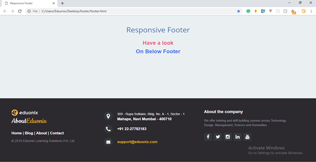
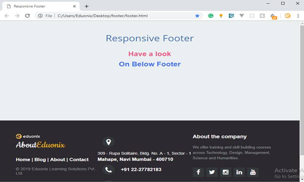
This is how Responsive Footer look like:

This is how Non-Responsive Footer look like:

Let’s get started with Coding!
HTML Code:
<!DOCTYPE html>
<html>

<head>
	<meta charset="utf-8">
	<meta http-equiv="X-UA-Compatible" content="IE=edge">
	<meta name="viewport" content="width=device-width, initial-scale=1">
	<meta name="keywords" content="footer, address, phone, icons" />

	<title>Responsive Footer</title>

	<link rel="stylesheet" href="style.css">

	<link rel="stylesheet" href="http://maxcdn.bootstrapcdn.com/font-awesome/4.2.0/css/font-awesome.min.css">

	<link href="http://fonts.googleapis.com/css?family=Cookie" rel="stylesheet" type="text/css">

</head>
	<body>
		<header>
			<h1> Responsive Footer </h1>
			<h2>Have a look</h2>
			<h2><span>On Below Footer</span></h2>
		</header>

		<!-- The content of your page would go here. -->

		<footer class="footer-distributed">

			<div class="footer-left">
          <img src="img/logo.png">
				<h3>About<span>Eduonix</span></h3>

				<p class="footer-links">
					<a href="#">Home</a>
					|
					<a href="#">Blog</a>
					|
					<a href="#">About</a>
					|
					<a href="#">Contact</a>
				</p>

				<p class="footer-company-name">© 2019 Eduonix Learning Solutions Pvt. Ltd.</p>
			</div>

			<div class="footer-center">
				<div>
					<i class="fa fa-map-marker"></i>
					  <p><span>309 - Rupa Solitaire,
						 Bldg. No. A - 1, Sector - 1</span>
						Mahape, Navi Mumbai - 400710</p>
				</div>

				<div>
					<i class="fa fa-phone"></i>
					<p>+91 22-27782183</p>
				</div>
				<div>
					<i class="fa fa-envelope"></i>
					<p><a href="mailto:[email protected]">[email protected]</a></p>
				</div>
			</div>
			<div class="footer-right">
				<p class="footer-company-about">
					<span>About the company</span>
					We offer training and skill building courses across Technology, Design, Management, Science and Humanities.</p>
				<div class="footer-icons">
					<a href="#"><i class="fa fa-facebook"></i></a>
					<a href="#"><i class="fa fa-twitter"></i></a>
					<a href="#"><i class="fa fa-instagram"></i></a>
					<a href="#"><i class="fa fa-linkedin"></i></a>
					<a href="#"><i class="fa fa-youtube"></i></a>
				</div>
			</div>
		</footer>
	</body>
</html>
Required CSS:
@import url('http://fonts.googleapis.com/css?family=Open+Sans:400,700');

*{
	padding:0;
	margin:0;
}

html{
	background-color: #eaf0f2;
}

body{
	font:16px/1.6 Arial,  sans-serif;
}

header{
	text-align: center;
	padding-top: 100px;
	margin-bottom:190px;
}

header h1{
	font: normal 32px/1.5 'Open Sans', sans-serif;
	color: #3F71AE;
	padding-bottom: 16px;
}

header h2{
	color: #F05283;
}

header span{
	color: #3F71EA;
}


/* The footer is fixed to the bottom of the page */

footer{
	position: fixed;
	bottom: 0;
}

@media (max-height:800px){
	footer { position: static; }
	header { padding-top:40px; }
}


.footer-distributed{
	background-color: #2c292f;
	box-sizing: border-box;
	width: 100%;
	text-align: left;
	font: bold 16px sans-serif;
	padding: 50px 50px 60px 50px;
	margin-top: 80px;
}

.footer-distributed .footer-left,
.footer-distributed .footer-center,
.footer-distributed .footer-right{
	display: inline-block;
	vertical-align: top;
}

/* Footer left */

.footer-distributed .footer-left{
	width: 30%;
}

.footer-distributed h3{
	color:  #ffffff;
	font: normal 36px 'Cookie', cursive;
	margin: 0;
}

/* The company logo */

.footer-distributed .footer-left img{
	width: 30%;
}

.footer-distributed h3 span{
	color:  #e0ac1c;
}

/* Footer links */

.footer-distributed .footer-links{
	color:  #ffffff;
	margin: 20px 0 12px;
}

.footer-distributed .footer-links a{
	display:inline-block;
	line-height: 1.8;
	text-decoration: none;
	color:  inherit;
}

.footer-distributed .footer-company-name{
	color:  #8f9296;
	font-size: 14px;
	font-weight: normal;
	margin: 0;
}

/* Footer Center */

.footer-distributed .footer-center{
	width: 35%;
}


.footer-distributed .footer-center i{
	background-color:  #33383b;
	color: #ffffff;
	font-size: 25px;
	width: 38px;
	height: 38px;
	border-radius: 50%;
	text-align: center;
	line-height: 42px;
	margin: 10px 15px;
	vertical-align: middle;
}

.footer-distributed .footer-center i.fa-envelope{
	font-size: 17px;
	line-height: 38px;
}

.footer-distributed .footer-center p{
	display: inline-block;
	color: #ffffff;
	vertical-align: middle;
	margin:0;
}

.footer-distributed .footer-center p span{
	display:block;
	font-weight: normal;
	font-size:14px;
	line-height:2;
}

.footer-distributed .footer-center p a{
	color:  #e0ac1c;
	text-decoration: none;;
}


/* Footer Right */

.footer-distributed .footer-right{
	width: 30%;
}

.footer-distributed .footer-company-about{
	line-height: 20px;
	color:  #92999f;
	font-size: 13px;
	font-weight: normal;
	margin: 0;
}

.footer-distributed .footer-company-about span{
	display: block;
	color:  #ffffff;
	font-size: 18px;
	font-weight: bold;
	margin-bottom: 20px;
}

.footer-distributed .footer-icons{
	margin-top: 25px;
}

.footer-distributed .footer-icons a{
	display: inline-block;
	width: 35px;
	height: 35px;
	cursor: pointer;
	background-color:  #33383b;
	border-radius: 2px;

	font-size: 20px;
	color: #ffffff;
	text-align: center;
	line-height: 35px;

	margin-right: 3px;
	margin-bottom: 5px;
}

/* Here is the code for Responsive Footer */
/* You can remove below code if you don't want Footer to be responsive */


@media (max-width: 880px) {

	.footer-distributed .footer-left,
	.footer-distributed .footer-center,
	.footer-distributed .footer-right{
		display: block;
		width: 100%;
		margin-bottom: 40px;
		text-align: center;
	}

	.footer-distributed .footer-center i{
		margin-left: 0;
	}

}
This is what Footer will look like:
1. Large screen
2. Medium Screen
3. Small Screen

Wrapping Up!
So, there you go! This is how you build a responsive footer for a website using HTML and CSS. Hope this helps and if you want to build some cool projects like Sign Up Form, Profile Cards, Slideshow, Hamburger Menu (3D) and others by using HTML, CSS & JavaScript then you can explore the different sections of HTML, CSS, JavaScript Course – Build 6 Creative Projects.
Read More:
- Adaptive vs Responsive Design: What Works Best for Your Website
- How to Build a Responsive Website Footer Using HTML and Bootstrap 4?
- Learn How to Design a Simple Website Using Flexbox?
- Learn How to Build Engaging UX Design?
- Learn To Create Responsive Navbar Using Bootstrap 4
Latest Updates On Coronavirus
- Using Various Technologies To Prevent Coronavirus!!
- How Tech-Giants Are Using Technology to Fight COVID-19?
- Coronavirus Impact on Top Tech Conferences Around the World


hi
I really like your footer coding. although I like to use this code for my website, I try to change some line of your code, it would not be looking exactly the same. I am not sure about it because of copyright. Can anyone help or advice?
thanks for your good website
i will always follow it.
Thank you very much for the design!
Activate windows..