

In this tutorial today we will learn how to create a responsive website using html5 and css .
- So to learn how to create a responsive website using html5 and css follow the steps given below :
- Before working on responsive website first of all lets create a basic design template .
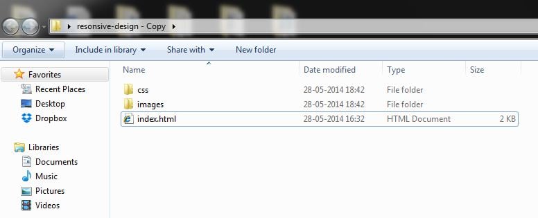
- First of all create a new folder for example say responsive, inside that folder create some other folders like css, images and also create a new index.html file .
- CSS folder will contain the style.css file which we will be using in our website development to add some styling effect .
- So you will have the following content in your responsive folder as shown below :
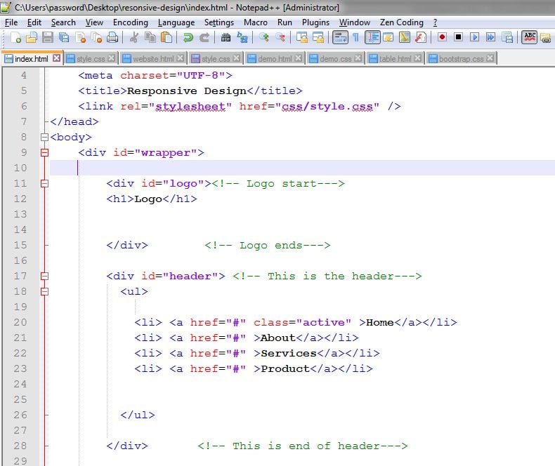
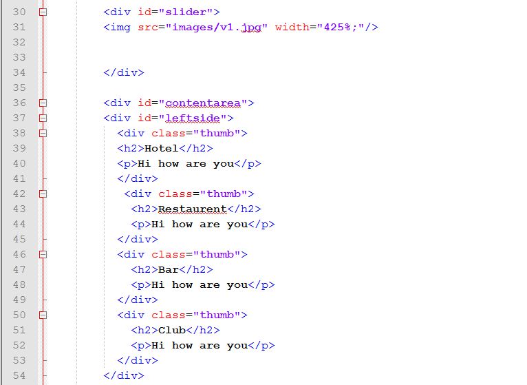
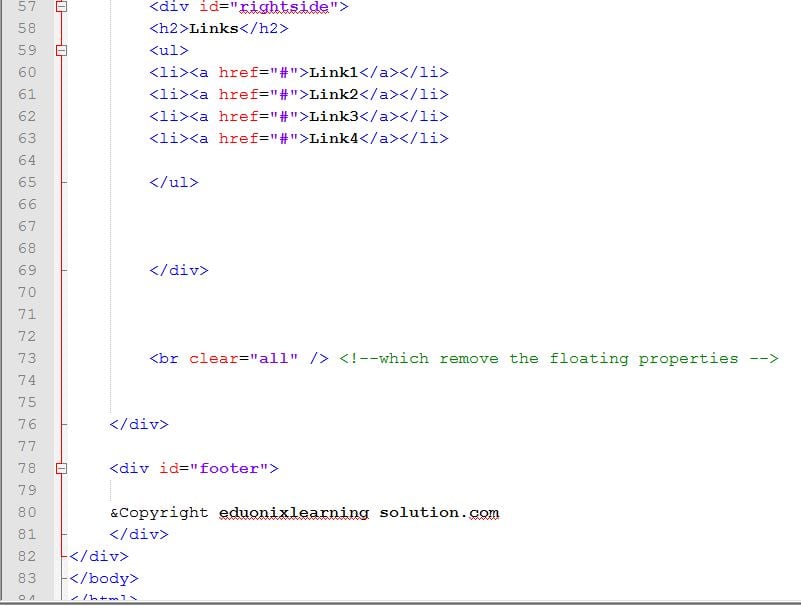
- Open your index.html file with any of the text editor and write the following code :
- Here are the screenshots for the code :
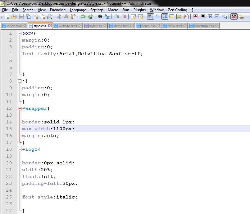
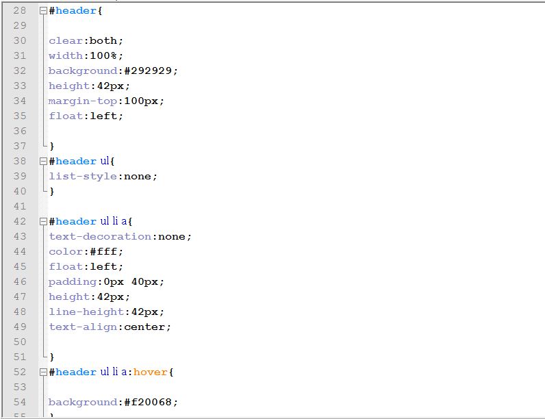
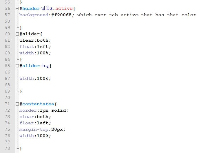
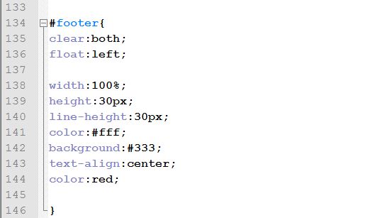
- Now to add some styling effects just create a style.css file in css folder and write the following code in it :
- Screenshots for the style.css file are given below :
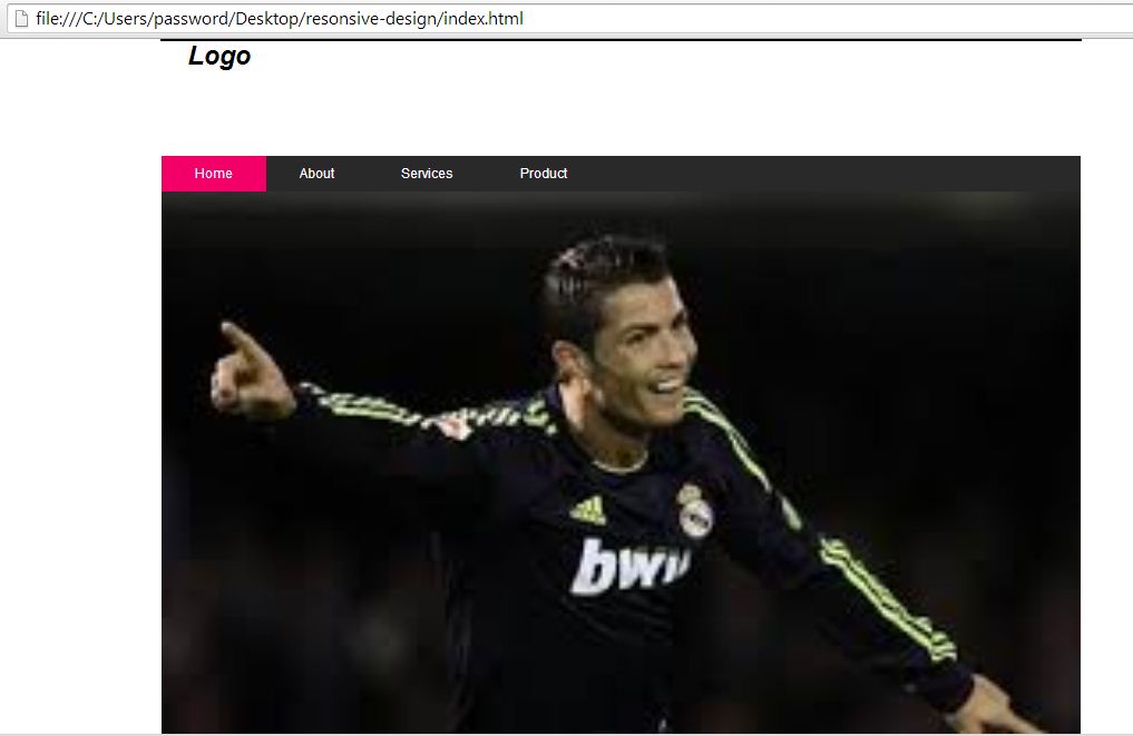
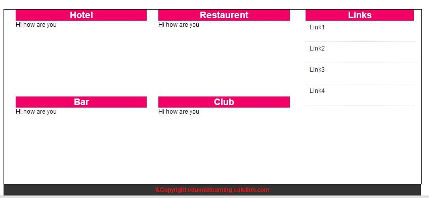
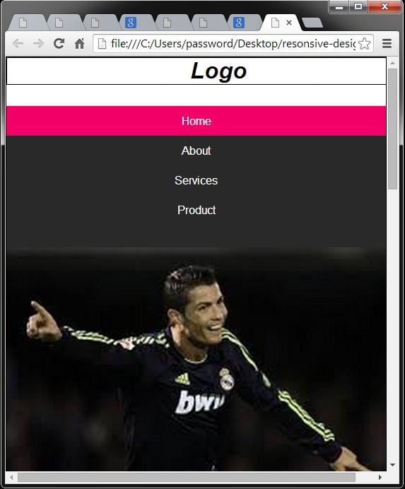
- Hence, when you run your index.html file you will have following output :
- To make your website responsive you will have to add the media queries in your css file .
- The syntax is given below :
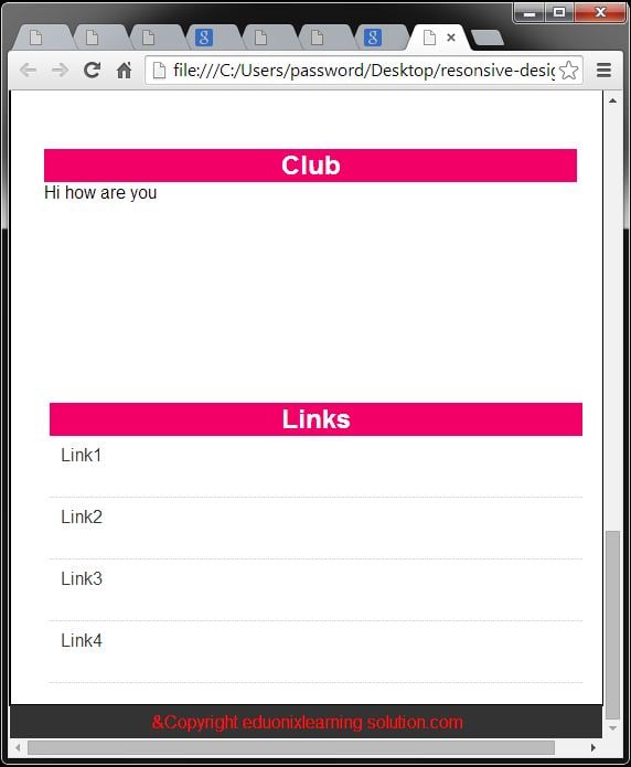
- So now when you shrink the page you will have the following output :
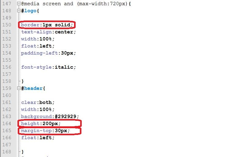
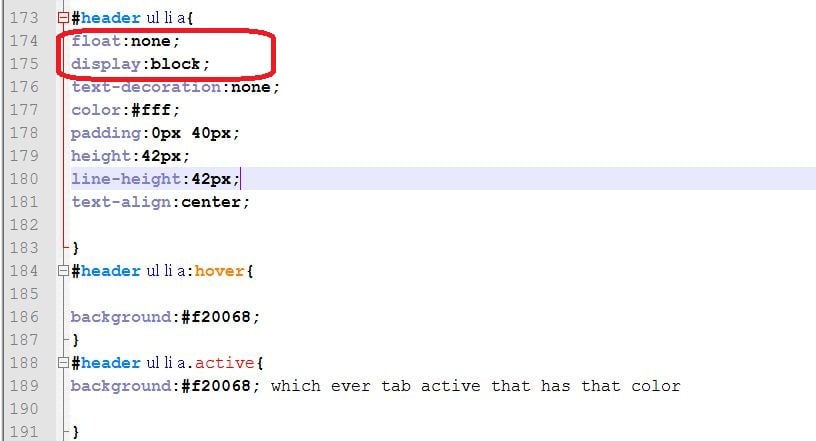
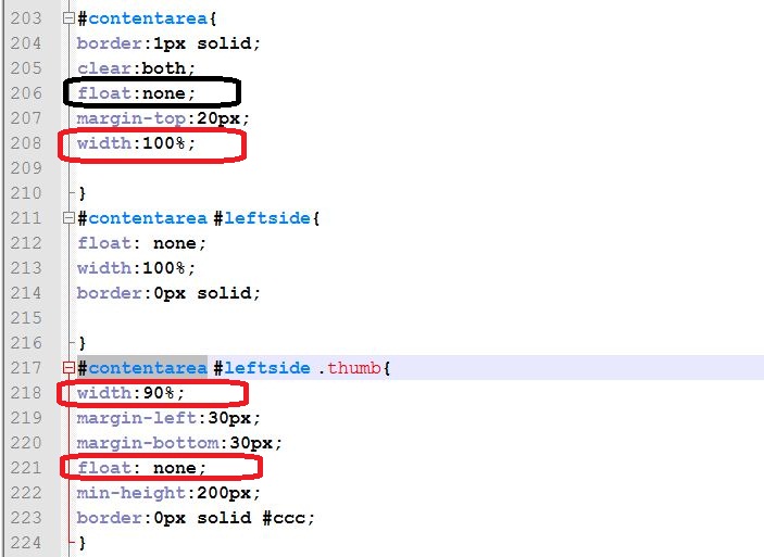
- Now just perform slight changes in the css as shown below :
- After adding media screen for the tablet the output window will have following look out :
- Hence, we have successfully learnt how to create a responsive website using html5 and css .
<!DOCTYPE HTML>
<html lang="en-US">
<head>
	<meta charset="UTF-8">
	<title>Responsive Design</title>
	<link rel="stylesheet" href="css/style.css" />
</head>
<body>
	<div id="wrapper">

		<div id="logo"><!-- Logo start--->
		<h1>Logo</h1>


		</div>        <!-- Logo ends--->

		<div id="header"> <!-- This is the header--->
		  <ul>

		    <li> <a href="#" class="active" >Home</a></li>
			<li> <a href="#" >About</a></li>
			<li> <a href="#" >Services</a></li>
			<li> <a href="#" >Product</a></li>


		  </ul>

		</div>       <!-- This is end of header--->

		<div id="slider">
		<img src="images/v1.jpg" width="425%;"/>


		</div>

		<div id="contentarea">
		<div id="leftside">
		  <div class="thumb">
		  <h2>Hotel</h2>
		  <p>Hi how are you</p>
		  </div>
		   <div class="thumb">
		    <h2>Restaurent</h2>
			<p>Hi how are you</p>
		  </div>
		  <div class="thumb">
		    <h2>Bar</h2>
			<p>Hi how are you</p>
		  </div>
		  <div class="thumb">
		    <h2>Club</h2>
			<p>Hi how are you</p>
		  </div>
		</div>


		<div id="rightside">
		<h2>Links</h2>
		<ul>
		<li><a href="#">Link1</a></li>
		<li><a href="#">Link2</a></li>
		<li><a href="#">Link3</a></li>
        <li><a href="#">Link4</a></li>

		</ul>


		</div>


		<br clear="all" /> <!--which remove the floating properties -->


	</div>

	<div id="footer">

	&Copyright eduonixlearning solution.com
	</div>
</div>
</body>
</html>
body{
margin:0;
padding:0;
font-family:Arial,Helvitica Sanf serif;


}
*{
padding:0;
margin:0;
}
#wrapper{

border:solid 1px;
max-width:1100px;
margin:auto;
}
#logo{

border:0px solid;
width:20%;
float:left;
padding-left:30px;

font-style:italic;

}
#header{

clear:both;
width:100%;
background:#292929;
height:42px;
margin-top:100px;
float:left;

}
#header ul{
list-style:none;
}

#header ul li a{
text-decoration:none;
color:#fff;
float:left;
padding:0px 40px;
height:42px;
line-height:42px;
text-align:center;

}
#header ul li a:hover{

background:#f20068;
}
#header ul li a.active{
background:#f20068; which ever tab active that has that color

}
#slider{
clear:both;
float:left;
width:100%;
}
#slider img{

width:100%;

}

#contentarea{
border:1px solid;
clear:both;
float:left;
margin-top:20px;
width:100%;

}
#contentarea #leftside{
float:left;
width:70%;
border:0px solid;

}
#contentarea #leftside .thumb{
width:45%;
margin-left:30px;
margin-bottom:30px;
float:left;
min-height:200px;
border:0px solid #ccc;
}
#contentarea #leftside .thumb h2{
background:#f20068;
width:100%;
color:white;
text-align:center;

}
#contentarea #rightside{
width:26%;
float:right;
border:0px solid #ccc;
margin-right:20px;

}

#contentarea #rightside h2{
background:#f20068;
width:100%;
color:white;
text-align:center;

}
#contentarea #rightside ul{
list-style:none;
}
#contentarea #rightside ul li {
border-bottom:1px dotted #ccc;
height:55px;
line-height:35px;
padding-left:10px;

}
#contentarea #rightside ul li a{
text-decoration:none;
color:#333;

}
#contentarea #rightside ul li a:hover{
color:#f20068;
}

#footer{
clear:both;
float:left;

width:100%;
height:30px;
line-height:30px;
color:#fff;
background:#333;
text-align:center;
color:red;

}
@media screen and (max-width:720px){
#logo{

border:1px solid;
text-align:center;
width:100%;
float:left;
padding-left:30px;

font-style:italic;

}
#header{

clear:both;
width:100%;
background:#292929;
height:200px;
margin-top:30px;
float:left;

}
#header ul{
list-style:none;
}

#header ul li a{
float:none;
display:block;
text-decoration:none;
color:#fff;
float:left;
padding:0px 40px;
height:42px;
line-height:42px;
text-align:center;

}
#header ul li a:hover{

background:#f20068;
}
#header ul li a.active{
background:#f20068; which ever tab active that has that color

}
#slider{
clear:both;
float:left;
width:100%;
}
#slider img{

width:100%;

}

#contentarea{
border:1px solid;
clear:both;
float:left;
margin-top:20px;
width:100%;

}
#contentarea #leftside{
float: none;
width:100%;
border:0px solid;

}
#contentarea #leftside .thumb{
width:90%;
margin-left:30px;
margin-bottom:30px;
float: none;
min-height:200px;
border:0px solid #ccc;
}
#contentarea #leftside .thumb h2{
background:#f20068;
width:100%;
color:white;
text-align:center;

}
#contentarea #rightside{
width:90%;
float:none;
border:0px solid #ccc;
margin-right:20px;
margin-left:35px;

}

#contentarea #rightside h2{
background:#f20068;
width:100%;
color:white;
text-align:center;

}
#contentarea #rightside ul{
list-style:none;
}
#contentarea #rightside ul li {
border-bottom:1px dotted #ccc;
height:55px;
line-height:35px;
padding-left:10px;

}
#contentarea #rightside ul li a{
text-decoration:none;
color:#333;

}
#contentarea #rightside ul li a:hover{
color:#f20068;
}

#footer{
clear:both;
float:left;

width:100%;
height:30px;
line-height:30px;
color:#fff;
background:#333;
text-align:center;
color:red;

}


//This is for the tablet.

// Syntax to add the media queries:
@media screen and (max-width:720px;){
//Add your css here.
}

//For the mobile you have to add the media queries:

@media screen and (max-width:420px;){
//Add your css here.
}


