
Bootstrap v4 has a new stylesheet known as _reboot.scss that builds on Normalize with reset styles. Reboot is a single file that has a collection of element-specific CSS changes. These features help provide a stylish, reliable and a start point to build front end displays. We can further add the styling to the HTML elements with the help of classes. E.g. when we use a table in the HTML body then it reboots with the <table> styles that has the stylesheet definition present in _reboot.scss. This provides a start point for the table as an element, and we can further use classes such as .table, .table-striped, .table-bordered, .table-inverse, etc. to style table for an elegant look. The file _reboot.scss is located in the following directory (/scss/_reboot.scss) in the Bootstrap v4 package.
Reboot changes in Bootstrap 4.0.0.0 are as follows.
- It is a new stylesheet which is added to Bootstrap v4 that builds on Normalize with reset styles.
- This file has selectors which use only elements (e.g. table, h1, h2, h3, h4, h5, h6, img, pre, address, etc.) as there are no classes.
- It is the complete isolation of the reset styles from the component styles which promote the vision of the modular approach.
- The most important resets include the box-sizing: border change, moving from rem to em units on many elements, link styles, etc.
Guidelines to override element-specific CSS in Reboot
- Browser should use rems instead of ems for scalable component spacing.
- Avoid the use of margin-top. Instead use a single direction of margin.
- Block elements should use rems for margins instead of ems as they provide hassle free scaling across various device sizes (e.g. mobile, tablets, etc.).
- Use the inherit property for elements such as fonts, etc. whenever possible.
Bootstrap 4.0.0 default page
A bootstrap v4 default page has the HTML page elements <html> and <body>. Both of these elements have the following page defaults.
- The <body> of HTML in Bootstrap v4 has a declared background-color that defaults to #fff.
- The <body> element has a global font-family and line-height. It can be inherited by the form elements which help to prevent the overall font inconsistencies.
- Every element on the default page has the box-sizing which is set globally. It includes *: before and *: after, to border-box. As a result, the declared element width will never exceed due to padding or border.
- In Bootstrap 4.0.0, the pixel based units have moved to relative em/rem based units which has the base font-size of 16 pixels on the <html> and the font-size: 1rem on the <body> element. It enables an easy responsive type-scaling via media queries.
- Bootstrap 4.0.0 has a Native font stack (“Segoe UI” for windows, “Roboto” for Android, “Oxygen” for Linux, etc.) that has optimum text rendering. Earlier default web fonts were (Helvetica Neue, Helvetica, and Arial).
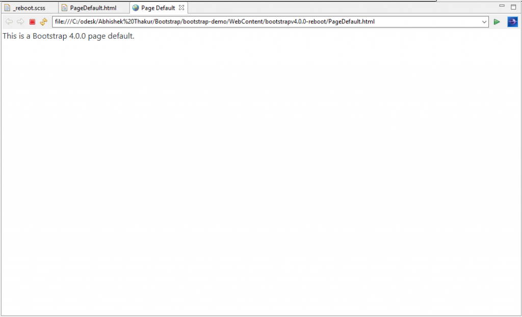
The following program demonstrates the page default in Bootstrap 4.0.0.
<!DOCTYPE html>
<html lang="en">
<head>
<!-- Required meta tags always come first -->
<meta charset="utf-8">
<meta name="viewport"
	content="width=device-width, initial-scale=1, shrink-to-fit=no">
<meta http-equiv="x-ua-compatible" content="ie=edge">
<!-- Bootstrap CSS -->
<link rel="stylesheet" href="https://maxcdn.bootstrapcdn.com/bootstrap/4.0.0-alpha.3/css/bootstrap.min.css">
<title>Page Default</title>
</head>
<body>
	This is a Bootstrap 4.0.0 page default.
	<!-- jQuery first, then Bootstrap JS. All Inclusive Plug-in -->
	<script src="https://ajax.googleapis.com/ajax/libs/jquery/3.0.0/jquery.min.js"></script>
    <script src="https://cdnjs.cloudflare.com/ajax/libs/tether/1.2.0/js/tether.min.js" ></script>
    <script src="https://maxcdn.bootstrapcdn.com/bootstrap/4.0.0-alpha.3/js/bootstrap.min.js"></script>
</body>
</html>
Output
When we run the above HTML code, we can see the Bootstrap 4.0.0 page default as shown below. The web font for the text “This is a Bootstrap 4.0.0.0 page default.” is “Segoe UI” i.e. for windows operating system.
Default Headings and paragraphs in Bootstrap 4.0.0
The following are the changes to default headings and paragraphs in Bootstrap 4.0.0
- Heading elements (<h1>, <h2>, <h3>, <h4>, <h5>, and <h6>) and paragraph (<p>) have their margin-top removed.
- However, all headings have added their margin-bottom: .5rem.
- Paragraph has added its margin-bottom: 1rem. This is allowed for easy spacing between lines.
- The following program is the page default in Bootstrap 4.0.0.
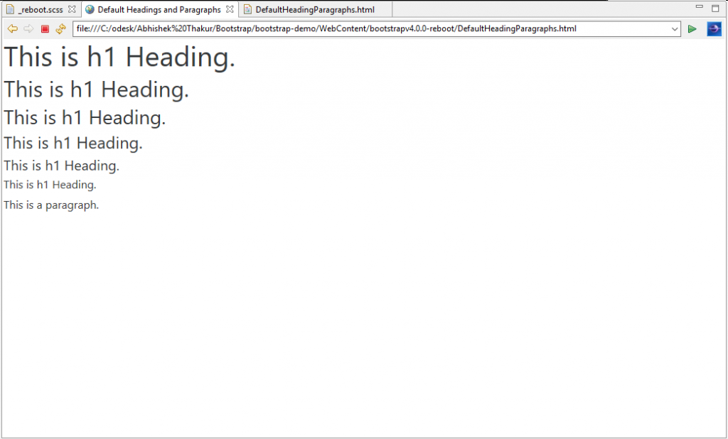
The following program demonstrates default headings and paragraph in Bootstrap 4.0.0.
<!DOCTYPE html>
<html lang="en">
<head>
<!-- Required meta tags always come first -->
<meta charset="utf-8">
<meta name="viewport"
	content="width=device-width, initial-scale=1, shrink-to-fit=no">
<meta http-equiv="x-ua-compatible" content="ie=edge">
<!-- Bootstrap CSS -->
<link rel="stylesheet" href="https://maxcdn.bootstrapcdn.com/bootstrap/4.0.0-alpha.3/css/bootstrap.min.css">
<title>Default Headings and Paragraphs</title>
</head>
<body>
	<h1>This is h1 Heading.</h1>
	<h2>This is h1 Heading.</h2>
	<h3>This is h1 Heading.</h3>
	<h4>This is h1 Heading.</h4>
	<h5>This is h1 Heading.</h5>
	<h6>This is h1 Heading.</h6>

	<p>This is a paragraph.</p>

	<!-- jQuery first, then Bootstrap JS. All Inclusive Plug-in -->
	<script src="https://ajax.googleapis.com/ajax/libs/jquery/3.0.0/jquery.min.js"></script>
    <script src="https://cdnjs.cloudflare.com/ajax/libs/tether/1.2.0/js/tether.min.js" ></script>
    <script src="https://maxcdn.bootstrapcdn.com/bootstrap/4.0.0-alpha.3/js/bootstrap.min.js"></script>
</body>
</html>
Output
When we browse the above HTML code, we can see the Bootstrap 4.0.0 page headings and paragraphs as shown below. Here, we can clearly observe the change in margin-top and margin-bottom for headings as well as paragraph. The web font of all the texts is “Segoe UI” i.e. for windows operating system.
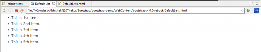
Default Lists in Bootstrap 4.0.0
- All lists elements (<ul>, <ol>, and <dl>) have their margin-top removed.
- However, a margin-bottom: 1rem has been added to all lists elements.
- It is to be noted that the nested lists have no margin-bottom at all.
- Description lists (<dd>) have updated margins. They have the reset margin-left to 0 and added margin-bottom: .5rem. <dt> is made bold. This enables the best spacing and clear hierarchy.
The following program demonstrates default lists in Bootstrap 4.0.0.
<!DOCTYPE html>
<html lang="en">
<head>
<!-- Required meta tags always come first -->
<meta charset="utf-8">
<meta name="viewport"
	content="width=device-width, initial-scale=1, shrink-to-fit=no">
<meta http-equiv="x-ua-compatible" content="ie=edge">
<!-- Bootstrap CSS -->
<link rel="stylesheet" href="https://maxcdn.bootstrapcdn.com/bootstrap/4.0.0-alpha.3/css/bootstrap.min.css">
<title>Default Headings and Paragraphs</title>
</head>
<body>
	<h1>This is h1 Heading.</h1>
	<h2>This is h1 Heading.</h2>
	<h3>This is h1 Heading.</h3>
	<h4>This is h1 Heading.</h4>
	<h5>This is h1 Heading.</h5>
	<h6>This is h1 Heading.</h6>

	<p>This is a paragraph.</p>

	<!-- jQuery first, then Bootstrap JS. All Inclusive Plug-in -->
	<script src="https://ajax.googleapis.com/ajax/libs/jquery/3.0.0/jquery.min.js"></script>
    <script src="https://cdnjs.cloudflare.com/ajax/libs/tether/1.2.0/js/tether.min.js" ></script>
    <script src="https://maxcdn.bootstrapcdn.com/bootstrap/4.0.0-alpha.3/js/bootstrap.min.js"></script>
</body>
</html>
Output
When we run the above HTML code, we can see the Bootstrap 4.0.0 page list as shown below. Here, we can clearly observe the changed margin-top and margin-bottom for the list. The web font of all the texts is “Segoe UI” i.e. for windows operating system.
Preformatted text in Bootstrap 4.0.0
The <pre> element has margin-top removed.
It uses rem units for its margin-bottom.
.pre-element {
  margin-bottom: 3rem;
}
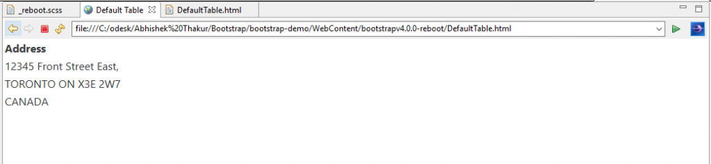
Default Tables in Bootstrap 4.0.0
- Tables are perfectly adjusted to style <caption>s and collapse borders.
- The default style ensures the reliable text-align throughout the element body.
- Table can be further styled with the help of table classes such as.table, .table-striped, .table-bordered, .table-inverse, etc.
The following program demonstrates the default table in Bootstrap 4.0.0.
<!DOCTYPE html>
<html lang="en">
<head>
<!-- Required meta tags always come first -->
<meta charset="utf-8">
<meta name="viewport"
	content="width=device-width, initial-scale=1, shrink-to-fit=no">
<meta http-equiv="x-ua-compatible" content="ie=edge">
<!-- Bootstrap CSS -->
<link rel="stylesheet" href="https://maxcdn.bootstrapcdn.com/bootstrap/4.0.0-alpha.3/css/bootstrap.min.css">
<title>Default Table</title>
</head>
<body>
	<table>
	<tbody>
	<tr><th>Address</th></tr>
	<tr><td>12345 Front Street East,</td></tr>
	<tr><td>TORONTO ON X3E 2W7</td></tr>
	<tr><td>CANADA</td></tr>
	</tbody>
	</table>


	<!-- jQuery first, then Bootstrap JS. All Inclusive Plug-in -->
	<script src="https://ajax.googleapis.com/ajax/libs/jquery/3.0.0/jquery.min.js"></script>
    <script src="https://cdnjs.cloudflare.com/ajax/libs/tether/1.2.0/js/tether.min.js" ></script>
    <script src="https://maxcdn.bootstrapcdn.com/bootstrap/4.0.0-alpha.3/js/bootstrap.min.js"></script>
</body>
</html>
Output
When we run the above HTML code, we can see the Bootstrap 4.0.0 page table as shown below.
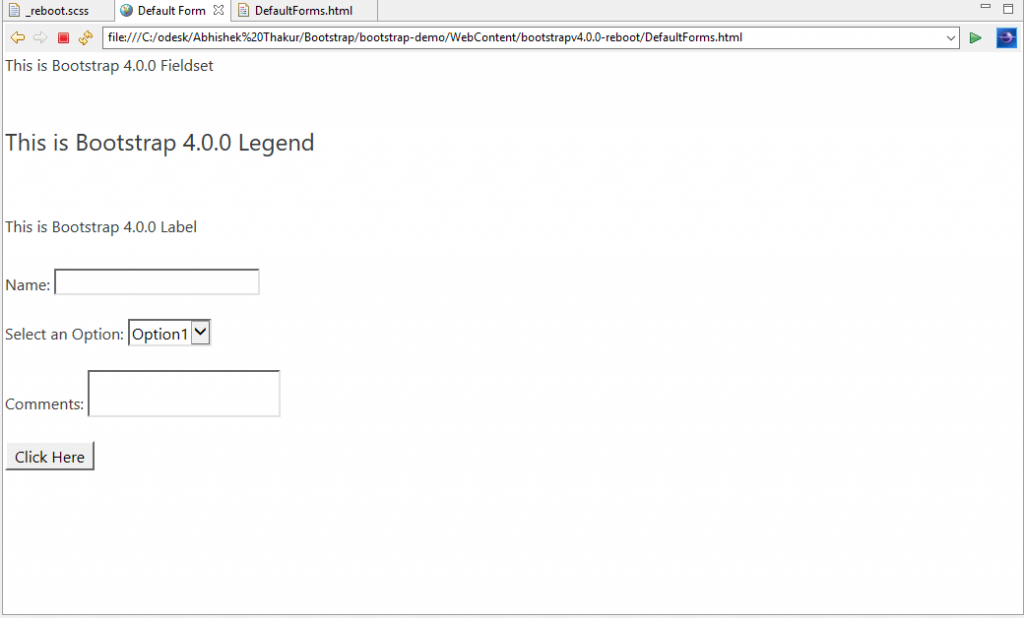
Default Forms in Bootstrap 4.0.0
The HTML Form elements are rebooted to the following base style.
- <fieldset> element — have no borders, padding, and margin. Therefore, it can be easily used as wrappers for an individual inputs or inputs groups.
- <legend> element — is restyled same as fieldset element.
- <label> element — is set to display: inline-block that allows margin to be applied.
- <input>, <textarea>, <select>, and <button> elements are addressed by Normalize and then Reboot removes their margin and sets line-height: inherit.
- <textarea> element is styled by Reboot that can be resized only vertically. Resizing horizontally is not allowed as it often “breaks” the page layout.
The following program demonstrates default form in Bootstrap 4.0.0.
<!DOCTYPE html>
<html lang="en">
<head>
<!-- Required meta tags always come first -->
<meta charset="utf-8">
<meta name="viewport"
	content="width=device-width, initial-scale=1, shrink-to-fit=no">
<meta http-equiv="x-ua-compatible" content="ie=edge">
<!-- Bootstrap CSS -->
<link rel="stylesheet" href="https://maxcdn.bootstrapcdn.com/bootstrap/4.0.0-alpha.3/css/bootstrap.min.css">
<title>Default Form</title>
</head>
<body>
	<fieldset>This is Bootstrap 4.0.0 Fieldset</fieldset><br><br>
	<legend> This is Bootstrap 4.0.0 Legend</legend> <br><br>
	<label> This is Bootstrap 4.0.0 Label</label><br><br>
	Name: <input name="namefield" type="text"/><br><br>
	Select an Option: <select name="selectfield">
	<option value="Option1">Option1</option>
	<option value="Option2">Option2</option>
	<option value="Option2">Option2</option>
	</select><br><br>
	Comments: <textarea name="textAreafield"> </textarea><br><br>
	<button name="Buttonfield">Click Here</button><br>
	<!-- jQuery first, then Bootstrap JS. All Inclusive Plug-in -->
	<script src="https://ajax.googleapis.com/ajax/libs/jquery/3.0.0/jquery.min.js"></script>
    <script src="https://cdnjs.cloudflare.com/ajax/libs/tether/1.2.0/js/tether.min.js" ></script>
    <script src="https://maxcdn.bootstrapcdn.com/bootstrap/4.0.0-alpha.3/js/bootstrap.min.js"></script>
</body>
</html>
Output
When we run the above HTML code, we can see the Bootstrap 4.0.0 page form as shown below.
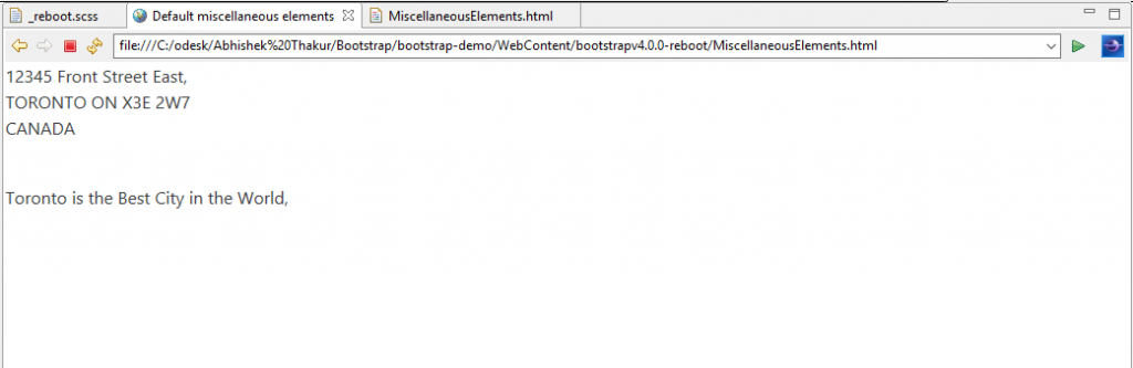
Default Miscellaneous elements Address, Blockquote and Inline elements in Bootstrap 4.0.0
The following are the Reboot changes for these miscellaneous elements.
- The <address> element has the default font-style changed from italic to normal. It has the inherited line-height, and margin-bottom: 1rem.
- The <blockquote> element has the margin reset to 0 0 1rem which is more reliable than other elements.
- The <abbr> element has the basic styling that makes it to look outstanding among the paragraph text.
The following program demonstrates default miscellaneous elements in Bootstrap 4.0.0.
<!DOCTYPE html>
<html lang="en">
<head>
<!-- Required meta tags always come first -->
<meta charset="utf-8">
<meta name="viewport"
content="width=device-width, initial-scale=1, shrink-to-fit=no">
<meta http-equiv="x-ua-compatible" content="ie=edge">
<!-- Bootstrap CSS -->
<link rel="stylesheet" href="https://maxcdn.bootstrapcdn.com/bootstrap/4.0.0-alpha.3/css/bootstrap.min.css">
<title>Default miscellaneous elements</title>
</head>
<body>
<address>
12345 Front Street East,<br>
TORONTO ON X3E 2W7<br>
CANADA<br>
</address><br>
<blockquote>Toronto is the Best City in the World.
</blockquote><br>

<!-- jQuery first, then Bootstrap JS. All Inclusive Plug-in -->
<script src="https://ajax.googleapis.com/ajax/libs/jquery/3.0.0/jquery.min.js"></script>
<script src="https://cdnjs.cloudflare.com/ajax/libs/tether/1.2.0/js/tether.min.js" ></script>
<script src="https://maxcdn.bootstrapcdn.com/bootstrap/4.0.0-alpha.3/js/bootstrap.min.js"></script>
</body>
</html>
Output
When we run the above HTML code, we can see the Bootstrap 4.0.0 page miscellaneous elements (Address, Blockquote and Inline) as shown below.
Source code for RebootStylesheet in Bootstrap 4
Conclusion
In this article, we discussed about Reboot changes in Bootstrap 4.0.0 which is a single file that has a collection of element-specific CSS changes. We have also glanced the default properties of the HTML page, body, table, heading, paragraph, lists, form and other miscellaneous elements with practical examples.
