
In this article, we will first outline the differences in the button component of Bootstrap v4 vs v3.x.x versions and then demonstrate how to build various kinds of buttons available in Bootstrap v4.
Comparison between Bootstrap v4 vs v3.x.x versions
The following are key changes in the Button component of Bootstrap project between v3.x.x and v4.0.0.
1. Buttons: – These are the changes in the Button component of Bootstrap v4.
- The .btn-default has been renamed to .btn-secondary.
- The .btn-xs class has been dropped entirely.
- Bootstrap v4 project has dropped the state full button feature of the button.js jQuery plugin. It includes the $().button (string) and $().button (‘reset’) methods.
- The other features of the plugin such as the button checkboxes, button radios, and single-toggle buttons have been retained in Bootstrap v4.
- The .btn-outline-* classes are added in Bootstrap v4 to outline the button with the color of primary, secondary, info, danger, warning, and success buttons (e.g. .btn-outline-primary class). These outline buttons are new in Bootstrap v4 and there is no outline for link buttons (i.e. .btn-outline-link class).
2. Button group: – The following are the changes in button group component of Bootstrap v4.
- The .btn-group-xs class has been dropped entirely.
Bootstrap v4 Button Examples
Bootstrap v4 Buttons can be summarized into the following seven features.
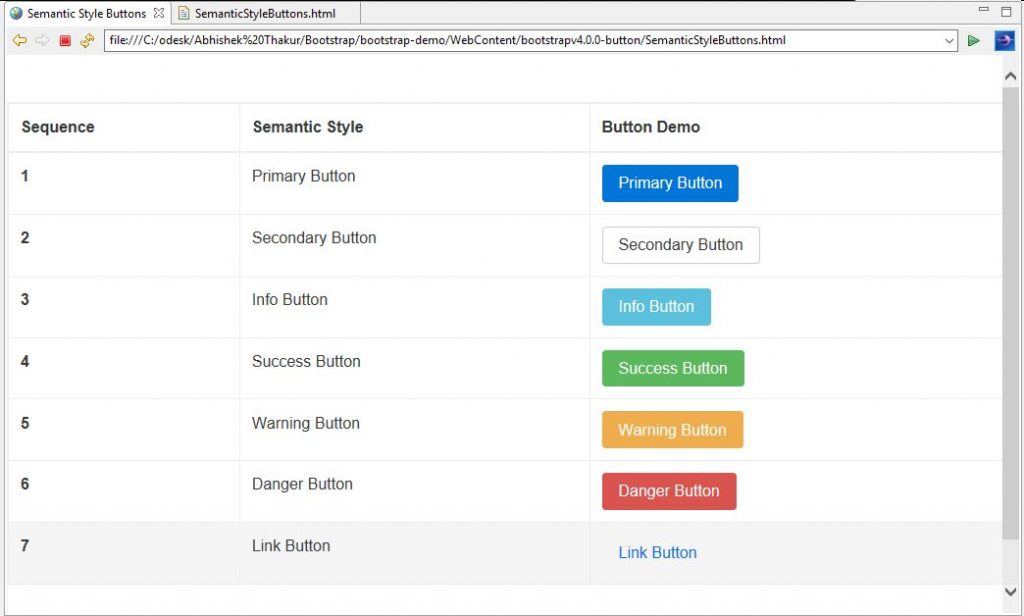
- Semantic Style Buttons: In Bootstrap v4, we can style a button by using its .btn class followed by the preferred style. E.g. class=”btn btn-info”, etc. which will result in an Info button. The following example demonstrates the use of all seven different types of semantic style buttons.
<!DOCTYPE html>
<html lang="en">
<head>
<!-- Required meta tags always come first -->
<meta charset="utf-8">
<meta name="viewport"
	content="width=device-width, initial-scale=1, shrink-to-fit=no">
<meta http-equiv="x-ua-compatible" content="ie=edge">
<!-- Bootstrap CSS -->
<link rel="stylesheet" href="dist/css/bootstrap.min.css">
<title>Semantic Style Buttons</title>
</head>
<body>
	<br><br>
		<div class="table table-hover table-bordered">
		<!-- class .table-responsive -->
		<table class="table">
			<thead>
				<tr>
					<th>Sequence</th>
					<th>Semantic Style</th>
					<th>Button Demo</th>
				</tr>
			</thead>
			<tbody>
				<tr>
					<th scope="row">1</th>
					<td>Primary Button</td>
					<td><button type="button" class="btn btn-primary">Primary Button</button></td>
				</tr>
				<tr>
					<th scope="row">2</th>
					<td>Secondary Button</td>
					<td><button type="button" class="btn btn-secondary">Secondary Button</button></td>
				</tr>
				<tr>
					<th scope="row">3</th>
					<td>Info Button</td>
					<td><button type="button" class="btn btn-info">Info Button</button></td>
				</tr>
				<tr>
					<th scope="row">4</th>
					<td>Success Button</td>
					<td><button type="button" class="btn btn-success">Success Button</button></td>
				</tr>
				<tr>
					<th scope="row">5</th>
					<td>Warning Button</td>
					<td><button type="button" class="btn btn-warning">Warning Button</button></td>
				</tr>
				<tr>
					<th scope="row">6</th>
					<td>Danger Button</td>
					<td><button type="button" class="btn btn-danger">Danger Button</button></td>
				</tr>
				<tr>
					<th scope="row">7</th>
					<td>Link Button</td>
					<td><button type="button" class="btn btn-link">Link Button</button></td>
				</tr>
			</tbody>
		</table>
		<div>
	<br><br>
	<!-- jQuery first, then Bootstrap JS. All Inclusive Plug-in -->
	<script
		src="https://ajax.googleapis.com/ajax/libs/jquery/2.1.4/jquery.min.js"></script>
	<script src="dist/js/bootstrap.min.js"></script>
</body>
</html>
Output
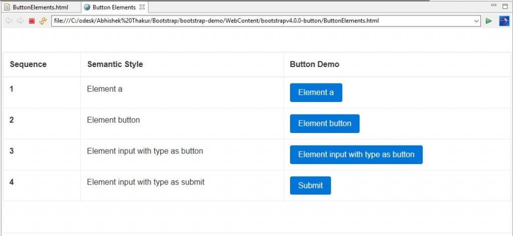
- Button Elements: In Bootstrap v4, the button style classes are more flexible and they can be applied to and elements as shown below. Also, when working with checkboxes and radio buttons, we can apply these button styles to
<!DOCTYPE html>
<html lang="en">
<head>
<!-- Required meta tags always come first -->
<meta charset="utf-8">
<meta name="viewport"
	content="width=device-width, initial-scale=1, shrink-to-fit=no">
<meta http-equiv="x-ua-compatible" content="ie=edge">
<!-- Bootstrap CSS -->
<link rel="stylesheet" href="dist/css/bootstrap.min.css">
<title>Button Elements</title>
</head>
<body>
	<br>
	<br>
	<div class="table table-hover table-bordered">
		<!-- class .table-responsive -->
		<table class="table">
			<thead>
				<tr>
					<th>Sequence</th>
					<th>Semantic Style</th>
					<th>Button Demo</th>
				</tr>
			</thead>
			<tbody>
				<tr>
					<th scope="row">1</th>
					<td>Element a</td>
					<td><a class="btn btn-primary" href="#" role="button">Element a</a></td>
				</tr>
				<tr>
					<th scope="row">2</th>
					<td>Element button</td>
					<td><button class="btn btn-primary" type="submit">Element button</button></td>
				</tr>
				<tr>
					<th scope="row">3</th>
					<td>Element input with type as button</td>
					<td><input class="btn btn-primary" type="button" value="Element input with type as button"></td>
				</tr>
				<tr>
					<th scope="row">4</th>
					<td>Element input with type as submit</td>
					<td><input class="btn btn-primary" type="submit"
						value="Submit"></td>
				</tr>
			</tbody>
		</table>
		<div>
			<br><br>
			<!-- jQuery first, then Bootstrap JS. All Inclusive Plug-in -->
			<script
				src="https://ajax.googleapis.com/ajax/libs/jquery/2.1.4/jquery.min.js"></script>
			<script src="dist/js/bootstrap.min.js"></script>
</body></html>
Output
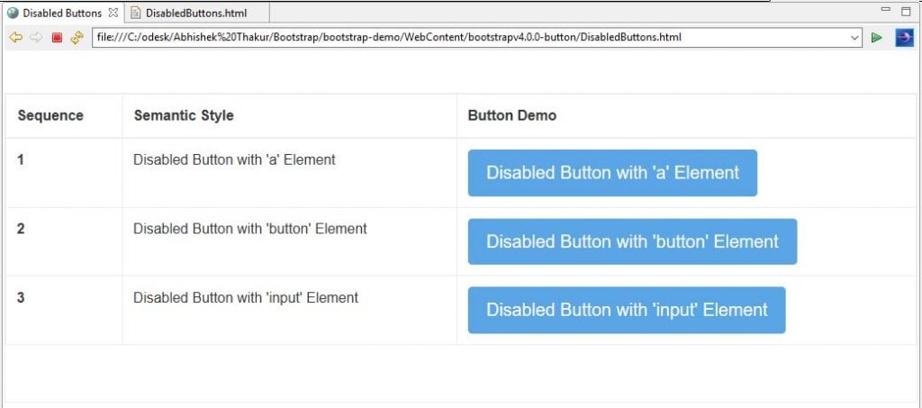
- Disabled Buttons: In Bootstrap v4, we can disable the button for various elements in the following ways.
1. If we are disabling the button that uses element then we can use .disabled class.
2. If we are disabling the button that uses the
The following is the demonstration on how to disable buttons using Bootstrap v4.
<!DOCTYPE html>
<html lang="en">
<head>
<!-- Required meta tags always come first -->
<meta charset="utf-8">
<meta name="viewport"
	content="width=device-width, initial-scale=1, shrink-to-fit=no">
<meta http-equiv="x-ua-compatible" content="ie=edge">
<!-- Bootstrap CSS -->
<link rel="stylesheet" href="dist/css/bootstrap.min.css">
<title>Disabled Buttons</title>
</head>
<body>
	<br>
	<br>
	<div class="table table-hover table-bordered">
		<!-- class .table-responsive -->
		<table class="table">
			<thead>
				<tr>
					<th>Sequence</th>
					<th>Semantic Style</th>
					<th>Button Demo</th>
				</tr>
			</thead>
			<tbody>
				<tr>
					<th scope="row">1</th>
					<td>Disabled Button with 'a' Element</td>
					<td><a href="#" class="btn btn-primary btn-lg disabled"
						role="button">Disabled Button with 'a' Element</a></td>
				</tr>
				<tr>
					<th scope="row">2</th>
					<td>Disabled Button with 'button' Element</td>
					<td><button type="button" class="btn btn-lg btn-primary"
							disabled="disabled">Disabled Button with 'button'
							Element</button></td>
				</tr>
				<tr>
					<th scope="row">3</th>
					<td>Disabled Button with 'input' Element</td>
					<td><input type="button" class="btn btn-lg btn-primary"
						disabled="disabled" value="Disabled Button with 'input' Element"></td>
				</tr>
			</tbody>
		</table>
		<div>
			<br> <br>
			<!-- jQuery first, then Bootstrap JS. All Inclusive Plug-in -->
			<script
				src="https://ajax.googleapis.com/ajax/libs/jquery/2.1.4/jquery.min.js"></script>
			<script src="dist/js/bootstrap.min.js"></script>
</body>
</html>
Output
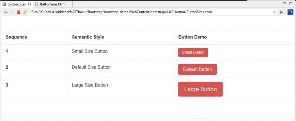
- Button Size: As we know that in Bootstrap v4, the .btn-xs has been dropped for extra small buttons. Therefore, we can only specify the button sizes as .btn-lg and .btn-sm classes (i.e. large and small sizes). These sizing classes can be used along with button semantic styles. The following is the demonstration of the various available button sizes in Bootstrap v4.
<!DOCTYPE html>
<html lang="en">
<head>
<!-- Required meta tags always come first -->
<meta charset="utf-8">
<meta name="viewport"
	content="width=device-width, initial-scale=1, shrink-to-fit=no">
<meta http-equiv="x-ua-compatible" content="ie=edge">
<!-- Bootstrap CSS -->
<link rel="stylesheet" href="dist/css/bootstrap.min.css">
<title>Button Sizes</title>
</head>
<body>
	<br>
	<br>
	<div class="table table-hover table-bordered">
		<!-- class .table-responsive -->
		<table class="table">
			<thead>
				<tr>
					<th>Sequence</th>
					<th>Semantic Style</th>
					<th>Button Demo</th>
				</tr>
			</thead>
			<tbody>
				<tr>
					<th scope="row">1</th>
					<td>Small Size Button</td>
					<td><button class="btn btn-danger btn-sm" type="button">Small Button</button></td>
				</tr>
				<tr>
					<th scope="row">2</th>
					<td>Default Size Button</td>
					<td><button class="btn btn-danger" type="button">Default Button</button></td>
				</tr>
				<tr>
					<th scope="row">3</th>
					<td>Large Size Button</td>
					<td><button class="btn btn-danger btn-lg" type="button">Large Button</button></td>
				</tr>
			</tbody>
		</table>
		<div>
			<br>
			<br>
			<!-- jQuery first, then Bootstrap JS. All Inclusive Plug-in -->
			<script
				src="https://ajax.googleapis.com/ajax/libs/jquery/2.1.4/jquery.min.js"></script>
			<script src="dist/js/bootstrap.min.js"></script>
</body>
</html>
Output
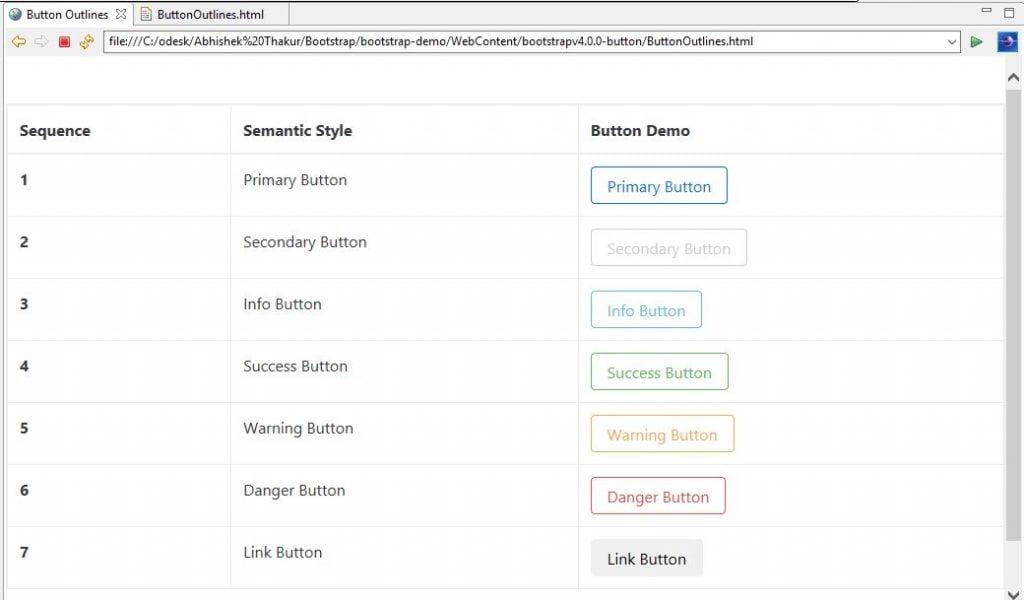
- Button Outlines: In Bootstrap v4, we can use .btn-outline-* classes to apply the semantic color only to the buttons’ outline. The following example demonstrates the use .btn-outline-* classes to outline buttons.
<!DOCTYPE html>
<html lang="en">
<head>
<!-- Required meta tags always come first -->
<meta charset="utf-8">
<meta name="viewport"
	content="width=device-width, initial-scale=1, shrink-to-fit=no">
<meta http-equiv="x-ua-compatible" content="ie=edge">
<!-- Bootstrap CSS -->
<!-- Bootstrap 4 alpha CSS -->
<link rel="stylesheet"
	href="https://maxcdn.bootstrapcdn.com/bootstrap/4.0.0-alpha.4/css/bootstrap.min.css"
	integrity="sha384-2hfp1SzUoho7/TsGGGDaFdsuuDL0LX2hnUp6VkX3CUQ2K4K+xjboZdsXyp4oUHZj"
	crossorigin="anonymous">
<title>Button Outlines</title>
</head>
<body>
	<br>
	<br>
	<div class="table table-hover table-bordered">
		<!-- class .table-responsive -->
		<table class="table">
			<thead>
				<tr>
					<th>Sequence</th>
					<th>Semantic Style</th>
					<th>Button Demo</th>
				</tr>
			</thead>
			<tbody>
				<tr>
					<th scope="row">1</th>
					<td>Primary Button</td>
					<td><button type="button" class="btn btn-outline-primary">Primary
							Button</button></td>
				</tr>
				<tr>
					<th scope="row">2</th>
					<td>Secondary Button</td>
					<td><button type="button" class="btn btn-outline-secondary">Secondary
							Button</button></td>
				</tr>
				<tr>
					<th scope="row">3</th>
					<td>Info Button</td>
					<td><button type="button" class="btn btn-outline-info">Info
							Button</button></td>
				</tr>
				<tr>
					<th scope="row">4</th>
					<td>Success Button</td>
					<td><button type="button" class="btn btn-outline-success">Success
							Button</button></td>
				</tr>
				<tr>
					<th scope="row">5</th>
					<td>Warning Button</td>
					<td><button type="button" class="btn btn-outline-warning">Warning
							Button</button></td>
				</tr>
				<tr>
					<th scope="row">6</th>
					<td>Danger Button</td>
					<td><button type="button" class="btn btn-outline-danger">Danger
							Button</button></td>
				</tr>
				<tr>
					<th scope="row">7</th>
					<td>Link Button</td>
					<td><button type="button" class="btn btn-outline-link">Link
							Button</button></td>
				</tr>
			</tbody>
		</table>
		<div>
			<br>
			<br>
			<!-- jQuery first, then Bootstrap JS. All Inclusive Plug-in -->
			<script
				src="https://ajax.googleapis.com/ajax/libs/jquery/2.1.4/jquery.min.js"></script>
			<script src="dist/js/bootstrap.min.js"></script>
</body>
</html>
Output:
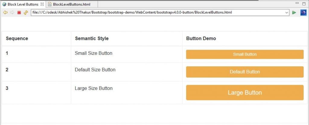
- Block Level Buttons: In Bootstrap v4, we can create a block level button with the help of the .btn-block class that spans the width of its parent as shown below.
<!DOCTYPE html>
<html lang="en">
<head>
<!-- Required meta tags always come first -->
<meta charset="utf-8">
<meta name="viewport"
	content="width=device-width, initial-scale=1, shrink-to-fit=no">
<meta http-equiv="x-ua-compatible" content="ie=edge">
<!-- Bootstrap CSS -->
<link rel="stylesheet" href="dist/css/bootstrap.min.css">
<title>Block Level Buttons</title>
</head>
<body>
	<br>
	<br>
	<div class="table table-hover table-bordered">
		<!-- class .table-responsive -->
		<table class="table">
			<thead>
				<tr>
					<th>Sequence</th>
					<th>Semantic Style</th>
					<th>Button Demo</th>
				</tr>
			</thead>
			<tbody>
				<tr>
					<th scope="row">1</th>
					<td>Small Size Button</td>
					<td><button class="btn btn-warning btn-sm btn-block" type="button">Small Button</button></td>
				</tr>
				<tr>
					<th scope="row">2</th>
					<td>Default Size Button</td>
					<td><button class="btn btn-warning btn-block" type="button">Default Button</button></td>
				</tr>
				<tr>
					<th scope="row">3</th>
					<td>Large Size Button</td>
					<td><button class="btn btn-warning btn-lg btn-block" type="button">Large Button</button></td>
				</tr>
			</tbody>
		</table>
		<div>
			<br>
			<br>
			<!-- jQuery first, then Bootstrap JS. All Inclusive Plug-in -->
			<script
				src="https://ajax.googleapis.com/ajax/libs/jquery/2.1.4/jquery.min.js"></script>
			<script src="dist/js/bootstrap.min.js"></script>
</body>
</html>
Output
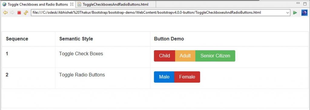
- Toggle Checkboxes & Radio Buttons: In Bootstrap v4, we can apply button semantic styles to checkboxes and radio buttons in order to provide them with a toggle feature. This can be achieved through the nesting of radio buttons or checkboxes inside a
<!DOCTYPE html>
<html lang="en">
<head>
<!-- Required meta tags always come first -->
<meta charset="utf-8">
<meta name="viewport"
	content="width=device-width, initial-scale=1, shrink-to-fit=no">
<meta http-equiv="x-ua-compatible" content="ie=edge">
<!-- Bootstrap CSS -->
<link rel="stylesheet" href="dist/css/bootstrap.min.css">
<title>Toggle Checkboxes and Radio Buttons</title>
</head>
<body>
	<br>
	<br>
	<div class="table table-hover table-bordered">
		<!-- class .table-responsive -->
		<table class="table">
			<thead>
				<tr>
					<th>Sequence</th>
					<th>Semantic Style</th>
					<th>Button Demo</th>
				</tr>
			</thead>
			<tbody>
				<tr>
					<th scope="row">1</th>
					<td>Toggle Check Boxes</td>
					<td><div class="btn-group" data-toggle="buttons">
							<label class="btn btn-danger active"> <input
								type="checkbox" checked autocomplete="off"> Child
							</label> <label class="btn btn-warning"> <input type="checkbox"
								autocomplete="off"> Adult
							</label> <label class="btn btn-success"> <input type="checkbox"
								autocomplete="off"> Senior Citizen
							</label>
						</div></td>
				</tr>
				<tr>
					<th scope="row">2</th>
					<td>Toggle Radio Buttons</td>
					<td><div class="btn-group" data-toggle="buttons">
							<label class="btn btn-primary"> <input type="radio"
								name="options" id="male" autocomplete="off" checked>
								Male
							</label> <label class="btn btn-danger"> <input type="radio"
								name="options" id="female" autocomplete="off"> Female
							</label>
						</div></td>
				</tr>
			</tbody>
		</table>
		<div>
			<br> <br>
			<!-- jQuery first, then Bootstrap JS. All Inclusive Plug-in -->
			<script
				src="https://ajax.googleapis.com/ajax/libs/jquery/2.1.4/jquery.min.js"></script>
			<script src="dist/js/bootstrap.min.js"></script>
</body>
</html>
Output
Source code for the Outline Button and Button Plugin in Bootstrap v4
Conclusion:
In this article, we have explored all the new features for button components available in Bootstrap v4 along with demo examples.
