

The concept of the Cards component is very exciting feature that has been added to Bootstrap v4. With the advent of this feature, the old features such as cover panels, thumbnails, and wells have been removed from Bootstrap. The cards can be described as a content container which are very extensible as well as very flexible and include a wide range of contents, contextual background colors, footers and headers, and robust display options.
Let’s explore the card is more detail:
- Cards in Bootstrap v4 requires less markup content and classes.
- It provides us the best possible control of the web element as these markup content and classes are flexible and extensible (i.e. capable of getting remixed and extended with great ease).
In the following example, we are using the .card-block class on the .card element to consolidate the markup.
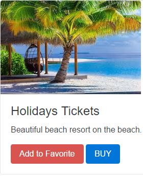
<!DOCTYPE html>
<html lang="en">
<head>
<!-- Required meta tags always come first -->
<meta charset="utf-8">
<meta name="viewport"
	content="width=device-width, initial-scale=1, shrink-to-fit=no">
<meta http-equiv="x-ua-compatible" content="ie=edge">
<!-- Bootstrap CSS -->
<link rel="stylesheet" href="dist/css/bootstrap.min.css">
<title>Bootstrap Card Example</title>
</head>
<body>
	<div class="card">
		<img class="card-img-top" src="images/scene4.jpe" alt="Card image cap">
		<div class="card-block">
			<h4 class="card-title">Holidays Tickets</h4>
			<p class="card-text">Beautiful beach resort on the beach.</p>
			<a href="#" class="btn btn-danger">Add to Favorite</a>
			<a href="#" class="btn btn-primary">BUY</a>
		</div>
	</div>
	<!-- jQuery first, then Bootstrap JS. All Inclusive Plug-in -->
	<script src="https://ajax.googleapis.com/ajax/libs/jquery/2.1.4/jquery.min.js"></script>
	<script src="dist/js/bootstrap.min.js"></script>
</body>
</html>
The following is the output for the above Bootstrap v4 cards markup:
Content types in Cards
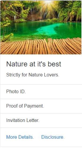
Cards component supports contents such as images, text, list groups, links, and much more. In the following example, we are doing a mix and match of these content types to create a beautiful card as shown below.
<!DOCTYPE html>
<html lang="en">
<head>
<!-- Required meta tags always come first -->
<meta charset="utf-8">
<meta name="viewport"
	content="width=device-width, initial-scale=1, shrink-to-fit=no">
<meta http-equiv="x-ua-compatible" content="ie=edge">
<!-- Bootstrap CSS -->
<link rel="stylesheet" href="dist/css/bootstrap.min.css">
<title>Content Type</title>
</head>
<body>
	<div class="card">
		<img class="card-img-top" src="images/scene2.JPE" alt="Card image cap">
		<div class="card-block">
			<h4 class="card-title">Nature at it's best</h4>
			<p class="card-text">Strictly for Nature Lovers.</p>
		</div>
		<ul class="list-group list-group-flush">
			<li class="list-group-item">Photo ID.</li>
			<li class="list-group-item">Proof of Payment.</li>
			<li class="list-group-item"> Invitation Letter.</li>
		</ul>
		<div class="card-block">
			<a href="#" class="card-link">More Details.</a>
			<a href="#" class="card-link">Disclosure.</a>
		</div>
	</div>
	<!-- jQuery first, then Bootstrap JS. All Inclusive Plug-in -->
	<script src="https://ajax.googleapis.com/ajax/libs/jquery/2.1.4/jquery.min.js"></script>
	<script src="dist/js/bootstrap.min.js"></script>
</body>
</html>
The following is the output for the above Bootstrap v4 cards markup:
Sizing in Cards: –
Cards have a sizing feature through which we can constrain the cards width with the help of custom CSS, or predefined grid classes, or custom styles using our grid mixins as shown below.
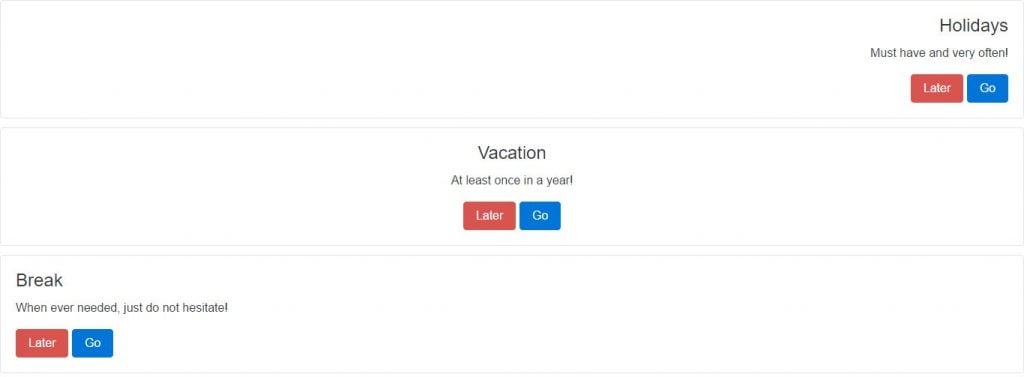
- Using the Grid — in the following example for cards sizing.
<!DOCTYPE html>
<html lang="en">
<head>
<!-- Required meta tags always come first -->
<meta charset="utf-8">
<meta name="viewport"
	content="width=device-width, initial-scale=1, shrink-to-fit=no">
<meta http-equiv="x-ua-compatible" content="ie=edge">
<!-- Bootstrap CSS -->
<link rel="stylesheet" href="dist/css/bootstrap.min.css">
<title>Sizing</title>
</head>
<body>
	<div class="row">
		<div class="col-sm-4">
			<div class="card card-block">
				<h3 class="card-title">Holidays</h3>
				<p class="card-text">Must have and very often!</p>
				<a href="#" class="btn btn-danger">Later</a>
				<a href="#" class="btn btn-primary">Go</a>
			</div>
		</div>
		<div class="col-sm-4">
			<div class="card card-block">
				<h3 class="card-title">Vacation</h3>
				<p class="card-text">At least once in a year!</p>
				<a href="#" class="btn btn-danger">Later</a>
				<a href="#" class="btn btn-primary">Go</a>
			</div>
		</div>
		<div class="col-sm-4">
			<div class="card card-block">
				<h3 class="card-title">Break</h3>
				<p class="card-text">When ever needed, just do not hesitate!</p>
				<a href="#" class="btn btn-danger">Later</a>
				<a href="#" class="btn btn-primary">Go</a>
			</div>
		</div>
	</div>
	<!-- jQuery first, then Bootstrap JS. All Inclusive Plug-in -->
	<script src="https://ajax.googleapis.com/ajax/libs/jquery/2.1.4/jquery.min.js"></script>
	<script src="dist/js/bootstrap.min.js"></script>
</body>
</html>
The following is the output for the above Bootstrap v4 cards markup.

- Using custom widths— in the following example for cards sizing.
<!DOCTYPE html>
<html lang="en">
<head>
<!-- Required meta tags always come first -->
<meta charset="utf-8">
<meta name="viewport"
	content="width=device-width, initial-scale=1, shrink-to-fit=no">
<meta http-equiv="x-ua-compatible" content="ie=edge">
<!-- Bootstrap CSS -->
<link rel="stylesheet" href="dist/css/bootstrap.min.css">
<title>Sizing Custom Width</title>
</head>
<body>
	<div class="card card-block" style="width: 20rem;">
		<h3 class="card-title">Need Vacation?</h3>
		<p class="card-text">No second thought, just buy tickets.</p>
		<a href="#" class="btn btn-danger">RE THINK</a>
		<a href="#" class="btn btn-primary">BUY</a>
	</div>
	<!-- jQuery first, then Bootstrap JS. All Inclusive Plug-in -->
	<script src="https://ajax.googleapis.com/ajax/libs/jquery/2.1.4/jquery.min.js"></script>
	<script src="dist/js/bootstrap.min.js"></script>
</body>
</html>
The following is the output for the above Bootstrap v4 cards markup.

Text alignment in Cards
Utility classes in cards component allows to change the text alignment of any card in its entirety or on its specific part. An example on text alignment is shown below.
<!DOCTYPE html>
<html lang="en">
<head>
<!-- Required meta tags always come first -->
<meta charset="utf-8">
<meta name="viewport"
	content="width=device-width, initial-scale=1, shrink-to-fit=no">
<meta http-equiv="x-ua-compatible" content="ie=edge">
<!-- Bootstrap CSS -->
<link rel="stylesheet" href="dist/css/bootstrap.min.css">
<title>Text Alignment</title>
</head>
<body>
	<div class="card card-block text-xs-right">
		<h4 class="card-title">Holidays</h4>
		<p class="card-text">Must have and very often!</p>
		<a href="#" class="btn btn-danger">Later</a>
		<a href="#" class="btn btn-primary">Go</a>
	</div>
	<div class="card card-block text-xs-center">
		<h4 class="card-title">Vacation</h4>
		<p class="card-text">At least once in a year!</p>
		<a href="#" class="btn btn-danger">Later</a>
		<a href="#" class="btn btn-primary">Go</a>
	</div>
	<div class="card card-block text-xs-left">
		<h4 class="card-title">Break</h4>
		<p class="card-text">Whenever needed, just do not hesitate!</p>
		<a href="#" class="btn btn-danger">Later</a>
		<a href="#" class="btn btn-primary">Go</a>
	</div>
	<!-- jQuery first, then Bootstrap JS. All Inclusive Plug-in -->
	<script src="https://ajax.googleapis.com/ajax/libs/jquery/2.1.4/jquery.min.js"></script>
	<script src="dist/js/bootstrap.min.js"></script>
</body>
</html>
The following is the output for the above Bootstrap v4 cards markup.
Header and footer in Cards
By using utility classes in cards, we can add an optional header and/or footer within a card as shown in the following example.
<!DOCTYPE html>
<html lang="en">
<head>
<!-- Required meta tags always come first -->
<meta charset="utf-8">
<meta name="viewport"
	content="width=device-width, initial-scale=1, shrink-to-fit=no">
<meta http-equiv="x-ua-compatible" content="ie=edge">
<!-- Bootstrap CSS -->
<link rel="stylesheet" href="dist/css/bootstrap.min.css">
<title>Header and Footer</title>
</head>
<body>
	<div class="card text-xs-center">
		<div class="card-header">We refreshes body and mind!</div>
		<div class="card-block">
			<h4 class="card-title">Vacation advisor</h4>
			<p class="card-text">I need vacations.</p>
			<a href="#" class="btn btn-danger">Later</a>
			<a href="#" class="btn btn-primary">Now</a>
		</div>
		<div class="card-footer text-muted">Have a great vacation ahead!</div>
	</div>
	<!-- jQuery first, then Bootstrap JS. All Inclusive Plug-in -->
	<script src="https://ajax.googleapis.com/ajax/libs/jquery/2.1.4/jquery.min.js"></script>
	<script src="dist/js/bootstrap.min.js"></script>
</body>
</html>
The following is the output for the above Bootstrap v4 cards markup.

Image caps in Cards
In Bootstrap v4, similar to the headers and footers, the cards can include the top and the bottom image caps as shown in the following example.
<!DOCTYPE html>
<html lang="en">
<head>
<!-- Required meta tags always come first -->
<meta charset="utf-8">
<meta name="viewport"
	content="width=device-width, initial-scale=1, shrink-to-fit=no">
<meta http-equiv="x-ua-compatible" content="ie=edge">
<!-- Bootstrap CSS -->
<link rel="stylesheet" href="dist/css/bootstrap.min.css">
<title>Images Caps</title>
</head>
<body>
	<div class="card">
		<img class="card-img-top" src="images/scene1.JPE" alt="Card image cap">
		<div class="card-block">
			<h4 class="card-title">Vacation Plan 1</h4>
			<p class="card-text">Camping in Nature.</p>
			<p class="card-text">
				<small class="text-muted">Last updated 5 hours ago!</small>
			</p>
		</div>
	</div>
	<div class="card">
		<div class="card-block">
			<h4 class="card-title">Vacation Plan 2</h4>
			<p class="card-text">Exploring Nature.</p>
			<p class="card-text">
				<small class="text-muted">Last updated 9 hours ago!</small>
			</p>
		</div>
		<img class="card-img-bottom" src="images/scene2.JPE" alt="Card image cap">
	</div>
	<!-- jQuery first, then Bootstrap JS. All Inclusive Plug-in -->
	<script src="https://ajax.googleapis.com/ajax/libs/jquery/2.1.4/jquery.min.js"></script>
	<script src="dist/js/bootstrap.min.js"></script>
</body>
</html>
The following is the output for the above Bootstrap v4 cards markup.
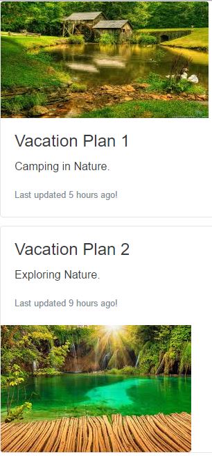
Image overlays:
By using the utility classes present in the cards, we can overlay the image by turning it into a background and overlaying the card’s text. One of such known utility class is .card-inverse. Such an example is shown below.
<!DOCTYPE html>
<html lang="en">
<head>
<!-- Required meta tags always come first -->
<meta charset="utf-8">
<meta name="viewport"
	content="width=device-width, initial-scale=1, shrink-to-fit=no">
<meta http-equiv="x-ua-compatible" content="ie=edge">
<!-- Bootstrap CSS -->
<link rel="stylesheet" href="dist/css/bootstrap.min.css">
<title>Image Overlay</title>
</head>
<body>
	<div class="card card-inverse">
		<img class="card-img" src="images/scene4.JPE" alt="Card image">
		<div class="card-img-overlay">
			<h4 class="card-title">Loving Nature</h4>
			<p class="card-text">Nature has a lovely flair spreading <br>beauty everywhere.</p>
			<p class="card-text">
				<small class="text-muted">Last updated 10 hours ago</small>
			</p>
		</div>
	</div>
	<!-- jQuery first, then Bootstrap JS. All Inclusive Plug-in -->
	<script src="https://ajax.googleapis.com/ajax/libs/jquery/2.1.4/jquery.min.js"></script>
	<script src="dist/js/bootstrap.min.js"></script>
</body>
</html>
The following is the output for the above Bootstrap v4 cards markup.

Inverted text
There are various utility classes which are included in Bootstrap v4 for inverted text on cards. One of such a class is that quickly toggles the text color. By default, Bootstrap v4 use the dark text and assume a light background. Also, we can call .card-inverse class for white text that specify the background-color and border-color that suits the best. Alternatively, we can also use .card-inverse class with the contextual backgrounds variants as shown in the following example.
<!DOCTYPE html>
<html lang="en">
<head>
<!-- Required meta tags always come first -->
<meta charset="utf-8">
<meta name="viewport"
	content="width=device-width, initial-scale=1, shrink-to-fit=no">
<meta http-equiv="x-ua-compatible" content="ie=edge">
<!-- Bootstrap CSS -->
<link rel="stylesheet" href="dist/css/bootstrap.min.css">
<title>Inverted Texts</title>
</head>
<body>
	<div class="card card-inverse" style="background-color: #333; border-color: #333;">
		<div class="card-block">
			<h3 class="card-title">Vacation Club</h3>
			<p class="card-text">Purchase Membership and become a member.</p>
			<a href="#" class="btn btn-danger">Decline</a>
			<a href="#" class="btn btn-primary">Accept</a>
		</div>
	</div>
	<!-- jQuery first, then Bootstrap JS. All Inclusive Plug-in -->
	<script src="https://ajax.googleapis.com/ajax/libs/jquery/2.1.4/jquery.min.js"></script>
	<script src="dist/js/bootstrap.min.js"></script>
</body>
</html>
The following is the output for the above Bootstrap v4 cards markup.

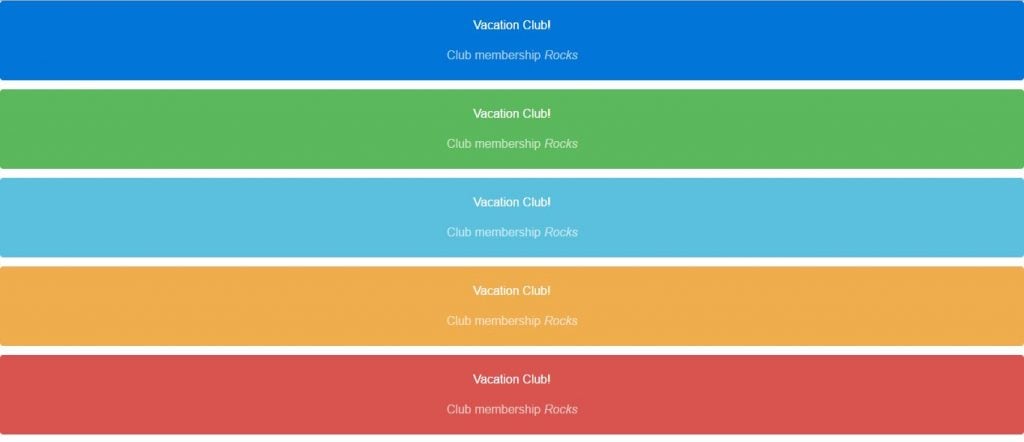
Background variants
There are several background variant utility classes of cards in Bootstrap v4 which can quickly change the background-color and border-color of a card. This is to be noted that the darker colors require the use of .card-inverse class. Such an example is shown below.
<!DOCTYPE html>
<html lang="en">
<head>
<!-- Required meta tags always come first -->
<meta charset="utf-8">
<meta name="viewport"
	content="width=device-width, initial-scale=1, shrink-to-fit=no">
<meta http-equiv="x-ua-compatible" content="ie=edge">
<!-- Bootstrap CSS -->
<link rel="stylesheet" href="dist/css/bootstrap.min.css">
<title>Background Variants</title>
</head>
<body>
	<div class="card card-inverse card-primary text-xs-center">
		<div class="card-block">
			<blockquote class="card-blockquote">
				<p>Vacation Club!</p>
				<footer>
					Club membership <cite title="Source Title">Rocks</cite>
				</footer>
			</blockquote>
		</div>
	</div>
	<div class="card card-inverse card-success text-xs-center">
		<div class="card-block">
			<blockquote class="card-blockquote">
				<p>Vacation Club!</p>
				<footer>
					Club membership <cite title="Source Title">Rocks</cite>
				</footer>
			</blockquote>
		</div>
	</div>
	<div class="card card-inverse card-info text-xs-center">
		<div class="card-block">
			<blockquote class="card-blockquote">
				<p>Vacation Club!</p>
				<footer>
					Club membership <cite title="Source Title">Rocks</cite>
				</footer>
			</blockquote>
		</div>
	</div>
	<div class="card card-inverse card-warning text-xs-center">
		<div class="card-block">
			<blockquote class="card-blockquote">
				<p>Vacation Club!</p>
				<footer>
					Club membership <cite title="Source Title">Rocks</cite>
				</footer>
			</blockquote>
		</div>
	</div>
	<div class="card card-inverse card-danger text-xs-center">
		<div class="card-block">
			<blockquote class="card-blockquote">
				<p>Vacation Club!</p>
				<footer>
					Club membership <cite title="Source Title">Rocks</cite>
				</footer>
			</blockquote>
		</div>
	</div>
	<!-- jQuery first, then Bootstrap JS. All Inclusive Plug-in -->
	<script src="https://ajax.googleapis.com/ajax/libs/jquery/2.1.4/jquery.min.js"></script>
	<script src="dist/js/bootstrap.min.js"></script>
</body>
</html>
The following is the output for the above Bootstrap v4 cards markup.
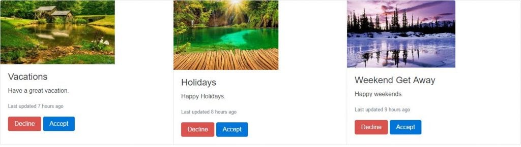
Groups
This is one of the best feature that is added to Bootstrap v4 for cards component. Here we can do the following.
- Use the card groups to render cards as a single, attached element with equal width and height columns.
- Card groups are using options such as display: table; and table-layout: fixed; (by default) in order to achieve the uniform sizing.
- Also, in group cards we may enable the flexbox mode to use display: flex; that provide the same effect.
The following is an example on group cards.
<!DOCTYPE html>
<html lang="en">
<head>
<!-- Required meta tags always come first -->
<meta charset="utf-8">
<meta name="viewport"
	content="width=device-width, initial-scale=1, shrink-to-fit=no">
<meta http-equiv="x-ua-compatible" content="ie=edge">
<!-- Bootstrap CSS -->
<link rel="stylesheet" href="dist/css/bootstrap.min.css">
<title>Groups</title>
</head>
<body>
	<div class="card-group">
		<div class="card">
			<img class="card-img-top" src="images/scene1.JPE"
				alt="Card image cap">
			<div class="card-block">
				<h4 class="card-title">Vacations</h4>
				<p class="card-text">Have a great vacation.</p>
				<p class="card-text">
					<small class="text-muted">Last updated 7 hours ago</small>
				</p>
				<a href="#" class="btn btn-danger">Decline</a> <a href="#"
					class="btn btn-primary">Accept</a>
			</div>
		</div>
		<div class="card">
			<img class="card-img-top" src="images/scene2.JPE"
				alt="Card image cap">
			<div class="card-block">
				<h4 class="card-title">Holidays</h4>
				<p class="card-text">Happy Holidays.</p>
				<p class="card-text">
					<small class="text-muted">Last updated 8 hours ago</small>
				</p>
				<a href="#" class="btn btn-danger">Decline</a> <a href="#"
					class="btn btn-primary">Accept</a>
			</div>
		</div>
		<div class="card">
			<img class="card-img-top" src="images/scene3.JPE"
				alt="Card image cap">
			<div class="card-block">
				<h4 class="card-title">Weekend Get Away</h4>
				<p class="card-text">Happy weekends.</p>
				<p class="card-text">
					<small class="text-muted">Last updated 9 hours ago</small>
				</p>
				<a href="#" class="btn btn-danger">Decline</a> <a href="#"
					class="btn btn-primary">Accept</a>
			</div>
		</div>
	</div>
	<!-- jQuery first, then Bootstrap JS. All Inclusive Plug-in -->
	<script
		src="https://ajax.googleapis.com/ajax/libs/jquery/2.1.4/jquery.min.js"></script>
	<script src="dist/js/bootstrap.min.js"></script>
</body>
</html>
The following is the output for the above Bootstrap v4 cards markup.
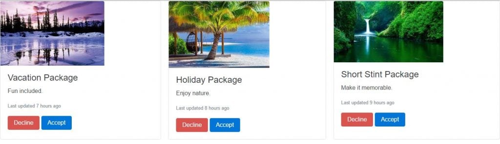
Decks
This is another great feature that is added to Bootstrap v4 for cards component. With this feature, we can do the following.
- Card decks are used when there is a set of cards in which each card is of the equal width and the height to that of other card in the set.
- Card decks require two wrapping elements: .card-deck-wrapper and a .card-deck (by default).
- We can also use the table styles for the sizing and the gutters on .card-deck. The .card-deck-wrapper is used to negative out the margin of the border-spacing on the .card-deck.
Let’s understand decks with the help of following example.
<!DOCTYPE html>
<html lang="en">
<head>
<!-- Required meta tags always come first -->
<meta charset="utf-8">
<meta name="viewport"
	content="width=device-width, initial-scale=1, shrink-to-fit=no">
<meta http-equiv="x-ua-compatible" content="ie=edge">
<!-- Bootstrap CSS -->
<link rel="stylesheet" href="dist/css/bootstrap.min.css">
<title>Decks</title>
</head>
<body>
	<div class="card-deck-wrapper">
		<div class="card-deck">
			<div class="card">
				<img class="card-img-top" src="images/scene3.JPE"
					alt="Card image cap">
				<div class="card-block">
					<h4 class="card-title">Vacation Package</h4>
					<p class="card-text">Fun included.</p>
					<p class="card-text">
						<small class="text-muted">Last updated 7 hours ago</small>
					</p>
					<a href="#" class="btn btn-danger">Decline</a> <a href="#"
						class="btn btn-primary">Accept</a>
				</div>
			</div>
			<div class="card">
				<img class="card-img-top" src="images/scene4.JPE"
					alt="Card image cap">
				<div class="card-block">
					<h4 class="card-title">Holiday Package</h4>
					<p class="card-text">Enjoy nature.</p>
					<p class="card-text">
						<small class="text-muted">Last updated 8 hours ago</small>
					</p>
					<a href="#" class="btn btn-danger">Decline</a> <a href="#"
						class="btn btn-primary">Accept</a>
				</div>
			</div>
			<div class="card">
				<img class="card-img-top" src="images/scene5.JPE"
					alt="Card image cap">
				<div class="card-block">
					<h4 class="card-title">Short Stint Package</h4>
					<p class="card-text">Make it memorable.</p>
					<p class="card-text">
						<small class="text-muted">Last updated 9 hours ago</small>
					</p>
					<a href="#" class="btn btn-danger">Decline</a> <a href="#"
						class="btn btn-primary">Accept</a>
				</div>
			</div>
		</div>
	</div>
	<!-- jQuery first, then Bootstrap JS. All Inclusive Plug-in -->
	<script
		src="https://ajax.googleapis.com/ajax/libs/jquery/2.1.4/jquery.min.js"></script>
	<script src="dist/js/bootstrap.min.js"></script>
</body>
</html>
The following is the output for the above Bootstrap v4 cards markup.
Columns
Card columns feature in Bootstrap v4 is another interesting feature. With this feature, we can do the following.
- Card columns organize cards into Masonry-like columns where CSS wrap them in .card-columns.
- This is to be noted that this feature is not available in IE9 browser and browsers which have no support for the column-* CSS properties.
The following is an example on Columns in Cards.
<!DOCTYPE html>
<html lang="en">
<head>
<!-- Required meta tags always come first -->
<meta charset="utf-8">
<meta name="viewport"
	content="width=device-width, initial-scale=1, shrink-to-fit=no">
<meta http-equiv="x-ua-compatible" content="ie=edge">
<!-- Bootstrap CSS -->
<link rel="stylesheet" href="dist/css/bootstrap.min.css">
<title>Columns</title>
</head>
<body>
	<div class="card-columns">
		<div class="card">
			<img class="card-img-top" src="images/scene2.JPE" alt="Card image cap">
			<div class="card-block">
				<h4 class="card-title">Fun Package</h4>
				<p class="card-text">Go on Vacation.</p>
			</div>
		</div>
		<div class="card card-block">
			<blockquote class="card-blockquote">
				<p>You will like our services.</p>
				<footer>
					<small class="text-muted"> Vacation Club<cite
						title="Source Title">Rocks</cite>
					</small>
				</footer>
			</blockquote>
		</div>
		<div class="card">
			<img class="card-img-top" src="images/scene4.JPE" alt="Card image cap">
			<div class="card-block">
				<h4 class="card-title">Short Stint Package</h4>
				<p class="card-text">Enjoy your short stay.</p>
				<p class="card-text">
					<small class="text-muted">Last updated 7 hours ago</small>
				</p>
			</div>
		</div>
		<div class="card card-block card-inverse card-primary text-xs-center">
			<blockquote class="card-blockquote">
				<p>Happy stay with us.</p>
				<footer>
					<small> Vacation Club <cite title="Source Title">Rocks</cite>
					</small>
				</footer>
			</blockquote>
		</div>
		<div class="card card-block text-xs-center">
			<h4 class="card-title">Vacation Club Members</h4>
			<p class="card-text">Enjoy the moments with us with the part of family.</p>
			<p class="card-text">
				<small class="text-muted">Last updated 8 hours ago</small>
			</p>
		</div>
		<div class="card">
			<img class="card-img" src="images/scene5.JPE" alt="Card image">
		</div>
		<div class="card card-block text-xs-right">
			<blockquote class="card-blockquote">
				<p>Premier Vacation Club</p>
				<footer>
					<small class="text-muted"> Vacation Club <cite
						title="Source Title">Rocks</cite>
					</small>
				</footer>
			</blockquote>
		</div>
		<div class="card card-block">
			<h4 class="card-title">Economy Vacation Club</h4>
			<p class="card-text">Affordable to everyone.</p>
			<p class="card-text">
				<small class="text-muted">Last updated 9 hours ago</small>
			</p>
		</div>
	</div>
	<!-- jQuery first, then Bootstrap JS. All Inclusive Plug-in -->
	<script
		src="https://ajax.googleapis.com/ajax/libs/jquery/2.1.4/jquery.min.js"></script>
	<script src="dist/js/bootstrap.min.js"></script>
</body>
</html>
The following is the output for the above Bootstrap v4 cards markup.

Source Code for Cards in Bootstrap v4
Conclusion
In this chapter, we have covered everything you might need to know about Cards and cards components which are added to Bootstrap v4. We also went over examples of each of the new aspects and features that were demonstrated.
