In this chapter, we are going to discuss the various styling options which are present in Bootstrap 4.0.0 for images and carousels.
Bootstrap 4.0.0 Images
All the styling classes for images which exist before Bootstrap 4.0.0 are working in the current bootstrap package except for .img-responsive class which has been renamed to .img-fluid.
Bootstrap 4.0.0 Image Shapes
The following are image shapes which are supported in Bootstrap 4.0.0.
- Rounded Corners Image: We use the .img-rounded class to make the corner of the image rounded on the webpage. It should be noted that the Microsoft IE 8 browser does not support the rounded corners of an image. The following is an example of the rounded corner image using Bootstrap 4.0.0.
<!DOCTYPE html>
<html lang="en">
<head>
<!-- Required meta tags always come first -->
<meta charset="utf-8">
<meta name="viewport"
	content="width=device-width, initial-scale=1, shrink-to-fit=no">
<meta http-equiv="x-ua-compatible" content="ie=edge">
<!-- Bootstrap CSS -->
<link rel="stylesheet" href="https://maxcdn.bootstrapcdn.com/bootstrap/4.0.0-alpha.3/css/bootstrap.min.css">
<title>Rounded Corner Image</title>
</head>
<body>
	<div align="center">
	<p>It is an example of Rounded Corner image using Bootstrap 4.0.0</p><br>
	<img src="images/scene1.jpe" class="img-rounded" alt="Nature at its best!" width="304" height="236">
	</div>
	<!-- jQuery first, then Bootstrap JS. All Inclusive Plug-in -->
	<script src="https://ajax.googleapis.com/ajax/libs/jquery/3.0.0/jquery.min.js"></script>
    <script src="https://cdnjs.cloudflare.com/ajax/libs/tether/1.2.0/js/tether.min.js" ></script>
    <script src="https://maxcdn.bootstrapcdn.com/bootstrap/4.0.0-alpha.3/js/bootstrap.min.js"></script>
</body>
</html>
Output:
When we run the above program on a compatible browser, we can see the rounded corners of an image on the webpage as shown below.

- Circular Image: We use the .img-circle class to make the circular image on the webpage. It should be noted that Microsoft IE 8 browser does not support the circular image. The following is an example of the circular image using Bootstrap 4.0.0.
<!DOCTYPE html>
<html lang="en">
<head>
<!-- Required meta tags always come first -->
<meta charset="utf-8">
<meta name="viewport"
	content="width=device-width, initial-scale=1, shrink-to-fit=no">
<meta http-equiv="x-ua-compatible" content="ie=edge">
<!-- Bootstrap CSS -->
<link rel="stylesheet" href="https://maxcdn.bootstrapcdn.com/bootstrap/4.0.0-alpha.3/css/bootstrap.min.css">
<title>Circular Image</title>
</head>
<body>
	<div align="center">
	<p>It is an example of Circular image using Bootstrap 4.0.0</p><br>
	<img src="images/scene4.jpe" class="img-circle" alt="Nature at its best!" width="300" height="200">
	</div>
	<!-- jQuery first, then Bootstrap JS. All Inclusive Plug-in -->
	<script src="https://ajax.googleapis.com/ajax/libs/jquery/3.0.0/jquery.min.js"></script>
    <script src="https://cdnjs.cloudflare.com/ajax/libs/tether/1.2.0/js/tether.min.js" ></script>
    <script src="https://maxcdn.bootstrapcdn.com/bootstrap/4.0.0-alpha.3/js/bootstrap.min.js"></script>
</body>
</html>
Output:
When we run the above program on a compatible browser, we can see the circular image on the webpage as shown below.
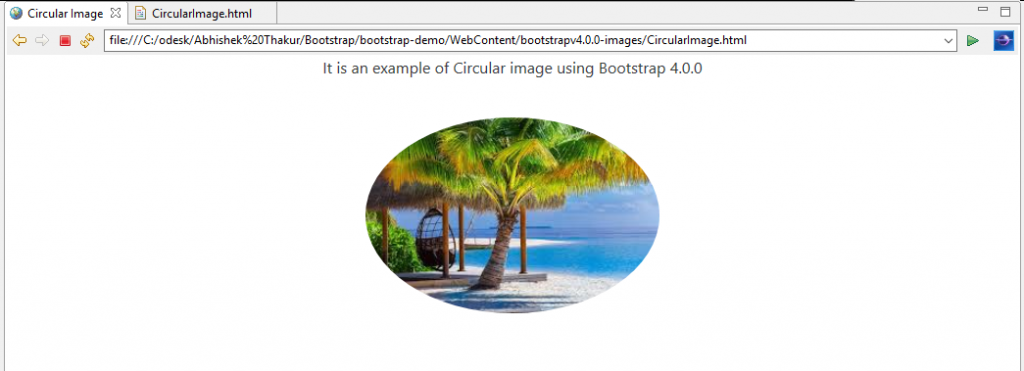
- Thumbnail Image: We use the .img-thumbnail class to make an image thumbnail on the webpage. The following is an example of the image thumbnail using Bootstrap 4.0.0.
<!DOCTYPE html>
<html lang="en">
<head>
<!-- Required meta tags always come first -->
<meta charset="utf-8">
<meta name="viewport"
	content="width=device-width, initial-scale=1, shrink-to-fit=no">
<meta http-equiv="x-ua-compatible" content="ie=edge">
<!-- Bootstrap CSS -->
<link rel="stylesheet" href="https://maxcdn.bootstrapcdn.com/bootstrap/4.0.0-alpha.3/css/bootstrap.min.css">
<title>Thumbnail Image</title>
</head>
<body>
	<div align="center">
	<p>It is an example of the image Thumbnail using Bootstrap 4.0.0</p><br>
	<img src="images/scene3.jpe" class="img-thumbnail" alt="Nature at its best!" width="300" height="200">
	</div>
	<!-- jQuery first, then Bootstrap JS. All Inclusive Plug-in -->
	<script src="https://ajax.googleapis.com/ajax/libs/jquery/3.0.0/jquery.min.js"></script>
    <script src="https://cdnjs.cloudflare.com/ajax/libs/tether/1.2.0/js/tether.min.js" ></script>
    <script src="https://maxcdn.bootstrapcdn.com/bootstrap/4.0.0-alpha.3/js/bootstrap.min.js"></script>
</body>
</html>
Output
When we run the above program on a compatible browser, we can see the image thumbnail on the webpage as shown below.
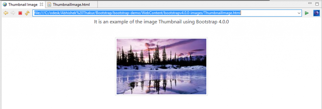
- Responsive Images: In Bootstrap 4.0.0, the .img-responsive class has been renamed to .img-fluid class. As we know, the images are of variable sizes and the size of the viewport may also vary from device to device. Therefore, with the use of .img-fluid class, a responsive image can automatically adjust to the size of the view port or screen. The .img-fluid class applies display: block; and max-width: 100%; and height: auto; to the image when called in an img tag.
<!DOCTYPE html>
<html lang="en">
<head>
<!-- Required meta tags always come first -->
<meta charset="utf-8">
<meta name="viewport"
	content="width=device-width, initial-scale=1, shrink-to-fit=no">
<meta http-equiv="x-ua-compatible" content="ie=edge">
<!-- Bootstrap CSS -->
<link rel="stylesheet" href="https://maxcdn.bootstrapcdn.com/bootstrap/4.0.0-alpha.3/css/bootstrap.min.css">
<title>Responsive Image</title>
</head>
<body>
	<div align="center">
	<p>It is an example of the Responsive image using Bootstrap 4.0.0</p><br>
	<img src="images/scene2.jpe" class="img-fluid" alt="Nature at its best!" width="300" height="200">
	</div>
	<!-- jQuery first, then Bootstrap JS. All Inclusive Plug-in -->
	<script src="https://ajax.googleapis.com/ajax/libs/jquery/3.0.0/jquery.min.js"></script>
    <script src="https://cdnjs.cloudflare.com/ajax/libs/tether/1.2.0/js/tether.min.js" ></script>
    <script src="https://maxcdn.bootstrapcdn.com/bootstrap/4.0.0-alpha.3/js/bootstrap.min.js"></script>
</body>
</html>
Output
When we run the above program on a compatible browser, we can see the responsive image on the webpage as shown below.
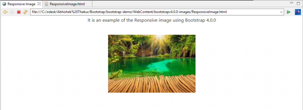
- Image Gallery: We can use Bootstrap’s grid system along with .thumbnail class to create a beautiful image gallery. The following is an example of the image gallery using Bootstrap 4.0.0.
<!DOCTYPE html>
<html lang="en">
<head>
<!-- Required meta tags always come first -->
<meta charset="utf-8">
<meta name="viewport"
	content="width=device-width, initial-scale=1, shrink-to-fit=no">
<meta http-equiv="x-ua-compatible" content="ie=edge">
<!-- Bootstrap CSS -->
<link rel="stylesheet" href="https://maxcdn.bootstrapcdn.com/bootstrap/4.0.0-alpha.3/css/bootstrap.min.css">
<title>Image Gallery</title>
</head>
<body>
<div align="center">
	<p>It is an example of an image Gallery using Bootstrap 4.0.0</p><br>
	</div>
<div class="row">
  <div class="col-md-3">
    <a href="images/scene1.jpe" class="thumbnail">
      <p>Nature at its best!</p>
      <img src="images/scene1.jpe" alt="Nature at its best!" style="width:150px;height:150px">
    </a>
  </div>
  <div class="col-md-3">
    <a href="images/scene2.jpe" class="thumbnail">
      <p>Nature has as lovely flare</p>
      <img src="images/scene2.jpe" alt="Lovely Nature" style="width:150px;height:150px">
    </a>
  </div>
  <div class="col-md-3">
    <a href="images/scene3.jpe" class="thumbnail">
      <p>Love and live across nature.</p>
      <img src="images/scene3.jpe" alt="Live across nature" style="width:150px;height:150px">
    </a>
  </div>
  <div class="col-md-3">
    <a href="images/scene4.jpe" class="thumbnail">
      <p>Love and live across nature.</p>
      <img src="images/scene4.jpe" alt="Natural Beauty" style="width:150px;height:150px">
    </a>
  </div>
</div>
	<!-- jQuery first, then Bootstrap JS. All Inclusive Plug-in -->
	<script src="https://ajax.googleapis.com/ajax/libs/jquery/3.0.0/jquery.min.js"></script>
    <script src="https://cdnjs.cloudflare.com/ajax/libs/tether/1.2.0/js/tether.min.js" ></script>
    <script src="https://maxcdn.bootstrapcdn.com/bootstrap/4.0.0-alpha.3/js/bootstrap.min.js"></script>
</body>
</html>
Output
When we run the above program on a compatible browser, we can see an image gallery on the webpage as shown below.
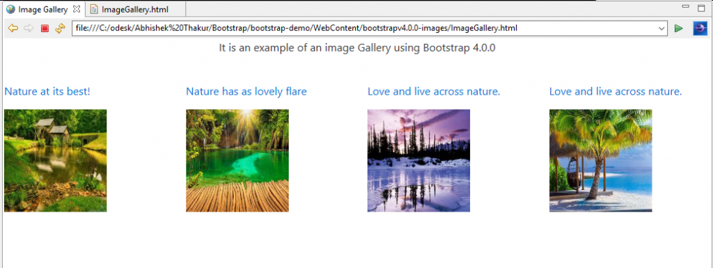
- Responsive Embeds Images/Videos: The class .embed-responsive-item can be applied to various elements such as <iframe>, <embed>, <video>, and <object>. This class creates a responsive video, image, etc. that adjusts automatically to the size of the viewport or screen. The aspect ratio of such a video or image is defined by the <div> element under which it is defined.
<!DOCTYPE html>
<html lang="en">
<head>
<!-- Required meta tags always come first -->
<meta charset="utf-8">
<meta name="viewport"
	content="width=device-width, initial-scale=1, shrink-to-fit=no">
<meta http-equiv="x-ua-compatible" content="ie=edge">
<!-- Bootstrap CSS -->
<link rel="stylesheet" href="https://maxcdn.bootstrapcdn.com/bootstrap/4.0.0-alpha.3/css/bootstrap.min.css">
<title>Responsive Video</title>
</head>
<body>
	<div align="center">
	<p>It is an example of the Responsive video using Bootstrap 4.0.0</p><br>
	<iframe src="https://www.youtube.com/embed/oIlIVFBBbNw" class="embed-responsive-item"></iframe>
	</div>
	<!-- jQuery first, then Bootstrap JS. All Inclusive Plug-in -->
	<script src="https://ajax.googleapis.com/ajax/libs/jquery/3.0.0/jquery.min.js"></script>
    <script src="https://cdnjs.cloudflare.com/ajax/libs/tether/1.2.0/js/tether.min.js" ></script>
    <script src="https://maxcdn.bootstrapcdn.com/bootstrap/4.0.0-alpha.3/js/bootstrap.min.js"></script>
</body>
</html>
OutputWhen we run the above program on a compatible browser, we can see a responsive YouTube video on the webpage as shown below.

Bootstrap 4.0.0 Carousal
All the styling classes for carousels that existed before Bootstrap 4.0.0 are working in the current bootstrap package except for .item class, which has been renamed to .carousel-item.
The Carousel Plugin
In Bootstrap 4.0.0, we use the Carousel plugin. It is a component which is used for cycling through elements, such a carousel or slideshow of images. This Plugin can be either included individually i.e. by using the individual approach “carousel.js” file, or all inclusion approach by using “bootstrap.js” or “bootstrap.min.js” file. In the below example we will be using “bootstrap.min.js” file.
Things to remember:
- Browsers which support the Page Visibility API will avoid the sliding carousal when the webpage is not visible to the user i.e. the browser tab is inactive or the browser window is minimized, etc.
- Also, Nested carousels are not supported in Bootstrap 4.0.0.
We will walk through all the available carousal classes which are present in Bootstrap 4.0.0 with the help of the following two examples.
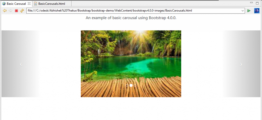
- Basic Carousel Example: The following is an example of the basic carousal.
<!DOCTYPE html>
<html lang="en">
<head>
<!-- Required meta tags always come first -->
<meta charset="utf-8">
<meta name="viewport"
	content="width=device-width, initial-scale=1, shrink-to-fit=no">
<meta http-equiv="x-ua-compatible" content="ie=edge">
<!-- Bootstrap CSS -->
<link rel="stylesheet" href="https://maxcdn.bootstrapcdn.com/bootstrap/4.0.0-alpha.3/css/bootstrap.min.css">
<title>Basic Carousel</title>
</head>
<body>
<div align ="center">
<p>An example of basic carousel using Bootstrap 4.0.0.</p><br>
<div id="carousel-example-generic" class="carousel slide" data-ride="carousel">
  <ol class="carousel-indicators">
    <li data-target="#basic-carousel" data-slide-to="0" class="active"></li>
    <li data-target="#basic-carousel" data-slide-to="1"></li>
    <li data-target="#basic-carousel" data-slide-to="2"></li>
  </ol>
  <div class="carousel-inner" role="listbox">
    <div class="carousel-item active">
      <img src="images/scene1.jpe" alt="First sliding Image" height="300" width="400">
    </div>
    <div class="carousel-item">
      <img src="images/scene2.jpe" alt="Second sliding Image" height="300" width="400">
    </div>
    <div class="carousel-item">
      <img src="images/scene3.jpe" alt="Third sliding Image" height="300" width="400">
    </div>
  </div>
  <a class="left carousel-control" href="#basic-carousel" role="button" data-slide="prev">
    <span class="icon-prev" aria-hidden="true"></span>
    <span class="sr-only">Previous</span>
  </a>
  <a class="right carousel-control" href="#basic-carousel" role="button" data-slide="next">
    <span class="icon-next" aria-hidden="true"></span>
    <span class="sr-only">Next</span>
  </a>
</div>
</div>
	<!-- jQuery first, then Bootstrap JS. All Inclusive Plug-in -->
	<script src="https://ajax.googleapis.com/ajax/libs/jquery/3.0.0/jquery.min.js"></script>
    <script src="https://cdnjs.cloudflare.com/ajax/libs/tether/1.2.0/js/tether.min.js" ></script>
    <script src="https://maxcdn.bootstrapcdn.com/bootstrap/4.0.0-alpha.3/js/bootstrap.min.js"></script>
</body>
</html>
Here, we are using the following classes.
|
S. No. |
Class |
Description |
|
1. |
.carousel |
This class is used to create a carousel. |
|
2. |
.slide |
This class is used to add a CSS transition and animation effect while it slide over from one item to the next item. |
|
3. |
.carousel-indicators |
This class is used to add the indicators for the carousel. These are the little circular dots which are present at the bottom of each slide. The number of dots indicate the number of slides present in the carousal. |
|
4. |
.carousel-inner |
This class is used to add the actual slides to the carousel |
|
5. |
.carousel-item |
This class specifies the content of each slide. |
|
6. |
.left carousel-control |
This class is used to add a left button to the carousel. This button allows the user to go back between the successive slides. |
|
7. |
.right carousel-control |
This class is used to add a right button to the carousel. This button allows the user to go forward between the successive slides. |
|
8. |
.carousel-caption |
This class specifies a caption for the carousel. |
OutputWhen we run the above program on a compatible browser, we can see the basic carousel on the webpage as shown below.
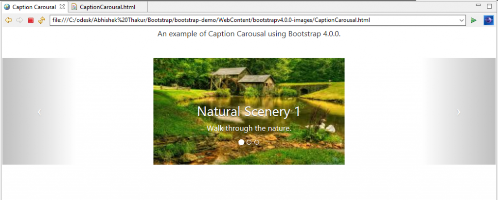
- Adding caption to sliding images in Carousel: In the following example, we will add a caption to the sliding images by using the class .carousel-caption.
<!DOCTYPE html>
<html lang="en">
<head>
<!-- Required meta tags always come first -->
<meta charset="utf-8">
<meta name="viewport"
	content="width=device-width, initial-scale=1, shrink-to-fit=no">
<meta http-equiv="x-ua-compatible" content="ie=edge">
<!-- Bootstrap CSS -->
<link rel="stylesheet" href="https://maxcdn.bootstrapcdn.com/bootstrap/4.0.0-alpha.3/css/bootstrap.min.css">
<title>Caption Carousel</title>
</head>
<body>
<div align ="center">
<p>An example of Caption Carousel using Bootstrap 4.0.0.</p><br>
<div id="carousel-example-generic" class="carousel slide" data-ride="carousel">
  <ol class="carousel-indicators">
    <li data-target="#basic-carousel" data-slide-to="0" class="active"></li>
    <li data-target="#basic-carousel" data-slide-to="1"></li>
    <li data-target="#basic-carousel" data-slide-to="2"></li>
  </ol>
  <div class="carousel-inner" role="listbox">
    <div class="carousel-item active">
      <img src="images/scene1.jpe" alt="First sliding Image" height="300" width="400">
      <div class="carousel-caption">
        <h3>Natural Scenery 1</h3>
        <p>Walk through the nature.</p>
      </div>
    </div>
    <div class="carousel-item">
      <img src="images/scene2.jpe" alt="Second sliding Image" height="300" width="400">
      <div class="carousel-caption">
        <h3>Natural Scenery 2</h3>
        <p>Enjoy the Nature.</p>
      </div>
    </div>
    <div class="carousel-item">
      <img src="images/scene3.jpe" alt="Third sliding Image" height="300" width="400">
      <div class="carousel-caption">
        <h3>Natural Scenery 3</h3>
        <p>Love the Nature.</p>
      </div>
    </div>
  </div>
  <a class="left carousel-control" href="#basic-carousel" role="button" data-slide="prev">
    <span class="icon-prev" aria-hidden="true"></span>
    <span class="sr-only">Previous</span>
  </a>
  <a class="right carousel-control" href="#basic-carousel" role="button" data-slide="next">
    <span class="icon-next" aria-hidden="true"></span>
    <span class="sr-only">Next</span>
  </a>
</div>
</div>
	<!-- jQuery first, then Bootstrap JS. All Inclusive Plug-in -->
	<script src="https://ajax.googleapis.com/ajax/libs/jquery/3.0.0/jquery.min.js"></script>
    <script src="https://cdnjs.cloudflare.com/ajax/libs/tether/1.2.0/js/tether.min.js" ></script>
    <script src="https://maxcdn.bootstrapcdn.com/bootstrap/4.0.0-alpha.3/js/bootstrap.min.js"></script>
</body>
</html>
OutputWhen we run the above program on a compatible browser, we can see the carousel with caption on the sliding images on the webpage as shown below.
Source Code for Images and Carousel
Conclusion: In this chapter, we discussed about the various classes which are present in Bootstrap 4.0.0 for images as well as carousel elements to glorify our website development using Bootstrap 4.0.0.


