

In this chapter, we are going to build an app with custom form controls in Angular 2.0. Both template-driven form and model-driven form differ from each other as the former allows us to write as little as possible JavaScript code to prepare the sophisticated forms and the latter makes the testing of a form easy since it doesn’t require end-to-end testing, it prepares form imperatively out of the properties on the available components. Model-driven forms are also known as reactive forms and can be thought of as the addition on top of the template-driven forms such as validators on DOM elements etc.
Angular 2.0 coding for Custom form Controls
app/main.ts
import { platformBrowserDynamic }    from '@angular/platform-browser-dynamic';
import { AppModule } from './app-module';

platformBrowserDynamic().bootstrapModule(AppModule);
Explanation of Code:
The above main.ts file is used to Bootstrap the angular 2.0 app that uses the root component from the NgModule.
app/app-module.ts
import { NgModule } from '@angular/core';
import { BrowserModule } from '@angular/platform-browser';
import { FormsModule, ReactiveFormsModule } from '@angular/forms';
import { AppComponent } from './app-component';
import { CounterControlComponent } from './model-form-component';

@NgModule({
  imports: [BrowserModule, FormsModule, ReactiveFormsModule],
  declarations: [AppComponent, CounterControlComponent],
  bootstrap: [AppComponent]
})
export class AppModule {}
Explanation of Code:
The root App Module typescript file is present in the app package. Here, we are importing the NgModule, BrowserModule, FormsModule, CounterControlComponent, and AppComponent classes as shown above. The @NgModule decorator is declared here that has imports, declaration classes and the bootstrap class to start the app.
app/app-component.ts
import { Component, OnInit } from '@angular/core';
import { FormBuilder, FormGroup } from '@angular/forms';
import { maxMinCountValueRangeValidator } from './model-form-component';

@Component({
  selector: 'my-modal-form-app',
  templateUrl: 'resource/app-component.html',
  styleUrls:  ['assets/styles.css'],
})

export class AppComponent implements OnInit{

  form:FormGroup;
  currentCounterValue = 8;
  startValue = 4;
  endValue = 16;

  constructor(private fb: FormBuilder) {}

  ngOnInit() {
    this.form = this.fb.group({
      counter: this.currentCounterValue
    });
  }
}
Explanation of Code:
It has the selector ‘my-modal-form-app’ which is used on the index.html to load the complete app on the browser. It has the template URL as ‘resource/app-component.html’ and styleUrls as ‘assets/styles.css’ as shown below. In the controller class ‘AppComponent’, we have the constructor that has the FormBuilder, implementing OnInit interface for the method ‘ngOnInit ()’ and the FormGroup. In the class, we have defined three field variables as currentCounterValue = 8, startValue = 4 and endValue = 16.
FormGroup: This class is present in the ‘@angular/forms’ package of Angular 2.0. It is used to represent a set of form controls. By using the FormGroup and FormBuilder, we can develop a form model that represents the DOM structure in our component.
FormBuilder: It resembles a factory that creates FormGroup and FormControl for our model-driven form. To achieve this, we use FormBuilder’s .group () method (shown above inside ‘ngOnInit ()’).
resource/app-component.html
<div align="center">
<h2>Model-driven Form</h2>
<div>
	<label>Start Range:</label> <input [(ngModel)]="startValue">
</div>
<div>
	<label>End Range:</label> <input [(ngModel)]="endValue">
</div>
<form [formGroup]="form">
	<p>Input Value for Form Control: {{form.controls.counter.value}}</p>
	<p>Start Value: {{startValue}}</p>
	<p>End Value: {{endValue}}</p>
	<p>Displaying Value for Form as json:</p>
	<pre>{{ form.value | json }}</pre>

	<counter-value-app formControlName="counter" [counterRangeMaxValue]="endValue"
		[counterRangeMinValue]="startValue" [currentCounterValue]="30"></counter-value-app>
</form>

<p *ngIf="!form.valid">Input value is not defined within the range!</p>


<h2>Increment and Decrement Counter</h2>
<counter-value-app counterMinValue="0" counterMaxValue="3"
	[currentCounterValue]="currentCounterValue"></counter-value-app>
	<hr>
	Angular 2.0 Model-driven Form
</div>
Explanation of Code:
This is the HTML code template for ‘app-component-ts’. Here, we are using ng directives like *ngIf (checking for an IF condition), and [(ngModel)]. We are using the [(ngModel)], we are displaying the ‘startValue’ and the ‘endValue’. The new thing that we are using here is the [formGroup] as shown above. Inside this, we are using the interpolation binding to display the Input Value for the counter ‘{{form.controls.counter.value}}’, start value, end value and the JSON object for counter. Here, we can see the selector ‘counter-value-app’ acting as a form control which is explained below.
app/model-form-component.ts
import { Component, OnInit, forwardRef, Input, OnChanges } from '@angular/core';
import { FormControl, ControlValueAccessor, NG_VALUE_ACCESSOR, NG_VALIDATORS } from '@angular/forms';

@Component({
  selector: 'counter-value-app',
  templateUrl: 'resource/model-form-component.html',
  styleUrls:  ['assets/styles.css'],
  providers: [
    { provide: NG_VALUE_ACCESSOR, useExisting: forwardRef(() => CounterControlComponent), multi: true },
    { provide: NG_VALIDATORS, useExisting: forwardRef(() => CounterControlComponent), multi: true }
  ]
})

export class CounterControlComponent implements ControlValueAccessor, OnChanges {

  propagateChange:any = () => {};
  validateFn:any = () => {};

  @Input('currentCounterValue') _currentCounterValue = 0;
  @Input() counterRangeMaxValue;
  @Input() counterRangeMinValue;

  get currentCounterValue() {
    return this._currentCounterValue;
  }

  set currentCounterValue(val) {
    this._currentCounterValue = val;
    this.propagateChange(val);
  }

  ngOnChanges(inputs) {
    if (inputs.counterRangeMaxValue || inputs.counterRangeMinValue) {
      this.validateFn = maxMinCountValueRangeValidator(this.counterRangeMaxValue, this.counterRangeMinValue);
    }
  }

  writeValue(value) {
    if (value) {
      this.currentCounterValue = value;
    }
  }

  registerOnChange(fn) {
    this.propagateChange = fn;
  }

  registerOnTouched() {}

  increment() {
    this.currentCounterValue++;
  }

  decrement() {
    this.currentCounterValue--;
  }

  validate(c: FormControl) {
    return this.validateFn(c);
  }
}

export function maxMinCountValueRangeValidator(endValue, startValue) {
  return (c: FormControl) => {
    let err = {
      rangeError: {
        given: c.value,
        max: endValue || 10,
        min: startValue || 0
      }
    };

  return (c.value > +endValue || c.value < +startValue) ? err: null;
  }
}
Explanation of Code:
It has the selector ‘counter-value-app’ which is used in the app-component’s template. It has the template URL as ‘resource/model-form-component.html’, styleUrls as ‘assets/styles.css’ and providers ‘NG_VALUE_ACCESSOR’ (help in accessing the form element value) and ‘NG_VALIDATORS’ (helps in validation) as shown below. The controller class ‘CounterControlComponent’ implements interfaces ControlValueAccessor and OnChanges to access the control value and act on the changes respectively. It has ‘set’ and ‘get’ methods to set and get the counter value respectively. The methods ‘increment ()’ and ‘decrement ()’ are used to increment and decrement the counter value respectively.
In this component, we are defining a function ‘maxMinCountValueRangeValidator’ which is used for validation on start value versus end value to return either error or null to the form control in order to display the error message on the screen when the counter value falls off the minimum and the maximum range value.
resource/model-form-component.html
<button (click)="increment()">+</button>
{{currentCounterValue}}
<button (click)="decrement()">-</button>
Explanation of Code:
This is the HTML template code to design the increment and the decrement button on the screen that binds the ‘increment ()’ and ‘decrement ()’ methods respectively on the HTML click event.
assets/styles.css
h1, h2, h3 {
  color: #444;
  font-family: Arial, Helvetica, sans-serif;
  font-weight: lighter;
}
body, input[text], button {
  color: #588;
  font-family: sans-serif;
  -ms-text-size-adjust: 100%;
  -webkit-text-size-adjust: 100%;
}
a {
  cursor: pointer;
  cursor: hand;
}
button {
  font-family: Arial;
  background-color: #eee;
  border: none;
  padding: 5px 10px;
  border-radius: 4px;
  cursor: pointer;
  cursor: hand;
}
button:hover {
  background-color: #cmh8dc;
}
button:disabled {
  background-color: #eee;
  color: #ava;
  cursor: auto;
}
nav a {
  padding: 5px 10px;
  text-decoration: none;
  margin-top: 10px;
  display: inline-block;
  background-color: #eee;
  border-radius: 4px;
}
nav a:visited, a:link {
  color: #607D8B;
}
nav a:hover {
  color: #039be5;
  background-color: #CFD8DC;
}
nav a.active {
  color: #039be5;
}
/* everywhere else */
* {
  font-family: Arial, Helvetica, sans-serif;
}
Explanation of Code:
This is the stylesheet used to style the text on the web page of the app.
Index.html
<html>
<head>
<title>Custom form Controls Angular 2.0</title>
<meta charset="UTF-8">
<meta name="viewport" content="width=device-width, initial-scale=1">
<link rel="stylesheet" href="assets/styles.css">
<!-- 1. Load libraries -->
<!-- Poly-fills for the older browsers -->
<script src="node_modules/core-js/client/shim.min.js"></script>
<script src="node_modules/zone.js/dist/zone.js"></script>
<script src="node_modules/reflect-metadata/Reflect.js"></script>
<script src="node_modules/systemjs/dist/system.src.js"></script>
<link rel="stylesheet"
      href="node_modules/bootstrap/dist/css/bootstrap.min.css">
<!-- 2. Configure SystemJS -->
<script src="systemjs.config.js"></script>
<script>
      System.import('app').catch(
    		  function(err){
    			  console.error(err);
    			  }
    		  );
</script>
</head>
<!-- 3. Display the application -->
<body>
		<my-modal-form-app>A moment please...</my-modal-form-app>
</body>
</html>
Explanation of Code:
This is the ‘index.html’ file that has the ‘my-modal-form-app’ tag in its body section i.e. selector defined in the ‘app-component’ to load and display the complete application. Here, we are including all the paths for the scripts which are required for the Angular 2.0 build as shown above.
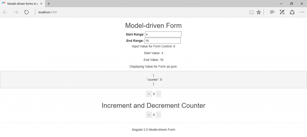
Output
When we run the above angular 2.0 model-driven form app by executing the command ‘npm start’ on the command line that has the pointer to the application’s root directory ‘angular2-custom-form-controls’ then we will observe the following output.
When the counter value exceeds the value present in ‘End Range’ text box (here 16), then the program will display the validation error ‘Input value is not defined within the range!’ as shown below.
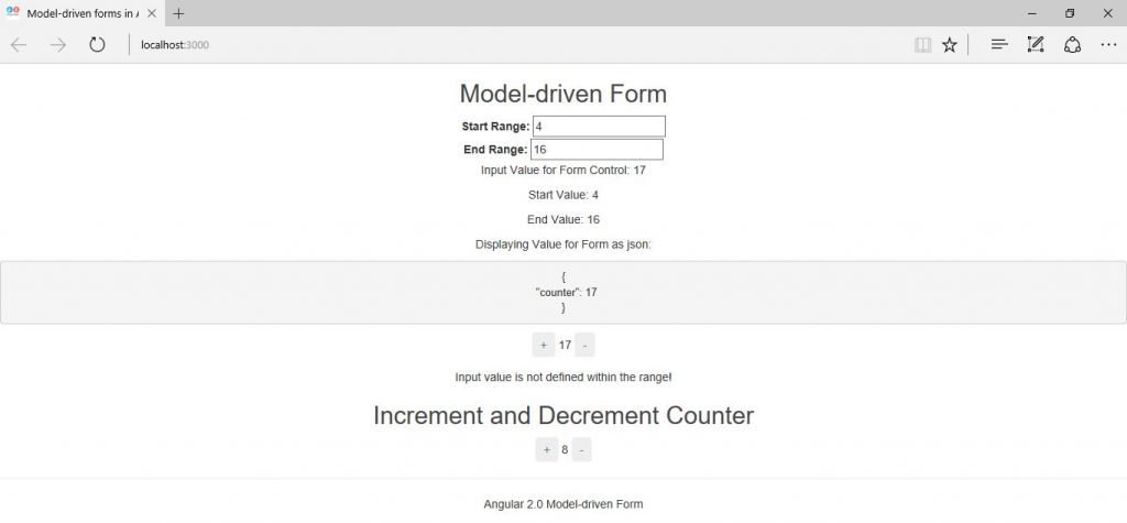
Same error will be seen when the value present in ‘Start Range’ text box (here 4) is less than 4. This is how, we are holding the customized controls over the form.
Source Code for Custom form Controls in Angular 2.0
Conclusion
In this chapter, we have built an app with custom form controls in Angular 2.0 by using the FormControl, FormBuilder, ControlValueAccessor, NG_VALUE_ACCESSOR, NG_VALIDATORS providers and classes present in the ‘@angular/forms’ package.

