In this chapter, we are going to discuss components which are used in Angular 2.0 along with a practical example.
Components
As we know that in Angular 1, we were using directives, controllers, and scopes to build an application. However in Angular 2.0 application building, these are all combined into Components. The Components in Angular 2.0 are nothing but the basic building blocks. Each component has the following notable properties.
- A component is self-describing: We define a template either by writing the HTML code or through templateUrl that points to a HTML file that holds the code. The template are defined within the @Component decorator. It describes how the component is going to be rendered on the web page.
- Selective Styling: We can selectively style the HTML code associated with the component with the help of styleUrls configuration detail which we will see later in this chapter.
- A component has precise inputs and outputs: In component, we can define the inputs as well as output through class field decorators, @Input and @Output respectively.
- The lifecycle of a component is well defined: In Angular 2.0, the component has Input and Output. Whenever there is any change in the input properties, the component will be notified and hence the output will vary accordingly.
Component configuration
The following are the component configuration.
|
Sr No. |
Component configuration |
Description |
|
1. |
moduleId: module.id |
If this configuration is set, then the templateUrl and styleUrl are resolved by relative path to the component. |
|
2. |
viewProviders: [MyAppService, { provide: … }] |
It specifies a list of dependency injection providers which are scoped to this component’s view. |
|
3. |
template: ‘Hi {{userName}}’ templateUrl: ‘my-app-component.html’ |
It specifies an Inline template or external template URL of the component’s view as shown in below example. |
|
4. |
styles: [‘.primary {color: blue}’] styleUrls: [‘my-app-component.css’] |
It specifies a list of inline CSS styles or the external stylesheet URLs which are used for the styling the component’s view as shown in the below example. |
The following is an example of an Angular 2.0 component that provides the vacation plan details. We will explain how it works step by step.
app/main.ts
import { platformBrowserDynamic } from '@angular/platform-browser-dynamic';
import { AppModule } from './Module';
platformBrowserDynamic().bootstrapModule(AppModule);
Explanation of Code:
The above main.ts file is used to Bootstrap the angular 2.0 app that uses the root component from the NgModule.
app/Module.ts
import { NgModule }      from '@angular/core';
import { BrowserModule } from '@angular/platform-browser';

import { AppComponent }  from './Component';

@NgModule({
  imports:      [ BrowserModule ],
  declarations: [ AppComponent ],
  bootstrap:    [ AppComponent ]
})
export class AppModule { }
Explanation of Code:
The root App Module typescript file is present in the app package. This type imports the NgModule, BrowserModule, and AppComponent as shown above. The @NgModule decorator is declared here.
app/Component.ts
import { Component } from '@angular/core';

@Component({
  selector: 'my-angular2-app',
  templateUrl: 'resource/template.html',
  styleUrls: ['assets/styles.css']
})

export class AppComponent {
	heading = "Vacation plan Application in Angular 2.0";
	paragraph = "Hello Angular 2 framework";
	plan1 = "Premium Customer Plan, all inclusive";
	plan2 = "Platinum Customer Plan";
	plan3 = "Golden Customer Plan";
	plan4 = "Silver Customer Plan";
	plan5 = "Bronze Customer Plan";
	benefit1 = "Air Tickets, Rental Car, 5-star Hotel and Breakfast";
	benefit2 = "Rental Car, 5-star Hotel and Breakfast";
	benefit3 = "Rental Car, 4-star Hotel and Breakfast";
	benefit4 = "4-star Hotel and Breakfast";
	benefit5 = "3-star Hotel and Breakfast";
}
Explanation of Code:
This is the actual Component code for Angular 2.0. A component is represented by @Component decorator that is imported from ‘@angular/core’ package of Angular 2.0. It has the following configuration.
- Selector as ‘my-angular2-app’ that behaves as a tag to load the complete app in the body section of the index.html.
- TemplateUrl as ‘resource/template.html’ that holds the required HTML code to render on the browser.
- StyleUrls as [‘assets/styles.css’] that holds the styling configuration of the web elements on the web page.
- Lastly we are exporting a class as ‘AppComponent’ that has all the texts which are required to be displayed on the template web page by using Interpolation data binding technique as shown below.
<h3>{{heading}}</h3>
resource/template.html
<div align="center">
<h3>{{heading}}</h3>
<br>
<table class="table table-bordered">
<thead>
<tr><th>Sequence</th><th>Holiday Plan</th><th>Details</th><th>Benefits</th><tr>
</thead>
<tbody>
<tr><th scope="row">1</th><td><img src="images/scene1.jpe" height="50" width="100"/></td><td>{{plan1}}</td><td>{{benefit1}}</td><tr>
<tr><th scope="row">2</th><td><img src="images/scene2.jpe" height="50" width="100"/></td><td>{{plan2}}</td><td>{{benefit2}}</td><tr>
<tr><th scope="row">3</th><td><img src="images/scene3.jpe" height="50" width="100"/></td><td>{{plan3}}</td><td>{{benefit3}}</td><tr>
<tr><th scope="row">4</th><td><img src="images/scene4.jpe" height="50" width="100"/></td><td>{{plan4}}</td><td>{{benefit4}}</td><tr>
<tr><th scope="row">5</th><td><img src="images/scene5.jpe" height="50" width="100"/></td><td>{{plan5}}</td><td>{{benefit5}}</td><tr>
</tbody>
</table>
</div>
Explanation of Code:
As discussed above, this is the actual template file that has the HTML code. Here, the data binding is done by the interpolation using the double curly opening and closing braces.
assets/styles.css
h3 {
  color: #369;
  font-family: Georgia, Helvetica, sans-serif;
  font-size: 150%;
}
p {
  color: #969;
  font-family: Georgia, Helvetica, sans-serif;
  font-size: 250%;
}
body {
  margin: 2em;
}

body, button {
	color: #269;
	font-family: Georgia, Helvetica, sans-serif;
}
Explanation of Code:
As discussed above, this is the actual styling CSS file that has the CSS details to style the text and web elements present on the above HTML template.
Index.html
<html>
<head>
<title>Vacation Planning App</title>
<!-- Bootstrap CSS -->
<link rel="stylesheet" href="node_modules/bootstrap/dist/css/bootstrap.min.css">
<meta charset="UTF-8">
<meta name="viewport" content="width=device-width, initial-scale=1">
<link rel="stylesheet" href="assets/styles.css">
<!-- 1. Load libraries -->
<!-- Poly-fills for the older browsers -->
<script src="node_modules/core-js/client/shim.min.js"></script>
<script src="node_modules/zone.js/dist/zone.js"></script>
<script src="node_modules/reflect-metadata/Reflect.js"></script>
<script src="node_modules/systemjs/dist/system.src.js"></script>
<!-- 2. Configure SystemJS -->
<script src="systemjs.config.js"></script>
<script>
      System.import('app').catch(
    		  function(err){
    			  console.error(err);
    			  }
    		  );
</script>
</head>
<!-- 3. Display the application -->
<body>
	<my-angular2-app>Please wait...</my-angular2-app>
</body>
<script src="https://ajax.googleapis.com/ajax/libs/jquery/2.1.4/jquery.min.js"></script>
<script src="node_modules/bootstrap/js/bootstrap.min.js"></script>
</html>
Explanation of Code:
This is the actual index.html file that has the component’s selector ‘my-angular2-app’ in the body section which loads the app. Here, we have declared the ‘bootstrap.min.css’ and ‘bootstrap.min.js’ in the head section of the HTML file which are required to trigger the Bootstrap module styling on the web page of the app. This is to be noted that we have to install Bootstrap along with Angular 2.0 by using the command [npm install bootstrap –save] that we already discussed in an earlier chapter.
Output
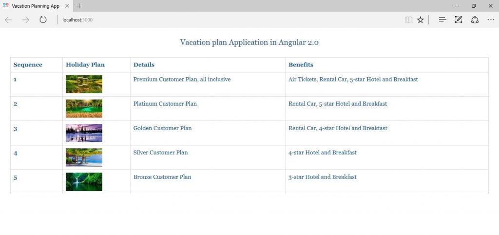
When we execute the command ‘npm start’ on the command line that has the directory pointer on the current project folder ‘angular2-components’ then we can observe that our vacation planning app has been successfully loaded as shown below.

Here, we can observe that all the components which include the HTML template, CSS stylesheet and the texts in AppComponent class are displayed on this page.
Source code for Components in Angular 2
Conclusion
In this chapter, we specifically discussed about the components and their configurations in Angular 2.0 for building a vacation planning application.


