

Table in HTML is a well-known web element and is used on various websites since ages. Bootstrap v4 has added something new as an improvement. The following are the features for Tables Type in Bootstrap v4.
1. Default Table in Bootstrap v4 [class=”table”]
Let’s understand the various HTML tags for a table.
- We create table in HTML with a fixed tag <table>that ends with tag </table>
- To define a row in table, we use tag <tr>as an opening tag and tag </tr> as a closing tag.
- Similarly, a column in table is defined with <td> as an opening tag and </td> as closing tag.
- The very first row in table forms a heading row that may have one or more columns. Columns in such heading row are defined with <th> as an opening tag and </th> as a closing tag.
- A row that forms the header of the table encloses the row and the column tags between<thead></thead> tags.
- Similarly, all non-header rows and columns are enclosed between <tbody></tbody>tags.
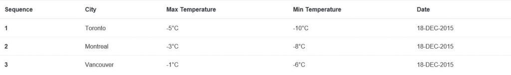
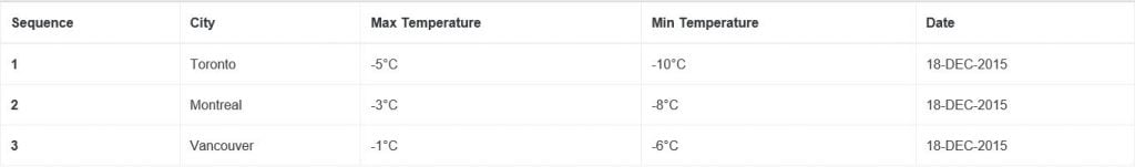
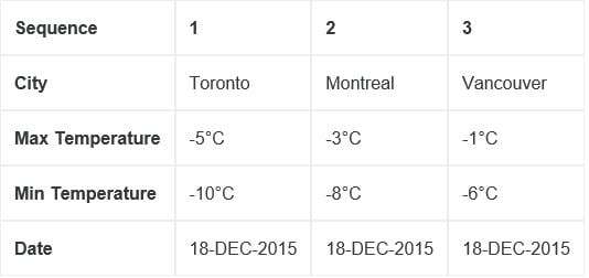
A default table in Bootstrap v4 has the class as .table along with tag. The following is an example of a default table in Bootstrap v4.
<!DOCTYPE html>
<html lang="en">
<head>
<!-- Required meta tags always come first -->
<meta charset="utf-8">
<meta name="viewport"
	content="width=device-width, initial-scale=1, shrink-to-fit=no">
<meta http-equiv="x-ua-compatible" content="ie=edge">
<!-- Bootstrap CSS -->
<link rel="stylesheet"
	href="https://maxcdn.bootstrapcdn.com/bootstrap/4.0.0-alpha.2/css/bootstrap.min.css"
	integrity="sha384-y3tfxAZXuh4HwSYylfB+J125MxIs6mR5FOHamPBG064zB+AFeWH94NdvaCBm8qnd"
	crossorigin="anonymous">
<title> Default Table</title>
</head>
<body>
	<table class="table"><!-- default table class .table -->
		<thead>
			<tr>
				<th>Sequence</th>
				<th>City</th>
				<th>Max Temperature</th>
				<th>Min Temperature</th>
				<th>Date</th>
			</tr>
		</thead>
		<tbody>
			<tr>
				<th scope="row">1</th>
				<td>Toronto</td>
				<td>-5°C</td>
				<td>-10°C</td>
				<td>18-DEC-2015</td>
			</tr>
			<tr>
				<th scope="row">2</th>
				<td>Montreal</td>
				<td>-3°C</td>
				<td>-8°C</td>
				<td>18-DEC-2015</td>
			</tr>
			<tr>
				<th scope="row">3</th>
				<td>Vancouver</td>
				<td>-1°C</td>
				<td>-6°C</td>
				<td>18-DEC-2015</td>
			</tr>
		</tbody>
	</table>
	<!-- jQuery first, then Bootstrap JS. -->
	<script
	src="https://ajax.googleapis.com/ajax/libs/jquery/2.1.4/jquery.min.js"></script>
	<script
		src="https://maxcdn.bootstrapcdn.com/bootstrap/4.0.0-alpha.2/js/bootstrap.min.js"
		integrity="sha384-vZ2WRJMwsjRMW/8U7i6PWi6AlO1L79snBrmgiDpgIWJ82z8eA5lenwvxbMV1PAh7"
		crossorigin="anonymous"></script>
</body>
</html>
Output: Default table output is as follows.
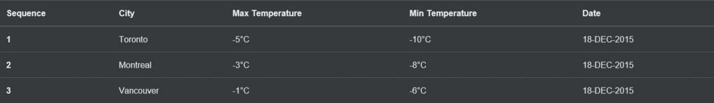
2. Inverse Table in Bootstrap v4 [class=”table table-inverse”]
We can inverse the color of above default table by simply using the class .table-inverse. In this case, the color of text becomes white and the background as black. The following is an example of an inverse table in Bootstrap v4.
<!DOCTYPE html>
<html lang="en">
<head>
<!-- Required meta tags always come first -->
<meta charset="utf-8">
<meta name="viewport"
	content="width=device-width, initial-scale=1, shrink-to-fit=no">
<meta http-equiv="x-ua-compatible" content="ie=edge">
<!-- Bootstrap CSS -->
<link rel="stylesheet"
	href="https://maxcdn.bootstrapcdn.com/bootstrap/4.0.0-alpha.2/css/bootstrap.min.css"
	integrity="sha384-y3tfxAZXuh4HwSYylfB+J125MxIs6mR5FOHamPBG064zB+AFeWH94NdvaCBm8qnd"
	crossorigin="anonymous">
<title>Inverse Table</title>
</head>
<body>
	<table class="table table-inverse"><!-- inverse table class .table-inverse -->
		<thead>
			<tr>
				<th>Sequence</th>
				<th>City</th>
				<th>Max Temperature</th>
				<th>Min Temperature</th>
				<th>Date</th>
			</tr>
		</thead>
		<tbody>
			<tr>
				<th scope="row">1</th>
				<td>Toronto</td>
				<td>-5°C</td>
				<td>-10°C</td>
				<td>18-DEC-2015</td>
			</tr>
			<tr>
				<th scope="row">2</th>
				<td>Montreal</td>
				<td>-3°C</td>
				<td>-8°C</td>
				<td>18-DEC-2015</td>
			</tr>
			<tr>
				<th scope="row">3</th>
				<td>Vancouver</td>
				<td>-1°C</td>
				<td>-6°C</td>
				<td>18-DEC-2015</td>
			</tr>
		</tbody>
	</table>
	<!-- jQuery first, then Bootstrap JS. -->
	<script
		src="https://ajax.googleapis.com/ajax/libs/jquery/2.1.4/jquery.min.js"></script>
	<script
		src="https://maxcdn.bootstrapcdn.com/bootstrap/4.0.0-alpha.2/js/bootstrap.min.js"
		integrity="sha384-vZ2WRJMwsjRMW/8U7i6PWi6AlO1L79snBrmgiDpgIWJ82z8eA5lenwvxbMV1PAh7"
		crossorigin="anonymous"></script>
</body>
</html>
Output:Inverse table output is as follows.
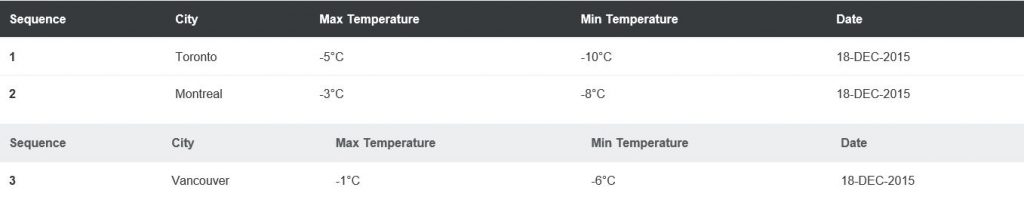
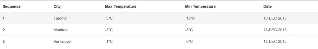
3. Table Head Inverse options in Bootstrap v4 [class=”thead-inverse” or “thead-default”]
Instead of Inversing the entire table, we can just inverse the head of the table by using either .thead-inverse or .thead-default classes. The following is an example on the table head inverse option in Bootstrap v4.
<!DOCTYPE html>
<html lang="en">
<head>
<!-- Required meta tags always come first -->
<meta charset="utf-8">
<meta name="viewport"
	content="width=device-width, initial-scale=1, shrink-to-fit=no">
<meta http-equiv="x-ua-compatible" content="ie=edge">
<!-- Bootstrap CSS -->
<link rel="stylesheet"
	href="https://maxcdn.bootstrapcdn.com/bootstrap/4.0.0-alpha.2/css/bootstrap.min.css"
	integrity="sha384-y3tfxAZXuh4HwSYylfB+J125MxIs6mR5FOHamPBG064zB+AFeWH94NdvaCBm8qnd"
	crossorigin="anonymous">
<title>Inverse Head Option</title>
</head>
<body>
	<table class="table">
		<thead class="thead-inverse"><!-- inverse head class .thead-inverse -->
			<tr>
				<th>Sequence</th>
				<th>City</th>
				<th>Max Temperature</th>
				<th>Min Temperature</th>
				<th>Date</th>
			</tr>
		</thead>
		<tbody>
			<tr>
				<th scope="row">1</th>
				<td>Toronto</td>
				<td>-5°C</td>
				<td>-10°C</td>
				<td>18-DEC-2015</td>
			</tr>
			<tr>
				<th scope="row">2</th>
				<td>Montreal</td>
				<td>-3°C</td>
				<td>-8°C</td>
				<td>18-DEC-2015</td>
			</tr>
		</tbody>
	</table>
	<table class="table">
		<thead class="thead-default"><!-- inverse head class .thead-default -->
			<tr>
				<th>Sequence</th>
				<th>City</th>
				<th>Max Temperature</th>
				<th>Min Temperature</th>
				<th>Date</th>
			</tr>
		</thead>
		<tbody>
			<tr>
				<th scope="row">3</th>
				<td>Vancouver</td>
				<td>-1°C</td>
				<td>-6°C</td>
				<td>18-DEC-2015</td>
			</tr>
		</tbody>
	</table>
	<!-- jQuery first, then Bootstrap JS. -->
	<script
		src="https://ajax.googleapis.com/ajax/libs/jquery/2.1.4/jquery.min.js"></script>
	<script
		src="https://maxcdn.bootstrapcdn.com/bootstrap/4.0.0-alpha.2/js/bootstrap.min.js"
		integrity="sha384-vZ2WRJMwsjRMW/8U7i6PWi6AlO1L79snBrmgiDpgIWJ82z8eA5lenwvxbMV1PAh7"
		crossorigin="anonymous"></script>
</body>
</html>
Output: Table head inversion options output is as follows.
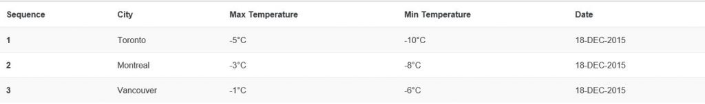
4. Striped Table in Bootstrap v4 [class=”table-striped”]
Stripped table has a shade of alternate dark and light color on the rows in a table. We can create a zig-zag pattern by using the class .table-striped. The following is an example of a striped table in Bootstrap v4.
<!DOCTYPE html>
<html lang="en">
<head>
<!-- Required meta tags always come first -->
<meta charset="utf-8">
<meta name="viewport"
	content="width=device-width, initial-scale=1, shrink-to-fit=no">
<meta http-equiv="x-ua-compatible" content="ie=edge">
<!-- Bootstrap CSS -->
<link rel="stylesheet"
	href="https://maxcdn.bootstrapcdn.com/bootstrap/4.0.0-alpha.2/css/bootstrap.min.css"
	integrity="sha384-y3tfxAZXuh4HwSYylfB+J125MxIs6mR5FOHamPBG064zB+AFeWH94NdvaCBm8qnd"
	crossorigin="anonymous">
<title>Striped Table</title>
</head>
<body>
	<table class="table table-striped"><!-- table class .table-striped -->
		<thead>
			<tr>
				<th>Sequence</th>
				<th>City</th>
				<th>Max Temperature</th>
				<th>Min Temperature</th>
				<th>Date</th>
			</tr>
		</thead>
		<tbody>
			<tr>
				<th scope="row">1</th>
				<td>Toronto</td>
				<td>-5°C</td>
				<td>-10°C</td>
				<td>18-DEC-2015</td>
			</tr>
			<tr>
				<th scope="row">2</th>
				<td>Montreal</td>
				<td>-3°C</td>
				<td>-8°C</td>
				<td>18-DEC-2015</td>
			</tr>
			<tr>
				<th scope="row">3</th>
				<td>Vancouver</td>
				<td>-1°C</td>
				<td>-6°C</td>
				<td>18-DEC-2015</td>
			</tr>
		</tbody>
	</table>
	<!-- jQuery first, then Bootstrap JS. -->
	<script
		src="https://ajax.googleapis.com/ajax/libs/jquery/2.1.4/jquery.min.js"></script>
	<script
		src="https://maxcdn.bootstrapcdn.com/bootstrap/4.0.0-alpha.2/js/bootstrap.min.js"
		integrity="sha384-vZ2WRJMwsjRMW/8U7i6PWi6AlO1L79snBrmgiDpgIWJ82z8eA5lenwvxbMV1PAh7"
		crossorigin="anonymous"></script>
</body>
</html>
Output: Striped table output is as follows.
5. Bordered Table in Bootstrap v4 [class=”table-bordered”]
A bordered table will display the border around rows and columns in a table. We can create a bordered table by using the class .table-bordered. The following is an example of a bordered table in Bootstrap v4.
<!DOCTYPE html>
<html lang="en">
<head>
<!-- Required meta tags always come first -->
<meta charset="utf-8">
<meta name="viewport"
	content="width=device-width, initial-scale=1, shrink-to-fit=no">
<meta http-equiv="x-ua-compatible" content="ie=edge">
<!-- Bootstrap CSS -->
<link rel="stylesheet"
	href="https://maxcdn.bootstrapcdn.com/bootstrap/4.0.0-alpha.2/css/bootstrap.min.css"
	integrity="sha384-y3tfxAZXuh4HwSYylfB+J125MxIs6mR5FOHamPBG064zB+AFeWH94NdvaCBm8qnd"
	crossorigin="anonymous">
<title>Bordered Table</title>
</head>
<body>
	<table class="table table-bordered"><!--table class .table-bordered -->
		<thead>
			<tr>
				<th>Sequence</th>
				<th>City</th>
				<th>Max Temperature</th>
				<th>Min Temperature</th>
				<th>Date</th>
			</tr>
		</thead>
		<tbody>
			<tr>
				<th scope="row">1</th>
				<td>Toronto</td>
				<td>-5°C</td>
				<td>-10°C</td>
				<td>18-DEC-2015</td>
			</tr>
			<tr>
				<th scope="row">2</th>
				<td>Montreal</td>
				<td>-3°C</td>
				<td>-8°C</td>
				<td>18-DEC-2015</td>
			</tr>
			<tr>
				<th scope="row">3</th>
				<td>Vancouver</td>
				<td>-1°C</td>
				<td>-6°C</td>
				<td>18-DEC-2015</td>
			</tr>
		</tbody>
	</table>
	<!-- jQuery first, then Bootstrap JS. -->
	<script
		src="https://ajax.googleapis.com/ajax/libs/jquery/2.1.4/jquery.min.js"></script>
	<script
		src="https://maxcdn.bootstrapcdn.com/bootstrap/4.0.0-alpha.2/js/bootstrap.min.js"
		integrity="sha384-vZ2WRJMwsjRMW/8U7i6PWi6AlO1L79snBrmgiDpgIWJ82z8eA5lenwvxbMV1PAh7"
		crossorigin="anonymous"></script>
</body>
</html>
Output: Bordered table output is as follows.
6. Mouse Hover Table in Bootstrap v4 [class=”table-hover”]
Mouse hover table will highlight the row on which we hover the mouse. We can create a mouse hover table by using the class .table-hover. The following is an example of a mouse hover table in Bootstrap v4.
<!DOCTYPE html>
<html lang="en">
<head>
<!-- Required meta tags always come first -->
<meta charset="utf-8">
<meta name="viewport"
	content="width=device-width, initial-scale=1, shrink-to-fit=no">
<meta http-equiv="x-ua-compatible" content="ie=edge">
<!-- Bootstrap CSS -->
<link rel="stylesheet"
	href="https://maxcdn.bootstrapcdn.com/bootstrap/4.0.0-alpha.2/css/bootstrap.min.css"
	integrity="sha384-y3tfxAZXuh4HwSYylfB+J125MxIs6mR5FOHamPBG064zB+AFeWH94NdvaCBm8qnd"
	crossorigin="anonymous">
<title>Bordered Table</title>
</head>
<body>
	<table class="table table-bordered"><!--table class .table-bordered -->
		<thead>
			<tr>
				<th>Sequence</th>
				<th>City</th>
				<th>Max Temperature</th>
				<th>Min Temperature</th>
				<th>Date</th>
			</tr>
		</thead>
		<tbody>
			<tr>
				<th scope="row">1</th>
				<td>Toronto</td>
				<td>-5°C</td>
				<td>-10°C</td>
				<td>18-DEC-2015</td>
			</tr>
			<tr>
				<th scope="row">2</th>
				<td>Montreal</td>
				<td>-3°C</td>
				<td>-8°C</td>
				<td>18-DEC-2015</td>
			</tr>
			<tr>
				<th scope="row">3</th>
				<td>Vancouver</td>
				<td>-1°C</td>
				<td>-6°C</td>
				<td>18-DEC-2015</td>
			</tr>
		</tbody>
	</table>
	<!-- jQuery first, then Bootstrap JS. -->
	<script
		src="https://ajax.googleapis.com/ajax/libs/jquery/2.1.4/jquery.min.js"></script>
	<script
		src="https://maxcdn.bootstrapcdn.com/bootstrap/4.0.0-alpha.2/js/bootstrap.min.js"
		integrity="sha384-vZ2WRJMwsjRMW/8U7i6PWi6AlO1L79snBrmgiDpgIWJ82z8eA5lenwvxbMV1PAh7"
		crossorigin="anonymous"></script>
</body>
</html>
Output: Mouse hover table output is as follows.
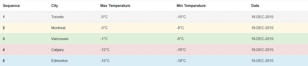
7. Context Table in Bootstrap v4
We can use the following classes at row or column level in a table to explain the context of that row or column as successful, active, neutral, warning, dangerous, etc.
- Class .table-active is used to hover the background color which is applied to row or cell level.
- Class .table-success is used to display a successful or positive action at row or cell level.
- Class .table-info is used to display a neutral or informative content at row or cell level.
- Class .table-warning is used to display a warning that requires an attention at row or cell level.
- Class .table-danger is used to display a dangerous or harmful action at row or cell level.
The following is an example of a context table in Bootstrap v4.
<!DOCTYPE html>
<html lang="en">
<head>
<!-- Required meta tags always come first -->
<meta charset="utf-8">
<meta name="viewport"
	content="width=device-width, initial-scale=1, shrink-to-fit=no">
<meta http-equiv="x-ua-compatible" content="ie=edge">
<!-- Bootstrap CSS -->
<link rel="stylesheet"
	href="https://maxcdn.bootstrapcdn.com/bootstrap/4.0.0-alpha.2/css/bootstrap.min.css"
	integrity="sha384-y3tfxAZXuh4HwSYylfB+J125MxIs6mR5FOHamPBG064zB+AFeWH94NdvaCBm8qnd"
	crossorigin="anonymous">
<title>Context Table</title>
</head>
<body>
	<table class="table">
		<thead>
			<tr>
				<th>Sequence</th>
				<th>City</th>
				<th>Max Temperature</th>
				<th>Min Temperature</th>
				<th>Date</th>
			</tr>
		</thead>
		<tbody>
			<tr class="table-active">
				<th scope="row">1</th>
				<td>Toronto</td>
				<td>-5°C</td>
				<td>-10°C</td>
				<td>18-DEC-2015</td>
			</tr>
			<tr class="table-warning">
				<th scope="row">2</th>
				<td>Montreal</td>
				<td>-3°C</td>
				<td>-8°C</td>
				<td>18-DEC-2015</td>
			</tr>
			<tr class="table-success">
				<th scope="row">3</th>
				<td>Vancouver</td>
				<td>-1°C</td>
				<td>-6°C</td>
				<td>18-DEC-2015</td>
			</tr>
			<tr class="table-danger">
				<th scope="row">4</th>
				<td>Calgary</td>
				<td>-12°C</td>
				<td>-16°C</td>
				<td>18-DEC-2015</td>
			</tr>
			<tr class="table-info">
				<th scope="row">5</th>
				<td>Edmonton</td>
				<td>-15°C</td>
				<td>-18°C</td>
				<td>18-DEC-2015</td>
			</tr>
		</tbody>
	</table>
	<!-- jQuery first, then Bootstrap JS. -->
	<script
		src="https://ajax.googleapis.com/ajax/libs/jquery/2.1.4/jquery.min.js"></script>
	<script
		src="https://maxcdn.bootstrapcdn.com/bootstrap/4.0.0-alpha.2/js/bootstrap.min.js"
		integrity="sha384-vZ2WRJMwsjRMW/8U7i6PWi6AlO1L79snBrmgiDpgIWJ82z8eA5lenwvxbMV1PAh7"
		crossorigin="anonymous"></script>
</body>
</html>
Output: Context table output is as follows.
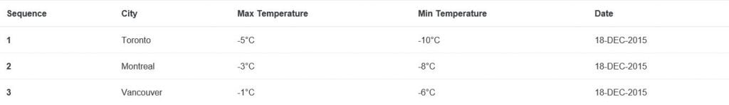
8. Responsive Table in Bootstrap v4
A responsive table shrinks to the size of the viewport of a particular device. We can create a responsive table by using a class .table-responsive within the <div> element tag that encapsulates a table. The following is an example of a responsive table in Bootstrap v4.
<!DOCTYPE html>
<html lang="en">
<head>
<!-- Required meta tags always come first -->
<meta charset="utf-8">
<meta name="viewport"
	content="width=device-width, initial-scale=1, shrink-to-fit=no">
<meta http-equiv="x-ua-compatible" content="ie=edge">
<!-- Bootstrap CSS -->
<link rel="stylesheet"
	href="https://maxcdn.bootstrapcdn.com/bootstrap/4.0.0-alpha.2/css/bootstrap.min.css"
	integrity="sha384-y3tfxAZXuh4HwSYylfB+J125MxIs6mR5FOHamPBG064zB+AFeWH94NdvaCBm8qnd"
	crossorigin="anonymous">
<title>Responsive Table</title>
</head>
<body>
	<div class="table-responsive">
		<!-- class .table-responsive -->
		<table class="table">
			<thead>
				<tr>
					<th>Sequence</th>
					<th>City</th>
					<th>Max Temperature</th>
					<th>Min Temperature</th>
					<th>Date</th>
				</tr>
			</thead>
			<tbody>
				<tr>
					<th scope="row">1</th>
					<td>Toronto</td>
					<td>-5°C</td>
					<td>-10°C</td>
					<td>18-DEC-2015</td>
				</tr>
				<tr>
					<th scope="row">2</th>
					<td>Montreal</td>
					<td>-3°C</td>
					<td>-8°C</td>
					<td>18-DEC-2015</td>
				</tr>
				<tr>
					<th scope="row">3</th>
					<td>Vancouver</td>
					<td>-1°C</td>
					<td>-6°C</td>
					<td>18-DEC-2015</td>
				</tr>
			</tbody>
		</table>
		<div>
			<!-- jQuery first, then Bootstrap JS. -->
			<script
				src="https://ajax.googleapis.com/ajax/libs/jquery/2.1.4/jquery.min.js"></script>
			<script
				src="https://maxcdn.bootstrapcdn.com/bootstrap/4.0.0-alpha.2/js/bootstrap.min.js"
				integrity="sha384-vZ2WRJMwsjRMW/8U7i6PWi6AlO1L79snBrmgiDpgIWJ82z8eA5lenwvxbMV1PAh7"
				crossorigin="anonymous"></script>
</body>
</html>
Output: A responsive table output is as follows.
9. Reflow Table in Bootstrap v4
Reflow table are designed to adjust to the shrink space and it converts rows in columns and vice-versa. We can create a reflow table by using class .table-reflow within the <table> tag element. The following is an example of a reflow table in Bootstrap v4.
<!DOCTYPE html>
<html lang="en">
<head>
<!-- Required meta tags always come first -->
<meta charset="utf-8">
<meta name="viewport"
	content="width=device-width, initial-scale=1, shrink-to-fit=no">
<meta http-equiv="x-ua-compatible" content="ie=edge">
<!-- Bootstrap CSS -->
<link rel="stylesheet"
	href="https://maxcdn.bootstrapcdn.com/bootstrap/4.0.0-alpha.2/css/bootstrap.min.css"
	integrity="sha384-y3tfxAZXuh4HwSYylfB+J125MxIs6mR5FOHamPBG064zB+AFeWH94NdvaCBm8qnd"
	crossorigin="anonymous">
<title>Reflow Table</title>
</head>
<body>
	<table class="table table-reflow">
		<thead>
			<tr>
				<th>Sequence</th>
				<th>City</th>
				<th>Max Temperature</th>
				<th>Min Temperature</th>
				<th>Date</th>
			</tr>
		</thead>
		<tbody>
			<tr>
				<th scope="row">1</th>
				<td>Toronto</td>
				<td>-5°C</td>
				<td>-10°C</td>
				<td>18-DEC-2015</td>
			</tr>
			<tr>
				<th scope="row">2</th>
				<td>Montreal</td>
				<td>-3°C</td>
				<td>-8°C</td>
				<td>18-DEC-2015</td>
			</tr>
			<tr>
				<th scope="row">3</th>
				<td>Vancouver</td>
				<td>-1°C</td>
				<td>-6°C</td>
				<td>18-DEC-2015</td>
			</tr>
		</tbody>
	</table>
	<!-- jQuery first, then Bootstrap JS. -->
	<script
		src="https://ajax.googleapis.com/ajax/libs/jquery/2.1.4/jquery.min.js"></script>
	<script
		src="https://maxcdn.bootstrapcdn.com/bootstrap/4.0.0-alpha.2/js/bootstrap.min.js"
		integrity="sha384-vZ2WRJMwsjRMW/8U7i6PWi6AlO1L79snBrmgiDpgIWJ82z8eA5lenwvxbMV1PAh7"
		crossorigin="anonymous"></script>
</body>
</html>
Output: Reflow table output is as follows.
10. Small table in Bootstrap v4
We can use a small table when we need to display a large of elements (rows and columns) within a limited size of viewport. We can create small table by using class .table-sm. The following is an example of small table in Bootstrap v4.
<!DOCTYPE html>
<html lang="en">
<head>
<!-- Required meta tags always come first -->
<meta charset="utf-8">
<meta name="viewport"
	content="width=device-width, initial-scale=1, shrink-to-fit=no">
<meta http-equiv="x-ua-compatible" content="ie=edge">
<!-- Bootstrap CSS -->
<link rel="stylesheet"
	href="https://maxcdn.bootstrapcdn.com/bootstrap/4.0.0-alpha.2/css/bootstrap.min.css"
	integrity="sha384-y3tfxAZXuh4HwSYylfB+J125MxIs6mR5FOHamPBG064zB+AFeWH94NdvaCBm8qnd"
	crossorigin="anonymous">
<title>Small Table</title>
</head>
<body>
	<table class="table table-sm">
		<thead>
			<tr>
				<th>Sequence</th>
				<th>City</th>
				<th>Max Temperature</th>
				<th>Min Temperature</th>
				<th>Date</th>
				<th>Country</th>
				<th>Geography</th>
				<th>Weather Forecast</th>
			</tr>
		</thead>
		<tbody>
			<tr>
				<th scope="row">1</th>
				<td>Toronto</td>
				<td>-5°C</td>
				<td>-10°C</td>
				<td>18-DEC-2015</td>
				<td>Canada</td>
				<td>North America</td>
				<td>Snow Storm</td>
			</tr>
			<tr>
				<th scope="row">2</th>
				<td>Montreal</td>
				<td>-3°C</td>
				<td>-8°C</td>
				<td>18-DEC-2015</td>
				<td>Canada</td>
				<td>North America</td>
				<td>Sunny</td>
			</tr>
			<tr>
				<th scope="row">3</th>
				<td>Vancouver</td>
				<td>-1°C</td>
				<td>-6°C</td>
				<td>18-DEC-2015</td>
				<td>Canada</td>
				<td>North America</td>
				<td>Ice Rain</td>
			</tr>
		</tbody>
	</table>
	<!-- jQuery first, then Bootstrap JS. -->
	<script
		src="https://ajax.googleapis.com/ajax/libs/jquery/2.1.4/jquery.min.js"></script>
	<script
		src="https://maxcdn.bootstrapcdn.com/bootstrap/4.0.0-alpha.2/js/bootstrap.min.js"
		integrity="sha384-vZ2WRJMwsjRMW/8U7i6PWi6AlO1L79snBrmgiDpgIWJ82z8eA5lenwvxbMV1PAh7"
		crossorigin="anonymous"></script>
</body>
</html>
Output:Small table output is as follows.
Conclusion
In this chapter, we have explored several new classes for HTML table that are introduced in Bootstrap v4 along with practical examples.
