

In this article, we are going to explore the grid tier system and breakpoint feature of Bootstrap v4. The Grid system enables us to create advanced layouts by using the rows and columns. In Bootstrap v4 Grid system, we can create a maximum of 12 columns with the different viewport size specifications (e.g. mobile devices, laptop, tablets, etc.).
The following is an example of a Bootstrap grid:
<!DOCTYPE html>
<html lang="en">
<head>
<!-- Required meta tags always come first -->
<meta charset="utf-8">
<meta name="viewport"
	content="width=device-width, initial-scale=1, shrink-to-fit=no">
<meta http-equiv="x-ua-compatible" content="ie=edge">
<!-- Bootstrap 4 alpha CSS -->
<link rel="stylesheet"
	href="https://maxcdn.bootstrapcdn.com/bootstrap/4.0.0-alpha.4/css/bootstrap.min.css"
	integrity="sha384-2hfp1SzUoho7/TsGGGDaFdsuuDL0LX2hnUp6VkX3CUQ2K4K+xjboZdsXyp4oUHZj"
	crossorigin="anonymous">
	<!-- Styles (so that we can see the grid) -->
<style scoped>
.bs-grid-system  div[class^="col"] {
	border: 2px solid white;
	background: #f5f6f7;
	text-align: center;
	padding-top: 9px;
	padding-bottom: 9px;
}
</style>
<title>Grid Systems</title>
</head>
<body>
	<br>
	<div class="bs-grid-system">
		<!-- Bootstrap Grid -->
		<div class="row">
			<div class="col-xs-1">Column-xs-1st</div>
			<div class="col-xs-1">Column-xs-2nd</div>
			<div class="col-xs-1">Column-xs-3rd</div>
			<div class="col-xs-1">Column-xs-4th</div>
			<div class="col-xs-1">Column-xs-5th</div>
			<div class="col-xs-1">Column-xs-6th</div>
			<div class="col-xs-1">Column-xs-7th</div>
			<div class="col-xs-1">Column-xs-8th</div>
			<div class="col-xs-1">Column-xs-9th</div>
			<div class="col-xs-1">Column-xs-10th</div>
			<div class="col-xs-1">Column-xs-11th</div>
			<div class="col-xs-1">Column-xs-12th</div>
		</div>
		<div class="row">
			<div class="col-xs-2">Column-xs-2 spots</div>
			<div class="col-xs-3">Column-xs-3 spots</div>
			<div class="col-xs-7">Column-xs-7 spots</div>
		</div>
		<div class="row">
			<div class="col-xs-3">Column-xs-3 spots</div>
			<div class="col-xs-3">Column-xs-3 spots</div>
			<div class="col-xs-3">Column-xs-3 spots</div>
			<div class="col-xs-3">Column-xs-3 spots</div>
		</div>
		<div class="row">
			<div class="col-xs-12">Column-xs-12 spots</div>
		</div>
		<div class="row">
			<div class="col-xs-4">Column-xs-4 spots</div>
			<div class="col-xs-8">Column-xs-8 spots</div>
		</div>
		<div class="row">
			<div class="col-xs-6">Column-xs-6 spots</div>
			<div class="col-xs-6">Column-xs-6 spots</div>
		</div>
	</div>
	<br>
	<!-- jQuery first, then Bootstrap JS. All Inclusive Plug-in -->
	<script
		src="https://ajax.googleapis.com/ajax/libs/jquery/2.1.4/jquery.min.js"></script>
	<script src="dist/js/bootstrap.min.js"></script>
</body>
</html>
Output

Explanation of code
- The first row has 12 columns and for each column, we have used the .col-xs-1 class. It means that, the xs column (extra small column) is going to occupy a single spot out of 12 spots in a row. Therefore, under the .row class, we have defined 12 such columns so that they occupy all the 12 spots for that row.
- In the 2nd row, we have defined 3 columns where 1st column occupies 2 spots, followed by 2nd column and third column which occupies 3 and 7 spots respectively.
- In the 3rd row, we have defined 4 columns of equal size with each column occupies 3 spots (i.e. .col-xm-3 class).
- In the 4th row, we have defined only a single column that occupies 12 spots (i.e. .col.xm-12 class).
- In the 5th row, we have defined 2 rows where the first column occupies 4 spots and the second column occupies 8 spots.
- In the 6th row, we have defined two columns of equal lengths of 6 spots each (i.e. .col-xm-6 class).
Grid Sizes
In the above example, we have used the column size as .col-xs-. In Bootstrap v4, there are total 5 column sizes are available. They are as follows.
- Extra small (i.e. .col-xs-* class).
- Small (i.e. .col-sm-* class).
- Medium (i.e. .col-md-* class).
- Large (i.e. .col-lg-* class).
- Extra-large (i.e. .col-xl-* class).
Let’s compare the actual size and other features for each of the column type on how different grid options work with different viewport sizes in the following table.
|
FEATURES |
Extra small <34em |
Small ≥34em |
Medium ≥48em |
Large ≥62em |
Extra-large ≥75em |
|
Class |
.col-xs-* |
.col-sm-* |
.col-md-* |
.col-lg-* |
.col-xl-* |
|
Width of Container |
None (auto) |
34rem |
45rem |
60rem |
72.25rem |
|
Allowed columns |
Max 12 |
Max 12 |
Max 12 |
Max 12 |
Max 12 |
|
Grid behavior |
Always Horizontal |
Collapsed to start, horizontal above the breakpoints. |
|||
|
Gutter width |
30px (15px on each side of a column). |
||||
|
Column order |
Yes |
Yes |
Yes |
Yes |
Yes |
|
Nestable |
Yes |
Yes |
Yes |
Yes |
Yes |
|
Offsets |
Yes |
Yes |
Yes |
Yes |
Yes |
Interesting things to know about Grid Systems in Bootstrap v4
- Containers: Grids should always be placed in the container either by using .container class or the .container-fluid class. This will help in the appropriate alignment and padding.
- Rows & Columns: A row may contain from 1 column to the maximum of 12 columns. The width of the column is adjustable within the 12 spots for a row. The content is present in the columns which are immediate children of a row.
- Padding: Padding is present for the columns. The interesting thing to note here is that the padding on the first and the last column is offset by a negative margin on the row.
- What will happen when we place more than 12 columns per row? If we attempt to define more than 12 columns for a single row then the columns will wrap to a new line. For example, if we have defined two columns as .col-lg-9 and .col.lg-4 then the column with .col.lg-4 class will wrap to the next new line.
- What will happen when we place less than 12 Columns per Row? It is not necessary to use all the 12 column spots in a row. Therefore, we can use any number of columns within the 12 column spots and if exceed that then it will be wrapped to the next line.
- Grid Classes: We can apply Grid classes to the devices with their screen widths greater than or equal to the breakpoint sizes. Also, we can override these grid classes targeting the smaller devices. Therefore, when we use .col-xs-* class, it will not only affect the devices with extra small viewport but also the small, medium and large devices viewports (unless we have defined viewport sizes via media query for a col-sm-*, col-md-* and/or col-lg-*).
- Multiple Classes: We can use multiple classes in collaboration for a given element. E.g. we can use class=”col-sm-9 col-md-5″ in order to specify 9 columns for small viewports and 5 columns for medium and large viewports.
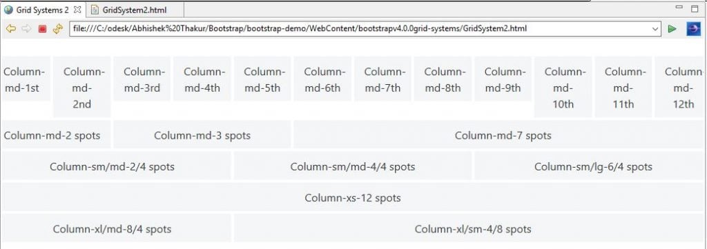
Medium Sized Device Columns, Grid Class Override and Multiple Classes
In the following example, we are going to use .col-md-* for medium sizes view ports which will override large and extra-large sized viewports as well. Also, we are using multiple classes to define the column spots for a row depending on the size of the devices’ viewport.
<!DOCTYPE html>
<html lang="en">
<head>
<!-- Required meta tags always come first -->
<meta charset="utf-8">
<meta name="viewport"
	content="width=device-width, initial-scale=1, shrink-to-fit=no">
<meta http-equiv="x-ua-compatible" content="ie=edge">
<!-- Bootstrap 4 alpha CSS -->
<link rel="stylesheet"
	href="https://maxcdn.bootstrapcdn.com/bootstrap/4.0.0-alpha.4/css/bootstrap.min.css"
	integrity="sha384-2hfp1SzUoho7/TsGGGDaFdsuuDL0LX2hnUp6VkX3CUQ2K4K+xjboZdsXyp4oUHZj"
	crossorigin="anonymous">
	<!-- Styles (so that we can see the grid) -->
<style scoped>
.bs-grid-system  div[class^="col"] {
	border: 2px solid white;
	background: #f5f6f7;
	text-align: center;
	padding-top: 9px;
	padding-bottom: 9px;
}
</style>
<title>Grid Systems 2</title>
</head>
<body>
	<br>
	<div class="bs-grid-system">
		<!-- Bootstrap Grid -->
		<div class="row">
			<div class="col-md-1">Column-md-1st</div>
			<div class="col-md-1">Column-md-2nd</div>
			<div class="col-md-1">Column-md-3rd</div>
			<div class="col-md-1">Column-md-4th</div>
			<div class="col-md-1">Column-md-5th</div>
			<div class="col-md-1">Column-md-6th</div>
			<div class="col-md-1">Column-md-7th</div>
			<div class="col-md-1">Column-md-8th</div>
			<div class="col-md-1">Column-md-9th</div>
			<div class="col-md-1">Column-md-10th</div>
			<div class="col-md-1">Column-md-11th</div>
			<div class="col-md-1">Column-md-12th</div>
		</div>
		<div class="row">
			<div class="col-md-2">Column-md-2 spots</div>
			<div class="col-md-3">Column-md-3 spots</div>
			<div class="col-md-7">Column-md-7 spots</div>
		</div>
		<div class="row">
			<div class="col-sm-2 col-md-4">Column-sm/md-2/4 spots</div>
			<div class="col-sm-4 col-md-4">Column-sm/md-4/4 spots</div>
			<div class="col-sm-6 col-lg-4">Column-sm/lg-6/4 spots</div>
		</div>
		<div class="row">
			<div class="col-xl-12">Column-xs-12 spots</div>
		</div>
		<div class="row">
			<div class="col-xl-8 col-md-4">Column-xl/md-8/4 spots</div>
			<div class="col-xl-4 col-sm-8">Column-xl/sm-4/8 spots</div>
		</div>
	</div>
	<br>
	<!-- jQuery first, then Bootstrap JS. All Inclusive Plug-in -->
	<script
		src="https://ajax.googleapis.com/ajax/libs/jquery/2.1.4/jquery.min.js"></script>
	<script src="dist/js/bootstrap.min.js"></script>
</body>
</html>
Output
Conclusion:
In this article, we discussed the popular grid system and its interesting features for Bootstrap v4 along with demo examples.
