In this topic, we are going to talk about the Bootstrap 4.0.0 project and its new features which are added or updated over the existing features (earlier Bootstrap versions) and the old features which are dropped permanently. After going through this topic, one can realize that Bootstrap v4 framework is the complete new form of Bootstrap and has the following remarkable amendments as compared to its previous versions.
What Browsers are supported?
It is very important to know which browsers are officially supported by Bootstrap v4.
Bootstrap v4 supports IE9 (Internet Explorer 9) and its higher end versions.
On iOS side, it supports browsers on iOS 7 and its higher end versions.
It has now added the support for Android v5.0 Lollipop’s Browser and WebView, which were previously supported unofficially for their earlier versions.
What are the global changes in Bootstrap v4?
The following are the global changes in Bootstrap v4.
Source CSS files switched from less to SCSS.
Primary CSS unit switched from pixels to rem. The pixel based units have moved to relative em/rem based units which have the base font-size of 16 pixels.
Global font-size changed and increased from 14 pixels to 16 pixels.
New Grid tier new grid tier has been added for ~480px and below in Bootstrap v4.
Configurable options the separate optional theme has been replaced with the configurable options via SCSS variables such as $enable-gradients: true, etc.
What new components are added or dropped in Bootstrap v4?
As mentioned earlier, the latest version of Bootstrap can be considered as a complete new project when compared to its earlier version. The following is the summary of new components which are added and old components which are removed.
Summary of New components added to Bootstrap v4
|
S No. |
Components |
Description |
|
1. |
Cards |
Cards are a more flexible component which have replaced panels, thumbnails, and wells completely in Bootstrap v4. |
|
2. |
New navbar |
The new navbar has replaced the previous navbar with a new, simpler component. |
|
3. |
New progress bars |
The new progress bar has replaced the old .progress <div> with a real <progress> element. |
|
4. |
New table variants |
New table variants have added multiple new features such as .table-inverse, table head options, .table-reflow, .table-sm, etc. |
|
5. |
New utility classes and Print classes |
Bootstrap v4 has the various utility classes which display or hide the content on the viewport of the device via media query. |
Summary of dropped components from Bootstrap v4
|
S No. |
Components |
Description |
|
1. |
Panels |
Replaced by Cards in Bootstrap v4. |
|
2. |
Thumbnails |
Replaced by Cards in Bootstrap v4. |
|
3. |
Wells |
Replaced by Cards in Bootstrap v4. |
|
4. |
Justified navs |
Removed completely. |
The following are the detailed changes in components for Bootstrap v4.
1. Cards have been introduced in Bootstrap 4 which cover features such as existing panels, thumbnails, and wells. Therefore, these (panels, thumbnails, and wells) components are permanently dropped in Bootstrap v4. The following is an example of card.

2. The Glyphicons icon font has been dropped in Bootstrap v4. Instead, one can now use the other options to procure such type of icons. They are the upstream version of Glyphicons, Octicons and Font Awesome.
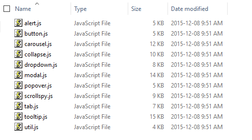
3. The Affix jQuery plugin has been dropped in Bootstrap v4. Instead, one can use a position: sticky polyfill to procure the same function. While using Affix to apply additional, non-position styles, we need to make sure to use the third-party ScrollPos-Styler library as the polyfills might not support this use case anymore. All plugins can be located in the package bootstrap-4.0.0-alpha.2/dist/src/umd. There are total 11 plugins in Bootstrap 4.0.0-alpha as shown below.

4. All components are refactored to use more un-nested classes in place of the children selectors.
What are the miscellaneous changes in Bootstrap v4?
The following are the miscellaneous changes in Bootstrap v4.
- There is no support for the usage of Bootstrap which is Non-responsive.
- The online Customizer has been dropped in Bootstrap v4. Instead it focuses on customized builds and extensive setup documentation.
What all are the detailed component wise changes in Bootstrap v4?
The following list shows the keys changes in the components of Bootstrap project between v3.x.x and v4.0.0.
1. Buttons: – The following are the changes in this component of Bootstrap v4.
- The .btn-default has been renamed to .btn-secondary.
- The .btn-xs class has been dropped entirely.
- Bootstrap v4 project has dropped the state full button feature of the button.js jQuery plugin. It includes the $().button (string) and $().button (‘reset’) methods.
- The other features of the plugin such as the button checkboxes, button radios, and single-toggle buttons have been retained in Bootstrap v4.
2. Button group: – The following are the changes in this component of Bootstrap v4.
- The .btn-group-xs class has been dropped entirely.
3. Carousel: – The following are the changes in this component of Bootstrap v4.
- The .item has been renamed to .carousel-item.
4. Forms: – The following are the changes in this component of Bootstrap 4.
- In Bootstrap v4, the moved element resets to the _reboot.scss file.
- In Bootstrap v4, .control-label has renamed to .form-control-label.
- In Bootstrap v4, .input-lg and .input-sm have renamed to .form-control-lg and .form-control-sm, respectively.
- In Bootstrap v4, .form-group-* classes has been removed for simplicity’s sake. Instead, use .form-control-* classes now.
- Horizontal forms overhauled in In Bootstrap v4,
- In Bootstrap v4, dropped the .form-horizontal class requirement.
.form-group no longer mixins the .row class, so it’s now required for grid layouts in In Bootstrap v4, - In Bootstrap v4, new .form-control-label class has been added to vertically center labels with .form-controls.
- Grid system: – As discussed earlier, the Bootstrap v4 project has added a new ~480px grid breakpoint which means that there are now five total tiers.
- Images: – The .img-responsive has been renamed to .img-fluid.
- Pager: – The .previous and .next have been renamed to .pager-prev and .pager-next.
- Pagination: – The explicit classes (.page-item, .page-link) are now required on the descendants of .paginations.
Panels, thumbnails, and wells: – These components are completely dropped and the new card component has been introduced in their place.
Panels: – The following are the changes in the panels component of Bootstrap v4.
- .panel has changed to .card.
- .panel-default has been removed and has no replacement.
- .panel-heading has changed to .card-header.
- .panel-title has changed to .card-title.
- .panel-body has changed to .card-block.
- .panel-footer has changed to .card-footer.
- .panel-primary has changed to .card-primary and .card-inverse.
- .panel-success has changed to .card-success and .card-inverse.
- .panel-info has changed to .card-info and .card-inverse.
- .panel-warning has changed to .card-warning and .card-inverse.
- .panel-danger has changed to .card-danger and .card-inverse.
Reboot: –
- It is a new stylesheet which is added to Bootstrap v4 that builds on Normalize with reset styles.
- This file has selectors which use only elements as there are no classes.
- This is the complete isolation of the reset styles from the component styles with the vision of more modular approach.
- The most important resets are the box-sizing: border change, moving from rem to em units on many elements, link styles, etc.
Tables: – The following are the changes in this component of Bootstrap v4.
- Almost, all instances of the > selector have been removed which means the nested tables will now automatically inherit styles from their parents. This change will simplify our selectors and their potential customizations.
- The responsive tables no longer require a wrapping element. A responsive table shrinks to the size of the viewport of a particular device. Instead, just put the .table-responsive right on the <table>tag. The following is an example of responsive table.

- .table-condensed has been renamed to .table-sm for consistency. The following is the GUI example for small table.

- A new .table-inverse option has been added to tables. The following is an example of inverse table.

- A new .table-reflow option has been added to tables. The following is an example of inverse table.

- The table header modifiers: .thead-default and .thead-inverse have been added to tables. The following is an example of header modifiers.

Typography: – All .text- utilities have been moved to the _utilities.scss file.
- The .page-header class has been dropped entirely.
- .dl-horizontal in Bootstrap 4 requires grid classes and now it has increased flexibility in column widths.
- Customized <blockquote> styling has been moved to classes—.blockquote and the .blockquote-reverse modifier.
Navbar: – The .navbar-form class has been dropped entirely as it is not at all required.
Navs: – Nearly all > selectors have been dropped for simpler styling via un-nested classes.
- In place of HTML-specific selectors like .nav > li > a, now in Bootstrap v4, we use separate classes for .navs, .nav-items, and .nav-links. This will make our HTML more flexible with increased extensibility.
Other Utilities level change: –
- The .pull-{xs, sm, md, lg, xl}-{left, right, none} classes have been added for responsive floats.
- The .pull-left and .pull-right have been removed since they are redundant to .pull-xs-left and .pull-xs-right.
What are the dropped Responsive utilities in the new Bootstrap?
The following deprecated variables have been removed in Bootstrap v4.0.0:
- @screen-phone, @screen-tablet, @screen-desktop, @screen-lg-desktop are removed. Instead of these variables use the more abstract $screen-{xs, sm, md, lg, xl}-* variables.
- @screen-sm, @screen-md, @screen-lg are removed. Instead of these variables use the more clearly named $screen-{xs, sm, md, lg, xl}-min variables.
- @screen-xs, @screen-xs-min are removed. Instead of these variables use this variables ($screen-xs-max).
The responsive utility classes that have also been overhauled are as follows:
- The old classes (.hidden-xs .hidden-sm .hidden-md .hidden-lg .visible-xs-block .visible-xs-inline .visible-xs-inline-block .visible-sm-block .visible-sm-inline .visible-sm-inline-block .visible-md-block .visible-md-inline .visible-md-inline-block .visible-lg-block .visible-lg-inline .visible-lg-inline-block) are complete removed in Bootstrap v4. They have been replaced by .hidden-xs-up .hidden-xs-down .hidden-sm-up .hidden-sm-down .hidden-md-up .hidden-md-down .hidden-lg-up .hidden-lg-down.
- These .hidden-*-up classes hide the element in case the viewport is at the given breakpoint or larger (e.g. .hidden-md-up hides an element on medium, large, and extra-large devices).
- The .hidden-*-down classes hide the element in case the viewport is at the given breakpoint or smaller (e.g. .hidden-md-down hides an element on extra-small, small, and medium devices).
- Instead of using explicit .visible-* classes, we can make a web element visible by simply not hiding it at that screen size. Also, we can combine one .hidden-*-up class with one .hidden-*-down class to show a particular web element only on a given interval of screen sizes (e.g. .hidden-sm-down.hidden-xl-up shows the element only on medium and large devices).
What are the other dropped Bootstrap v4 features?
- In Bootstrap v4, the min–moz-device-pixel-ratio typo hack has been removed which was used for retina media queries.
- The .hidden and .show have been dropped entirely. This is because they were conflicting with jQuery’s $(…).hide () and $(…).show () methods.
- Change buttons’ [disabled] to: disabled as Internet Explorer 9+ Supports: disabled.
Conclusion
In this chapter, we have covered the various features which are added, updated and dropped in Bootstrap v4. In the following chapter, we will implement new features of Bootstrap v4 such as inverse tables and other classes, cards, media queries with SaaS, etc. practically.


