
Media Query
Media Query is a CSS technique that was introduced in CSS3, which allows application of the stylesheet properties on the web component based on the size of the viewport. In other words, it first detects the size of the screen of the device (smart phones, tablets, laptop, etc.) and based on that, it applies the stylesheet properties (component display features on web browser) to the web components present on the webpage.
CSS syntax is the @media rule that includes a block of CSS properties when the viewport size condition becomes true. Let’s understand this concept better with the help of following examples.
<html>
<head>
<meta name="viewport" content="width=device-width, initial-scale=1.0"/>
<style>
body {
    background-color: yellow;
}

@media only screen and (max-width: 400px) {
    body {
        background-color: green;
    }
}
</style>
<title>Media Queries Demo</title>
</head>
<body>
<p>If you want to see the background color as green then resize the window less than 400 pixels. Otherwise background color will be yellow.</p>
</body>
</html>
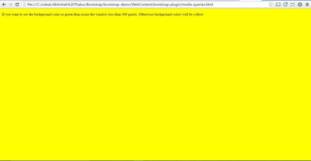
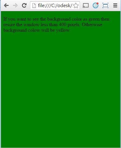
Output: It is bit tricky here. I would suggest using Google Chrome, where you can resize the browser window easily with the help of resize button present at its top right corner as shown below.
Case 1: When the size of the viewport (here browser) is greater than 400 pixels then the background color visible is yellow.
Case 2: Use the browser’s resize button and reduce the width of the viewport to less than 400 pixels. There we may notice the background color will get changed to green.
The following are viewport screenshots for both the case.
Screenshot for the case 1, when the size of the viewport is greater than 400 pixels.
Screenshot for the case 2, when the size of the viewport is less than 400 pixels.
Adding a breakpoint to Media Queries
Breakpoint is a method where we define the maximum or minimum width of the viewport of screen that triggers the change of CSS properties. The following are the media queries that could be used in our CSS files in order to create the key breakpoints in the grid system of the Bootstrap. In Bootstrap, any viewport which is less than the size of 768 pixels (i.e. extra small devices such as phones, etc.), no media queries are required as this is the default in Bootstrap.
/* Small devices (tablets or large size smart phone of size 768px and up) */
@media (min-width: @screen-sm-min) { ... }

/* Medium devices (desktops, laptops of size 992px and up) */
@media (min-width: @screen-md-min) { ... }

/* Large devices (large desktops, screens of size 1200px and up) */
@media (min-width: @screen-lg-min) { ... }
Bootstrap v4 with SAAS
When using Bootstrap with SAAS, we are writing our source CSS in SASS therefore, all of our media queries are available via SASS mixins as shown below.
/* Breakpoint for extra-small viewport */
@include media-breakpoint-up(xs) { ... }
/* Breakpoint for small viewport */
@include media-breakpoint-up(sm) { ... }
/* Breakpoint for medium viewport */
@include media-breakpoint-up(md) { ... }
/* Breakpoint for large viewport */
@include media-breakpoint-up(lg) { ... }
/* Breakpoint for extra-large viewport */
@include media-breakpoint-up(xl) { ... }

// Usage in example for medium viewport:
@include media-breakpoint-up(md) {
  .utility-class {
    background-color: green;
  }
}
Difference between Bootstrap 3.3.6 vs Bootstrap 4.0.0 Breakpoints
In Bootstrap 4.0.0, the pixel based units have moved to relative em/rem based units which has the base font-size of 16 pixels. Also, the grid in v4 has been broken down into further sub-divisions.
We need to first understand the grid breakpoints within Bootstrap v4 before we move on to our work with Sass files for media queries. The following is the neat table that show the translation of em/rem to pixels.
|
Grid Breakpoint |
Container Max Width |
|||
|
em |
px |
em |
px |
|
|
xs |
0 |
0 |
– |
– |
|
sm |
34em |
544px |
34rem |
544px |
|
md |
48em |
768px |
45rem |
720px |
|
lg |
62em |
992px |
60rem |
960px |
|
xl |
75em |
1200px |
72.25rem |
1156px |
When we are using Bootstrap 3.3.6 with SAAS, our media queries will have the min-width or max-width width specified in pixels as shown below.
/* Extra small viewport or screen */
@media only screen and (min-width : 480px) {
// write CSS properties here
}
/* Small viewport or screen */
@media only screen and (min-width : 768px) {
// write CSS properties here
}
/* Medium viewport or screen */
@media only screen and (min-width : 992px) {
// write CSS properties here
}
/* Large viewport or screen */
@media only screen and (min-width : 1200px) {
 // write CSS properties here
}
When we are using Bootstrap 4.0.0 with SAAS, our media queries will have the min-width or max-width width specified in relative em/rem based units as shown below.
// Extra small devices (smart phones, less than 34em)
@media (max-width: 33.9em) {
// write CSS properties here
 }
// Small devices (phones, tablets less than 48em)
@media (max-width: 47.9em) {
// write CSS properties here
}

// Medium devices (tablets, small laptops less than 62em)
@media (max-width: 61.9em) {
// write CSS properties here
 }

// Large devices (desktops, screens less than 75em)
@media (max-width: 74.9em) {
// write CSS properties here
}
This is to be noted that extra-large devices greater than 75em of size does not require media query since the extra-large breakpoint has no upper bound on its width.
Example on Media Queries using Bootstrap v4.0.0
In the following example, when we change the size of the view port (here browser), we will observe the changing background color depending on the size of the viewport or screen.
<!DOCTYPE html>
<html lang="en">
<head>
<!-- Required meta tags always come first -->
<meta charset="utf-8">
<meta name="viewport"
	content="width=device-width, initial-scale=1, shrink-to-fit=no">
<meta http-equiv="x-ua-compatible" content="ie=edge">
<!-- Bootstrap CSS -->
<link rel="stylesheet" href="dist/css/bootstrap.min.css">
<style>
body {
    background-color: violet;
}
@media only screen and (min-width: 33.9em) {
	body {
        background-color: indigo;
    }
}
@media only screen and (min-width: 47.9em) {
	body {
        background-color: blue;
    }
}
@media only screen and (min-width: 61.9em) {
	body {
        background-color: yellow;
    }
 }
@media only screen and (min-width: 74.9em) {
	body {
        background-color: orange;
    }
}
</style>
<title>Bootstrap Media Queries</title>
</head>
<p>If you want to see changing background color then adjust the viewport size.</p>
	<!-- jQuery first, then Bootstrap JS. All Inclusive Plug-in -->
	<script src="https://ajax.googleapis.com/ajax/libs/jquery/2.1.4/jquery.min.js"></script>
	<script src="dist/js/bootstrap.min.js"></script>
</body>
</html>
Bootstrap Utility classes using media Queries
Bootstrap v4 has various utility classes which display or hide the content on the viewport of the device via media query. These utility classes help in faster mobile-friendly development. Bootstrap 4.0.0 also includes other utility classes which help to toggle content when they are printed. Such utility classes are recommended to be used on the need basis in order to mitigate the creation of a different version of the same website. The following are the available Utility classes in Bootstrap v4 that interact via Media queries.
The .hidden-*-up classes are used to hide the element when the viewport is at the given breakpoint or wider than that. E.g., .hidden-md-up will hide an element on medium, large, and extra-large viewports on various devices.
The .hidden-*-down classes are used to hide the element when the viewport is at the given breakpoint or smaller than that. E.g., .hidden-md-down will hide an element on extra-small, small, and medium viewports on various devices.
This is to be noted that there are no explicit “visible”/”show” responsive utility classes and we can make an element visible if we don’t hide it at that breakpoint size.
We can use the combination of one .hidden-*-up class with one .hidden-*-down class in order to show an element only on a given interval of screen sizes. E.g., .hidden-sm-down.hidden-xl-up shows the element only on medium and large viewports on various devices.
Lastly, we should use custom CSS when these utility classes fail to accommodate any less common case where an element’s visibility can’t be expressed as a single contiguous range of viewport breakpoint sizes.
The following is the summary of Utility classes in Bootstrap v4 for Media Queries.
|
Utility Classes |
Extra Small Devices |
Small Devices |
Medium Devices |
Large Devices |
Extra-large Devices |
|
.hidden-xs-down |
Hidden |
Visible |
Visible |
Visible |
Visible |
|
.hidden-sm-down |
Hidden |
Hidden |
Visible |
Visible |
Visible |
|
.hidden-md-down |
Hidden |
Hidden |
Hidden |
Visible |
Visible |
|
.hidden-lg-down |
Hidden |
Hidden |
Hidden |
Hidden |
Visible |
|
.hidden-xl-down |
Hidden |
Hidden |
Hidden |
Hidden |
Hidden |
|
.hidden-xs-up |
Hidden |
Hidden |
Hidden |
Hidden |
Hidden |
|
.hidden-sm-up |
Visible |
Hidden |
Hidden |
Hidden |
Hidden |
|
.hidden-md-up |
Visible |
Visible |
Hidden |
Hidden |
Hidden |
|
.hidden-lg-up |
Visible |
Visible |
Visible |
Hidden |
Hidden |
|
.hidden-xl-up |
Visible |
Visible |
Visible |
Visible |
Hidden |
Print Classes
In addition to the regular utility classes, we may also use the following print classes for toggling the content for print.
|
Print Class |
Browser |
|
|
.visible-print-block |
Hidden |
Visible (as display: block) |
|
.visible-print-inline |
Hidden |
Visible (as display: inline) |
|
.visible-print-inline-block |
Hidden |
Visible (as display: inline-block) |
|
.hidden-print |
Visible |
Hidden |
Source code for Media Queries in Bootstrap v4
Conclusion
In this chapter, we have gone over the media queries and how they work along with examples. Following this, we discussed the differences between the breakpoint units for Bootstrap 3.3.6 vs 4.0.0 that could be used with SAAS media queries. Lastly, we summarized various utility and print class that are introduced in Bootstrap v4.

Hi!
it is really worth reading this article.I have learnt few fundamental things which I didn’t know before. Thanks a lot.