
In this article, we are going to explore Bootstrap v4 features for Navs, Navbar and Progress bar.
Navs
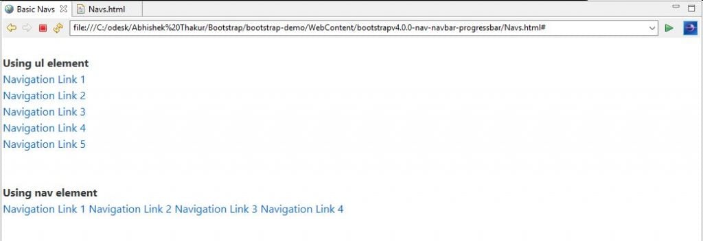
In Bootstrap v4, the .nav and other associated class are used to convert a list into tabs and navigation pills. In order to add a tab or a pill, we need to add the .nav class and either .nav-tabs or .nav-pills respectively to a <ul> element that contains a list of navigation items. Let’s understand the basic Nav with the help of the following example.
<!DOCTYPE html>
<html lang="en">
<head>
<!-- Required meta tags always come first -->
<meta charset="utf-8">
<meta name="viewport"
	content="width=device-width, initial-scale=1, shrink-to-fit=no">
<meta http-equiv="x-ua-compatible" content="ie=edge">
<!-- Bootstrap 4 alpha CSS -->
<link rel="stylesheet"
	href="https://maxcdn.bootstrapcdn.com/bootstrap/4.0.0-alpha.4/css/bootstrap.min.css"
	integrity="sha384-2hfp1SzUoho7/TsGGGDaFdsuuDL0LX2hnUp6VkX3CUQ2K4K+xjboZdsXyp4oUHZj"
	crossorigin="anonymous">
<title>Basic Navs</title>
</head>
<body>
	<br>
	<strong>Using ul element</strong><br>
	<ul class="nav">
		<li class="nav-item"><a class="nav-link active" href="#">Navigation
				Link 1</a></li>
		<li class="nav-item"><a class="nav-link" href="#">Navigation
				Link 2</a></li>
		<li class="nav-item"><a class="nav-link" href="#">Navigation
				Link 3</a></li>
		<li class="nav-item"><a class="nav-link" href="#">Navigation
				Link 4</a></li>
		<li class="nav-item"><a class="nav-link" href="#">Navigation
				Link 5</a></li>
	</ul>
	<br><br><strong>Using nav element</strong><br>
	<nav class="nav">

		<a class="nav-link active" href="#">Navigation Link 1</a> <a class="nav-link"
			href="#">Navigation Link 2</a> <a class="nav-link" href="#">Navigation Link 3</a> <a
			class="nav-link" href="#">Navigation Link 4</a>
	</nav>
	<br>
	<!-- jQuery first, then Bootstrap JS. All Inclusive Plug-in -->
	<script
		src="https://ajax.googleapis.com/ajax/libs/jquery/2.1.4/jquery.min.js"></script>
	<script src="dist/js/bootstrap.min.js"></script>
</body>
</html>
Output
Navbar
In Bootstrap v4, the navbar is a simple wrapper which can be used for positioning branding, navigation, and positioning of other elements into a navigation header. We can also configure navbars based on the size of the viewports to collapse in smaller viewports and become horizontal in larger viewports.
- Types of Navbar
Navbar can be of the following types.
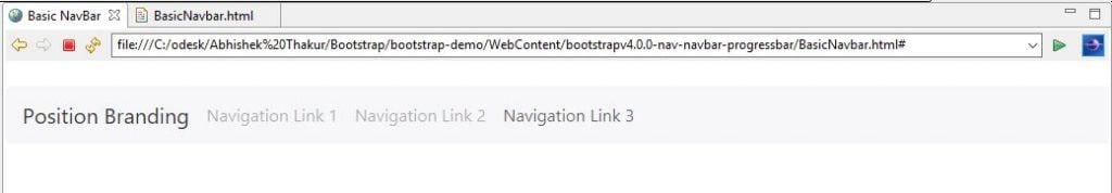
1. Basic Navbar
<!DOCTYPE html>
<html lang="en">
<head>
<!-- Required meta tags always come first -->
<meta charset="utf-8">
<meta name="viewport"
	content="width=device-width, initial-scale=1, shrink-to-fit=no">
<meta http-equiv="x-ua-compatible" content="ie=edge">
<!-- Bootstrap 4 alpha CSS -->
<link rel="stylesheet"
	href="https://maxcdn.bootstrapcdn.com/bootstrap/4.0.0-alpha.4/css/bootstrap.min.css"
	integrity="sha384-2hfp1SzUoho7/TsGGGDaFdsuuDL0LX2hnUp6VkX3CUQ2K4K+xjboZdsXyp4oUHZj"
	crossorigin="anonymous">
<title>Striped Progress Bar</title>
</head>
<body>
	<br>
	<nav class="navbar navbar-light bg-faded">
		<!-- Position Branding -->
		<a class="navbar-brand" href="#">Position Branding</a>
		<!-- Navigation Links -->
		<ul class="nav navbar-nav">
			<li class="nav-item"><a class="nav-link" href="#">Navigation Link 1</a></li>
			<li class="nav-item"><a class="nav-link" href="#">Navigation Link 2</a></li>
			<li class="nav-item"><a class="nav-link" href="#">Navigation Link 3</a></li>
		</ul>
	</nav>
	<br>
	<!-- jQuery first, then Bootstrap JS. All Inclusive Plug-in -->
	<script
		src="https://ajax.googleapis.com/ajax/libs/jquery/2.1.4/jquery.min.js"></script>
	<script src="dist/js/bootstrap.min.js"></script>
</body>
</html>
Output
Explanation of the code
- We have wrapped everything inside a <nav> element with the .navbar class, along with an appropriate color scheme. (e.g., class=”navbar navbar-light bg-faded”).
- Next, we have declared the list of links by using a <ul> element with class=”nav navbar-nav”.
- Next, for each of the individual item of the list, we have used <li> element with class=”nav-item”. There are total 3 items in the list as navigation link.
- Lastly, for each of the individual links, we have used <a> element with class=”nav-link”.
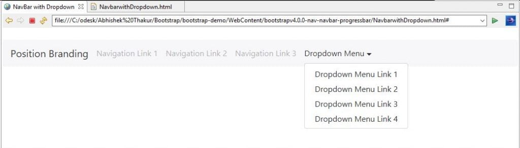
2. Navbar with dropdown menu
<!DOCTYPE html>
<html lang="en">
<head>
<!-- Required meta tags always come first -->
<meta charset="utf-8">
<meta name="viewport"
	content="width=device-width, initial-scale=1, shrink-to-fit=no">
<meta http-equiv="x-ua-compatible" content="ie=edge">
<!-- Bootstrap 4 alpha CSS -->
<link rel="stylesheet"
	href="https://maxcdn.bootstrapcdn.com/bootstrap/4.0.0-alpha.4/css/bootstrap.min.css"
	integrity="sha384-2hfp1SzUoho7/TsGGGDaFdsuuDL0LX2hnUp6VkX3CUQ2K4K+xjboZdsXyp4oUHZj"
	crossorigin="anonymous">
<title>NavBar with Dropdown</title>
</head>
<body>
	<br>
	<nav class="navbar navbar-light bg-faded">
		<!-- Position Branding -->
		<a class="navbar-brand" href="#">Position Branding</a>
		<!-- Navigation Links -->
		<ul class="nav navbar-nav">
			<li class="nav-item"><a class="nav-link" href="#">Navigation
					Link 1</a></li>
			<li class="nav-item"><a class="nav-link" href="#">Navigation
					Link 2</a></li>
			<li class="nav-item"><a class="nav-link" href="#">Navigation
					Link 3</a></li>
			<li class="nav-item dropdown"><a
				class="nav-link dropdown-toggle" data-toggle="dropdown" href="#"
				role="button" aria-haspopup="true" aria-expanded="false">
					Dropdown Menu</a>
				<div class="dropdown-menu" aria-labelledby="Preview">
					<a class="dropdown-item" href="#">Dropdown Menu Link 1</a> <a
						class="dropdown-item" href="#">Dropdown Menu Link 2</a> <a
						class="dropdown-item" href="#">Dropdown Menu Link 3</a> <a
						class="dropdown-item" href="#">Dropdown Menu Link 4</a>
				</div></li>
		</ul>
	</nav>
	<br>
	<!-- jQuery first, then Bootstrap JS. All Inclusive Plug-in -->
	<script
		src="https://ajax.googleapis.com/ajax/libs/jquery/2.1.4/jquery.min.js"></script>
	<script src="dist/js/bootstrap.min.js"></script>
</body>
</html>
Output
Explanation of the code
- To add a dropdown menu, we have just added the dropdown code to a <li>element with the .dropdown class applied to the <li> element.
3. Colored Navbar
<!DOCTYPE html>
<html lang="en">
<head>
<!-- Required meta tags always come first -->
<meta charset="utf-8">
<meta name="viewport"
	content="width=device-width, initial-scale=1, shrink-to-fit=no">
<meta http-equiv="x-ua-compatible" content="ie=edge">
<!-- Bootstrap 4 alpha CSS -->
<link rel="stylesheet"
	href="https://maxcdn.bootstrapcdn.com/bootstrap/4.0.0-alpha.4/css/bootstrap.min.css"
	integrity="sha384-2hfp1SzUoho7/TsGGGDaFdsuuDL0LX2hnUp6VkX3CUQ2K4K+xjboZdsXyp4oUHZj"
	crossorigin="anonymous">
<title>Colored NavBar</title>
</head>
<body>
	<br>
	<nav class="navbar navbar-dark bg-primary">
		<!-- Position Branding -->
		<a class="navbar-brand" href="#">Position Branding</a>
		<!-- Navigation Links -->
		<ul class="nav navbar-nav">
			<li class="nav-item"><a class="nav-link" href="#">Navigation
					Link 1</a></li>
			<li class="nav-item"><a class="nav-link" href="#">Navigation
					Link 2</a></li>
			<li class="nav-item"><a class="nav-link" href="#">Navigation
					Link 3</a></li>
			<li class="nav-item dropdown"><a
				class="nav-link dropdown-toggle" data-toggle="dropdown" href="#"
				role="button" aria-haspopup="true" aria-expanded="false">
					Dropdown Menu</a>
				<div class="dropdown-menu" aria-labelledby="Preview">
					<a class="dropdown-item" href="#">Dropdown Menu Link 1</a> <a
						class="dropdown-item" href="#">Dropdown Menu Link 2</a> <a
						class="dropdown-item" href="#">Dropdown Menu Link 3</a> <a
						class="dropdown-item" href="#">Dropdown Menu Link 4</a>
				</div></li>
		</ul>
	</nav>
	<br>
	<!-- jQuery first, then Bootstrap JS. All Inclusive Plug-in -->
	<script
		src="https://ajax.googleapis.com/ajax/libs/jquery/2.1.4/jquery.min.js"></script>
	<script src="dist/js/bootstrap.min.js"></script>
</body>
</html>
Output
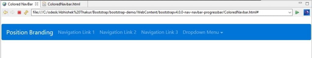
Explanation of Code
To the existing basic Navbar code where we have wrapped everything inside a <nav> element with the .navbar class, along with an appropriate color scheme and we have added class=”navbar navbar-dark bg-primary”.
Progress bar
In Bootstrap v4, we can use the Progress bar to provide feedback to the website user on the progress on the current request. It helps to provide a visual feedback to the user in the form of a bar that how much progress has been achieved and how much is left in order to complete the current request.
1. Types of Progress bars
Progress bar can be of the following types.
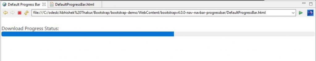
- Default Progress Bar: Using Bootstrap v4, we can create a default progress bar with the use of HTML5 <progress> element along with the .progress class as shown in the following example.
<!DOCTYPE html>
<html lang="en">
<head>
<!-- Required meta tags always come first -->
<meta charset="utf-8">
<meta name="viewport"
	content="width=device-width, initial-scale=1, shrink-to-fit=no">
<meta http-equiv="x-ua-compatible" content="ie=edge">
<!-- Bootstrap 4 alpha CSS -->
<link rel="stylesheet"
	href="https://maxcdn.bootstrapcdn.com/bootstrap/4.0.0-alpha.4/css/bootstrap.min.css"
	integrity="sha384-2hfp1SzUoho7/TsGGGDaFdsuuDL0LX2hnUp6VkX3CUQ2K4K+xjboZdsXyp4oUHZj"
	crossorigin="anonymous">
<title>Default Progress Bar</title>
</head>
<body>
	<br>
	Download Progress Status: <progress class="progress" value="55" max="100">55%</progress>
	<br>
	<!-- jQuery first, then Bootstrap JS. All Inclusive Plug-in -->
	<script
		src="https://ajax.googleapis.com/ajax/libs/jquery/2.1.4/jquery.min.js"></script>
	<script src="dist/js/bootstrap.min.js"></script>
</body>
</html>
Output:
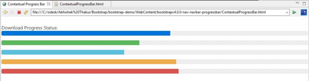
- Contextual Progress Bar: Using Bootstrap v4 contextual classes, we can provide extra semantics via color to the Progress Bar as shown in the following example.
<!DOCTYPE html>
<html lang="en">
<head>
<!-- Required meta tags always come first -->
<meta charset="utf-8">
<meta name="viewport"
	content="width=device-width, initial-scale=1, shrink-to-fit=no">
<meta http-equiv="x-ua-compatible" content="ie=edge">
<!-- Bootstrap 4 alpha CSS -->
<link rel="stylesheet"
	href="https://maxcdn.bootstrapcdn.com/bootstrap/4.0.0-alpha.4/css/bootstrap.min.css"
	integrity="sha384-2hfp1SzUoho7/TsGGGDaFdsuuDL0LX2hnUp6VkX3CUQ2K4K+xjboZdsXyp4oUHZj"
	crossorigin="anonymous">
<title>Contextual Progress Bar</title>
</head>
<body>
	<br> Download Progress Status:
	<progress class="progress progress-primary" value="55" max="100">55%</progress>
	<progress class="progress progress-success" value="45" max="100">45%</progress>
	<progress class="progress progress-info" value="400" max="1000">40%</progress>
	<progress class="progress progress-warning" value="57" max="100">57%</progress>
	<progress class="progress progress-danger" value="578" max="1000">57.8%</progress>
	<br>
	<!-- jQuery first, then Bootstrap JS. All Inclusive Plug-in -->
	<script
		src="https://ajax.googleapis.com/ajax/libs/jquery/2.1.4/jquery.min.js"></script>
	<script src="dist/js/bootstrap.min.js"></script>
</body>
</html>
Output:
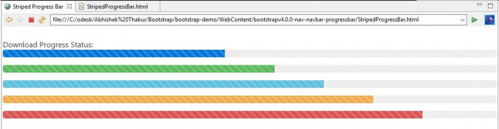
- Stripes: Using Bootstrap v4 striped classes, we can add stripes with the help of .progress-bar-striped class to the Progress Bar (i.e. .progress-bar element) as shown in the following example.
<!DOCTYPE html>
<html lang="en">
<head>
<!-- Required meta tags always come first -->
<meta charset="utf-8">
<meta name="viewport"
	content="width=device-width, initial-scale=1, shrink-to-fit=no">
<meta http-equiv="x-ua-compatible" content="ie=edge">
<!-- Bootstrap 4 alpha CSS -->
<link rel="stylesheet"
	href="https://maxcdn.bootstrapcdn.com/bootstrap/4.0.0-alpha.4/css/bootstrap.min.css"
	integrity="sha384-2hfp1SzUoho7/TsGGGDaFdsuuDL0LX2hnUp6VkX3CUQ2K4K+xjboZdsXyp4oUHZj"
	crossorigin="anonymous">
<title>Striped Progress Bar</title>
</head>
<body>
	<br> Download Progress Status:
	<progress class="progress progress-striped progress-primary" value="45"
		max="100">45%</progress>
	<progress class="progress progress-striped progress-success" value="55"
		max="100">55%</progress>
	<progress class="progress progress-striped progress-info" value="650"
		max="1000">65%</progress>
	<progress class="progress progress-striped progress-warning" value="75"
		max="100">75%</progress>
	<progress class="progress progress-striped progress-danger" value="850"
		max="1000">85%</progress>
	<br>
	<!-- jQuery first, then Bootstrap JS. All Inclusive Plug-in -->
	<script
		src="https://ajax.googleapis.com/ajax/libs/jquery/2.1.4/jquery.min.js"></script>
	<script src="dist/js/bootstrap.min.js"></script>
</body>
</html>
Output
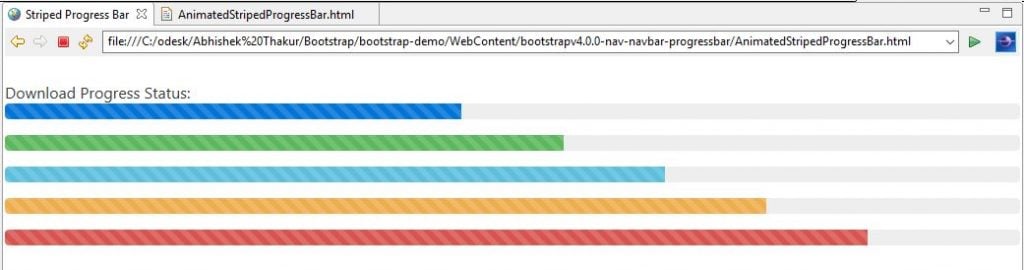
- Animated Stripes: Using Bootstrap v4 animation classes, we can animate and add stripes with the help of .progress-animated class to the Progress Bar (i.e. .progress element) as shown in the following example.
<!DOCTYPE html>
<html lang="en">
<head>
<!-- Required meta tags always come first -->
<meta charset="utf-8">
<meta name="viewport"
	content="width=device-width, initial-scale=1, shrink-to-fit=no">
<meta http-equiv="x-ua-compatible" content="ie=edge">
<!-- Bootstrap 4 alpha CSS -->
<link rel="stylesheet"
	href="https://maxcdn.bootstrapcdn.com/bootstrap/4.0.0-alpha.4/css/bootstrap.min.css"
	integrity="sha384-2hfp1SzUoho7/TsGGGDaFdsuuDL0LX2hnUp6VkX3CUQ2K4K+xjboZdsXyp4oUHZj"
	crossorigin="anonymous">
<title>Striped Progress Bar</title>
</head>
<body>
	<br> Download Progress Status:
	<progress
		class="progress progress-striped progress-primary progress-animated"
		value="45" max="100">45%</progress>
	<progress
		class="progress progress-striped progress-success progress-animated"
		value="55" max="100">55%</progress>
	<progress
		class="progress progress-striped progress-info progress-animated"
		value="650" max="1000">65%</progress>
	<progress
		class="progress progress-striped progress-warning progress-animated"
		value="75" max="100">75%</progress>
	<progress
		class="progress progress-striped progress-danger progress-animated"
		value="850" max="1000">85%</progress>
	<br>
	<!-- jQuery first, then Bootstrap JS. All Inclusive Plug-in -->
	<script
		src="https://ajax.googleapis.com/ajax/libs/jquery/2.1.4/jquery.min.js"></script>
	<script src="dist/js/bootstrap.min.js"></script>
</body>
</html>
Output
For Source Code : – the Nav, Navbar, the Progress bar in Bootstrap v4
Conclusion
In this article, we discussed the Nav, Navbar, the Progress bar and their interesting features for Bootstrap v4 along with demo examples.

