

In the learn ‘how to import and explore data’ article, we demonstrated how to set up an R development environment and import well-structured data from files and databases. In this article, we will build on that foundation to demonstrate data exploration and data management in R.
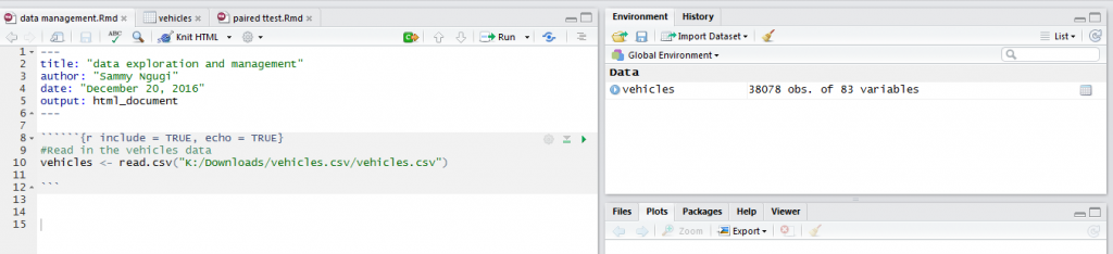
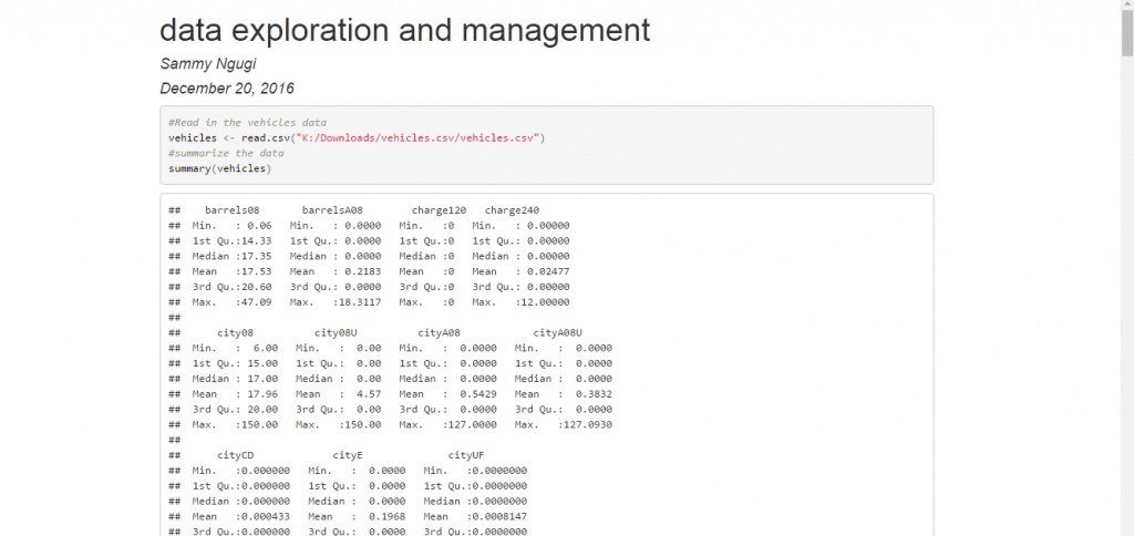
In the previous tutorial, we demonstrated how to import the data from this link https://www.fueleconomy.gov/feg/epadata/vehicles.csv.zip. Download the data, extract and import it. At this stage it is important to start using R Markdown to document your development efforts. Create a new R Markdown document and name it data exploration and management. Delete the automatically created content, label your chunk of code and set the options so that both code and output are displayed. Add the command below which will import the data. Your R Markdown document should now appear as shown below.
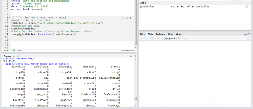
In any data analysis project, the first step is exploring your data to identify data quality problems such as missing and out of range values. One of the functions that is very useful for getting a general view of your data is summary. To summarize the vehicles data we use the function as shown below.
summary(vehicles)
For each variable in the data frame the function gives you the minimum, the maximum, the mean, the first and the third quartile. The console output is shown below but at the end of the article we will demonstrate how to generate a HTML document with the code and the output.
Another very important way of exploring your data is knowing how many missing values are present in each variable of your data frame. Missing values can cause biased results so it is important to identify and know how to handle them. The function below will return the number of missing values in each column.
sapply(vehicles, function(x) sum(is.na(x)))
Data summary is one of the ways that can be used to understand data. Another approach for understanding data is using graphics. Using graphics to understand data is referred to as visualization. When trying to understand your data you need to make a good judgment on which technique will best meet your needs. Some of the graphical techniques used for visualizing data are histograms, scatter plots, bar charts and pie charts.
In R the ggplot2 package is one of the best ways to visualize data. The ggplot2 package is very wide and we will only demonstrate the basics of plotting data. To visualize how a single continuous variable is distributed we use a histogram. A histogram shows you where most of the data is concentrated and any values that can be considered outliers. For example, the code below will create a histogram for the barreles08 variable.
library(ggplot2)
ggplot(vehicles) + geom_histogram(aes(x=barrels08),binwidth = 2,fill="blue")
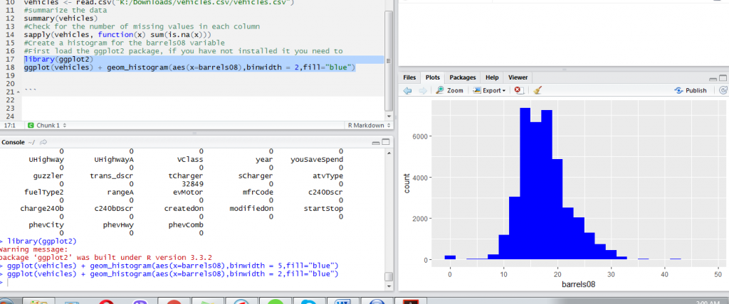
From the histogram above we can observe values below 5 and values above 35 appear as outliers. However, we need to investigate these values further before deciding they are outliers and whether they should be removed from our data in subsequent analyses. From the histogram we can also observe most values lie between 15 and 25.
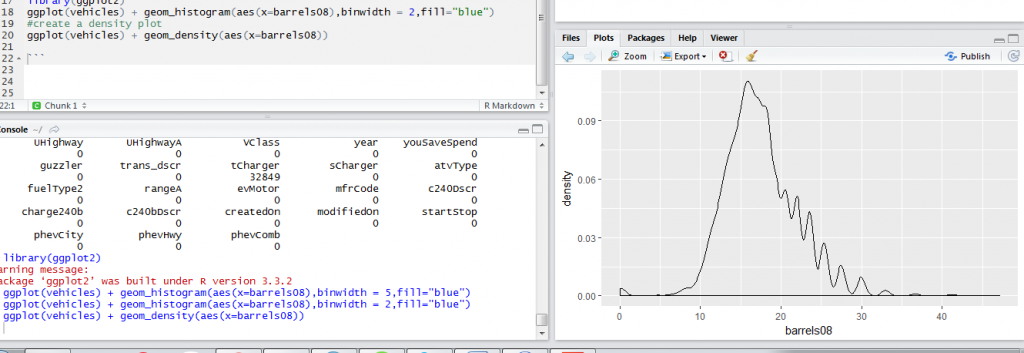
Another data visualization technique that is closely related and sometimes used together with a histogram is the density plot. Both the histogram and the density plot are very useful for understanding the distribution of our observations. They tell us if there is any skewness in the data.
The code below creates a density plot of barrels08 variable.
ggplot(vehicles) + geom_density(aes(x=barrels08))
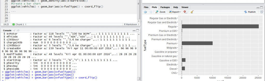
When we have a categorical variable, a bar chart is the appropriate visualization technique. The bar chart shows the number of observations in each category and uses bars to easily enable comparison between the different categories. In the vehicles data, we have a fuelType variable that shows the type of fuel used by the vehicle. We would like to know the number of vehicles using each fuel type. The code below creates a bar chart. In this case, we have created a horizontal bar chart because of the many categories.
ggplot(vehicles) + geom_bar(aes(x=fuelType)) + coord_flip()
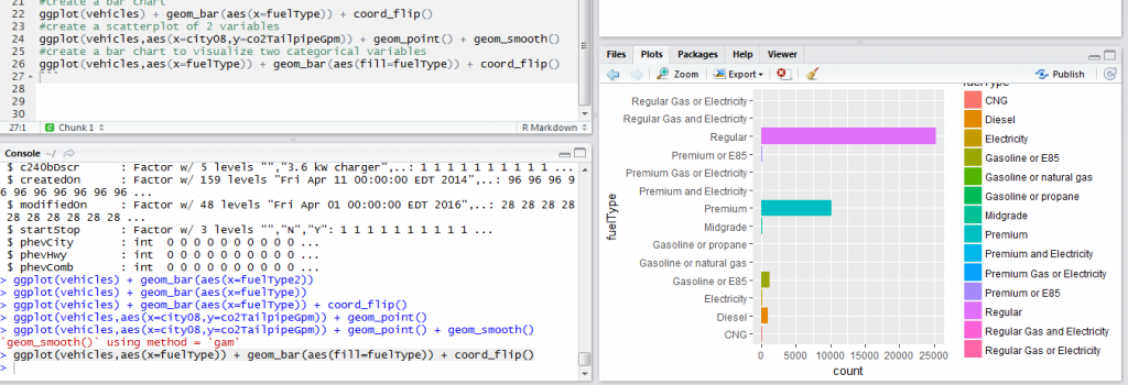
When we have two categorical variables, we can use a bar chart to visualize the two of them. To visualize the fuel type and guzzler type of vehicle we use the code below.
ggplot(vehicles,aes(x=fuelType)) + geom_bar(aes(fill=fuelType)) + coord_flip()
When we have two continuous variables, we would be interested in understanding the relationship between the two. A scatter plot is very useful for visually inspecting relationship between two variables. In our vehicles data, we would be interested in understanding the relationship between co2TailpipeGpm and city08. The code below will create the scatterplot and add a smoothing line to clearly bring out the relationship between the two variables.
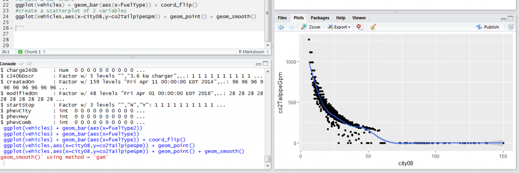
The scatter plot shows at low miles per gallon emission is high. So when the miles per gallon increase emission decreases.
Once you have completed writing your code you can create a HTML document with the code and the output. Save your R Markdown document and click on Knit HTML then Knit to HTML. An HTML document will then be produced containing the code, the output and the graphs. A sample screenshot is shown below.
Data exploration is just the beginning of your data analysis. From the results of your data exploration you can make decisions such as removing missing values and values that are out of range or manipulating your data in different ways. These activities are referred to as data management. In the next tutorial, we will cover data management in R.
In this tutorial, we introduced data exploration as the first step in data analysis. We noted data exploration helps us identify data problems such as missing values and values that are very large or very small and need further investigation. We noted we can explore data using data summaries or graphical techniques. We discussed the different graphical techniques that are useful for exploring data.
The complete code is shown below.
``````{r include = TRUE, echo = TRUE}
#Read in the vehicles data
vehicles <- read.csv("K:/Downloads/vehicles.csv/vehicles.csv")
#summarize the data
summary(vehicles)
#Check for the number of missing values in each column
sapply(vehicles, function(x) sum(is.na(x)))
#Create a histogram for the barrels08 variable
#First load the ggplot2 package, if you have not installed it you need to
library(ggplot2)
ggplot(vehicles) + geom_histogram(aes(x=barrels08),binwidth = 2,fill="blue")
#create a density plot
ggplot(vehicles) + geom_density(aes(x=barrels08))
#create a bar chart
ggplot(vehicles) + geom_bar(aes(x=fuelType)) + coord_flip()
#create a scatterplot of 2 variables
ggplot(vehicles,aes(x=city08,y=co2TailpipeGpm)) + geom_point() + geom_smooth()
#create a bar chart to visualize two categorical variables
ggplot(vehicles,aes(x=fuelType)) + geom_bar(aes(fill=fuelType)) + coord_flip()
```

