

What is Footer?
The bottom section of any document is called footer. You can find it under the main section or body of the document. In HTML, <footer> tag defines the footer for a document.
Why the Footer is so Important?
Footer is as important as the header or body of the content. It’s importance largely centers around many essential areas as discussed below.
- Website Technical and Legal Information
- Website Navigation or Map
- SEO
Footer Typically Contains:
- About us section
- Links to
- Contact us
- Address
- Social Media Icons
- Email Signup
- Copyright
What is Responsive Footer?
The responsive footer is one which fits in a large screen, tab’s screen as well as mobile screens. Having responsive footer is essential and this article will walk you through adding a responsive footer to your website using HTML and Bootstrap 4.
Read More: Learn to Build a Responsive Website Footer Using HTML and CSS
What Are the Advantages of Using Bootstrap Over CSS?
- Bootstrap has several built-in classes that make web development easier.
- It reduces the code length as we don’t have to create a separate css file.
- Using Bootstrap saves you the time.
You can also learn Bootstrap Development by exploring various sections of “Learn Bootstrap Development By Building 10 Projects“ for Free! You will learn to build Photo App Sales Websites, Portfolio Resume using SASS, Photo Gallery, Social Network Template and much more.
Below are the codes of HTML and Bootstrap required to add a responsive footer to your website.
<!doctype html>
<html lang="en">
<head>
<!-- Required meta tags -->
<meta charset="utf-8">
<meta name="viewport" content="width=device-width, initial-scale=1, shrink-to-fit=no">
<link rel="title icon" type="image/png" href="images/title-img.png"/>
<!-- Bootstrap CSS -->
<link rel="stylesheet" href="https://stackpath.bootstrapcdn.com/bootstrap/4.1.1/css/bootstrap.min.css" integrity="sha384-WskhaSGFgHYWDcbwN70/dfYBj47jz9qbsMId/iRN3ewGhXQFZCSftd1LZCfmhktB" crossorigin="anonymous">
<!-- fontawesome-->
<script defer src="https://use.fontawesome.com/releases/v5.0.13/js/all.js" integrity="sha384-xymdQtn1n3lH2wcu0qhcdaOpQwyoarkgLVxC/wZ5q7h9gHtxICrpcaSUfygqZGOe" crossorigin="anonymous"></script>
<title>Pure Bootstrap Website</title>
</head>
<body>
<!-- banner -->
<section>
<div class="container-fluid">
<div class="row bg-info justify-content-center align-items-center" style="height: 80vh">
<div class="col-sm-10 text-center">
<h1 class="display-2 text-capitalize"><span class="text-warning">pure bootstrap </span><span class="text-white font-weight-bold">website</span></h1>
</div>
</div>
</div>
</section>
<!-- end of banner -->
<!-- footer -->
<footer style="background-color: #2c292f">
<div class="container">
<div class="row ">
<div class="col-md-4 text-center text-md-left ">
<div class="py-0">
<h3 class="my-4 text-white">About<span class="mx-2 font-italic text-warning ">Eduonix</span></h3>
<p class="footer-links font-weight-bold">
<a class="text-white" href="#">Home</a>
|
<a class="text-white" href="#">Blog</a>
|
<a class="text-white" href="#">About</a>
|
<a class="text-white" href="#">Contact</a>
</p>
<p class="text-light py-4 mb-4">©2019 Eduonix Learning Solutions Pvt. Ltd.</p>
</div>
</div>
<div class="col-md-4 text-white text-center text-md-left ">
<div class="py-2 my-4">
<div>
<p class="text-white"> <i class="fa fa-map-marker mx-2 "></i>
309 - Rupa Solitaire,
Bldg. No. A - 1, Sector - 1
Mahape, Navi Mumbai - 400710</p>
</div>
<div>
<p><i class="fa fa-phone mx-2 "></i> +91 22-27782183</p>
</div>
<div>
<p><i class="fa fa-envelope mx-2"></i><a href="mailto:[email protected]">[email protected]</a></p>
</div>
</div>
</div>
<div class="col-md-4 text-white my-4 text-center text-md-left ">
<span class=" font-weight-bold ">About the Company</span>
<p class="text-warning my-2" >We offer training and skill building courses across Technology, Design, Management, Science and Humanities.</p>
<div class="py-2">
<a href="#"><i class="fab fa-facebook fa-2x text-primary mx-3"></i></a>
<a href="#"><i class="fab fa-google-plus fa-2x text-danger mx-3"></i></a>
<a href="#"><i class="fab fa-twitter fa-2x text-info mx-3"></i></a>
<a href="#"><i class="fab fa-youtube fa-2x text-danger mx-3"></i></a>
</div>
</div>
</div>
</div>
</footer>
<!-- end of footer -->
<!-- jQuery first, then Popper.js, then Bootstrap JS -->
<script src="https://code.jquery.com/jquery-3.3.1.slim.min.js" integrity="sha384-q8i/X+965DzO0rT7abK41JStQIAqVgRVzpbzo5smXKp4YfRvH+8abtTE1Pi6jizo" crossorigin="anonymous"></script>
<script src="https://cdnjs.cloudflare.com/ajax/libs/popper.js/1.14.3/umd/popper.min.js" integrity="sha384-ZMP7rVo3mIykV+2+9J3UJ46jBk0WLaUAdn689aCwoqbBJiSnjAK/l8WvCWPIPm49" crossorigin="anonymous"></script>
<script src="https://stackpath.bootstrapcdn.com/bootstrap/4.1.1/js/bootstrap.min.js" integrity="sha384-smHYKdLADwkXOn1EmN1qk/HfnUcbVRZyYmZ4qpPea6sjB/pTJ0euyQp0Mk8ck+5T" crossorigin="anonymous"></script>
</body>
</html>
Output
On small or mobile screen


On Medium Screen (iPad)

On Large Screen
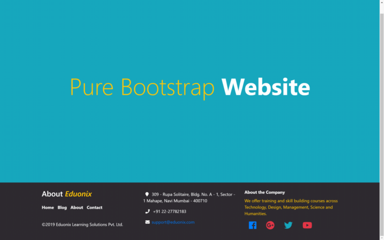
So, this was it! A fully functional responsive footer for a website using HTML and Bootstrap 4. I’ll hope that you find this helpful. Meanwhile, if you want to learn Bootstrap 4 from the ground up then you can opt for “Bootstrap 4 Development For Professionals“ online tutorial. It teaches you everything including SCSS + GULP, Grid, Flexbox, Typography, Components and many more cool concepts.

