

In this article, we are going to learn about various forms features available in Bootstrap 4. A default style is applied across most form controls in Bootstrap 4, which also provides various style classes for specific purposes. Generally, Bootstrap 4 by default applies display: block and width: 100% to the most form controls that results in the form controls being vertically stacked. This feature can be altered with the help of style classes anytime in the Bootstrap 4.
Basic Forms
The following points to remember.
- We use the .form-control class in Bootstrap 4 against textual <input>, <textarea>, and <select> elements in order to apply width: 100% by default.
- We use the .form-group class in Bootstrap 4 to wrap labels and controls inside a <fieldset> element for optimum spacing. Alternatively, we can use a <div> element.
The following is an example.
<!DOCTYPE html>
<html lang="en">
<head>
<!-- Required meta tags always come first -->
<meta charset="utf-8">
<meta name="viewport"
	content="width=device-width, initial-scale=1, shrink-to-fit=no">
<meta http-equiv="x-ua-compatible" content="ie=edge">
<!-- Bootstrap CSS -->
<link rel="stylesheet"
	href="https://maxcdn.bootstrapcdn.com/bootstrap/4.0.0-alpha.3/css/bootstrap.min.css">
<title>Page Default</title>
</head>
<body>
	<form action="">
		<fieldset class="form-group">
			<label for="user_name">User Name</label> <input type="text"
				class="form-control" id="user_name" name="user_name">
		</fieldset>
		<fieldset class="form-group">
			<label for="password">Password</label> <input type="password"
				class="form-control" id="password" name="password">
		</fieldset>
		<button type="submit" class="btn btn-default">Submit</button>
	</form>
</body>
</html>
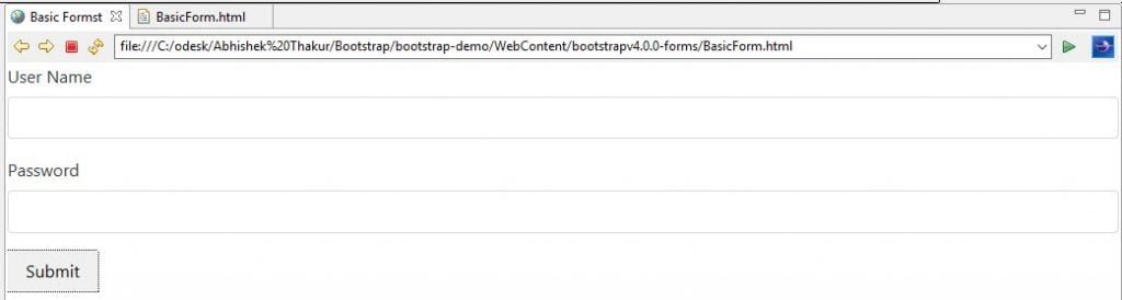
Output
When we execute about HTML code, we will get the following output.
Inline Form
We use the .form-inline style class in Bootstrap 4 in order to make the form elements render as inline-block and left-aligned.
The following is an example.
<!DOCTYPE html>
<html lang="en">
<head>
<!-- Required meta tags always come first -->
<meta charset="utf-8">
<meta name="viewport"
	content="width=device-width, initial-scale=1, shrink-to-fit=no">
<meta http-equiv="x-ua-compatible" content="ie=edge">
<!-- Bootstrap CSS -->
<link rel="stylesheet"
	href="https://maxcdn.bootstrapcdn.com/bootstrap/4.0.0-alpha.3/css/bootstrap.min.css">
<title> Inline Form</title>
</head>
<body>
	<form action="" class="form-inline">
		<div class="form-group">
			<label for="user_name">User Name</label> <input type="text"
				class="form-control" id="user_name" name="user_name">
		</div>
		<div class="form-group">
			<label for="password">Password</label> <input type="password"
				class="form-control" id="password" name="password">
		</div>
		<button type="submit" class="btn btn-default">Submit</button>
	</form>
</body>
</html>
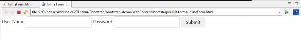
Output
When we execute about HTML code, we will procure the following output.
Forms with Hidden Labels
The following points to remember.
- We should always provide labels on input fields, otherwise screen readers will have trouble. We can hide the label, by using .sr-only style class in Bootstrap 4.
- We also add a placeholder attribute to provide a hint to the user as to what to enter in addition to .sr-only style class in Bootstrap 4. However it is not recommended.
The following is an example.
<!DOCTYPE html>
<html lang="en">
<head>
<!-- Required meta tags always come first -->
<meta charset="utf-8">
<meta name="viewport"
	content="width=device-width, initial-scale=1, shrink-to-fit=no">
<meta http-equiv="x-ua-compatible" content="ie=edge">
<!-- Bootstrap CSS -->
<link rel="stylesheet"
	href="https://maxcdn.bootstrapcdn.com/bootstrap/4.0.0-alpha.3/css/bootstrap.min.css">
<title>Form with Hidden Label</title>
</head>
<body>
	<form action="" class="form-inline">
		<div class="form-group">
			<label for="user_name" class="sr-only">User Name</label> <input
				type="text" class="form-control" id="user_name" name="user_name"
				placeholder="First Name">
		</div>
		<div class="form-group">
			<label for="password" class="sr-only">Password</label> <input
				type="password" class="form-control" id="password" name="password"
				placeholder="Last Name">
		</div>
		<button type="submit" class="btn btn-default">Submit</button>
	</form>
</body>
</html>
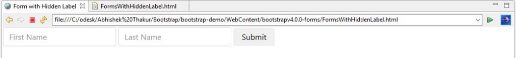
Output
When we execute about HTML code, we will get the following output.
Horizontal Form
The following points to remember.
- We use the grid classes to create horizontal forms in Bootstrap 4. Therefore, we need to specify the number of columns that each element should span. Definitely, we need to add a .row class to the .form-group and a .col-*-* class for each column.
- We should also add .col-form-label class to the
Differences between Bootstrap3 vs Bootstrap4 for Horizontal form
- While working with grids we require .row class for form layout. This is not the case with Bootstrap 3.
- While working with Control Labels, in Bootstrap 4 we uses .col-form-label * when using grids for form layout. However in Bootstrap 3 forms use .control-label.
- Bootstrap 3 requires .form-horizontal style class, whereas Bootstrap 4 doesn’t.
The following is an example.
<!DOCTYPE html>
<html lang="en">
<head>
<!-- Required meta tags always come first -->
<meta charset="utf-8">
<meta name="viewport"
	content="width=device-width, initial-scale=1, shrink-to-fit=no">
<meta http-equiv="x-ua-compatible" content="ie=edge">
<!-- Bootstrap CSS -->
<link rel="stylesheet"
	href="https://maxcdn.bootstrapcdn.com/bootstrap/4.0.0-alpha.3/css/bootstrap.min.css">
<title>Horizontal Form</title>
</head>
<body>
	<form action="">
		<div class="container">
			<div class="form-group row">
				<label for="user_name" class="col-xs-4 col-form-label">User
					Name</label>
				<div class="col-xs-9">
					<input type="text" class="form-control" id="user_name"
						name="user_name">
				</div>
			</div>
			<div class="form-group row">
				<label for="password" class="col-xs-4 col-form-label">
					Password</label>
				<div class="col-xs-9">
					<input type="password" class="form-control" id="password"
						name="password">
				</div>
			</div>
			<div class="form-group row">
				<div class="offset-xs-4 col-xs-8">
					<button type="submit" class="btn btn-default">Submit</button>
				</div>
			</div>
		</div>
	</form>
</body>
</html>
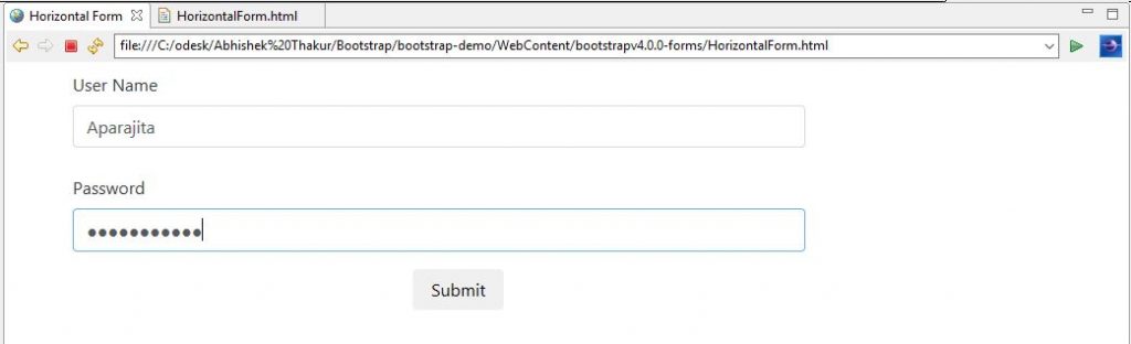
Output
When we execute above HTML code, we will see the following output.
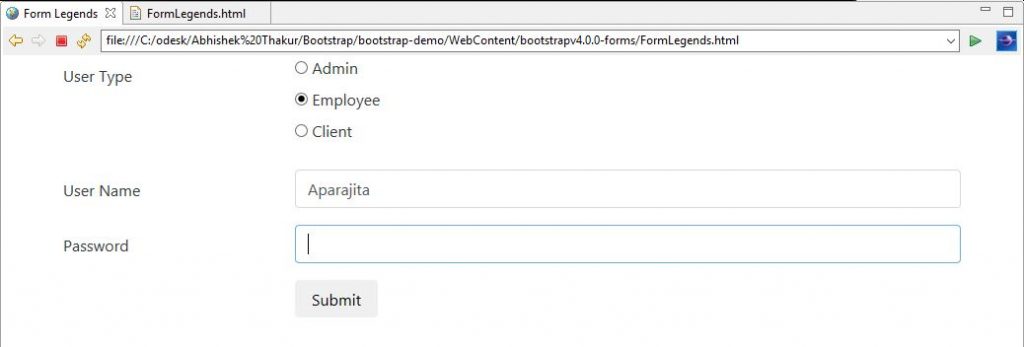
Form Legends
The following points to remember.
- When we use <legend> elements within our forms, then we have an option to add .col-form-legend style class in Bootstrap 4. This class styles helps the legend to look like a label.
- This will be very useful when we present a stack of radio buttons or checkboxes within a horizontal form.
The following is an example.
<!DOCTYPE html>
<html lang="en">
<head>
<!-- Required meta tags always come first -->
<meta charset="utf-8">
<meta name="viewport"
	content="width=device-width, initial-scale=1, shrink-to-fit=no">
<meta http-equiv="x-ua-compatible" content="ie=edge">
<!-- Bootstrap CSS -->
<link rel="stylesheet"
	href="https://maxcdn.bootstrapcdn.com/bootstrap/4.0.0-alpha.3/css/bootstrap.min.css">
<title>Form Legends</title>
</head>
<body>
	<form action="">
		<div class="container">
			<fieldset class="form-group row">
				<legend class="col-form-legend col-xs-3">User Type</legend>
				<div class="col-xs-9">
					<div class="form-check">
						<label class="form-check-label"> <input
							class="form-check-input" type="radio" name="legendRadio"
							id="legendRadio1" value="1"> Admin
						</label>
					</div>
					<div class="form-check">
						<label class="form-check-label"> <input
							class="form-check-input" type="radio" name="legendRadio"
							id="legendRadio2" value="2" checked> Employee
						</label>
					</div>
					<div class="form-check">
						<label class="form-check-label"> <input
							class="form-check-input" type="radio" name="legendRadio"
							id="legendRadio3" value="3"> Client
						</label>
					</div>
				</div>
			</fieldset>
			<div class="form-group row">
				<label for="user_name" class="col-xs-3 col-form-label">User
					Name</label>
				<div class="col-xs-9">
					<input type="text" class="form-control" id="user_name"
						name="user_name">
				</div>
			</div>
			<div class="form-group row">
				<label for="last_name" class="col-xs-3 col-form-label">
					Password</label>
				<div class="col-xs-9">
					<input type="password" class="form-control" id="password"
						name="password">
				</div>
			</div>

			<div class="form-group row">
				<div class="offset-xs-3 col-xs-9">
					<button type="submit" class="btn btn-default">Submit</button>
				</div>
			</div>

		</div>
	</form>
</body>
</html>
Output
When we execute above HTML code, we will get the following output.
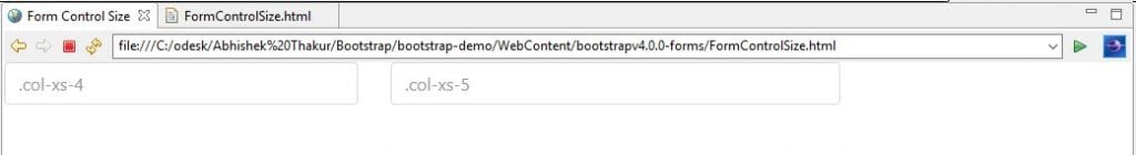
Form Control Size
We use .form-control-lg and .form-control-sm in order to increase or decrease the size of an input control in Bootstrap 4. In Bootstrap 3. We were using .input-lg and .input-sm to do the same function.
The following is an example.
<!DOCTYPE html>
<html lang="en">
<head>
<!-- Required meta tags always come first -->
<meta charset="utf-8">
<meta name="viewport"
	content="width=device-width, initial-scale=1, shrink-to-fit=no">
<meta http-equiv="x-ua-compatible" content="ie=edge">
<!-- Bootstrap CSS -->
<link rel="stylesheet"
	href="https://maxcdn.bootstrapcdn.com/bootstrap/4.0.0-alpha.3/css/bootstrap.min.css">
<title>Form Control Size</title>
</head>
<body>
	<div class="row">
		<div class="col-xs-4">
			<input type="text" class="form-control" placeholder=".col-xs-4">
		</div>
		<div class="col-xs-5">
			<input type="password" class="form-control" placeholder=".col-xs-5">
		</div>
	</div>
</body>
</html>
Output
When we execute above HTML code, we will see the following output.
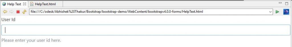
Help Text
The following points to remember.
- In Bootstrap 4, we use the .form-text class to display the help text. Also, we can combine this class with utility classes such as .text-muted.
- We use the .aria-describedby attribute in order to associate the help text with the form control.
- In Bootstrap 3, we were using .help-block style class.
The following is an example.
<!DOCTYPE html>
<html lang="en">
<head>
<!-- Required meta tags always come first -->
<meta charset="utf-8">
<meta name="viewport"
	content="width=device-width, initial-scale=1, shrink-to-fit=no">
<meta http-equiv="x-ua-compatible" content="ie=edge">
<!-- Bootstrap CSS -->
<link rel="stylesheet"
	href="https://maxcdn.bootstrapcdn.com/bootstrap/4.0.0-alpha.3/css/bootstrap.min.css">
<title>Help Text</title>
</head>
<body>
	<label for="user_id">User Id</label>
	<input type="text" id="user_id" class="form-control"
		aria-describedby="helpAccountId">
	<span id="helpAccountId" class="form-text text-muted">Please enter your user id here.</span>
</body>
</html>
Output
When we execute above HTML code, we will get the following output.
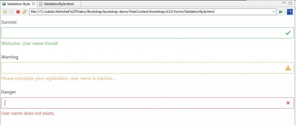
Validation Styles & Feedback Icons
Some points to remember.
- In Bootstrap 4, we include validation styles for form controls with which we can convey these three validation states i.e. success, danger, or warning to the user.
- These three classes are .has-success, .has-warning, and .has-danger which are applied to the parent element, so that any .col-form-label, .form-control, and custom form elements nested within that element will inherit these validation styles.
- We can include textual input controls by adding a .form-control-success, .form-control-warning, or .form-control-danger class to the .form-control input field.
The following is an example.
<!DOCTYPE html>
<html lang="en">
<head>
<!-- Required meta tags always come first -->
<meta charset="utf-8">
<meta name="viewport"
	content="width=device-width, initial-scale=1, shrink-to-fit=no">
<meta http-equiv="x-ua-compatible" content="ie=edge">
<!-- Bootstrap CSS -->
<link rel="stylesheet"
	href="https://maxcdn.bootstrapcdn.com/bootstrap/4.0.0-alpha.3/css/bootstrap.min.css">
<title>Validation Style</title>
</head>
<body>
	<div class="form-group has-success">
		<label class="col-form-label" for="user_name">Success</label> <input
			type="text" class="form-control form-control-success" id="user_name"
			aria-describedby="user_nameStatus">
		<div class="form-control-feedback">Welcome, User name found!</div>
	</div>

	<div class="form-group has-warning">
		<label class="col-form-label" for="user_name2">Warning</label> <input
			type="text" class="form-control form-control-warning"
			id="user_name2" aria-describedby="buser_name2Status">
		<div class="form-control-feedback">Please complete your registration, user name is inactive...</div>
	</div>

	<div class="form-group has-danger">
		<label class="col-form-label" for="phone">Danger</label> <input
			type="text" class="form-control form-control-danger" id="user_name3"
			aria-describedby="user_name3Status">
		<div class="form-control-feedback">User name does not exists.</div>
	</div>
</body>
</html>
Output
When we execute above HTML code, we will see the following output.
Source Code for this Form Features in Bootstrap 4 Blog
Conclusion
In this chapter, we discussed about various types of forms available in Bootstrap 4 with suitable examples and how they are different syntactically as compared to Bootstrap 3.

