

In the last blog, we have learned how to create “Dynamic Maps Using ggplot2“. In this article, we will explore more into the 3D visualization in R programming language by using the plot3d package.
The plot3d package can be used to generate stunning 3-D plots in R. It can generate an interesting array of plots, but in this recipe, we will focus on creating 3-D scatterplots. These arise in situations where we have three variables, and we want to plot the triplets of values on the x–y–z space.
We will use a specific dataset to plot them into fancy plots using the plot3d package. The following steps are implemented to create 3D visualization in R.
Step 1: Install the required packages which are needed for 3D visualization in R.
> install.packages("rgl")
Installing package into ‘C:/Users/admin/Documents/R/win-library/3.6’
(as ‘lib’ is unspecified)
trying URL 'https://cran.rstudio.com/bin/windows/contrib/3.6/rgl_0.100.30.zip'
Content type 'application/zip' length 4253430 bytes (4.1 MB)
downloaded 4.1 MB

package ‘rgl’ successfully unpacked and MD5 sums checked

The downloaded binary packages are in
	C:\Users\admin\AppData\Local\Temp\Rtmpymt5Jd\downloaded_packages

> install.packages("plot3D")
Installing package into ‘C:/Users/admin/Documents/R/win-library/3.6’
(as ‘lib’ is unspecified)
package ‘plot3D’ successfully unpacked and MD5 sums checked

The downloaded binary packages are in
	C:\Users\admin\AppData\Local\Temp\Rtmpymt5Jd\downloaded_packages
Include the required libraries in the mentioned workspace.

> library(plot3D)
> library(rgl)
Step 2: We will use the dataset named “income.csv” which includes all the necessary parameters which are needed for understanding income rates of every employee.
Step 3: Analyze the data structure of the dataset with the mentioned attributes.
> str(income)
'data.frame':	30 obs. of  5 variables:
 $ names    : Factor w/ 30 levels "brady","brandy",..: 27 29 14 17 10 26 22 24 30 18 ...
 $ Education: num  21.6 18.3 12.1 17 19.9 ...
 $ Seniority: num  113 119 101 188 20 ...
 $ Income   : num  99.9 92.6 34.7 78.7 68 ...
 $ gender   : int  1 1 0 0 1 1 1 1 1 1 ...
Step 4: It is important to understand the five-point summary of data before proceeding further. Visualization requires a lookout on bivariate and univariate analysis which is clearly understood with a five-point summary of data.
> summary(income)
      names      Education       Seniority          Income
 brady   : 1   Min.   :10.00   Min.   : 20.00   Min.   :17.61
 brandy  : 1   1st Qu.:12.48   1st Qu.: 44.83   1st Qu.:36.39
 brian   : 1   Median :17.03   Median : 94.48   Median :70.80
 brittany: 1   Mean   :16.39   Mean   : 93.86   Mean   :62.74
 bruce   : 1   3rd Qu.:19.93   3rd Qu.:133.28   3rd Qu.:85.93
 charles : 1   Max.   :21.59   Max.   :187.59   Max.   :99.92
 (Other) :24
     gender
 Min.   :0.0000
 1st Qu.:0.0000
 Median :1.0000
 Mean   :0.6333
 3rd Qu.:1.0000
 Max.   :1.0000
Step 5: Let us with bivariate analysis which focusses on 2-dimensional data and scatter plot is considered as an easy method to create the same.
> scatter3D(x = inc$Education, y = inc$Income, z =inc$Seniority,
+           colvar = inc$Income,
+           pch = 16, cex = 1.5, xlab = "Education", ylab = "Income",
+           zlab = "Seniority", theta = 60, d = 2,clab = c("Income"),
+           colkey = list(length = 0.5, width = 0.5, cex.clab = 0.75,
+                         dist = -.08, side.clab = 3)
+           ,main = "Relationship Between Income , Education and Seniority")
Here, we are plotting “Education” in the x-axis, “Income” in the y-axis and the “Seniority” level in the z-axis. The distinct legends are created based on the range of income parameters. The plot is helpful to show the relationship between Income, Education, and Society.
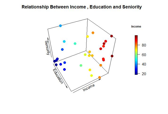
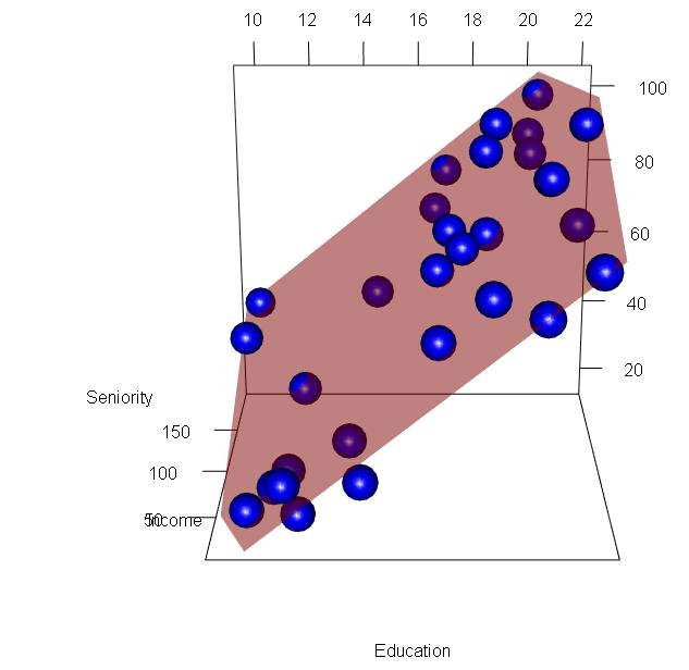
We can add more effects to the mentioned 3D plot with plane surfaces and ranges depicted in a specific order. Consider that we want to implement a linear regression model to establish the relationship between Seniority, Education and Income we can create a predictive model for the same.
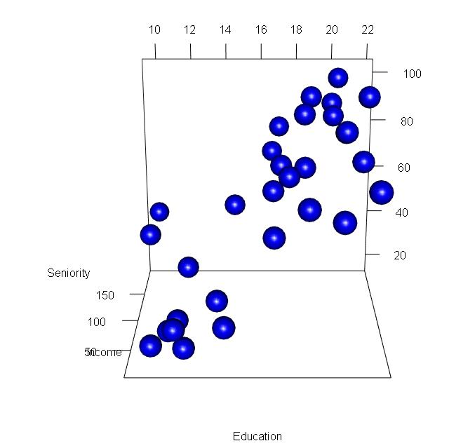
Step 6: Create a predictive model with the help of the RGL package. RGL is the 3D real-time rendering package in the R programming language. It provides high-level functions to create an interactive graph. To create a 3D plot of linear regression, we need to create a predictive model of the same.
> lmin = lm(inc$Income~inc$Education+inc$Seniority)
> lmin

Call:
lm(formula = inc$Income ~ inc$Education + inc$Seniority)

Coefficients:
  (Intercept)  inc$Education  inc$Seniority
     -50.0856         5.8956         0.1729
> est = coef(lmin)
> a = est["inc$Education"]
> b = est["inc$Seniority"]
> c=-1
> d= est["(Intercept)"]
> est
  (Intercept) inc$Education inc$Seniority
  -50.0856387     5.8955560     0.1728555
> a
inc$Education
     5.895556
> b
inc$Seniority
    0.1728555
> c
[1] -1
> d
(Intercept)
  -50.08564
Step 7: Once the required parameters for linear regression are taken into consideration, we can create an interactive graph where we plot the data points as a scattered graph and later embed the linear regression model in them.
> plot3d(inc$Education,inc$Seniority,inc$Income, type = "s",
+        col = "blue", xlab = "Education",ylab = "Income",zlab =
+            "Seniority",box = FALSE)
Now we will embed the linear regression line as mentioned below:
planes3d(a,b,c,d, alpha = 0.5, col = "red")
Step 8: We can create a surface plot that defines the volume and intensity of the data. Following steps are implemented to create a specific plot as mentioned below:
> inc= read.csv("income2.csv")
> View(inc)
> row.names(inc)= inc$names
> inc
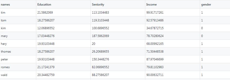
names Education Seniority Income gender
tim tim 21.58621 113.10345 99.91717 1
tom tom 18.27586 119.31034 92.57913 1
kim kim 12.06897 100.68966 34.67873 0
mary mary 17.03448 187.58621 78.70281 0
hary hary 19.93103 20.00000 68.00992 1
thomas thomas 18.27586 26.20690 71.50449 1
peter peter 19.93103 150.34483 87.97047 1
romeo romeo 21.17241 82.06897 79.81103 1
wald wald 20.34483 88.27586 90.00633 1
matt matt 10.00000 113.10345 45.65553 1
pam pam 13.72414 51.03448 31.91381 0
pamela pamela 18.68966 144.13793 96.28300 0
larry larry 11.65517 20.00000 27.98250 1
karl karl 16.62069 94.48276 66.60179 1
brian brian 10.00000 187.58621 41.53199 1
dan dan 20.34483 94.48276 89.00070 1
sim sim 14.13793 20.00000 28.81630 0
kristin kristin 16.62069 44.82759 57.68169 0
chiu chiu 16.62069 175.17241 70.10510 1
bruce bruce 20.34483 187.58621 98.83401 1
brady brady 18.27586 100.68966 74.70470 1
brandy brandy 14.55172 137.93103 53.53211 0
charles charles 17.44828 94.48276 72.07892 1
timothy timothy 10.41379 32.41379 18.57067 0
jerry jerry 21.58621 20.00000 78.80578 1
garry garry 11.24138 44.82759 21.38856 1
jena jena 19.93103 168.96552 90.81404 0
ram ram 11.65517 57.24138 22.63616 1
brittany brittany 12.06897 32.41379 17.61359 0
milly milly 17.03448 106.89655 74.61096 0
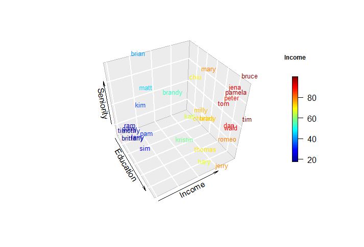
Here, we convert the dataset into a separate vector and we also created the index based on the names of candidates. Text3d is the function that adds text to the plane surface. The text represents actual data representation. As we converted the row names with names of candidates, it becomes easy to display text in the 3D plot.
> text3D(x = inc$Education, y = inc$Income, z =inc$Seniority,
+        colvar = inc$Income,labels= row.names(inc),
+        pch = 16, cex = 0.8, xlab = "Education", ylab = "Income",
+        zlab = "Seniority", theta = 60, d = 2,clab = c("Income"),
+        colkey = list(length = 0.5, width = 0.5, cex.clab = 0.75,
+                      dist = -.08, side.clab = 3)
+        ,bty = "g")
Step 9: We can convert the values in proper labels with distinct colors. This helps to visualize the 3D plot more easily and distinctly with a specific color range.
> text3D(x = inc$Education, y = inc$Income, z =inc$Seniority,
+        colvar= inc$gender,col = c("red","black"),labels= row.names(inc),
+        pch = 16, cex = 0.8,xlab = "Education", ylab = "Income",
+        zlab = "Seniority", theta = 60, d = 2,clab = c("Income"),
+        bty = "g", colkey = FALSE)
> legend("topright", fill = c("red", "black"), legend=
+            c("Female","Male"), bty = "n")
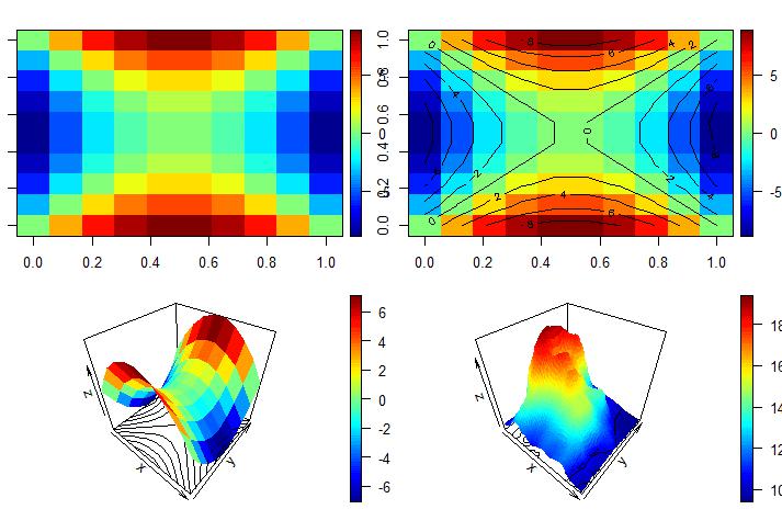
Contour Plots
Contour plots visually represent the intensity of the plot. The color and graphical representation help in the visual analysis of data.
> x = y = seq(-3,3, length.out = 10)
> x
[1] -3.0000000 -2.3333333 -1.6666667 -1.0000000 -0.3333333 0.3333333
[7] 1.0000000 1.6666667 2.3333333 3.0000000
> y
[1] -3.0000000 -2.3333333 -1.6666667 -1.0000000 -0.3333333 0.3333333
[7] 1.0000000 1.6666667 2.3333333 3.0000000
> f = function(x,y){ z= (y^2-x^2)}
> m = outer(x,y,f)
>
> image2D(m)
> image2D(m, contour = TRUE)
>
> persp3D(z = m, contour = TRUE)
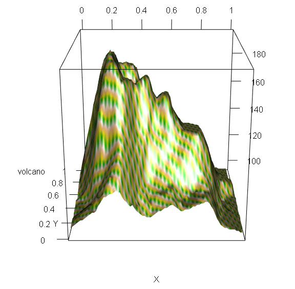
> persp3D(z = volcano, contour = TRUE)
>
> library(rgl)
> c = terrain.colors(5)
> persp3d(z = volcano, contour = TRUE, col = c)
The output of the contour plot is mentioned below:
The interactive 3d plot is mentioned below:
We can also create a plot with an animation feature which increases the interactive rate. For this, it is important to install an “animation” package which helps in creating the plots as desired.
> install.packages("plotrix")
Installing package into ‘C:/Users/admin/Documents/R/win-library/3.6’
(as ‘lib’ is unspecified)
trying URL 'https://cran.rstudio.com/bin/windows/contrib/3.6/plotrix_3.7-7.zip'
Content type 'application/zip' length 1132324 bytes (1.1 MB)
downloaded 1.1 MB
package ‘plotrix’ successfully unpacked and MD5 sums checked
The downloaded binary packages are in
C:\Users\admin\AppData\Local\Temp\RtmpSCUS7b\downloaded_packages
>
> install.packages("animation")
Installing package into ‘C:/Users/admin/Documents/R/win-library/3.6’
(as ‘lib’ is unspecified)
trying URL 'https://cran.rstudio.com/bin/windows/contrib/3.6/animation_2.6.zip'
Content type 'application/zip' length 548202 bytes (535 KB)
downloaded 535 KB
package ‘animation’ successfully unpacked and MD5 sums checked
The downloaded binary packages are in
C:\Users\admin\AppData\Local\Temp\RtmpSCUS7b\downloaded_packages
>
> library(plot3D)
> library(plotrix)
Attaching package: ‘plotrix’
The following object is masked from ‘package:rgl’:
mtext3d
> library(animation)
>
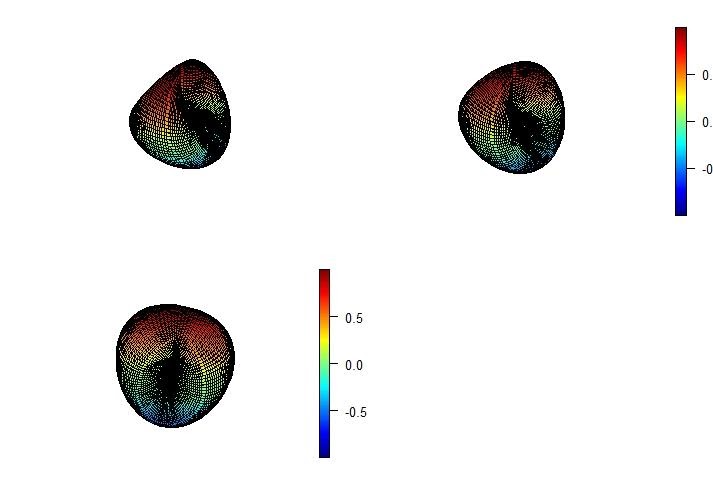
> x = y = seq(0,2*pi, length.out = 100)
>
> z = mesh(x,y)
> u = z$x
> v = z$y
>
> m= (sin(u)*sin(2*v)/2)
> n = (sin(2*u)*cos(v)*cos(v))
> o = (cos(2*u)*cos(v)*cos(v))
>
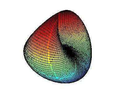
> surf3D(m, n,o, colvar = o, border = "black",colkey = FALSE,box = TRUE)
>
> surf3D(m, n,o, colvar = o, border = "black",colkey = TRUE, box = TRUE,theta = 60)
>
> surf3D(m, n,o, colvar = o, border = "black",colkey = TRUE,box = TRUE,theta = 100)
>
> library("animation")
> saveHTML({
+ for (i in 1:100 ){
+ x = y = seq(0,2*pi, length.out = 100)
+ z = mesh(x,y)
+ u = z$x
+ v = z$y
+ m= (sin(u)*sin(2*v)/2)
+ n = (sin(2*u)*cos(v)*cos(v))
+ o = (cos(2*u)*cos(v)*cos(v))
+ surf3D(m, n,o, colvar = o, border = "black",colkey = FALSE,
+ theta = i, box = TRUE)
+ }
+ },interval = 0.1, ani.width = 500, ani.height = 1000)
The ranges of the graphs are depicted below:
The file is saved with .html extension and represents the graphical animation of the values in three co-ordinates.
So, this was all about 3D visualization in R programming!
In the next section, we will be going to learn about Data Wrangling and Visualization in R programming language.


