
Infographics are a large part of the graphic design industry nowadays. Small businesses to large enterprises are using this visual tool to share and promote information.
If you want to upgrade your skill set and pay grade, learning how to design infographics like a pro will up your graphic design game.Today, we are going to show you how to create infographics like an expert with Adobe Illustrator.
What is an infographic?
An infographic is a helpful tool that contains data presented in a visual way. A lot of infographics deal with research, statistics and cited sources. The difference between any graphic design artwork and infographics is the credibility of the presented data in the form of design.
What kind of data is included in an infographic?
I’m sure you have seen an infographic by now.
There are many different data points used in infographics. Some deal with statistics, some with health information, some are charts, forecasts, but mostly they all deal with hard numbers.
Creating infographics is a more interesting way than looking at a large chunk of textual information.
Let’s get to the Adobe Illustrator Tutorial!
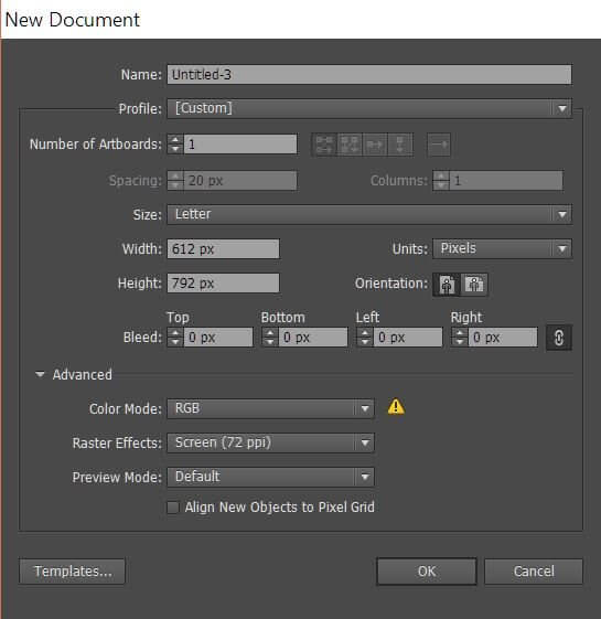
Step 1: Create a new document
Open Adobe Illustrator. Create a new document with the desired dimensions of your infographic.
Say, you want to make a portrait-sized infographic, you’d want to start with a rectangular shape for your blank document.
For this tutorial, we will create a template with the size of 612 x 792 pixels with a 72 ppi (pixels per inch).
*For screen resolutions, use 72 ppi. For print, use 150 to 300 dpi.
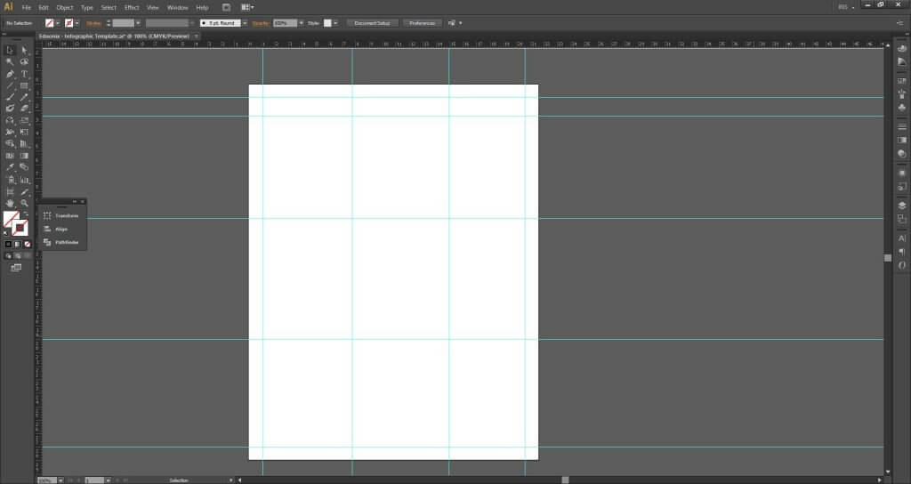
Step 2: Estimate the space allowance for your infographic
The art of making an infographic also lies with the amount of good “white space” or what is known as the space allowance that you’re giving for each element you put in.
A good infographic will have even white spaces and a sufficient amount of information.
Don’t cram everything in one go. Make space for the important tidbits.
Here are some notes on what makes a good infographic:
Vital information should always be big and bold.
Supporting statements should be smaller than the vital information or the heading.
If you’re presenting one number figure, enlarge it and consider it as vital information.
Don’t forget to cite sources in the end. Use italic and/or small size font.
Make sure your data is presented in a cohesive way. If one part is aligned to the left, the rest should follow the same format. Otherwise, arrange your layout again in a single aligment s. No information should look out of place.
Layout is important! Check if everything is well presented visually.
If you can’t decide on what layout you should do, do a research for inspiration.
For safe planning, some infographic designers would start with a grid layout of how and where each element will be placed so as not to be confused with placements when making the actual infographic.
How to estimate space for your infographic:
Set the rulers to appear visible. You can hit the shortcut Ctrl+R (Windows) or Cmd+R (Mac).
Drag the guides from the rulers to create boundaries for your infographic. It’s easier to work in inches, centimeters and pixels, depending on your requirement.
Now you will be able to see visible colored lines on your document. These are your spatial guides so you have an idea of how far apart your infographic elements are.
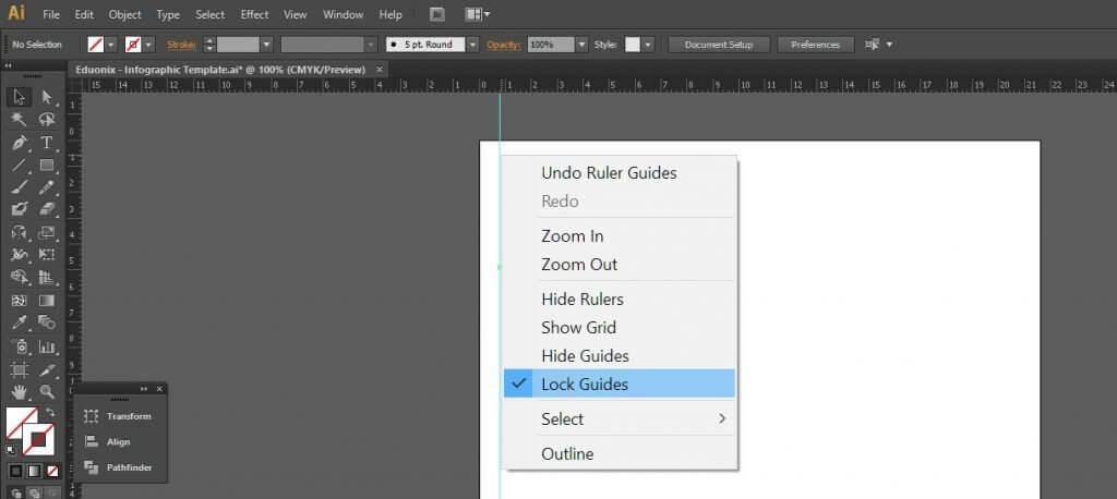
Note: If you are trying to move the ruler guides and they’re not movable, try right-clicking the line and then uncheck “Lock Guides”.
Step 3: Gather and present your data
The art of infographic is largely driven by data.
When you have accurate information, it’s easier to have a picture of how you want your infographic to look.
Research is a vital aspect. Without well-researched data, your visual presentation will lack credibility and clear-cut knowledge.
Tip: Keep a separate folder for each project so you know which data belongs to where. Remember, infographics present articulate facts so you really have to make sure your information is correct and does not suffer any mix-up!
Step 4: Design your infographic elements
Infographics are huge projects to tackle. Aside from the data you need to deal and verify with, you also need to think about the visual appeal of what you are presenting.
The best way to approach an infographic is to break down its sections by blocks.
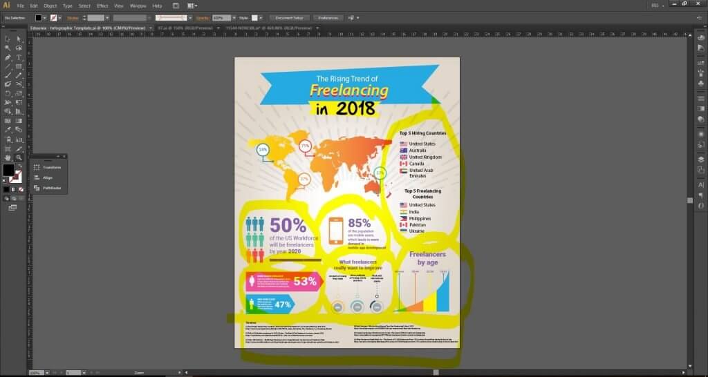
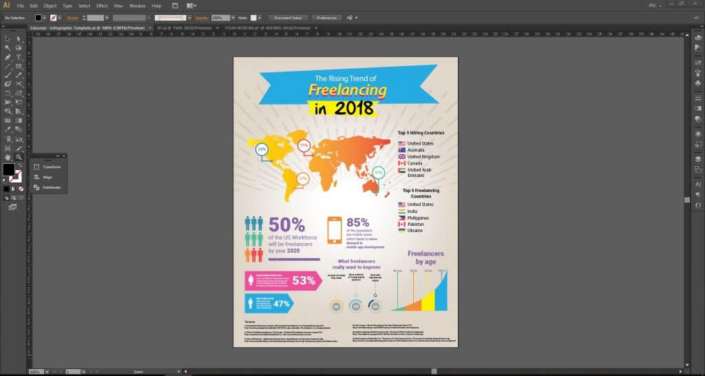
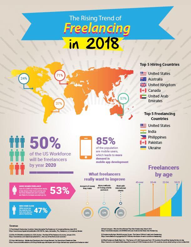
In our example, “The Rising Trend of Freelancing in 2018”, we have presented each data in blocks (highlighted yellow in the photo above), which are sorted by:
Country
Human Workforce
Gender
Age
Mobile Usage
These data points are essential in understanding the overall concept of freelancing demand.
As we have noted in Step 2, the emphasis on the data must be relevant to the priority of information. All important facts must be enlarged and secondary facts must be second in command.
Step 5: Play with variety
Infographics are fun to look at when done successfully.
Factors such as colors, sizes, font types and distance all play crucial roles when designing a professional infographic.
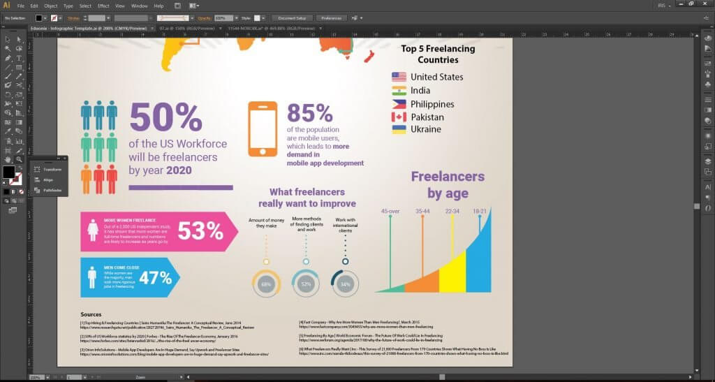
As you can see from our example, while we stuck with a trendy palette with mostly warm accents, we incorporated some colors that supported each data point.
Tips:
If you want to bring facts front and center, use classic colors such as black and white, or any bold color that brings attention to your data.
Don’t be afraid to make it a bit fun! Add patterns, texture and gradient when needed.
Try to stick to a cohesive color scheme. The more uniform, the better. The eyes recognize 3 main colors with 1-2 accent colors per palette.
If and when you can, try to shorten and sweeten your supporting sentences or phrases. Infographics thrive best with concise data than a large chunk of text.
Icons are your best friend! You can use ready-made icons from FlatIcons.com If you don’t have time to create each and every custom icon. This saves you the energy and focus so you can concentrate on the major task at hand: designing the overall look of your infographic.
And that’s it! Just by following these tips you can improve your skill as an infographic designer. Good luck and may you land infographic jobs after our tutorial!