
![]()
An icon by definition according to Merriam Webster, is “a small picture on a computer screen that represents a program or function.” In branding, it conveys the personality of an entity.
With that in mind, it is imperative that icons have the primary purpose of communicating its story through meaning in a graphical user interface or GUI.
As a visual representation, icons must be clear and concise.
However, there are still plenty of bad icons that roam around the internet. Take a look at apps in App Store or Google Play and you’ll know what we mean.
But how do you stop miscommunicating your brand through bad icons?
![]()
Easy: by learning the benefits and components.
When you master the benefits of a good icon, you can communicate your brand clearly and concisely. People will have no problem in determining what message you’re projecting to them.
What are the benefits & components of a good icon?
Let’s break them down.
1. Size
A good icon has a practical size: not too small that they can’t be seen clearly, and not too large that they occupy the space.
They should be easily operated by a mouse or a finger at their appropriate user interfaces (UI) and must avoid the “fat finger” issue common among all touch screens.
2. Space-saver
A good icon is a space-saver. It should be able to sit well among menus, toolbars and other icons in even the smallest space possible.
Good icons are compact and they don’t clutter up the space around them. They can still display the message they are created to make, but they do not take away the attention from the design and the other elements around them.
3. Easily Identifiable
Have you ever seen the Nike or the McDonald’s logo?
I’m sure you have.
You could recognize them from afar, do you?
That’s the strength of a good icon.
A well-composed icon makes use of proper colors, form and typography to create a design impact. Although most icons are visual with no context, any icon made for the purpose of storytelling must be without a doubt, easily identifiable.
4. Universal
Good icons are universal. It is easily understood worldwide, regardless of any age, race or language. There is no need for any translation.
When designing icons for multi-cultural users, you need to research the symbolic meaning or the standard representation of a message. An example is the case for the Department of Transportation.
In 1970s, the Department of Transportation worked with AIGA, a national organization of graphic designers, to create standardized icons that were used from airports to highway signages.
These icons have been the bedrock of universal message from parking to payphone, from no smoking signs to no entry.
5. Aesthetically pleasant
A good icon is not only great at conveying its message but is also tasteful and contemporary. It must be relevant and timely.
Designing a beautiful icon captures the attention of your target users. So for example, you’re making a photo app, you can’t have an icon that displays something food-related because that would defy your message.
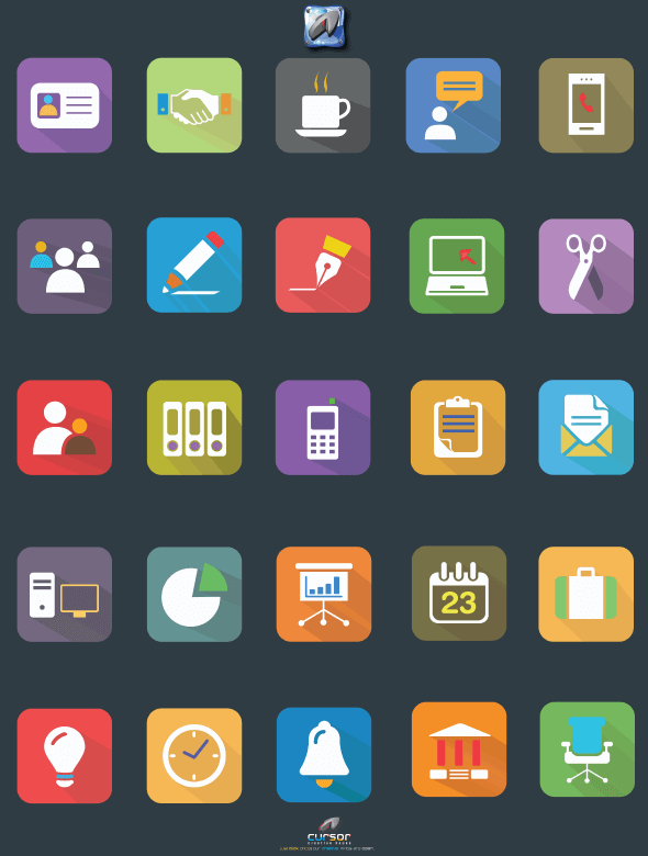
Here are some examples of aesthetically pleasant icons:
![]()
6. Simple
As you can see, icons possess simplicity in its core.
A good icon must not be too complex that users cannot understand what it is they’re seeing, but it also must not be too basic that it lacks the visual appeal it needs to capture attention.
7. Cohesive
Good icons support a product family or suite. When you create an icon pack, it must be of the same look and same feel as the others.
Because if there is an odd man out, chances are it will look like an eyesore and your icon pack will not serve its purpose.
So when creating icons, be sure to keep in mind the following:
• Do your research: – Before creating your icon, research the necessary information you need to make one. Are there any other existing icons that might resemble yours? Is the color you’re choosing appropriate for the message you want to convey? Are there any conflicts of interest with other icons or entities that may be using a similar representation? Will most international users understand your brand through your icon? These are just some of the questions that can arise before creating your icon.
• Make sure they look the same: – Use the same border attribute on every outline. This means the same thickness, same style, same color.
• Be consistent but not too repetitive: – If you’ve already used a pen symbol on one icon, don’t repeat it on another. Continuity is a good trait to have but too much of it becomes a bore.
• Check and iterate: – Once you’ve designed your icon, see if it looks even and parallel with the other icons. You may need to continually adjust the size, weight or other properties to create a beautiful and consistent icon set.
8. Availability
How you choose to deliver your icon can also affect its performance.
Would you want a regular icon or a retina-ready icon?
Would you deliver them in vector format (which is highly recommended by the way) as .EPS, .AI or .SVG or via a font file?
If you’re using Photoshop to make icons, then this is the point where you need to switch to Adobe Illustrator. Photoshop may be good for graphic designs, but not for vector icons.
Knowing how you want to deliver your brand’s message through design can aid you in creating a very effective icon that can last through time.
If you want to be sure that you’re not making any mistakes in your icon design, Turbo Milk has also released an article called “10 Mistakes in Icon Design”.
I suggest you check that out. It’s a very comprehensive guideline so you can avoid common icon design mistakes.
Before we end this article, there are 3 points I want to highlight with you when making your icon:
• Consider your audience
• Know your brand message
• Follow design guidelines
That’s it. If you want more design tutorials, you can check them out here.

