
In this article, we are going to develop a zippy component application in Angular 2. It demonstrates the following.
- Data flow in Angular 2.
- Working of Inputs and Outputs at Component level.
- An event is emitted when a component is opened or closed.
- At such event the application state is logged on the screen.
Zippy Component
In the zippy component, we are going to create a hyperlink (i.e. Get Application Status). When this hyperlink is clicked, it will emit an event and display the underlying hidden text (i.e. ‘View the Projected content’). An event will log the application status as ‘Component was opened’. The same hyperlink when clicked again will hide the underlying text and the emitted event will log the application status as ‘Component was closed’. Lets’ build this app as shown below.
Angular 2.0 coding for Tabs Component
app/main.ts
import { platformBrowserDynamic } from '@angular/platform-browser-dynamic';
import { AppModule } from './Module';
platformBrowserDynamic().bootstrapModule(AppModule);
Explanation of Code:
The above main.ts file is used to Bootstrap the angular 2.0 app that uses the root component from the NgModule.
app/Module.ts
import { NgModule }      from '@angular/core';
import { BrowserModule } from '@angular/platform-browser';
import { AppComponent }  from './Component';
import { ZippyComponent } from './Zippy.Component';

@NgModule({
  imports: [BrowserModule],
  declarations: [AppComponent, ZippyComponent],
  bootstrap: [AppComponent]
})

export class AppModule {}
Explanation of Code:
The root App Module typescript file is present in the app package. Here, we are importing the NgModule, BrowserModule, ZippyComponent, and AppComponent classes as shown above. The @NgModule decorator is declared here that has imports, declaration classes and bootstrap class to start the app.
app/Component.ts
import { Component } from '@angular/core';

@Component({
  selector: 'my-zippy-app',
  templateUrl: 'resource/app.component.html'
})

export class AppComponent {

  logs:string[] = [];

  log(message) {
    this.logs.push(message);
  }
}
Explanation of Code:
Here, we are declaring the component with selector as ‘my-zippy-app’ and templateUrl as ‘resource/app-component.html’ that has the required HTML code to render on the web page. The controller class ‘AppComponent’ has an array of string type (logs: string []) that holds the selected text from the zippy component. Next, we are writing a function i.e. log (message) that has event binding with the ‘selected’ event that will eventually call this function to display the selected text on the screen when the zippy component’s hyperlink is clicked.
resource/app.component.html
<div align="center">
<h2>Zippy Component Demonstration</h2>

<p>This component demonstrates the following.</p>
<pre>
1. Data flow in Angular 2.
2. Working of Inputs and Outputs at Component level.
3. An event is emitted when a component is opened or closed.
4. At such event the application state is logged.
</pre>
<p>Click on the below "Get Application Status" link to get Application Status Logs.</p>
<hr>
<br>
<my-zippy (opened)="log('Component was Opened')" (closed)="log('Component was Closed')" [isOpen]="false">
  View the Projected content
</my-zippy>

<h3>Application Logs:</h3>
<ul>
  <li *ngFor="let log of logs">
    {{log}}
  </li>
</ul>
<hr>
</div>
Explanation of Code:
Here, we are declaring the tag as ‘my-zippy’ where we are calling the ‘log (message)’ function to log the message on opened and closed events as ‘Component was Opened’ and ‘Component was Closed’, respectively. Initially at the time of loading we will keep [isOpen] event as false (i.e. no display of messages). Later, we will display the application logs lists whenever the zippy component link is clicked over and over.
app/Zippy.Component.ts
import { Component, EventEmitter, Output, Input } from '@angular/core';

@Component({
  selector: 'my-zippy',
  templateUrl: 'resource/zippy.component.html'
})
export class ZippyComponent {

  @Input() isOpen = true;
  @Output() opened = new EventEmitter();
  @Output() closed = new EventEmitter();

  toggle() {
    this.isOpen = !this.isOpen;
    this.isOpen ? this.opened.emit() : this.closed.emit();
  }
}
Explanation of Code:
In the ‘app.component.html’ file, we have used the tags ‘my-zippy’ which is nothing but the component selector that has underlying HTML defined in the template file ‘resource/zippy.component.html’ as shown below. It has the controller class ‘ZippyComponent’ we are declaring and initializing the values to the input (i.e. isOpen) and Outputs (i.e. opened and closed) events. Lastly, we have defined a ‘toggle ()’ function which does the flipping of displaying and hiding the underlying text when we click the zippy component.
resource/zippy.component.html
<div>
<a href="#" (click)="toggle()" class="title">
{{ isOpen ? '▼' : '▶'}} Get Application Status
</a>
<div [hidden]="!isOpen" class="content">
<ng-content></ng-content>
</div>
</div>
Explanation of Code:
It is the HTML template for ‘Zippy.Component’, it calls the ‘toggle ()’ function and does the flip flop of hiding and displaying the underlying text (i.e. Get Application Status) upon clicking of the hyperlink.
assets/styles.css
h2 {
	color: #369;
	font-family: Georgia, Helvetica, sans-serif;
	font-size: 250%;
}

h3 {
	color: #669;
	font-family: Georgia, Helvetica, sans-serif;
	font-size: 250%;
}

p {
	color: #969;
	font-family: Georgia, Helvetica, sans-serif;
	font-size: 100%;
}

body {
	margin: 2em;
}
Explanation of Code:
It is the stylesheet used to style the text on the web page of the app.
Index.html
<html>
<head>
<title>Zippy Component</title>
<meta charset="UTF-8">
<meta name="viewport" content="width=device-width, initial-scale=1">
<link rel="stylesheet" href="assets/styles.css">
<!-- 1. Load libraries -->
<!-- Poly-fills for the older browsers -->
<!-- 1. Load libraries -->
<!-- Polyfill(s) for older browsers -->

<script src="node_modules/core-js/client/shim.min.js"></script>
<script src="node_modules/zone.js/dist/zone.js"></script>
<script src="node_modules/reflect-metadata/Reflect.js"></script>
<script src="node_modules/systemjs/dist/system.src.js"></script>
<!-- 2. Configure SystemJS -->
<script src="systemjs.config.js"></script>
<script>
      System.import('app').catch(
    		  function(err){
    			  console.error(err);
    			  }
    		  );
</script>
</head>
<!-- 3. Display the application -->
<body>
	<my-zippy-app>Please wait...</my-zippy-app>
</body>
</html>
Explanation of Code:
It is the ‘index.html’ file that has the ‘my-zippy-app’ tag in its body section i.e. selector of ‘Component’ to load and display the complete application. Here, we are including all the paths for the scripts which are required for the Angular 2.0 build as shown above.
Output
When we run the above angular 2.0 app for Tab components by executing the command ‘npm start’ on command line that has pointer to the application’s root directory ‘my-zippy-component-app’, then we will observe the following output.
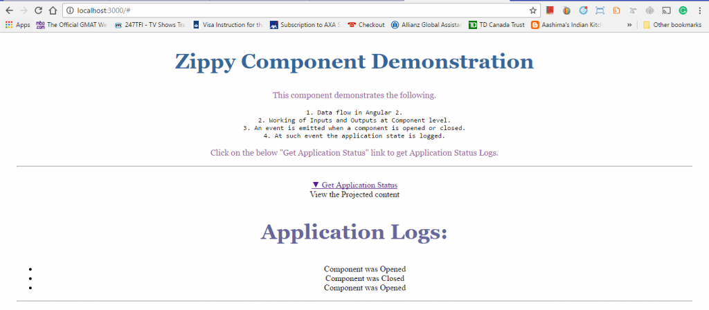
Source Code for My Zippy Component App
Conclusion: –
In this chapter, we developed a zippy component app in Angular 2.0 to demonstrate data flow and use of input and output events at component level.
About the Author