

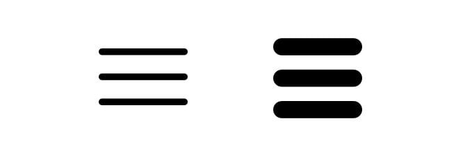
The hamburger menu consists of three horizontal lines (bars) piled upon one another which are generally found at the top right or left corner of the webpage. It allow users to click through and have a glimpse of a hidden menu of the different pages of the website. The hamburger menu is a technique in a responsive design aimed at improving the functionality of a website.
The hamburger menu was originally created by former Xerox product designer Norm Cox in 1981. It was intended to simply indicate a list within the company’s Star system.
What we are going to learn in this article?
When you click on the hamburger menu the window comes up with the navigation bar.
Pros and Cons of the Hamburger Menu
Pros :
- Signifies Importance
- Can save screen real estate
- Easy to use
- Allows for direct access
- Helps reducing complexity, offering a consistent way to display navigation
Cons:
- Features still not immediately viewable.
- Can take up a large block of screen real estate.
- It can hide a lot of vital information.
- There is an interaction cost as users need to click the hamburger icon every time they need to access the navigation rather than being able to just click a navigation item.
Hamburger Menu:
HTML Code:
<!DOCTYPE html>
<html lang="en">
<head>
    <meta charset="UTF-8">
    <meta name="viewport" content="width=device-width, initial-scale=1.0">
    <meta http-equiv="X-UA-Compatible" content="ie=edge">
    <link href="https://fonts.googleapis.com/css?family=Montserrat:300,400|Slabo+27px" rel="stylesheet">
    <link rel="stylesheet" href="https://use.fontawesome.com/releases/v5.5.0/css/all.css" integrity="sha384-B4dIYHKNBt8Bc12p+WXckhzcICo0wtJAoU8YZTY5qE0Id1GSseTk6S+L3BlXeVIU" crossorigin="anonymous">
    <link rel="stylesheet" href="style.css">
    <title>Hamburger Menu</title>
</head>

<body>
    <div class="container">
         <div class="banner">
            <div class="logo">
                <a href="#"><img src="images/logo.png"></a>
            </div>
        <div class="nav-wrapper">
            <div class="hamburger-menu">
                <div class="line line-1"></div>
                <div class="line line-2"></div>
                <div class="line line-3"></div>
            </div>
        <nav class="top-nav">
             <ul class="nav-list">
                    <li><a href="#" class="nav-link" data-text="Home">Home</a></li>
                    <li><a href="#" class="nav-link" data-text="About Us">About Us</a></li>
                    <li><a href="#" class="nav-link" data-text="Services">Services</a></li>
                    <li><a href="#" class="nav-link" data-text="Contact">Contact</a></li>
              </ul>
           </nav>
        </div>
    </div>
    <script src="app.js"></script>
</body>
</html>
CSS:
* {
    margin: 0;
    padding: 0;
}

.container {
    font-family: 'Montserrat', sans-serif;
}

.banner {
    width: 100%;
    height: 100vh;
    background: linear-gradient(rgba(0, 0, 0, .7), rgba(0, 0, 0, .8)), url(images/banner-bg.jpeg) center no-repeat;
    background-size: cover;
}

.logo {
    height: 80px;
    width: 80px;
    position: fixed;
    top: 20px;
    left: 50px;
    z-index: 100;
}

.logo img {
    width: 100%;
}

.hamburger-menu {
    width: 45px;
    height: 35px;
    position: fixed;
    top: 40px;
    right: 50px;
    display: flex;
    flex-direction: column;
    justify-content: space-between;
    cursor: pointer;
    z-index: 100;
}

.line {
    width: inherit;
    height: 5px;
    background-color: #16c3cf;
    border-radius: 25px;
    transform-origin: right;
    transition: transform .5s;
}

.line-2 {
    height: 3px;
}

.change .line-1 {
    transform: rotateZ(-45deg);
}

.change .line-2 {
    transform: translate(5px, 20px);
}

.change .line-3 {
    transform: rotateZ(45deg);
}

.top-nav {
    height: 15vh;
    width: 100%;
    background: linear-gradient(rgba(0, 0, 0, .8), rgba(0, 0, 0, .8)), url(images/nav-bg.jpeg) no-repeat 50% 0;
    background-size: cover;
    position: fixed;
    top: -15vh;
    z-index: 50;
    transition: top .4s;
}

.change .top-nav {
    top: 0;
}

.nav-list {
    list-style: none;
    width: 80%;
    margin: auto;
    height: inherit;
    display: flex;
    justify-content: space-evenly;
    align-items: center;
}

.nav-link {
    text-decoration: none;
    font-size: 30px;
    text-transform: uppercase;
    color: #ccc;
    background-color: #000;
    letter-spacing: 1px;
    padding: 5px 10px;
    display: block;
    position: relative;

}

.nav-link:hover {
    transform: rotateX(90deg);
}

.nav-link::after {
    content: attr(data-text);
    position: absolute;
    left: 0;
    bottom: -100%;
    background-color: #000;
    padding: inherit;
    color: #16c3cf;
    transform: rotateX(-90deg);
    transform-origin: top;
}

.bottom-nav {
    width: 100%;
    height: 85vh;
    background: linear-gradient(rgba(0, 0, 0, .8), rgba(0, 0, 0, .8)), url(images/nav-bg.jpeg) no-repeat 50% -15vh;
    background-size: cover;
    position: fixed;
    bottom: -85vh;
    transition: bottom .4s;
}


@media(max-width: 1200px) {
    .top-nav {
        background: #010101;
    }

    .nav-list {
        justify-content: center;
    }

    .nav-link {
        font-size: 25px;
    }

}

@media(max-width: 900px) {

    .top-nav {
        height: 25vh;
        top: -25vh;
    }

    .nav-list {
        width: 70%;
        flex-wrap: wrap;
        align-content: center;
    }

    .nav-link {
        margin: 3px 0;
    }

}
*/
@media(max-width: 750px) {
    .nav-list {
        width: 60%;
    }

}

@media(max-width: 550px) {

    .logo {
        width: 70px;
        height: 70px;
        left: 30px;
    }

    .top-nav {
        height: 30vh;
        top: -30vh;
    }

}

@media(max-width: 450px) {


    .top-nav {
        height: 35vh;
        top: -35vh;
    }

    .nav-list {
        width: 50%;
    }
}
JAVASCRIPT:
  document.querySelector('.hamburger-menu').addEventListener('click', () => {
    document.querySelector('.nav-wrapper').classList.toggle('change');
});
OUTPUT
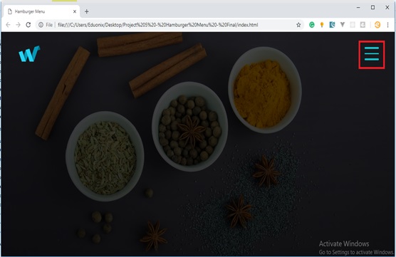
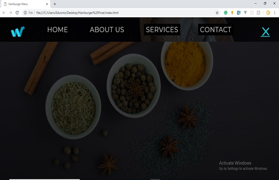
Now, the hamburger menu is ready to use. Hope you find this article useful and for more deeper insights you can explore HTML, CSS and JavaScript Course.
About the Author