

When technology advances rapidly, it’s the design that often gets neglected.
Did you know that the good thing about a user interface (UI) is that users don’t even notice it when you do it right?
What happens when a website lacks the desired UI features?
Users can’t get past the interface efficiently and have a bad experience with that website or design interface.
But, what is user interface design?
User interface design or UI design refers to the aesthetic design of a product’s user interface. It is the process of creating apps and websites that focus primarily on any interface’s look and feel.
It’s the space where interactions between machines and humans occur. UI design’s ultimate aim is to create software applications that make it easy and efficient for users to interact with or use a product.
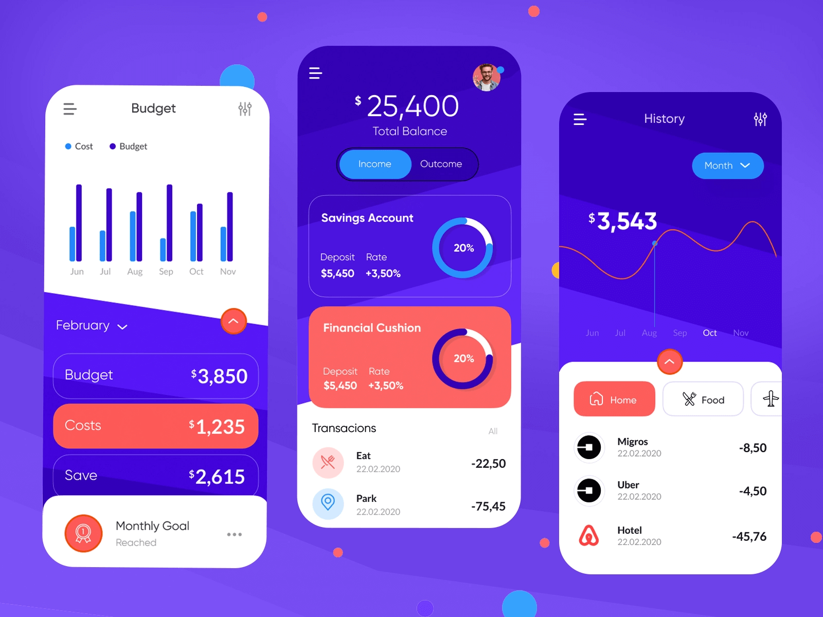
With usability being the heart of any application, UI designers can no longer overlook the power of a UI design.
To ensure you create interfaces that result in a seamless user experience, we’ve curated a list of design rules to keep in mind.
7 UI Design Rules you Need to Know
Follow these seven UI design rules to ensure customers come back to your website or app again and again.
1. Give users control over your design
A successful business is not one where designers have complete control over their interface design. Instead, one common trait of businesses that witness accelerating growth is giving users complete control over the design.
For instance, when an architect designed a complex structure of a shopping mall, he couldn’t figure out a place to install a walkway between two blocks. So, instead of randomly selecting a place, he placed a grass field in that area with a signboard “Walk on the grass.” A few months after completing this structure, the architect re-visited this place and tracked down the path where most people walked.
As a result, he placed the walkway in a strategic and user-approved place.
The same theory applies when you design a UI interface.
When creating a website, provide your users with an open canvas and study their usage patterns and identify areas on your website where they spent most of their time.
Recreate those areas, and you’re likely to witness an increase in the time a customer spends on your website.
Why?
You created a website to keep their requirements in mind.
Pro-tip: Focus on people first and design second.
2. Strive for consistency
Designing for consistency means using the same set of design patterns and sequences of action for similar situations. For example, if you’re using a red clickable button to decline a landing page offer, it should remain consistent throughout your software interface.
Don’t give your users a chance to wonder whether a transformed color of a clickable button means the same thing.
Before playing around with consistency, imagine how you would feel when you get behind the wheels of a car and witness that the brake is in the left corner and the accelerator is on the right.
Why put your precious users in this inconsistent boat?
So, strive to achieve consistency in typography, colors, commands, menus, terminology, and prompt screen throughout your user journey. Use metaphors from the real world, and don’t end up reinventing your symbols. Also, try to make your style uniform.
A slight deflection from a consistent pattern can confuse users who may consider shifting to a consistent application that doesn’t confuse them with their design.
Pro-tip: The more consistent your UI design is, the easier it will become to attract customers to your app or website.
3. Focus on using design dialogues
Your UI design should speak the language of your target audience. This helps them understand what you’re trying to say.
So, always try using words, phrases, and concepts familiar to your target audience. Use the universal language of design rather than internal jargon and terminologies that your audience isn’t familiar with.
For instance, instead of displaying codes like /* () return = /<recycle bin> to delete any item a customer mistakenly adds to their cart, show a recycle bin symbol or use ‘Delete.’
When you use universal terms and symbols in your design, you make the information sound natural and easy to understand.
Terms, concepts, images, and icons that may seem natural to a technical audience may be unfamiliar or confusing for your readers.
For a design to stand out, you should organize all sequences into groups with a clear beginning, middle, and end. Also, when a process is over, ensure your app or website displays a message that they’ve completed the required step.
Pro-tip: Focus on user research to understand user’s familiarity with technology and terminologies.
4. Allow easy reversal of actions
In your childhood, how did you react when you mistakenly used the wrong spelling of words while writing with a pen?
You always wished that there was a way to reverse this error. Why? Masking errors can help your notebook remain neat!
This same childhood rule applies to the design world.
When users know that they can reverse an action or undo an error, it allows them to explore unfamiliar options, thereby increasing the time they spend on your website or app.
Users can perform actions by mistake, and they prefer doing business with companies who offer an easy emergency exit to undo and come out of such a situation. They’re already stressed, and the last thing they would want is to undergo a tedious process to reverse a small mistake.

So, ensure your UI design interface provides users with an option to undo an action. It fosters confidence and provides users with a sense of freedom.
Pro-tip: Try to eliminate error-prone conditions or functionalities. If elimination is impossible, check for error-prone functionalities and notify your users about them before a user commits to such an action.
5. Reduce memory load
Did you know that the attention span of humans is now eight seconds, which is less than a goldfish?
To entice your users and build a strong business relationship, it’s essential to create designs that don’t test the memory of your users.
Testing a user’s memory load reduces their capacity to perform important tasks, and they may prefer switching to a company that ensures computers take over this memory load from them.
Try avoiding interfaces that require users to remember information across multiple pages of your website or app. For instance, don’t let your customer enter their username and password every time they purchase from you. Why?
Users don’t have patience for tedious job entries because it can frustrate them.
When designing your website, focus on the design principle of recognition instead of recall.
Pro-tip: The more your user loads their mind with information, the fewer conversions your website gets.
6. Pay attention to the elemental hierarchy
When designing an interface, ensure to include both utility and usability in your design equation.
This primarily means to place your most critical functions at the top of your page.
Elemental hierarchy can help a user down the page organically, leading the user through your products or services.
Apart from elemental hierarchy, try to make the best use of whitespaces to increase the overall aesthetics of your website.
Also, avoid cluttering elements on your website as it can reduce your website’s functionality and significantly impact its usability.
Pro-tip: As a rule of thumb, keep things flowing from top to bottom and left to right.
7. Focus on giving feedback
In the real world, all of us give and receive feedback immediately. We speak, and others respond.
We offer a biscuit to a dog, and it comes running to you.
However, digital interfaces fail to give much back to their visitors. This can leave the users in a dilemma whether they should reload the page or restart the laptop to see feedback from an application or website.

So, it’s essential to keep your users informed of what is happening at every process stage. Regardless of what the feedback is, ensure it’s meaningful, relevant, and clear.
Also, for every action taken by a user, they should get some system feedback. For infrequent and significant errors, create larger responses but for frequent and minor actions, ensure modest system responses.
For instance, when a visitor clicks a button on a website that fails to trigger a response, it could be highly frustrating. But if you provide instant feedback like ‘site is down’ or ‘wrong password,’ it can help a user rectify their mistake.
Pro-tip: Don’t let your user guess. Instead, tell your user’s what is happening.
The golden rules of UI design
A successful UI design is more about the visual aspect because you have to think out-of-the-box to create a design that resonates with your users.
Use these seven design rules to create designs that are beautiful and stable.
With these design rules, UI designers can create interfaces that encourage exploration without fear of negative consequences. It helps users explore your app or website without the fear of committing any mistake.
While the future of designs will be more intuitive, predictable, forgiving, and enticing, these seven design principles will come in handy.
How are you planning to use these seven design principles?
Share your thoughts with us!
Author’s bio:
Priya Jain is a professional copywriter with 8 years of experience. She has an MBA and engineering degree. When she is not writing, you will find her teaching math, spending her day running behind her toddler, and trying new recipes. You can follow her on LinkedIn and Twitter.
Also Read: The Difference Between A Web Designer and Web Developer

