
What is Responsive Web Design?
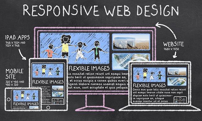
Responsive web design (RWD) is a design approach that ensures websites adapt to fit any device screen size, from tiny smartphones to large desktop monitors. The key to RWD lies in its flexibility. Instead of creating separate websites for different devices, a single responsive website adjusts its layout and content to provide an optimal viewing experience across all platforms.
For companies that need responsive websites built with both design quality and business goals in mind, working with a San Francisco web design agency can help ensure the final experience works smoothly across desktop, tablet, and mobile.
Why is Responsive Web Design Important?
- Enhanced User Experience: Users expect websites to be accessible and easy to navigate, regardless of the device they’re using. RWD ensures a seamless experience across different platforms.
- Increased Mobile Traffic: With the growing dominance of smartphones and tablets, having a mobile-friendly website is crucial for reaching your audience.
- Improved SEO: Search engines prioritize mobile-friendly websites. A responsive design can boost your search engine rankings.
- Cost-Effective: Developing a single responsive website is generally more cost-effective than creating separate websites for desktop and mobile.
- Faster Loading Times: RWD often involves optimized images and code, leading to faster loading times on mobile devices.
Core Components of Responsive Web Design
- Fluid Grid Layout:
- A flexible grid system allows elements to resize and rearrange based on screen size.
- Popular frameworks like Bootstrap provide pre-built grid systems.
- Responsive Images:
- Images should adjust their size and format to fit different screen dimensions.
- Use srcset and sizes attributes for efficient image delivery.
- Media Queries:
- CSS media queries detect screen size and apply specific styles based on the device.
- For example, you can hide elements on smaller screens or change font sizes.
- Flexible Typography:
- Text should be readable on various screen sizes.
- Use relative units like em or rem for font sizes.
Implementing Responsive Web Design in Your Projects
- Start with a Mobile-First Approach: Design for small screens first and then scale up for larger devices.
- Choose a Responsive Framework: Consider using a pre-built framework like Bootstrap, Foundation, or Materialize to speed up development.
- Create a Flexible Grid System: Define a grid structure that adapts to different screen sizes.
- Optimize Images: Use responsive images and consider image compression for faster loading.
- Test Across Devices: Thoroughly test your website on various devices to identify and fix issues.
- Prioritize Content: Focus on essential content and consider hiding less important elements on smaller screens.
- Use Responsive Typography: Ensure text is readable on all devices.
- Optimize for Performance: Optimize code and images for fast loading times.
Creating a Fluid Grid Layout: The Backbone of Responsive Design
A fluid grid layout is essential for achieving responsive web design. It allows elements on a webpage to adjust their position and size based on the screen width.
Understanding Grid Systems
A grid system is a framework that organizes content within a defined space. In responsive design, the grid must be flexible, allowing elements to rearrange and resize as the screen size changes.
Building a Responsive Grid
- Choose a Grid Framework: While building a grid from scratch is possible, using a pre-built framework like Bootstrap or Foundation can save time and effort. These frameworks provide pre-defined grid systems and utility classes for easy styling.
- Define Columns: Determine the number of columns you want to use for your layout. A common approach is a 12-column grid, but you can choose any number based on your design needs.
- Set Column Widths: Use percentages or em units for column widths to ensure flexibility. Avoid fixed pixel values.
- Create Gutters: Add spacing between columns using margins or padding.
- Implement Media Queries: Use media queries to adjust the grid layout at specific breakpoints (e.g., mobile, tablet, desktop).
Example using CSS:
CSS
.container {
width: 100%;
max-width: 1140px;
margin: 0 auto;
}
.row {
display: flex;
flex-wrap: wrap;
margin: 0 –15px;
}
.col {
flex: 0 0 auto;
padding: 0 15px;
}
/* Example for a 12-column grid */
.col-sm-12 {
width: 100%;
}
.col-sm-6 {
width: 50%;
}
/* Media query for smaller screens */
@media (max-width: 768px) {
.col-sm-6 {
width: 100%;
}
}
Key Considerations
- Responsive Images: Ensure images also scale proportionally with the grid layout.
- Flexibility: The grid should be flexible enough to accommodate different content arrangements.
- Testing: Thoroughly test your grid on various devices to identify and fix issues.
By creating a well-structured and responsive grid, you lay the foundation for a website that adapts seamlessly to different screen sizes.
Responsive Images: Optimizing Visual Content
Responsive images are crucial for delivering high-quality visuals while maintaining fast load times across different devices.
Understanding the Challenge
Traditional image optimization often involves creating multiple image sizes for different screen resolutions. This can be time-consuming and inefficient. Responsive images address this challenge by dynamically adjusting image size based on the user’s device and screen size.
Implementing Responsive Images
- Use srcset attribute:
- Specifies multiple image sources with different widths.
- The browser selects the most appropriate image based on the screen size.
- Example:
- HTML
<img src=“small.jpg” alt=“Image” srcset=“small.jpg 320w, medium.jpg 640w, large.jpg 1024w”>
- Use sizes attribute:
- Provides hints to the browser about the image dimensions in different viewport sizes.
- Improves image selection efficiency.
- Example:
- HTML
<img src=“small.jpg” alt=“Image” srcset=“small.jpg 320w, medium.jpg 640w, large.jpg 1024w” sizes=“(max-width: 600px) 320px, (max-width: 960px) 640px, 1024px”>
- Consider picture element:
- Provides more control over image selection for complex scenarios.
- Allows you to specify different image formats or sources based on conditions.
- Example:
- HTML
<picture>
<source media=“(min-width: 768px)” srcset=“large.jpg”>
<source media=“(min-width: 480px)” srcset=“medium.jpg”>
<img src=“small.jpg” alt=“Image”>
</picture>
- Optimize Image Formats:
- Use modern formats like WebP or AVIF for better compression.
- Consider progressive JPEGs for faster initial loading.
Optimizing Performance in Responsive Web Design
Responsive web design is not just about adapting to different screen sizes; it’s also about ensuring optimal performance across devices. A slow-loading website, regardless of its responsiveness, can frustrate users and impact your search engine rankings.
Key Performance Optimization Techniques
- Minimize HTTP Requests:
-
-
- Combine CSS and JavaScript files.
- Optimize images and use appropriate formats (WebP, AVIF).
- Leverage browser caching.
-
- Optimize Images:
-
-
- Compress images without compromising quality.
- Use responsive images to deliver appropriate image sizes.
- Consider lazy loading images.
-
- Leverage Browser Caching:
-
-
- Set appropriate cache headers to store static resources locally.
- Reduce server load and improve page load times.
-
- Minimize Resource Size:
-
-
- Minify CSS, JavaScript, and HTML files.
- Remove unnecessary code and comments.
- Optimize fonts.
-
- Prioritize Content Loading:
-
-
- Deliver critical content above the fold first.
- Use asynchronous loading for non-critical resources.
-
- Optimize CSS and JavaScript:
-
-
- Reduce CSS specificity to improve rendering performance.
- Optimize JavaScript code for efficiency.
- Defer non-critical JavaScript execution.
-
- Test and Analyze:
-
- Use performance profiling tools to identify bottlenecks.
- Continuously monitor website performance and make optimizations.
Additional Considerations
- Content Delivery Network (CDN): Distribute your website’s static content across multiple servers for faster delivery.
- Server-Side Rendering (SSR): Improve initial page load time by rendering content on the server.
- Web Workers: Offload heavy computations to background threads to improve responsiveness.
Tools for Performance Optimization
- Google PageSpeed Insights
- Lighthouse
- WebPageTest
By implementing these performance optimization techniques, you can create responsive websites that load quickly and provide a seamless user experience across all devices.
Accessibility in Responsive Web Design
Accessibility is a critical aspect of web design that ensures content is usable by everyone, regardless of their abilities. When combined with responsive design, it becomes even more crucial to create inclusive digital experiences.
Key Accessibility Considerations
- Color Contrast:
- Ensure sufficient color contrast between text and background for readability.
- Use tools like WebAIM’s Contrast Checker to evaluate contrast ratios.
- Provide alternative color schemes for users with visual impairments.
- Font Size and Readability:
- Use clear and legible fonts with appropriate font sizes.
- Allow users to adjust font sizes without affecting layout.
- Provide options for line spacing and character spacing.
- Keyboard Navigation:
- Ensure all interactive elements can be accessed and operated using the keyboard.
- Provide clear focus indicators for keyboard navigation.
- Implement logical keyboard shortcuts.
- Screen Reader Compatibility:
- Use semantic HTML elements and attributes (headings, labels, alt text).
- Provide descriptive text alternatives for images and multimedia content.
- Ensure proper focus order for screen reader users.
- Responsive Design Principles:
- Maintain consistent layout and navigation across different screen sizes.
- Avoid relying solely on visual cues for information.
- Ensure touch targets are large enough for touchscreens.
Tools and Resources
- WCAG (Web Content Accessibility Guidelines): Provides standards for accessible web content.
- WAVE: A free accessibility evaluation tool.
- Lighthouse: An open-source audit tool for improving web page quality.
- Color Contrast Checker: For evaluating color contrast ratios.
- Screen Reader Testing: Involve users with disabilities in testing.
Best Practices
- Test Early and Often: Involve accessibility experts in the design and development process.
- Prioritize User Needs: Focus on user experience and inclusivity.
- Stay Updated: Keep up with accessibility standards and guidelines.
- Continuous Improvement: Regularly assess and improve website accessibility.
By incorporating accessibility into your responsive web design process, you can create websites that are usable and inclusive for everyone
Conclusion
Responsive web design is a fundamental principle for creating modern, user-centric websites. By understanding the core components, implementing best practices, and prioritizing accessibility and performance, you can build websites that deliver exceptional experiences across all devices.
Remember, responsive design is an ongoing process. Technology and user expectations evolve, so it’s essential to stay updated with the latest trends and guidelines. By continuously testing, analyzing, and refining your designs, you can create websites that not only adapt to different screen sizes but also exceed user expectations.
Key Takeaways:
- Responsive web design is essential for reaching a wider audience.
- A fluid grid layout provides the foundation for adaptability.
- Responsive images optimize visual content for different devices.
- Media queries enable tailored styles based on screen size.
- Performance optimization is crucial for a positive user experience.
- Accessibility ensures inclusivity for all users.
By incorporating these principles into your web development projects, you can create websites that are not only visually appealing but also functional, accessible, and performant.
About the Author