
In today’s web design landscape, creating responsive layouts that look great on any device is non-negotiable. Whether you’re building a simple blog or a complex dashboard, CSS tools like Flexbox and CSS Grid are your go-to solutions. But which one should you use? In this guide, we’ll break down Flexbox vs. Grid, explore their strengths, and help you decide the best tool for your next responsive design project.
What is Flexbox?
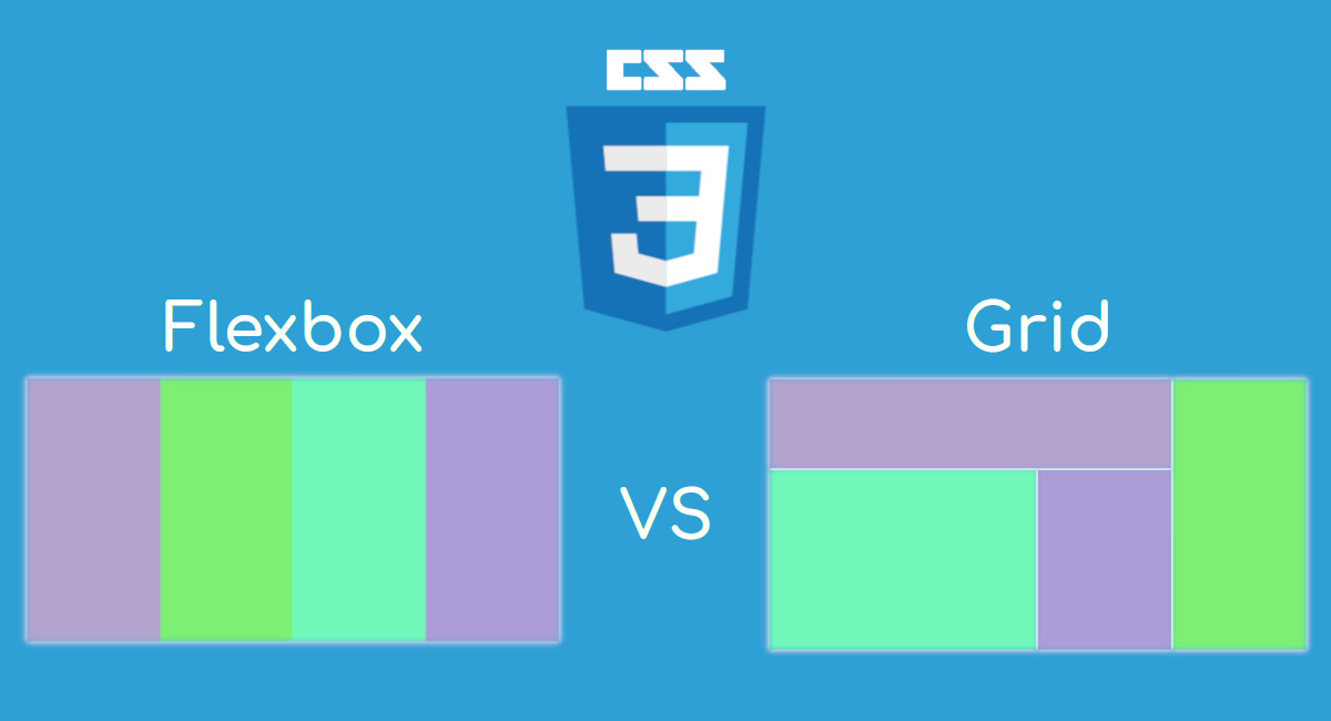
CSS Flexbox (Flexible Box Layout) is a one-dimensional layout system designed to arrange items in a single row or column. It’s perfect for managing space distribution and alignment with ease.
Key Features of Flexbox
- Flexible sizing of elements.
- Powerful alignment options (e.g., center, space-between).
- Reordering items without changing the HTML structure.
Common Use Cases
Flexbox shines in scenarios like responsive navigation bars, centered content blocks, or single-axis layouts (think horizontal card rows).
Why Flexbox for Responsive Design?
Its adaptability to dynamic content makes it a favorite. Whether your content shrinks or grows, Flexbox adjusts effortlessly—ideal for mobile-first designs.
What is CSS Grid?
CSS Grid is a two-dimensional layout system that lets you control both rows and columns. It’s built for complex, structured designs where precision matters.
Key Features of Grid
- Define explicit rows and columns.
- Create named grid areas for easy placement.
- Overlap elements without extra hacks.
Common Use Cases
Grid excels in full-page layouts, multi-column designs, or intricate setups like dashboards and magazine-style pages.
Why Grid for Responsive Design?
With Grid, you get unmatched control over layout structure. It’s a powerhouse for responsive designs that need to adapt seamlessly across screen sizes.
Flexbox vs. Grid: Key Differences
|
Feature |
Flexbox |
Grid |
|
Dimensionality |
1D (rows or columns) |
2D (rows and columns) |
|
Control |
Content-driven |
Layout-driven |
|
Complexity |
Easier to learn |
Steeper learning curve |
|
Best For |
Simpler, linear layouts |
Complex, structured designs |
Both tools enjoy excellent browser support in 2025, so compatibility isn’t a concern. The real question is: What does your project need?
When to Use Flexbox for Responsive Layouts
Flexbox is your go-to when you’re working with single-direction layouts or unpredictable content sizes.
Best Scenarios for Flexbox
- Navigation menus: Create a responsive navbar that collapses on mobile.
- Card layouts: Align cards horizontally with varying text lengths.
- Centering elements: Perfect for vertically or horizontally centering content.
Pros
- Simple syntax and quick setup.
- Adapts to content without rigid structure.
Cons
- Limited control over two-dimensional alignment.
For a responsive navbar that adjusts to screen size, Flexbox’s space-between and flex-wrap properties make it a breeze.
When to Use Grid for Responsive Layouts
Grid is the champion of complex layouts where you need precise control over rows and columns.
Best Scenarios for Grid
- Full-page layouts: Design a homepage with a header, sidebar, and content area.
- Multi-column articles: Build a responsive blog layout with side-by-side sections.
- Dashboards: Arrange widgets in a structured, grid-based design.
Pros
- Total control over layout structure.
- Simplifies complex responsive designs.
Cons
- Overkill for simple, linear layouts.
For a responsive dashboard, Grid’s ability to define rows, columns, and gaps ensures everything stays aligned, no matter the screen size.
Combining Flexbox and Grid
Why choose when you can use both? Combining Flexbox and Grid often yields the best results for responsive layouts.
How to Combine Them
- Use Grid for the overall page structure (e.g., header, main, footer).
- Use Flexbox for internal alignment (e.g., a row of buttons inside a Grid cell).
Example
Imagine a portfolio site: Grid sets up the main layout (gallery + sidebar), while Flexbox aligns the gallery images horizontally within their container. This hybrid approach maximizes flexibility and control.
Practical Tips for Responsive Design
Media Queries
Pair media queries with Flexbox or Grid to tweak layouts at different breakpoints. For example:
- Flexbox: Switch from row to column on mobile.
- Grid: Adjust column spans or gaps for smaller screens.
Mobile-First Design
Start with a single-column layout (Flexbox or Grid) and scale up with wider screens. This ensures a smooth experience on all devices.
Tools and Resources
- Use browser dev tools to visualize Flexbox and Grid layouts.
- Explore frameworks like Tailwind CSS or Bootstrap for pre-built responsive utilities.
Conclusion
So, Flexbox or Grid? It depends on your project. Flexbox is ideal for simpler, content-driven layouts, while Grid dominates complex, two-dimensional designs. For the ultimate responsive layout, consider blending both. Experiment with each tool to see what works best—mastering them will level up your web design game.
What’s Your Take?
Have you used Flexbox or Grid for a responsive project? Share your experience in the comments below! Ready to dive deeper? Check out this Udemy course on Responsive Web Development (use coupon code BLOG2025 for a discount) to master Flexbox, Grid, and more with hands-on projects. Happy coding!
About the Author