

Sometimes, your customers just need to be told what to do. This is where a call-to-action (CTA) comes in!
A CTA is a phrase, often on a button, subject line, landing page, or email, that tells a customer what to do next. “Sign up,” “Download now,” and “Start Your Free Trial” are all examples of CTAs. When used well, your CTA can help move a customer through your sales funnel and ultimately get you more sales.
Here, I’m going to explain how you can ensure your CTAs are as effective as possible.
Always lead with a strong verb
The entire point of a CTA is to get someone to do something, right? So, start your calls to action with a strong verb. Direct, mechanical CTAs like “Submit,” “Download,” or “Register” won’t be super effective on their own.
Stronger CTAs with verbs like “Learn more,” “Join free,” “Find your fit,” or “Discover now” are all excellent because they are more direct in telling the customer what they should be doing, and what they’ll be getting out of doing it.
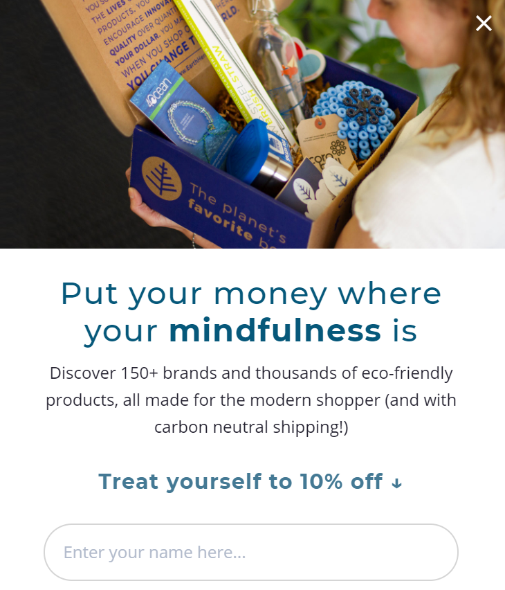
Earth Hero, an online retailer focused on sustainability, uses a strong CTA on their pop-up box that appears on their website. “Treat yourself to 10% off,” tells the customer what to do — start shopping with Earth Hero and give yourself a little treat while you do it. By offering 10% off, it’s clear that customers get a bit of a bonus out of the deal.
Ensure that your calls-to-action really stand out
Keep in mind that the design of your CTAs is just as important as the wording. You don’t want them to blend in, or viewers might not spot them! Consider using a contrasting color for your CTA button, and make sure it’s in a spot where your customers can see it.
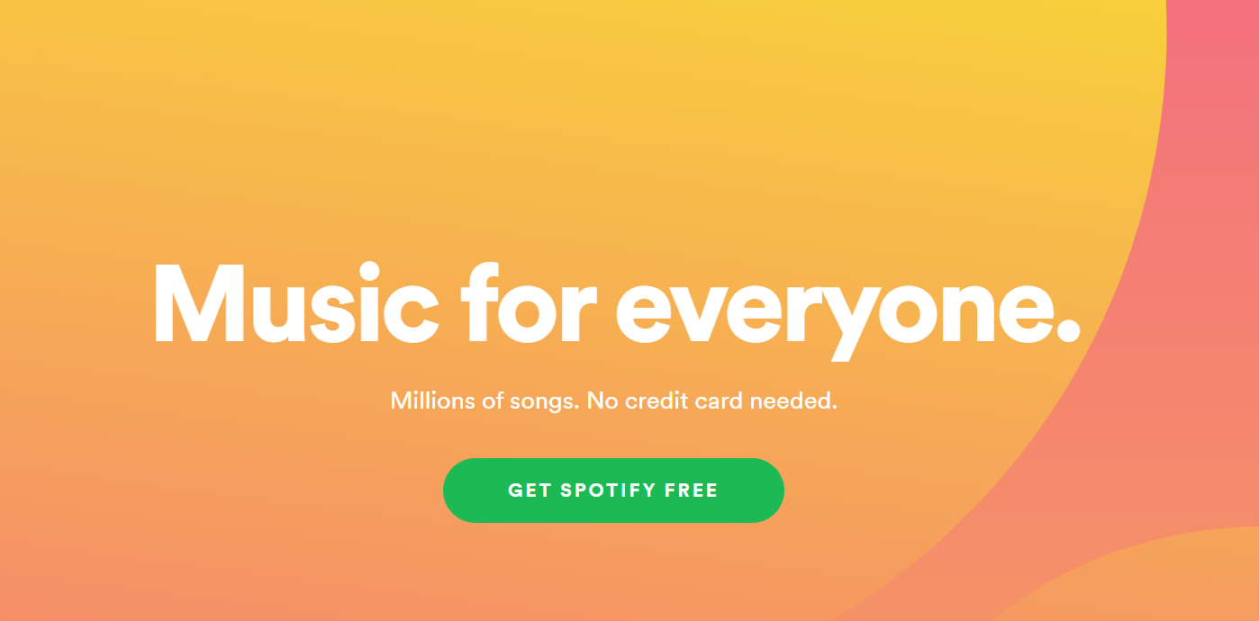
Spotify is great at creating CTAs that stand out. Take a look at this one from their homepage, for instance. Their CTA stands out in their bright, trademark green against a cheerful yellow background. It should also be noted that their wording and supporting copy help it stand out, as well; it’s clear that signing up for Spotify is free and doesn’t require a credit card.
Play on your customers’ FOMO
Fear of missing out can be a really effective motivator — play on this with your CTAs! If your readers feel like people just like them are buying your products, using your services, or otherwise taking your desired action, they’ll want to get in on it.
Use your copy and CTAs to show that people are much better off for having spent money with you! Consider showing off how many people have signed up for your product, for instance, or use certain verbs to help evoke a sense of excitement and FOMO.
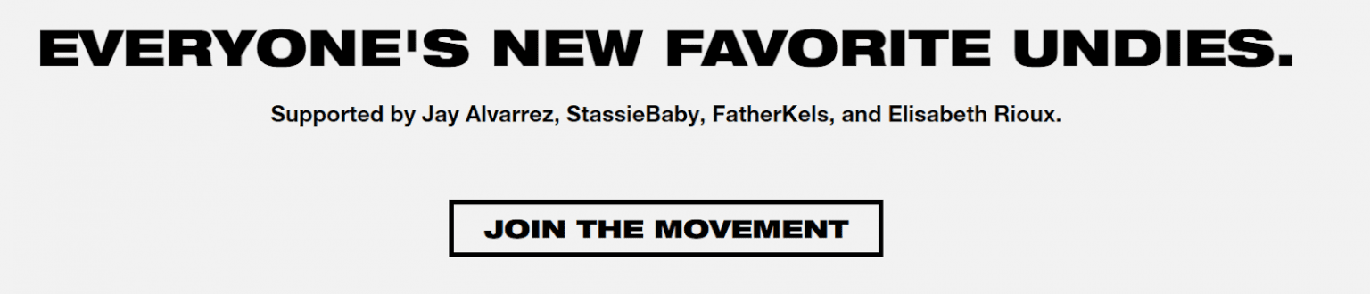
Take a look at how Bamboo Underwear incorporates FOMO into their CTA and supporting copy. The first thing that they want you to know? These are everyone’s new favorite underwear. Don’t you want to get in on the action? If you’re convinced, there’s a clear CTA telling the viewer to “Join The Movement.” This is such a strong phrasing for a CTA. You won’t just be getting a new pair of underwear when you sign up — it’s a phenomenon.
You can also play on prospective customers’ sense of FOMO by ensuring that your CTAs are accompanied by a positive review from a previous client. Take a look at how the law firm Florin Roebig uses this tactic to get results.
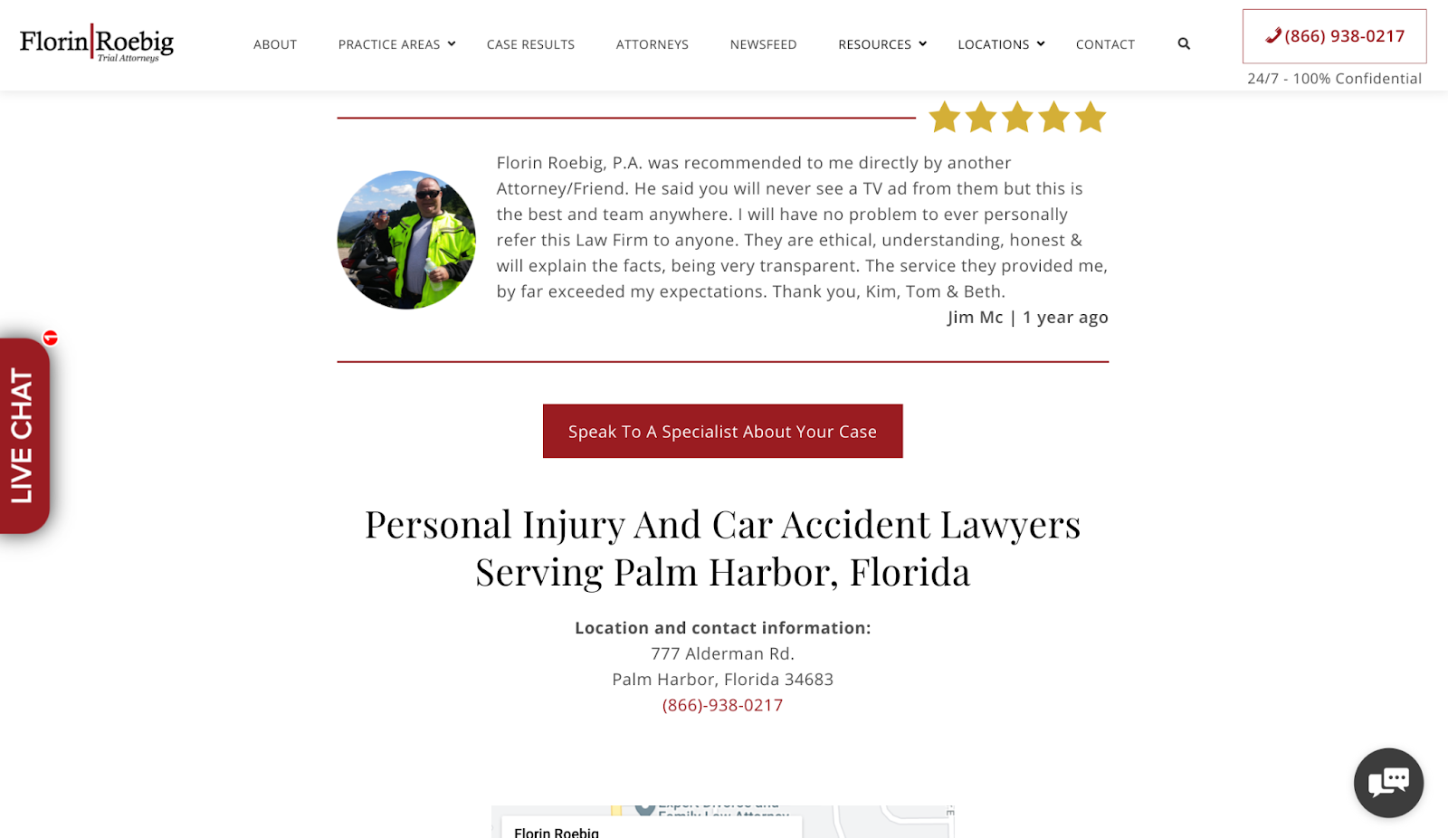
Placing a strong CTA after a positive testimonial can be very effective, as it shows that you’ve already helped people just like your current website visitors. And, if they decide to pay for your products or services, they can reap the same rewards that others already have. Word-of-mouth recommendations are also one of the most powerful forms of marketing, and this is a great way to replicate them. It can do wonders for your conversion rate, so it’s a technique you should definitely try out.
Create a sense of urgency for your customers
Similar to creating FOMO, building up a sense of urgency for your customers can make them feel like they’ll miss out if they don’t act immediately. This can help lead more people to take the action you want them to take right away.
There are a lot of ways to create a sense of urgency using your CTAs. Over an “Add to Cart” button, for example, you can tell customers how much stock you have. Something like, “Only 3 left – buy now!” will do, and help push customers to buy before someone else does. If you’re having a sale, you could use a timer to show that the clock is ticking!
Take a look at how Blogging.com created urgency around their limited-time offer. Their timer shows how long a viewer has to get in on the action. Their CTA, “Click Here to Get Started” tells customers exactly what they need to do next to get in on the offer, which is what makes it so effective.

Offer different calls-to-action for different people
Keep in mind that different CTAs will work for different people if they’re at different stages of the buying journey. For instance, some people might be more receptive to a CTA that encourages them to call for more information, while others might be ready to make a purchase and need a CTA to seal the deal. Keeping this in mind will help improve your customer experience.
Consider mapping out what your customer journey looks like to help figure out what CTAs you need to write. Do you have a referral system for existing customers to invite friends? Or, do you offer a free trial or brochure for new leads to learn more information? Consider incorporating these into your CTAs. For more information, take a look at HubSpot’s guide to creating an effective customer journey.
Take a look at how Edith Cowan University targets people at the beginning of the customer journey with their CTA.
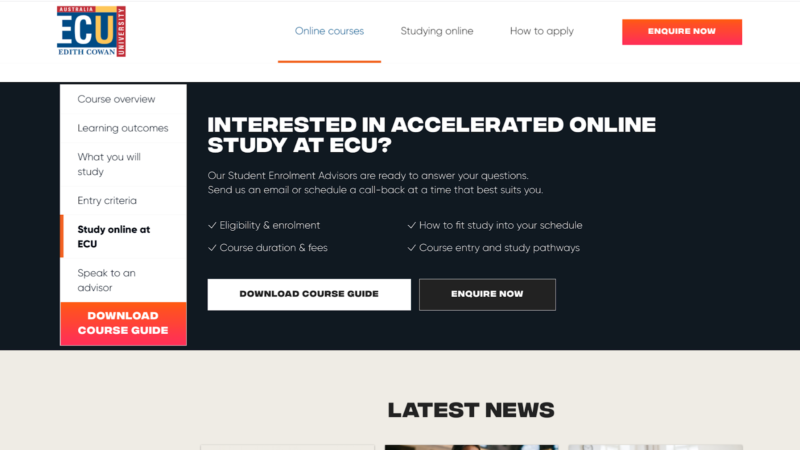
They offer a free online course guide for people scrolling through their website, potentially interested in their classes. Additionally, they have a button that lets a viewer call to learn more. Since this particular page is about their online Master of Education program, it targets people trying to determine if their program is right for them. These CTAs help to push a customer to take the next step in learning more.

Similarly, Koala, an Australian furniture retailer, targets existing customers with their pop-ups encouraging them to refer their friends and family to Koala. “Start Sharing” has a bit of a double meaning here — not only is a customer sharing the Koala brand, but they’re sharing the 10% off offer. As a bonus, the existing customer gets $50 store credit. This is a great example of a CTA that ropes back in customers that have already shopped with Koala. Then, on their site, there are different examples for other groups of visitors.
Summary
Getting your CTAs right is SO important to making a sale. If people don’t know exactly what you want them to do and how they can do it, they might leave your website before completing a purchase. Fortunately, there are lots of ways you can get these right.
Be sure that your CTAs stand out, have strong verbs, tap into a customer’s sense of urgency or FOMO, and target a variety of customers at different stages of the buying process. Start there, and don’t be afraid to try a few strategies to see what works best for your business.
Also Read: The Fundamentals of Copywriting!