

Data science is a branch of descriptive statistics that involves the processing and analysis of a large amount of data. Understanding, interpreting, and visualizing all this data becomes very difficult for humans as most of this data is in raw format. Visual representation of any form of data makes its interpretation convenient and helps to analyze the trends within the data. Data visualization is the presentation of data in a pictorial or graphical format to understand the data in a better way. Visualizing data grabs the user’s interest by making the information more appealing for analysis. It makes boring data that contains a large quantity of numerical data visually appealing and convenient to study. Histograms, heat maps, scatter plots, box plots, pie charts, flow charts, radar charts, and line charts are a handful of techniques available for visualizing complex data.
The python programming language offers various libraries that make visualization of data very convenient. Hence, Python is the most preferred language by data analysts and data scientists due to its vast features and user-friendliness. Matplotlib, Seaborn, Plotly, Altair, and Bokeh are a few of the libraries that offer data visualization techniques in python. These libraries contain numerous in-built methods that offer various visualization tools for a better understanding of the data. This article will demonstrate the visualization of a dataset using the famous library – Matplotlib.
Importing the Dataset and Required Libraries for Visualization
In this article, we will use the IRIS Dataset for visualization. This dataset contains 50 instances of each of three species of Iris flowers. This dataset is popular for use cases involving pattern recognition. It contains five attributes, namely sepal_length, sepal_width, petal_length, petal_width,and species. The following figure shows a few elements of the dataset.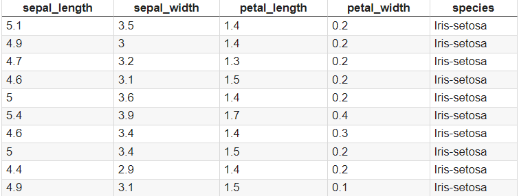 The libraries required for this tutorial are Pandas and Matplotlib. The Pandas library is used for reading the dataset, and the Matplotlib for creating various visual plots for visualizing the data. The Matplotlib is imported with the alias name as plt for convenience.
Matplotlib for Visualizing the Dataset
Matplotlib is a poplar, two-dimensional charting toolkit that aids in the visualization of data. Matplotlib creates graphs and visuals that are similar to those in Matlab. Matplotlib in Python is used because it is a reliable, free of cost, and simple data visualization package. A few basic plots using the Matplotlib library are shown in the following sections.
Scatter Plot
A scatter plot helps in understanding the relationship between two variables. It also aids in detecting any outliers in the data. It shows the correlation between the two variables plotted, which helps understanding how the variables depend on each other. 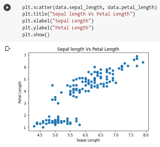 The above code snippet shows a scatter plot depicting the relationship between the iris flowers’ sepal length and petal length. As observed, the relation between the petal length and sepal length is almost linear, indicating that a flower’s petal length increases as the sepal length increases.
Histogram
A histogram is a visual representation of data presented in the form of groups. It is a precise approach for displaying numerical data distribution graphically. It’s a kind of bar plot in which the X-axis indicates bin ranges and the Y-axis represents frequency. 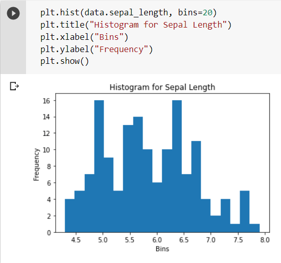 The X-axis shows the bins, that is, different ranges of sepal lengths, and the Y-axis shows the frequency of occurrence of these ranges in the dataset. Multiple histograms can also be plotted in the same plot as shown in the following code snippet.
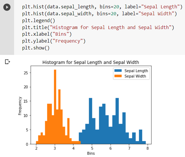
Box Plot
Box plot helps in summarizing the data and understanding its distribution. It helps in identifying any outliers present in the dataset. The terms associated with a box plot have been explained in the following figure. 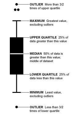 It gives complete information about the maximum and minimum numerical value, the range in which the majority of the data lies, and any outliers in the data. The line or a notch between the upper and lower quartiles represents the median of the data.
 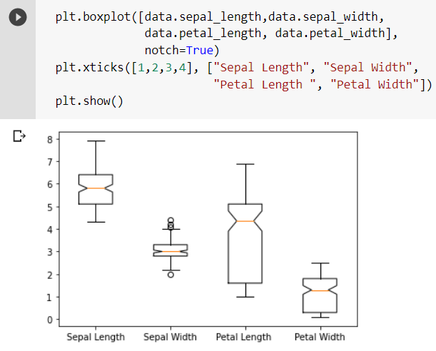 As observed from the box plot, the sepal width column in the dataset has a few outliers. It provides a complete understanding of the data by displaying the range of each attribute.
Violin Plot
A violin plot is much similar to a box plot. An advantage of it over a box plot is that it gives a broader visualization of the distribution. The denser areas indicate more distribution, while narrower regions indicate less quantity of data in that range.
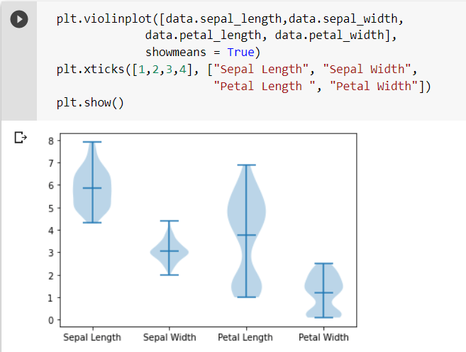 The line at the middle of the graph indicates the mean of all the data present in that particular attribute.
Stem Plot
Stem plots are useful in plotting and visualizing data that is in discrete form (i.e. not continuous in time). It represents each instance as a point in the 2-dimensional plane. 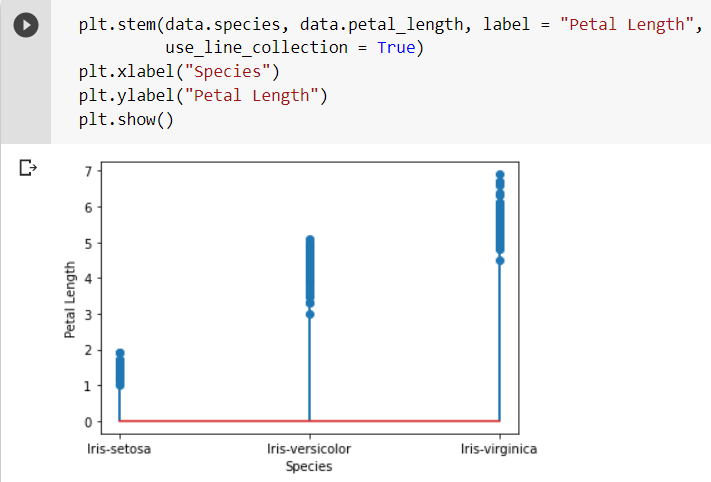 The stem plot in the code snippet plots each class’s petal lengths (or species). As observed, each element is represented by a point or a dot in the 2D plane. Here, the X and Y-axis of this plane represent the species and petal lengths, respectively.
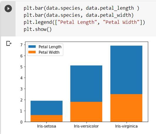
Bar Plot
A bar plot represents categorical data with rectangular bars whose height is proportional to the value or magnitude they represent. A bar plot has been plotted in the following snippet representing two attributes from the dataset.
Conclusion
Data visualization is a necessary and beneficial tool in data analysis. It makes understanding a large and complex set of data convenient and effortless by visually representing all the information through various charts and graphs. In this article, we have discussed a few techniques for visualizing data like scatter plots, histograms, box plots, violin plots, stem plots, and bar plots using the popular Matplotlib library. Some other libraries are also available in the Python programming language that provides many in-built methods for easy visualization of complex datasets. A few of them are Seaborn, Plotly, Altair, and Bokeh. There are yet many sophisticated visualization techniques to explore for better and efficient analysis of complex sets of data.
Also Read: Why is Python Programming Language So Popular Among Programmers?