
Herein, we are going to start building a 3D slide show which will be represented by a cube. Behind the cube, there will be a background image. On the left and right sides, we’ll have controls (arrows). When we hover on these arrows, the cube will be slightly rotated, but when we click on them, the slide show starts working. Also, we have another control at the bottom which allows the cube to work automatically. We can also pause the slide show by clicking it. This is the way how our cube will work.
In this project, we are going to use HTML, CSS and JAVASCRIPT.
So, let’s get started with the HTML
<!doctype html>
<html lang="en">

<head>
    <meta charset="UTF-8">
    <meta name="viewport "content ="device-width,initial-scale=1.0">
    <meta http-equiv="X-UA-Compatible" content="ie=edge">
    <link rel="stylesheet" href="style.css" >
    <link rel="stylesheet" href="https://use.fontawesome.com/releases/v5.6.3/css/all.css" integrity="sha384-UHRtZLI+pbxtHCWp1t77Bi1L4ZtiqrqD80Kn4Z8NTSRyMA2Fd33n5dQ8lWUE00s/" crossorigin="anonymous">
    <link href="https://fonts.googleapis.com/css?family=Pacifico" rel="stylesheet">
    <link href="https://fonts.googleapis.com/css?family=Satisfy" rel="stylesheet">
   <link href="https://fonts.googleapis.com/css?family=Josefin+Sans|Montserrat|Ubuntu" rel="stylesheet">

    <title>cube</title>

</head>

<body>
    <div class="container">
    <div class="viewport">
       <div class="control left-arrow"><i class="fas fa-arrow-left"></i></div>
        <div class="cube cube-1">
            <div class="face front"></div>
             <div class="face back "></div>
             <div class="face left"></div>
             <div class="face right"></div>
        </div>

          <div class=" control right-arrow"><i class="fas fa-arrow-right"></i></div>
          <div class=" control play-pause"><i class="fas fa-play"></i></div>
    </div>
    </div>
    <script src="app.js"></script>
</body>
</html>
Required CSS is here:
*{
    margin: 0;
    padding: 0;
}
.container{
    height:100vh;
    width:100%;
    background: linear-gradient(rgba(0,0,0,.6),rgba(0,0,0,.8)), url(image/a.jpeg) no-repeat;
    background-size: cover;
}
.viewport{
    width:42vw;
    height: 21vw;
    position: absolute;
    top:50%;
    left:50%;
    transform: translate(-50%,-50%);
    perspective: 1300px;
}
.cube{
    width:100%;
    height: 100%;
    background-color: #ccc;
    transform-style: preserve-3d;
    position: relative;

}
.face{
    width:100%;
    height: 100%;
    position: absolute;
  }

.front{
    transform: translateZ(21vw);
}
.cube-1 .front{
    background: url(image/1.jpeg) no-repeat 50% 0;
    background-size: cover;
    }
.back{
    transform: translateZ(-21vw) rotateY(180deg);
}
.cube-1 .back{
    background: url(image/2.jpeg) no-repeat 50% 0;
    background-size: cover;
    }
.left{
    transform: translateX(-21vw) rotateY(-90deg);
}
.cube-1 .left{
    background: url(image/3.jpeg) no-repeat 50% 0;
    background-size: cover;
    }
.right{
    transform: translateX(21vw) rotateY(90deg);
}
.cube-1 .right{
    background: url(image/4.jpeg) no-repeat 50% 0;
    background-size: cover;
    }
.control{
    position: absolute;
    transform: translate(-50%,-50%);
    width: 40px;
    height: 40px;
    border: 1px solid #fff;
    background-color: rgba(59,52,50,.7);
    display: flex;
    justify-content: center;
    align-items: center;
    color: #fff;
    border-radius: 100%;
    cursor: pointer;
    z-index: 100;
    transition: background-color .3s;
}
.control:hover{
    background-color: rgba(42,38,36,.8);
}
.control i{
    pointer-events: none;
}
.left-arrow{
    top: 50%;
    left: -35%;
}
.right-arrow{
    top:50%;
    left:135%;
}
.play-pause{
    top: 140%;
    left: 120%;
}
It’s time to add some JavaScript to our project and make this cube working.
When we hover on the left and right arrows, the cube should be rotated (by 25 degrees) and when we click them, slide show should be started (rotated by 90 degrees). On each click, the cube will be rotated once.
Play-Pause button will run slide-show automatically and then pause it on click.
And here is the Javascript:
let x = 0, bool = false, interval;

const rotate =() =>{
    const cubes=document.querySelectorAll('.cube');
    Array.from(cubes).forEach(cube => cube.style.transform = `rotateY(${x}deg)`);
}
const changeplaypause =() => {
    const i = document.querySelector('.play-pause i');
    const cls = i.classList[1];
    if(cls ==='fa-play'){
        i.classList.remove('fa-play');
         i.classList.add('fa-pause');
    }
    else{
        i.classList.remove('fa-pause');
         i.classList.add('fa-play');
    }
}

const playpause = () =>{
    if(!bool){
       interval=setInterval(() =>{
        x -=90;
        rotate();
    },1000);
        changeplaypause();
  bool=true;
    }else{
        clearInterval(interval);
        changeplaypause();
        bool = false;
    }

}
document.querySelector('.left-arrow').addEventListener('click',() =>{
    x += 90;
   rotate();
})
document.querySelector('.right-arrow').addEventListener('mouseover',() =>{
    x-= 25;
    rotate();
 })
document.querySelector('.left-arrow').addEventListener('mouseover',() =>{
    x+= 25;
    rotate();
 })
document.querySelector('.left-arrow').addEventListener('mouseout',() =>{
    x-= 25;
    rotate();
 })
document.querySelector('.right-arrow').addEventListener('mouseout',() =>{
    x+= 25;
    rotate();
 })
document.querySelector('.right-arrow').addEventListener('click',() =>{
    x -= 90;
    rotate();
 })

document.querySelector('.play-pause').addEventListener('click',() =>{
   playpause();

 })
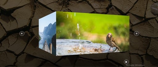
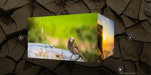
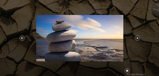
OUTPUT:
Output when we hover on left arrow
Output when we hover on the right arrow
Output when we click on Play-Pause button
In the meantime, if you are interested in building various projects such as Hamburger Menu, Slideshow, Profile Cards and others using HTML, CSS & JavaScript then you can opt for this online tutorial.
About the Author