
In this article, I’ll show you how to create a responsive Navbar using Bootstrap 4. Herein, we are going to design a navbar for the food website which will have options like Home, Categories, About Us, Contact and Search Box. We will design a responsive navbar. Responsive web design makes a website look good on all devices like desktops, tablets, and phones, etc.
What is Bootstrap?
Bootstrap is the most popular HTML, CSS, and JavaScript framework for developing responsive websites. It is a front-end framework used to create modern websites and web apps. It’s open-source and free to use.
Reasons to use Bootstrap for Amazing web Designs:
- Easy to Use:
It is an easy and speedy procedure, to begin with Bootstrap. It is very adaptable too. - Responsiveness:
Design and development should respond to the user’s behavior and environment based on screen size, platform and orientation. - Packaged JavaScript Components:
Bootstrap approaches with a pack of JavaScript components for including the functionality that crafts it in a simple way for operating things, such as tooltips, modal windows, alerts, etc. You can even leave out the writing scripts completely. - Grid:
Bootstrap has the capability to utilize a 12-column grid that is responsive. It also supports offset and nested elements. The grid can be maintained in a responsive mode. - Simple Integration:
Bootstrap can be easily integrated along with various other platforms and frameworks on existing as well on new sites. It can be used along with current CSS.
Some Common Differences Between Bootstrap 3 and Bootstrap 4:
-
Components
Bootstrap 3
Bootstrap 4
CSS Files (Source)
LESS
SCSS
CSS Unit
px
rem
Media Queries Unit
px
px
Font Size
14px
16px
Grid Tiers
4 tier grid system (xs, sm, md, lg)
5 tier grid system (xs, sm, md, lg, xl)
Offsetting Columns
Uses col-*-offset-* classes to offset columns. For example, col-md-offset-4.
Uses offset-*-* classes to offset columns. For example, offset-md-4.
NOTE:
From lowest breakpoint, Bootstrap 4 has removed the xs. Therefore, col-* covers all devices. There is no need to specify the size in this case
Code for Responsive Navbar:
<!DOCTYPE html>

<html>

<head>

<!-- Required meta tags -->

<meta charset="utf-8">

<meta name="viewport" content="width=device-width, initial-scale=1.0">

<script src="https://code.jquery.com/jquery-2.1.3.min.js"></script>


<!-- Bootstrap CSS -->

<link rel="stylesheet" href="https://stackpath.bootstrapcdn.com/bootstrap/4.2.1/css/bootstrap.min.css" integrity="sha384-GJzZqFGwb1QTTN6wy59ffF1BuGJpLSa9DkKMp0DgiMDm4iYMj70gZWKYbI706tWS" crossorigin="anonymous">

<script src="https://stackpath.bootstrapcdn.com/bootstrap/4.2.1/js/bootstrap.min.js" integrity="sha384-B0UglyR+jN6CkvvICOB2joaf5I4l3gm9GU6Hc1og6Ls7i6U/mkkaduKaBhlAXv9k" crossorigin="anonymous"></script>


<!--fontawesome-->

<script defer src="https://use.fontawesome.com/releases/v5.0.13/js/all.js" integrity="sha384-xymdQtn1n3lH2wcu0qhcdaOpQwyoarkgLVxC/wZ5q7h9gHtxICrpcaSUfygqZGOe" crossorigin="anonymous"></script>

<!--This is used for search icon. Instead putting icon manually it is loaded from fontawesome-->


<title>Responsive nav bar with Bootstrap 4</title>

</head>

<body>

<!-- navbar -->

<nav class="navbar navbar-expand-md navbar-light bg-dark fixed-top">

<a class="navbar-brand"><img src="img/dish.png"></a>

<button type="button" class="navbar-toggler bg-light" data-toggle="collapse" data-target="#nav">

<span class="navbar-toggler-icon"></span>

</button>

<div class="collapse navbar-collapse justify-content-between" id="nav">

<ul class="navbar-nav">

<li class="nav-item" >

<a class="nav-link text-light font-weight-bold px-3" href="#">HOME</a>

</li>

<li class="nav-item dropdown" data-toggle="dropdown">

<a class="nav-link text-light font-weight-bold px-3 dropdown-toggle" href="#">CATEGORIES</a>

<div class="dropdown-menu">

<a class="dropdown-item" href="#">Fast Food</a>

<a class="dropdown-item" href="#">Lunch</a>

<a class="dropdown-item" href="#">Dessert</a>

</div>

</li>

<li class="nav-item">

<a class="nav-link text-light font-weight-bold px-3" href="#">ABOUT US</a>

</li>

<li class="nav-item">

<a class="nav-link text-light font-weight-bold px-3" href="#">CONTACT</a>

</li>

</ul>


<!-- Search bar -->

<form class="form-inline ml-3">

<div class="input-group">

<input type="text" class="form-control " placeholder="Search" >

<button type="submit"><i class="fa fa-search"></i></button>

</div>

</form>

</div>

</nav>

</body>

</html>
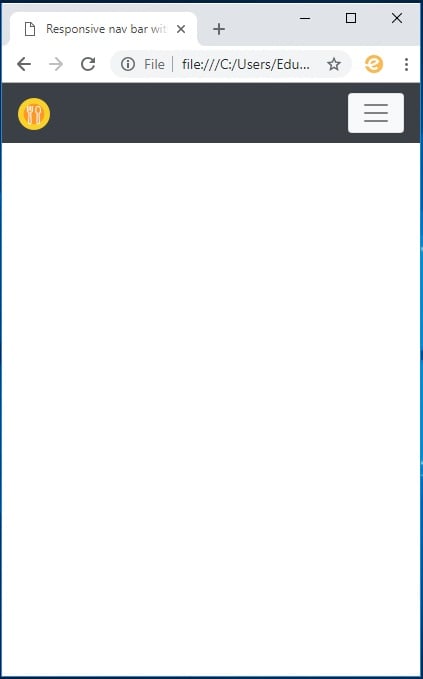
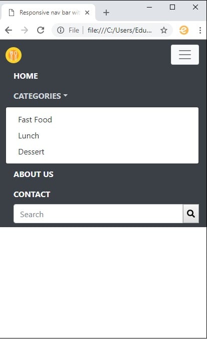
Output:
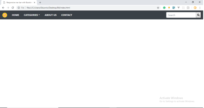
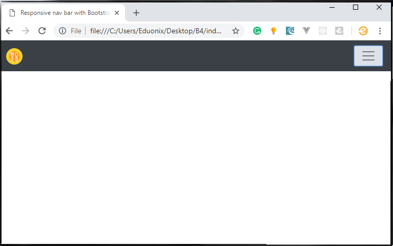
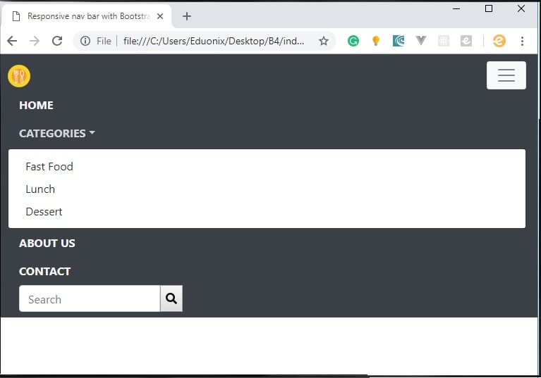
This is what the menu looks like on:
-
large screen
- medium screen (close)
-
medium screen (open)
-
Small screen (close)
-
Small screen (open)
Content Delivery Networks (CDNs):
Content Delivery Network is a system that exists all over the world and cashe files for users to access. CDNs allow for the quick transfer of assets needed for loading internet contents including HTML pages, javaScript files, Stylesheets, images, and videos, etc.
CDNs used in the above code are:
Jquery cdn :
<script src="https://code.jquery.com/jquery-2.1.3.min.js"></script>
Bootstrap CSS :
<link rel="stylesheet" href="https://stackpath.bootstrapcdn.com/bootstrap/4.2.1/css/bootstrap.min.css" integrity="sha384-GJzZqFGwb1QTTN6wy59ffF1BuGJpLSa9DkKMp0DgiMDm4iYMj70gZWKYbI706tWS" crossorigin="anonymous">


<script src="https://stackpath.bootstrapcdn.com/bootstrap/4.2.1/js/bootstrap.min.js" integrity="sha384-B0UglyR+jN6CkvvICOB2joaf5I4l3gm9GU6Hc1og6Ls7i6U/mkkaduKaBhlAXv9k" crossorigin="anonymous"></script>
This (below) CDN (fontawesome) is used for the search icon in the Navbar. We can also add other icons using this link.
<script defer src="https://use.fontawesome.com/releases/v5.0.13/js/all.js" integrity="sha384-xymdQtn1n3lH2wcu0qhcdaOpQwyoarkgLVxC/wZ5q7h9gHtxICrpcaSUfygqZGOe" crossorigin="anonymous"></script>
Now, responsive Navbar by using Bootstrap 4 is ready to use. Hope this article helped! To have a complete & in-depth understanding of Bootstrap 4 from the beginning you can enroll for the Bootstrap 4 Course!
Read More: How to Create a Responsive Bootstrap Website?
About the Author