Flexbox is a CSS module that provides developers with a more efficient way to design the layout of a web page. It simplifies the process of laying out, aligning and distributing space among items in a container, even when their size is unknown and/or dynamic. The objective of using Flex is to give the container the ability to modify its items’ width/height in order to best fill the available space. Flex accommodates all types of screen sizes and all display devices. In this article, we will be discussing step by step coding on how to design a simple website using Flexbox.
Because of the freedom that Flexbox offers when it comes to designing a layout, a lot of developers are now turning to flexbox to help them build dynamic and responsive layouts.
Let’s take a look at how you can build and integrate a simple website using Flexbox from scratch.
Before we begin with a flexbox example, we will need to download a few things such as the editor. Please download the sublimetext editor from “https://www.sublimetext.com/download” and install it on your system.
1) Create Project
On your desktop, create a folder with a name “flexbox”. Also create an index.html file and a CSS folder inside the flexbox folder. Now, create style.css file in the CSS folder.
2) Create a Form
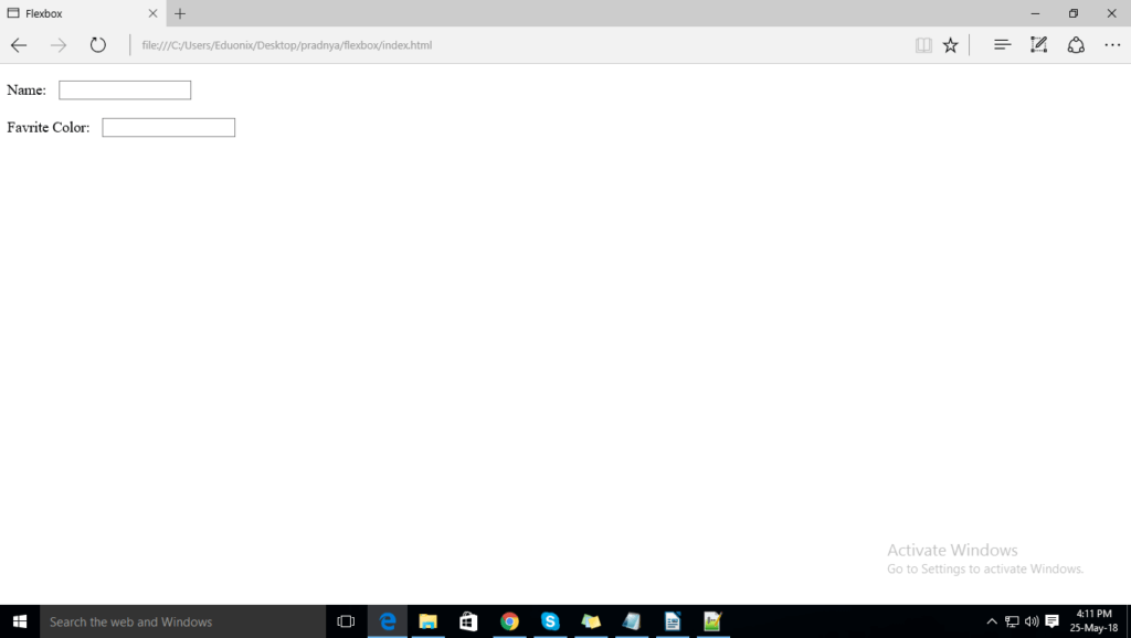
Add the following code to create a Form with 2 rows and 2 fields as shown below in the index.html file:
<html>
<head>
<title>Flexbox</title>
<link rel="stylesheet" href="css/style.css">
</head>
<body>

<center><div class="container">
  <form action="">
    <div class="form-row">
	 <label for="name">Name:</label>
     <input type="text" id="name">
	</div>

	<div class="form-row">
	 <label for="favColor">Favrite Color:</label>
     <input type="text" id="favColor">
	</div>

  </form>
 </div>


</body>

</html>
Now add this piece of code to the Style.css file:
.form-row{
	padding: 10px 0;
}

.form-row label {
	padding-right: 10px;
}

.form-row input
{

}
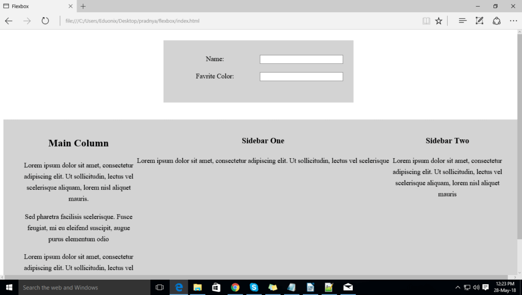
After you add the code, Save and close. Once you run the code, you will see the form has been created. Take a look at the snapshot below:
3) Parent Element
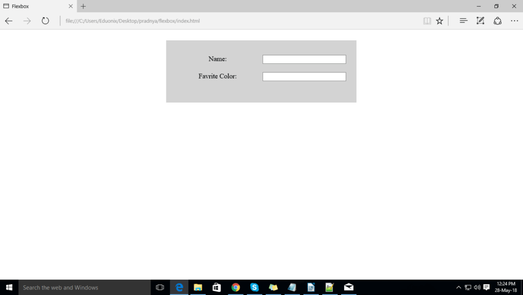
The width value for the input field is different. With flexbox, we don’t need to assign the width. Each label is wrapped in the container div. We are setting the display property to flex, this will help the flex container become flexible and to set all flexible item in the same length.
Please add the code to the style.css file and see the changes
.form-row{
	padding: 10px 0;
	display: flex;
.container{
	background-color: lightgrey;
    width: 400px;
    padding: 25px;
    margin: 25px;

}

.form-row{
	padding: 10px 0;
	display: flex;
}

.form-row label {
	padding-right: 10px;
	flex:1;
}

.form-row input
{
	flex: 1;
}
4) Three column layout:
Lets create the class for a column layout which contain 3 divs for main-column, sidebar one, sidebar-two. Please add the following code to the index.html file.
<div class="column-layout">
   <div class="main-column">
    <h2>Main Column</h2>

	<p>Lorem ipsum dolor sit amet, consectetur adipiscing elit.
	Ut sollicitudin, lectus vel scelerisque aliquam, lorem
	nisl aliquet mauris, et dignissim urna nisi
	nec ligula. Integer lobortis erat et accumsan volutpat.</p>

	<p>Sed pharetra facilisis scelerisque.
	Fusce feugiat, mi eu eleifend suscipit,
	augue purus elementum odio, nec egestas enim arcu
	quis tortor. Duis mi purus, venenatis sed
	tempus consequat </p>

    <p>Lorem ipsum dolor sit amet, consectetur adipiscing elit.
	Ut sollicitudin, lectus vel scelerisque aliquam, lorem
	nisl aliquet mauris, et dignissim urna nisi
	nec ligula. Integer lobortis erat et accumsan volutpat.
	Vestibulum tristique id nunc nec molestie.
	</p>
	</div>

	<div class="sidebar-one">
	 <h3>Sidebar One</h3>
	  <p>Lorem ipsum dolor sit amet, consectetur adipiscing elit.
	Ut sollicitudin, lectus vel scelerisque aliquam</p>
	</div>

	<div class="sidebar-two">
	 <h3>Sidebar Two</h3>
	  <p>Lorem ipsum dolor sit amet, consectetur adipiscing elit.
	Ut sollicitudin, lectus vel scelerisque aliquam, lorem
	nisl aliquet mauris</p>
	</div>


</div>
In the CSS file, we have added the display: flex; for set three divs side by side and to make three equal width column we added flex: 1 for each column, similarly if you want twice width for the main column you can set flex: 2 for main column etc.
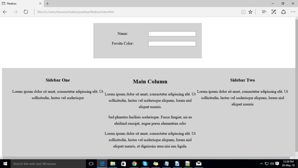
If you want to apply order for div, then you will give sidebar-one for order 1 and the main-column for order 2 and sidebar-two is on order 3, then add order in CSS as shown below:
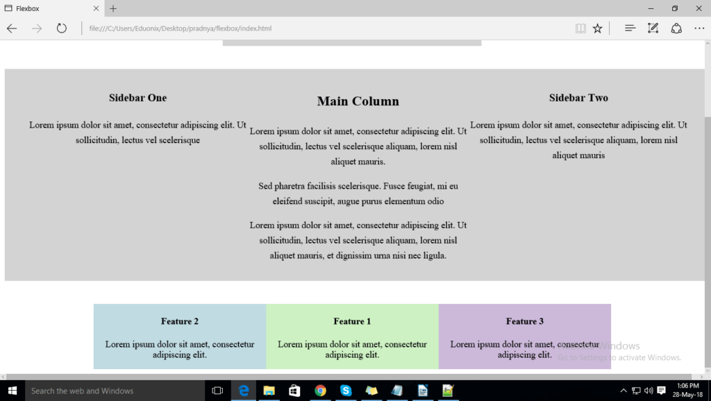
5) Margins:
Let’s add a new section for 3 features as shown below.
Add the following code to the respective files. Save and close.
Index.html file
<div class="call-outs-container">
<div class="call-out">
 <h4>Feature 2</h4>
  <p>Lorem ipsum dolor sit amet, consectetur adipiscing elit.</p>
</div>

<div class="call-out">
 <h4>Feature 1</h4>
  <p>Lorem ipsum dolor sit amet, consectetur adipiscing elit.</p>
</div>

<div class="call-out">
 <h4>Feature 3</h4>
  <p>Lorem ipsum dolor sit amet, consectetur adipiscing elit.</p>
</div>
Style.css file
.call-outs-container{
	max-width:900px;
	margin:40px auto 0 auto;
	display: flex;
}

.call-outs {
	padding: 20px;
	margin-bottom: 20px;
	flex:1;
}

.call-out:nth-child(1){background-color: #c0dbe2;}
.call-out:nth-child(2){background-color: #cdf1c3;}
.call-out:nth-child(3){background-color: #ccb9da;}
You will see the 3 features are added with no margins, same height, and the same width. See the example below:
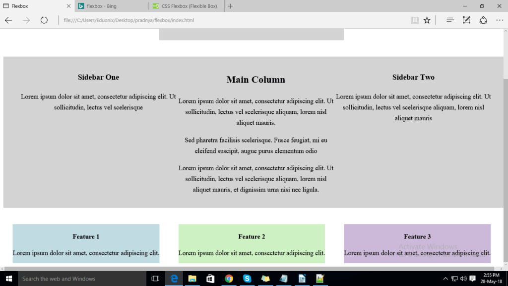
Add margins in between the columns by using the space-around value, this displays the flex items between, after, before the line. Add the CSS shown below
.call-outs-container{
	max-width: 1400px;
	margin:40px auto 0 auto;
	display: flex;
	justify-content: space-around;

}

.call-out{
	padding: 20px;
	box-sizing: border-box;
	margin-bottom: 20px;
		flex-basis: 30%;
}

.call-out:nth-child(1){background-color: #c0dbe2;}
.call-out:nth-child(2){background-color: #cdf1c3;}
.call-out:nth-child(3){background-color: #ccb9da;}
The Above CSS snippet creates margins in between the column as shown in the screenshot
6) Responsive
To make your 3 feature box responsive,add the below code in the style.css file
.container{
	background-color: lightgrey;
    width: 400px;
    padding: 25px;
    margin: 25px;

}

.form-row{
	padding: 10px 0;
	display: flex;
}

.form-row label {
	padding-right: 10px;
	flex:1;
}

.form-row input
{
	flex: 1;
}

.column-layout {
	max-width: 1300px;
	margin: 40px auto 0 auto;
	line-height: 1.65;
	padding: 15px 40px;
	display:flex;
	background-color: lightgrey;
	 width: 1150px;

}

.main-column{
	flex: 1;
	order:2;

}

.sidebar-one{
	flex: 1;
	order:1;

}

.sidebar-two{
	flex: 1;
	order:3;
}

.call-outs-container{
	max-width: 1400px;
	margin:40px auto 0 auto;


}

.call-out{
	padding: 20px;
	box-sizing: border-box;
	margin-bottom: 20px;
		flex-basis: 30%;
}

@media (min-width: 900px)
{
	.call-outs-container{
		display: flex;
	    justify-content: space-around;
	}

}


.call-out:nth-child(1){background-color: #c0dbe2;}
.call-out:nth-child(2){background-color: #cdf1c3;}
.call-out:nth-child(3){background-color: #ccb9da;}
7) Multiple rows of items
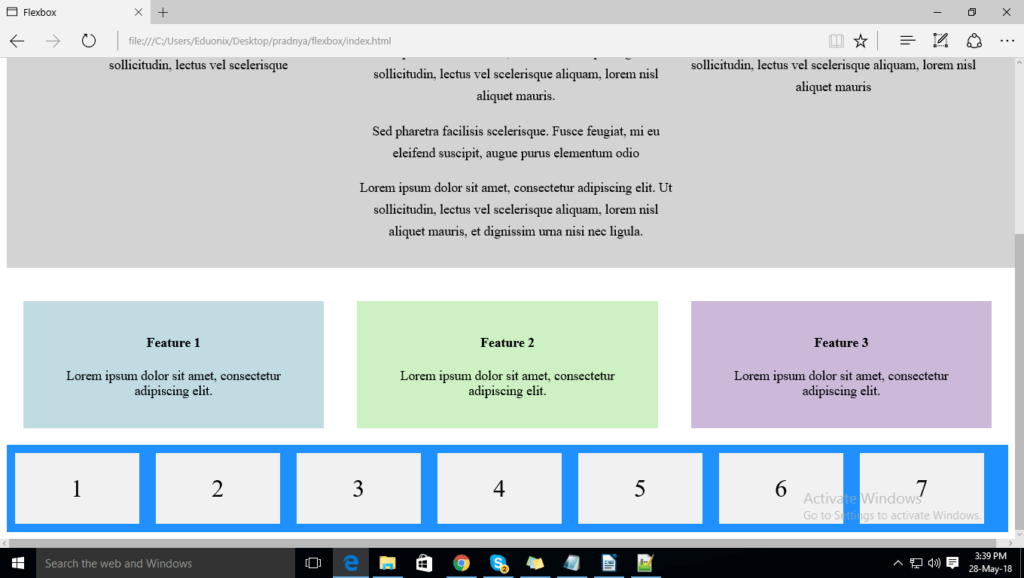
Now, let’s create multiple rows of the item in next section by using tyhe flex-wrap property which specifies if the flex items wrap or not. Please check the example below. It has 7 flex items to demonstrate the flex-wrap property. Add the code to the index.html file. Save and close.
<div class="flex-container">
  <div>1</div>
  <div>2</div>
  <div>3</div>
  <div>4</div>
  <div>5</div>
  <div>6</div>
  <div>7</div>
</div>
Style.css file
.flex-container {
  display: flex;
  flex-wrap: nowrap;
  background-color: DodgerBlue;
}

.flex-container>div {
  background-color: #f1f1f1;
  width: 150px;
  margin: 10px;
  text-align: center;
  line-height: 85px;
  font-size: 30px;
The code below is the complete code of index.html file and style.css file.
index.html file
<html>
<head>
<title>Flexbox</title>
<link rel="stylesheet" href="css/style.css">
</head>
<body>

<center><div class="container">
  <form action="">
    <div class="form-row">
	 <label for="name">Name:</label>
     <input type="text" id="name">
	</div>

	<div class="form-row">
	 <label for="favColor">Favrite Color:</label>
     <input type="text" id="favColor">
	</div>

  </form>
 </div>

 <div class="column-layout">
   <div class="main-column">
    <h2>Main Column</h2>

	<p>Lorem ipsum dolor sit amet, consectetur adipiscing elit.
	Ut sollicitudin, lectus vel scelerisque aliquam, lorem
	nisl aliquet mauris.</p>

	<p>Sed pharetra facilisis scelerisque.
	Fusce feugiat, mi eu eleifend suscipit,
	augue purus elementum odio </p>

    <p>Lorem ipsum dolor sit amet, consectetur adipiscing elit.
	Ut sollicitudin, lectus vel scelerisque aliquam, lorem
	nisl aliquet mauris, et dignissim urna nisi
	nec ligula.
	</div>

	<div class="sidebar-one">
	 <h3>Sidebar One</h3>
	  <p>Lorem ipsum dolor sit amet, consectetur adipiscing elit.
	Ut sollicitudin, lectus vel scelerisque </p>
	</div>

	<div class="sidebar-two">
	 <h3>Sidebar Two</h3>
	  <p>Lorem ipsum dolor sit amet, consectetur adipiscing elit.
	Ut sollicitudin, lectus vel scelerisque aliquam, lorem
	nisl aliquet mauris</p>
	</div>
</div>

<div class="call-outs-container">

<div class="call-out">
 <h4>Feature 1</h4>
  <p>Lorem ipsum dolor sit amet, consectetur adipiscing elit.</p>
</div>

<div class="call-out">
 <h4>Feature 2</h4>
  <p>Lorem ipsum dolor sit amet, consectetur adipiscing elit.</p>
</div>

<div class="call-out">
 <h4>Feature 3</h4>
  <p>Lorem ipsum dolor sit amet, consectetur adipiscing elit.</p>
</div>
</div></center>

<div class="flex-container">
  <div>1</div>
  <div>2</div>
  <div>3</div>
  <div>4</div>
  <div>5</div>
  <div>6</div>
  <div>7</div>
</div>

</body>

</html>
Style.css file
.container{
	background-color: lightgrey;
    width: 400px;
    padding: 25px;
    margin: 25px;

}

.form-row{
	padding: 10px 0;
	display: flex;
}

.form-row label {
	padding-right: 10px;
	flex:1;
}

.form-row input
{
	flex: 1;
}

.column-layout {

	margin: 40px auto 0 auto;
	line-height: 1.65;
	padding: 15px 40px;
	display:flex;
	background-color: lightgrey;


}

.main-column{
	flex: 1;
	order:2;

}

.sidebar-one{
	flex: 1;
	order:1;

}

.sidebar-two{
	flex: 1;
	order:3;
}

.call-outs-container{
	max-width: 1400px;
	margin:40px auto 0 auto;


}

.call-out{
	padding: 20px;
	box-sizing: border-box;
	margin-bottom: 20px;
		flex-basis: 30%;
}

@media (min-width: 900px)
{
	.call-outs-container{
		display: flex;
	    justify-content: space-around;
	}

}


.call-out:nth-child(1){background-color: #c0dbe2;}
.call-out:nth-child(2){background-color: #cdf1c3;}
.call-out:nth-child(3){background-color: #ccb9da;}


.flex-container {
  display: flex;
  flex-wrap: nowrap;
  background-color: DodgerBlue;
}

.flex-container>div {
  background-color: #f1f1f1;
  width: 150px;
  margin: 10px;
  text-align: center;
  line-height: 85px;
  font-size: 30px;
}
Since responsive has become such as important factor in web design, it is important for developers to be able to develop this technology without having to go through a lot of hassle. With Flexbox, this task becomes easier.
In this article, we showed you exactly how you can use Flex box to create multiple boxes on a single page. Now, you can add content and other features easily on your website. You can easily flex their sizes to respond to available space. If you have any problems or questions regarding Flexbox, please feel free to drop us a message in the comments section below.
About the Author