

R is a well-known and popular programming language that is heavily used for statistical computing and graphics by the researchers and statisticians from all over the world. R programming is mainly seen in data science where statisticians & data miners use it for drawing insights from the given dataset.
In recent years, despite the popularity of Java or Python, R is still used by a good number of people from all over the world. It is mainly because of the fact that ‘R language’ was solely designed for statisticians. R programming has immense scope and is important for programmers in data science.
Considering this, we are bringing this exclusive series that will teach you various aspects of Data Science using various tools of R programming language. Below are the different concepts that you will be going to learn with this series.
- Dynamic Map creation using ggmap and R
- Creating dynamic maps using ggplot2
- 3D Visualization in R
- Data Wrangling and Visualization in R
- Exploratory Data Analysis using R
- Clustering using FactoExtra Package
So, let’s begin!
As mentioned earlier, we will first start with creating dynamic maps with the help of R and related packages. We will focus on a dataset that helps in analyzing the range of votes to be given to the mentioned geographical region.
We will implement the following steps to create a dynamic map from the mentioned dataset, where we will implement the necessary packages which are needed for creating the map.
Step 1: Install the necessary packages which are needed for creating the dynamic map in R. Include the packages in the mentioned workspace.
install.packages("gridExtra")
install.packages("Lock5Data")
install.packages("maps")
install.packages("mapproj")
install.packages("corrplot")
> require("ggplot2")
Loading required package: ggplot2
> require("tibble")
Loading required package: tibble
> require("dplyr")
Loading required package: dplyr

Attaching package: ‘dplyr’

The following objects are masked from ‘package:stats’:

    filter, lag

The following objects are masked from ‘package:base’:

    intersect, setdiff, setequal, union

> require("Lock5Data")
Loading required package: Lock5Data

Attaching package: ‘Lock5Data’

The following object is masked _by_ ‘.GlobalEnv’:

    USStates

> require("zoo")
Loading required package: zoo

Attaching package: ‘zoo’

The following objects are masked from ‘package:base’:

    as.Date, as.Date.numeric

> require("corrplot")
Loading required package: corrplot
corrplot 0.84 loaded
> require("maps")
Loading required package: maps
> require("mapproj")
Loading required package: mapproj
Step 2: Create a dataset from the maps package using a specific function that helps in the creation of a data frame suitable for plotting with ggplot2.
> states_map <- map_data("state")
Step 3: Now let us understand the structure of the data frame namely “states_map” which includes all the necessary attributes.
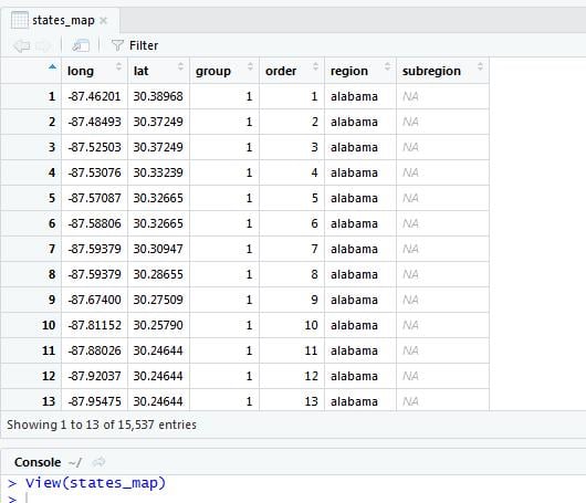
> glimpse(states_map)
Observations: 15,537
Variables: 6
$ long      <dbl> -87.46201, -87.48493, -87.52503, -87.53076, -87.57087, -87....
$ lat       <dbl> 30.38968, 30.37249, 30.37249, 30.33239, 30.32665, 30.32665,...
$ group     <dbl> 1, 1, 1, 1, 1, 1, 1, 1, 1, 1, 1, 1, 1, 1, 1, 1, 1, 1, 1, 1,...
$ order     <int> 1, 2, 3, 4, 5, 6, 7, 8, 9, 10, 11, 12, 13, 14, 15, 16, 17, ...
$ region    <chr> "alabama", "alabama", "alabama", "alabama", "alabama", "ala...
$ subregion <chr> NA, NA, NA, NA, NA, NA, NA, NA, NA, NA, NA, NA, NA, NA, NA,...
> str(states_map)
'data.frame':	15537 obs. of  6 variables:
 $ long     : num  -87.5 -87.5 -87.5 -87.5 -87.6 ...
 $ lat      : num  30.4 30.4 30.4 30.3 30.3 ...
 $ group    : num  1 1 1 1 1 1 1 1 1 1 ...
 $ order    : int  1 2 3 4 5 6 7 8 9 10 ...
 $ region   : chr  "alabama" "alabama" "alabama" "alabama" ...
 $ subregion: chr  NA NA NA NA ...
We have 15,537 observations or records with 6 columns mentioned in it. The dataset also includes the combination of latitude and longitude which helps in catering the required values while plotting a particular plot. The map_data() function returns a data frame with the following columns:
long – Longitude
lat – Latitude
group – This is a grouping variable for each polygon
A region or subregion might have multiple polygons, for example, if it includes islands.
Step 4: Let us plot the geographical regions from the mentioned set of coordinates of latitudes and longitudes.
> ggplot(states_map, aes(x=long, y=lat, group=group)) + geom_polygon(fill="white", colour="black")
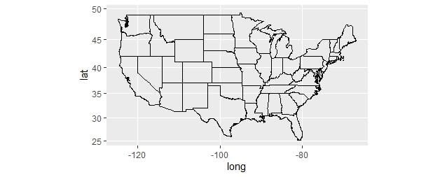
> ggplot(states_map, aes(x=long, y=lat, group=group)) +
+ geom_path() + coord_map("mercator")
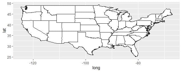
We refine the attributes to have a proper visualization and the output for that is given below:
Step 5: Now let us create the map with regions that are colored according to the mentioned values.
> USStates$Statelower <- as.character(tolower(USStates$State))
> glimpse(USStates)
Observations: 50
Variables: 23
$ State            <fct> Alabama, Alaska, Arizona, Arkansas, California, Colo...
$ HouseholdIncome  <dbl> 43.253, 70.760, 49.774, 40.768, 61.094, 58.433, 69.4...
$ Region           <fct> S, W, W, S, W, W, NE, NE, S, S, W, W, MW, MW, MW, MW...
$ Population       <dbl> 4.849, 0.737, 6.731, 2.966, 38.803, 5.356, 3.597, 0....
$ EighthGradeMath  <dbl> 269.2, 281.6, 279.7, 277.9, 275.9, 289.7, 285.2, 282...
$ HighSchool       <dbl> 84.9, 92.8, 85.6, 87.1, 84.1, 89.5, 91.0, 86.9, 87.1...
$ College          <dbl> 24.9, 24.7, 25.5, 22.4, 31.4, 37.0, 39.8, 31.7, 26.5...
$ IQ               <dbl> 95.7, 99.0, 97.4, 97.5, 95.5, 101.6, 103.1, 100.4, 9...
$ GSP              <dbl> 32.615, 61.156, 35.195, 31.837, 46.029, 46.242, 54.9...
$ Vegetables       <dbl> 74.2, 80.8, 76.2, 72.0, 82.7, 80.9, 77.8, 71.1, 79.2...
$ Fruit            <dbl> 54.1, 60.3, 60.5, 49.5, 69.6, 64.3, 66.3, 59.6, 62.0...
$ Smokers          <dbl> 21.5, 22.6, 16.3, 25.9, 12.5, 17.7, 15.5, 19.6, 16.8...
$ PhysicalActivity <dbl> 45.4, 55.3, 51.9, 41.2, 56.3, 60.4, 50.9, 49.7, 50.2...
$ Obese            <dbl> 32.4, 28.4, 26.8, 34.6, 24.1, 21.3, 25.0, 31.1, 26.4...
$ NonWhite         <dbl> 30.7, 33.1, 20.8, 21.7, 37.7, 15.8, 22.1, 30.0, 23.7...
$ HeavyDrinkers    <dbl> 4.3, 8.2, 6.3, 5.0, 6.4, 6.7, 6.3, 6.6, 7.2, 4.7, 7....
$ Electoral        <int> 9, 3, 11, 6, 55, 9, 7, 3, 29, 16, 4, 4, 20, 11, 6, 6...
$ ObamaVote        <dbl> 0.384, 0.408, 0.446, 0.369, 0.602, 0.515, 0.581, 0.5...
$ ObamaRomney      <fct> R, R, R, R, O, O, O, O, O, R, O, R, O, R, O, R, R, R...
$ TwoParents       <dbl> 58.7, 69.6, 62.7, 62.0, 65.3, 69.9, 67.0, 60.4, 60.2...
$ StudentSpending  <dbl> 8.755, 18.175, 7.208, 9.394, 9.220, 8.647, 16.631, 1...
$ Insured          <dbl> 78.8, 79.8, 74.7, 71.7, 79.7, 80.0, 87.7, 85.7, 70.9...
$ Statelower       <chr> "alabama", "alaska", "arizona", "arkansas", "califor...
> us_data <- merge(USStates,states_map,by.x="Statelower",by.y="region")
> head(us_data)
  Statelower   State HouseholdIncome Region Population EighthGradeMath HighSchool
1    alabama Alabama          43.253      S      4.849           269.2       84.9
2    alabama Alabama          43.253      S      4.849           269.2       84.9
3    alabama Alabama          43.253      S      4.849           269.2       84.9
4    alabama Alabama          43.253      S      4.849           269.2       84.9
5    alabama Alabama          43.253      S      4.849           269.2       84.9
6    alabama Alabama          43.253      S      4.849           269.2       84.9
  College   IQ    GSP Vegetables Fruit Smokers PhysicalActivity Obese NonWhite
1    24.9 95.7 32.615       74.2  54.1    21.5             45.4  32.4     30.7
2    24.9 95.7 32.615       74.2  54.1    21.5             45.4  32.4     30.7
3    24.9 95.7 32.615       74.2  54.1    21.5             45.4  32.4     30.7
4    24.9 95.7 32.615       74.2  54.1    21.5             45.4  32.4     30.7
5    24.9 95.7 32.615       74.2  54.1    21.5             45.4  32.4     30.7
6    24.9 95.7 32.615       74.2  54.1    21.5             45.4  32.4     30.7
  HeavyDrinkers Electoral ObamaVote ObamaRomney TwoParents StudentSpending
1           4.3         9     0.384           R       58.7           8.755
2           4.3         9     0.384           R       58.7           8.755
3           4.3         9     0.384           R       58.7           8.755
4           4.3         9     0.384           R       58.7           8.755
5           4.3         9     0.384           R       58.7           8.755
6           4.3         9     0.384           R       58.7           8.755
  Insured      long      lat group order subregion
1    78.8 -87.46201 30.38968     1     1      <NA>
2    78.8 -87.48493 30.37249     1     2      <NA>
3    78.8 -87.95475 30.24644     1    13      <NA>
4    78.8 -88.00632 30.24071     1    14      <NA>
5    78.8 -88.01778 30.25217     1    15      <NA>
6    78.8 -87.52503 30.37249     1     3      <NA>
In this step, we are merging two data sets into one to understand the voting rate of the population of the US. If you observe there is a parameter called “ObamaVote” which defines the rate of votes given by people to Obama.
Step 6: Let us create the vote chart of the 2012 elections with the mentioned rate card.
> ggplot(us_data, aes(x=long, y=lat, group=group, fill=ObamaVote)) +    geom_polygon(colour="black") +
+     coord_map("mercator")+scale_fill_gradient(low="red",high="blue")
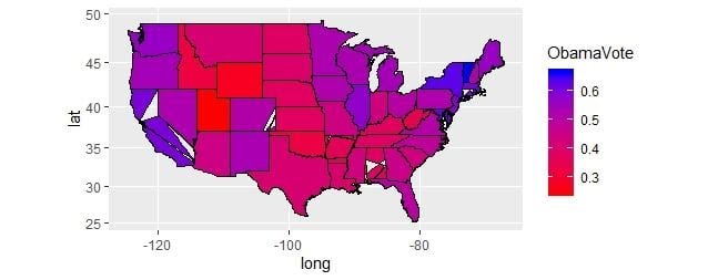
The plot defines the range of votes which is shared among the population of the mentioned regions.
Step 7: Let us create a world map with the associated coordinates to create the world data records.
> world_map <- map_data("world")
> world_map
         long      lat group order      region subregion
1   -69.89912 12.45200     1     1       Aruba      <NA>
2   -69.89571 12.42300     1     2       Aruba      <NA>
3   -69.94219 12.43853     1     3       Aruba      <NA>
4   -70.00415 12.50049     1     4       Aruba      <NA>
5   -70.06612 12.54697     1     5       Aruba      <NA>
6   -70.05088 12.59707     1     6       Aruba      <NA>
7   -70.03511 12.61411     1     7       Aruba      <NA>
8   -69.97314 12.56763     1     8       Aruba      <NA>
9   -69.91181 12.48047     1     9       Aruba      <NA>
10  -69.89912 12.45200     1    10       Aruba      <NA>
12   74.89131 37.23164     2    12 Afghanistan      <NA>
13   74.84023 37.22505     2    13 Afghanistan      <NA>
14   74.76738 37.24917     2    14 Afghanistan      <NA>
15   74.73896 37.28564     2    15 Afghanistan      <NA>
16   74.72666 37.29072     2    16 Afghanistan      <NA>
17   74.66895 37.26670     2    17 Afghanistan      <NA>
18   74.55899 37.23662     2    18 Afghanistan      <NA>
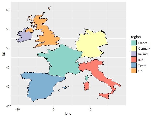
Step 8: Select the regions of Europe. We need to create a subset of countries of Europe.
> europe <- map_data("world", region=c("Germany", "Spain", "Italy",                                        "France","UK","Ireland"))
> europe
         long      lat group order  region subregion
1   14.213672 53.87075     1     1 Germany    Usedom
2   14.172168 53.87437     1     2 Germany    Usedom
3   14.048340 53.86309     1     3 Germany    Usedom
4   13.925780 53.87905     1     4 Germany    Usedom
5   13.902148 53.93896     1     5 Germany    Usedom
Step 9: Now let us create the geographical plots which define each region with a specific color.
> ggplot(europe, aes(x=long, y=lat, group=group, fill=region)) + geom_polygon(colour="black") + scale_fill_brewer(palette="Set3")
Conclusion
Sometimes, we want to know the trends and behaviors of people in different countries or states. For example, we might want to see the shopping behaviors of people in different states. The maps package is useful for this purpose. In this section, we will look at how to draw and display information with maps. We saw various strategies through which we can plot dynamic maps using ggmap and maps packages which are included in R.
In the next section, we will explore various ways of creating dynamic maps using ggplot2 in R language. These maps will include different types of scatter plots, jitter plot, bar plot, histogram, density plot, box plot, dot plot, violin plot, bubble plot & others.
Read More:
- The Rise of R Programming Language and Its Usefulness in Data Science
- A Quick Guide To Cloud Computing Utilizing R Programming